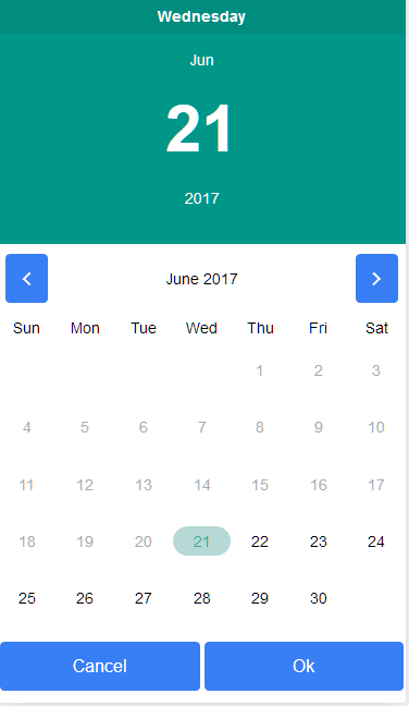
### [Demo](https://ion-datepicker.herokuapp.com/)
## How to use ###
### 1) Install using npm ###
```
npm i ion-datepicker --save
```
### 2) Add it to your ngModule in app.module ###
```
import { DatePickerModule } from 'ion-datepicker';
```
```
imports: [
IonicModule.forRoot(App),
DatePickerModule,
],
```
### 3) Use the directive ion-datepicker in your html ###
```
{{localDate | date}}
```
### Dismiss the datepicker from the class ###
```
import { DatePickerDirective } from 'ion-datepicker';
@ViewChild(DatePickerDirective) private datepickerDirective:DatePickerDirective;
public closeDatepicker(){
this.datepickerDirective.modal.dismiss();
}
```
## Options ###
`[value]` - defines the initial value, can be two bindable as in [(value)].
`[min]` - minimum date that user is allowed to select. (not required)
`[max]` - maximum date that user is allowed to select. (not required)
`[disabledDates]` - An array of dates that should be disabled (not required)
`[calendar]` - A boolean that determines whether to show calendar or not. Defaults to true.
`[markDates]` - An array of dates that should be marked with background color (not required)
`(ionChanged)` - an event emitter that returns the date as a $event.
`(ionCanceled)` - an event that is raised when the cancel button is activated. Returns no data.
`(ionSelected)` - an event that is raised when a date is selected
`[headerClasses]` - a bridge to the header classes of the directive using ngClass (string, array or object) (not required)
`[bodyClasses]` - a bridge to the date classes of the directive using ngClass (string, array or object) (not required)
`[modalOptions]` - a modal is used to display the picker to configure the animation or other options you may use this
`[locale]` - for translating the calendar. Avaliable local is en-US, en-UK, he-IL, pt-BR, ru-RU, de, fi, fr-FR, zh-TW, zh-CN, ja-JP. Please note en-US locale starts the calendar with monday and en-UK starts it with sunday
`[localeStrings]` - if you dont want to use the built translations - accepts an object { weekdays: string[], months: string[], monday:boolean },
For example:
```
{
monday:true,
weekdays: ['Monday', 'Tuesday', 'Wednesday', 'Thursday', 'Friday', 'Saturday', 'Sunday'],
months: ['January', 'February', 'March', 'April', 'May', 'June', 'July', 'August', 'September', 'October', 'November', 'December']
},
```
`[okText]` - text for the ok button
`[cancelText]` - text for the cancel button
### 4) Pictures ###