![Logo](admin/mytime.png)

# ioBroker.mytime

[![NPM version](https://img.shields.io/npm/v/iobroker.mytime.svg)](https://www.npmjs.com/package/iobroker.mytime)
[![Downloads](https://img.shields.io/npm/dm/iobroker.mytime.svg)](https://www.npmjs.com/package/iobroker.mytime)
![Number of Installations](https://iobroker.live/badges/mytime-installed.svg)
![Current version in stable repository](https://iobroker.live/badges/mytime-stable.svg)

[![NPM](https://nodei.co/npm/iobroker.mytime.png?downloads=true)](https://nodei.co/npm/iobroker.mytime/)

**Tests:** ![Test and Release](https://github.com/oweitman/ioBroker.mytime/workflows/Test%20and%20Release/badge.svg)

## IMPORTANT

Only the english documentation is valid as the automatic translation
translates areas that should not be translated.

## mytime adapter for ioBroker

This adapter handle Time (eg: countdown,etc.).
The countdown functionality provides datapoints that you can use to manage a
countdown (e.g. in a script). The adapter also includes several widgets
to visualize these countdowns. Time series can be used to create
complex time series at which the data points are triggered.

### Configuration

#### Countdown

In the configuration dialog Tab "Countdown" you can create a new countdown
eg 'test', set timer to 10 seconds and import the following widgets.
Datapoints are pre configured for a countdown named test.

##### Stop behaviour timer

After the countdown gets the signal stop, the countdown resets
to the time set by timer.

##### Stop behaviour zero

After the countdown gets the signal stop, the countdown remains at 0.

##### Stop behaviour rerun

When the timer expires, it will automatically restart.

#### Timeseries

In the configuration dialog Tab "Timeseries" you can create a
new timeseries with one or more timerules. For each timerule you can
define different parameters
Each timeseries creates a seperate datapoint which is triggered
at the calculated time events.
The time events are calculated in real time. However, the rrule library
used is not yet perfect in all parameter combinations.
This shows that with some combinations the page goes into an endless loop.
The demo page <http://jakubroztocil.github.io/rrule/> can also be used for experiments.
Additional to add a timerule, you can add a timerule to exclude time events,
to add single time events and also to exclude single time events.

In addition to the functionality of rrule, dynamically calculated times
for the various sun and moon phases can now also be calculated.
This calculation only occurs if the time interval is at
least daily (not hourly or minutely).

##### Sun based time events

- astronomicalDawn
- amateurDawn
- nauticalDawn
- blueHourDawnStart
- civilDawn
- blueHourDawnEnd
- goldenHourDawnStart
- sunriseStart
- sunriseEnd
- goldenHourDawnEnd
- solarNoon
- goldenHourDuskStart
- sunsetStart
- sunsetEnd
- goldenHourDuskEnd
- blueHourDuskStart
- civilDusk
- blueHourDuskEnd
- nauticalDusk
- amateurDusk
- astronomicalDusk
- nadir

##### Moon based time events

- moonrise
- moonhigh
- moonset

### Usage

#### Usage of Timeseries

##### Available Datapoints of a timeserie

After configuration of a new timeserie the adapter creates the following datapoints:

| datapoint | description                                                  |
| --------- | ------------------------------------------------------------ |
| action    | actual state of thie timeserie. possible values are stop,run |
| cmd       | no function atm                                              |

##### Available action states

| action | description                                                                                   |
| ------ | --------------------------------------------------------------------------------------------- |
| stop   | no time event is active at the moment                                                         |
| run    | a time event was triggered. after the configured duration time, the datapoint changes to stop |

#### Usage of Countdown

##### Available Datapoints of a countdown

After configuration of a new countdown the adapter creates the following datapoints:

| datapoint | description                                                            |
| --------- | ---------------------------------------------------------------------- |
| action    | actual state of thie countdown. possible values are stop,run,pause,end |
| cmd       | datapoint for commands. possible commands are described below          |
| config    | enthält zusätzliche konfiguration für den countdowntimer.              |
| start     | datapoint for the start time in milliseconds                           |
| end       | datapoint for the end time in milliseconds                             |
| timer     | datapoint for the total time set in milliseconds                       |

##### Available action states of a countdown

| action | description                                                                                           |
| ------ | ----------------------------------------------------------------------------------------------------- |
| stop   | the countdown is stopped, start and end time is set to 0                                              |
| run    | the countdown runs. if the countdown reachs the end time. the action switchs to end                   |
| pause  | countdown is in pausemode. the end time was set to the time of the pause                              |
| end    | the countdown is ended. this state you can use as a trigger for further actions (sound, popups, etc.) |

##### Available commands for the cmd datapoint

| command         | example                 | description                                                                                                                          |
| --------------- | ----------------------- | ------------------------------------------------------------------------------------------------------------------------------------ |
| `+value`        | `+1:10`                 | adds time to the countdown setting. the setting will be taken into account at the next start                                         |
| `+!value`       | ``+!1:10`               | like + operator and extend the running timer                                                                                         |
| `-value`        | `-1:2:3`                | subtracts time from the countdown. the setting will be taken into account at the next start                                          |
| `-!value`       | `-!1:2:3`               | like - operator and reduce the running timer                                                                                         |
| `=value`        | `=5:00`                 | set the countdowntimer to this time.                                                                                                 |
| `=!value`       | `=!5:00`                | like = operator and set running timer to the given time                                                                              |
| `#ISO-Date`     | `#2025-01-01T10:00:00`  | set the countdowntimer to a target time. The Time must be formatted as ISO-Datestring                                                |
| `#!ISO-Date`    | `#!2025-01-01T10:00:00` | like # operator and setting running timer to the given target time                                                                   |
| `$Time`         | `$20:15`                | set the countdowntimer to a target time. If Time is before current time. the next day is set.                                        |
| `$!Time`        | `$!20:15`               | like $ operator and setting running timer to the given target time                                                                   |
| `start`         | `start`                 | starts the countdown                                                                                                                 |
| `stop`          | `stop`                  | stops the countdown. the countdown time is reset to the setting                                                                      |
| `pause`         | `pause`                 | pauses the countdown                                                                                                                 |
| `end`           | `end`                   | stops the countdown. the countdown is set to 0                                                                                       |
| `reset`         | `reset`                 | reset the timer to the configuration state                                                                                           |
| `setstop2timer` | `setstop2timer`         | set stop behaviour configuration to timer                                                                                            |
| `setstop2zero`  | `setstop2zero`          | set stop behaviour configuration to zero                                                                                             |
| `setstop2rerun` | `setstop2rerun`         | set stop behaviour configuration to rerun                                                                                            |
| `save`          | `save`                  | save the configuration defined in datapoints to the iobroker configuration, iobroker restarts the adapter after saving automatically |

##### Format of the value for setting the countdown timer

you can set the countdown to an unlimited time.
the notation of the value is
[days:[hours:[minutes:[seconds]]]]
days,hours and minutes are optional.
if you want to set the timer to one day you have
to set hours, minutes and second aswell
you dont have to respect the normal value ranges (eg hours 0-24).
You can also set 48 hours.
If you want you can set irregular time notations. the time is summed up seperatly

**Examples:**

| setting   | description                                 |
| --------- | ------------------------------------------- |
| 1:0:0:0   | set/adds/subtracts 1 day to the timer       |
| 2:0:0     | set/adds/subtracts 2 hours to the timer     |
| 3:0       | set/adds/subtracts 3 minutes to the timer   |
| 120       | set/adds/subtracts 120 seconds to the timer |
| 48:0:0    | set/adds/subtracts 48 hours to the timer    |
| 48:75:120 | set/adds/subtracts the timer                |

##### Format of the Datetime to format the output in the widget

The following placeholders are available:

| placeholder | description                                                     |
| ----------- | --------------------------------------------------------------- |
| YYYY        | years in 4 digits                                               |
| YY          | years in 2 digits                                               |
| w           | months without leading zeros, (not together with the months)    |
| ww          | months with leading zeros, (not together with the months)       |
| M           | months without leading zeros, (not together with the weeks)     |
| MM          | months with leading zeros, (not together with the weeks)        |
| d           | days without leading zeros                                      |
| dd          | days with leading zeros                                         |
| H           | hours without leading zeros                                     |
| HH          | hours with leading zeros                                        |
| m           | minutes without leading zeros                                   |
| mm          | minutes with leading zeros                                      |
| s           | seconds without leading zeros                                   |
| ss          | seconds with leading zeros                                      |
| \           | Escape character if you want to use a placeholder in the output |

When multiple parts are taken, there must be no gaps between them.

Example:

Valid: year, month, day | hour, minute, second
Irvalid: year, minute, second

**Examples:**

All following Examples with countdown timer 1:2:3:4

| template           | example         | result                                           |
| ------------------ | --------------- | ------------------------------------------------ |
| d\d Hh m\m s\s     | 1d 2h 3m 4s     | with escape-characters and without leading zeros |
| dd\d HHh mm\m ss\s | 01d 02h 03m 04s | with escape-characters and with leading zeros    |
| ss\s               | 93784s          | only seconds                                     |
| dd\d HH\h          | 01d 02h         | only days and hours                              |
| HH\h mm\m          | 26h 03m         | only hours and minutes                           |

### Widgets

From Version 1.2.0 on the widgets should be compatible with vis1 and vis2.

#### Widget Countdown plain

![Widget Countdown plain](admin/mytime-plain-countdown.png)

A countdown widget for a plain textual output.
The output can be configured in detail.

##### Widget Attributes

| Attribute      | Description                                                                                                                        |
| -------------- | ---------------------------------------------------------------------------------------------------------------------------------- |
| `Object ID`    | Datapoint of the countdown timer. any datapoint can be used                                                                        |
| `Format`       | Format of the output, Please see chapter [Datetime Format](#format-of-the-datetime-to-format-the-output-in-the-widget) for details |
| `HTML-Prepend` | This text or html is prepended to the output of the widget                                                                         |
| `HTML-Append`  | This text or html is appended to the output of the widget                                                                          |

##### Example widget code

The widgets are preconfigured for a countdown named test.
There a 2 seperate versions for vis1 and vis2

![Example](admin/mytime-example1.png)

**VIS1:**

<details>
  <summary>Details</summary>
  <pre><code>[{"tpl":"tplMyTimeCountdownPlain","data":{"g_fixed":false,"g_visibility":false,"g_css_font_text":false,"g_css_background":false,"g_css_shadow_padding":false,"g_css_border":false,"g_gestures":false,"g_signals":false,"g_last_change":false,"visibility-cond":"==","visibility-val":1,"visibility-groups-action":"hide","signals-cond-0":"==","signals-val-0":true,"signals-icon-0":"/vis/signals/lowbattery.png","signals-icon-size-0":0,"signals-blink-0":false,"signals-horz-0":0,"signals-vert-0":0,"signals-hide-edit-0":false,"signals-cond-1":"==","signals-val-1":true,"signals-icon-1":"/vis/signals/lowbattery.png","signals-icon-size-1":0,"signals-blink-1":false,"signals-horz-1":0,"signals-vert-1":0,"signals-hide-edit-1":false,"signals-cond-2":"==","signals-val-2":true,"signals-icon-2":"/vis/signals/lowbattery.png","signals-icon-size-2":0,"signals-blink-2":false,"signals-horz-2":0,"signals-vert-2":0,"signals-hide-edit-2":false,"lc-type":"last-change","lc-is-interval":true,"lc-is-moment":false,"lc-format":"","lc-position-vert":"top","lc-position-horz":"right","lc-offset-vert":0,"lc-offset-horz":0,"lc-font-size":"12px","lc-font-family":"","lc-font-style":"","lc-bkg-color":"","lc-color":"","lc-border-width":"0","lc-border-style":"","lc-border-color":"","lc-border-radius":10,"lc-zindex":0,"countdown_oid":"mytime.0.Countdowns.test.timer","format":"d H m s"},"style":{"left":"771px","top":"143px","width":"151px","height":"16px"},"widgetSet":"mytime"},{"tpl":"tplJquiButtonState","data":{"oid":"mytime.0.Countdowns.test.cmd","g_fixed":true,"g_visibility":false,"g_css_font_text":true,"g_css_background":true,"g_css_shadow_padding":true,"g_css_border":true,"g_gestures":false,"g_signals":false,"g_last_change":false,"buttontext":"+10s","signals-cond-0":"==","signals-val-0":true,"signals-icon-0":"/vis/signals/lowbattery.png","signals-icon-size-0":0,"signals-blink-0":false,"signals-horz-0":0,"signals-vert-0":0,"signals-hide-edit-0":false,"signals-cond-1":"==","signals-val-1":true,"signals-icon-1":"/vis/signals/lowbattery.png","signals-icon-size-1":0,"signals-blink-1":false,"signals-horz-1":0,"signals-vert-1":0,"signals-hide-edit-1":false,"signals-cond-2":"==","signals-val-2":true,"signals-icon-2":"/vis/signals/lowbattery.png","signals-icon-size-2":0,"signals-blink-2":false,"signals-horz-2":0,"signals-vert-2":0,"signals-hide-edit-2":false,"lc-type":"last-change","lc-is-interval":true,"lc-is-moment":false,"lc-format":"","lc-position-vert":"top","lc-position-horz":"right","lc-offset-vert":0,"lc-offset-horz":0,"lc-font-size":"12px","lc-font-family":"","lc-font-style":"","lc-bkg-color":"","lc-color":"","lc-border-width":"0","lc-border-style":"","lc-border-color":"","lc-border-radius":10,"lc-zindex":0,"value":"+10","visibility-cond":"==","visibility-val":1,"visibility-groups-action":"hide","class":"mytime"},"style":{"left":"742px","top":"111px","color":"white","font-weight":"lighter","font-size":"x-small","background":"","border-width":"2px","border-style":"solid","border-color":"white","border-radius":"10px","background-color":"#303030 !important","box-shadow":"2px 2px 3px rgba(20, 20, 20, 50)","width":"55px"},"widgetSet":"jqui"},{"tpl":"tplJquiButtonState","data":{"oid":"mytime.0.Countdowns.test.cmd","g_fixed":true,"g_visibility":false,"g_css_font_text":true,"g_css_background":true,"g_css_shadow_padding":true,"g_css_border":true,"g_gestures":false,"g_signals":false,"g_last_change":false,"buttontext":"-10s","signals-cond-0":"==","signals-val-0":true,"signals-icon-0":"/vis/signals/lowbattery.png","signals-icon-size-0":0,"signals-blink-0":false,"signals-horz-0":0,"signals-vert-0":0,"signals-hide-edit-0":false,"signals-cond-1":"==","signals-val-1":true,"signals-icon-1":"/vis/signals/lowbattery.png","signals-icon-size-1":0,"signals-blink-1":false,"signals-horz-1":0,"signals-vert-1":0,"signals-hide-edit-1":false,"signals-cond-2":"==","signals-val-2":true,"signals-icon-2":"/vis/signals/lowbattery.png","signals-icon-size-2":0,"signals-blink-2":false,"signals-horz-2":0,"signals-vert-2":0,"signals-hide-edit-2":false,"lc-type":"last-change","lc-is-interval":true,"lc-is-moment":false,"lc-format":"","lc-position-vert":"top","lc-position-horz":"right","lc-offset-vert":0,"lc-offset-horz":0,"lc-font-size":"12px","lc-font-family":"","lc-font-style":"","lc-bkg-color":"","lc-color":"","lc-border-width":"0","lc-border-style":"","lc-border-color":"","lc-border-radius":10,"lc-zindex":0,"value":"-10","visibility-cond":"==","visibility-val":1,"visibility-groups-action":"hide","class":"mytime"},"style":{"left":"801px","top":"111px","color":"white","font-weight":"lighter","font-size":"x-small","background":"","border-width":"2px","border-style":"solid","border-color":"white","border-radius":"10px","background-color":"#303030 !important","box-shadow":"2px 2px 3px rgba(20, 20, 20, 50)","width":"55px"},"widgetSet":"jqui"},{"tpl":"tplJquiButtonState","data":{"oid":"mytime.0.Countdowns.test.cmd","g_fixed":true,"g_visibility":false,"g_css_font_text":true,"g_css_background":true,"g_css_shadow_padding":true,"g_css_border":true,"g_gestures":false,"g_signals":false,"g_last_change":false,"buttontext":"=10","signals-cond-0":"==","signals-val-0":true,"signals-icon-0":"/vis/signals/lowbattery.png","signals-icon-size-0":0,"signals-blink-0":false,"signals-horz-0":0,"signals-vert-0":0,"signals-hide-edit-0":false,"signals-cond-1":"==","signals-val-1":true,"signals-icon-1":"/vis/signals/lowbattery.png","signals-icon-size-1":0,"signals-blink-1":false,"signals-horz-1":0,"signals-vert-1":0,"signals-hide-edit-1":false,"signals-cond-2":"==","signals-val-2":true,"signals-icon-2":"/vis/signals/lowbattery.png","signals-icon-size-2":0,"signals-blink-2":false,"signals-horz-2":0,"signals-vert-2":0,"signals-hide-edit-2":false,"lc-type":"last-change","lc-is-interval":true,"lc-is-moment":false,"lc-format":"","lc-position-vert":"top","lc-position-horz":"right","lc-offset-vert":0,"lc-offset-horz":0,"lc-font-size":"12px","lc-font-family":"","lc-font-style":"","lc-bkg-color":"","lc-color":"","lc-border-width":"0","lc-border-style":"","lc-border-color":"","lc-border-radius":10,"lc-zindex":0,"value":"=10","visibility-cond":"==","visibility-val":1,"visibility-groups-action":"hide","class":"mytime"},"style":{"left":"864px","top":"111px","color":"white","font-weight":"lighter","font-size":"x-small","background":"","border-width":"2px","border-style":"solid","border-color":"white","border-radius":"10px","background-color":"#303030 !important","box-shadow":"2px 2px 3px rgba(20, 20, 20, 50)","width":"55px"},"widgetSet":"jqui"},{"tpl":"tplJquiButtonState","data":{"oid":"mytime.0.Countdowns.test.cmd","g_fixed":true,"g_visibility":false,"g_css_font_text":true,"g_css_background":true,"g_css_shadow_padding":true,"g_css_border":true,"g_gestures":false,"g_signals":false,"g_last_change":false,"buttontext":"start","signals-cond-0":"==","signals-val-0":true,"signals-icon-0":"/vis/signals/lowbattery.png","signals-icon-size-0":0,"signals-blink-0":false,"signals-horz-0":0,"signals-vert-0":0,"signals-hide-edit-0":false,"signals-cond-1":"==","signals-val-1":true,"signals-icon-1":"/vis/signals/lowbattery.png","signals-icon-size-1":0,"signals-blink-1":false,"signals-horz-1":0,"signals-vert-1":0,"signals-hide-edit-1":false,"signals-cond-2":"==","signals-val-2":true,"signals-icon-2":"/vis/signals/lowbattery.png","signals-icon-size-2":0,"signals-blink-2":false,"signals-horz-2":0,"signals-vert-2":0,"signals-hide-edit-2":false,"lc-type":"last-change","lc-is-interval":true,"lc-is-moment":false,"lc-format":"","lc-position-vert":"top","lc-position-horz":"right","lc-offset-vert":0,"lc-offset-horz":0,"lc-font-size":"12px","lc-font-family":"","lc-font-style":"","lc-bkg-color":"","lc-color":"","lc-border-width":"0","lc-border-style":"","lc-border-color":"","lc-border-radius":10,"lc-zindex":0,"value":"start","visibility-cond":"==","visibility-val":1,"visibility-groups-action":"hide","class":"mytime"},"style":{"left":"742px","top":"163px","color":"white","font-weight":"lighter","font-size":"x-small","background":"","border-width":"2px","border-style":"solid","border-color":"white","border-radius":"10px","background-color":"#303030 !important","box-shadow":"2px 2px 3px rgba(20, 20, 20, 50)","width":"55px"},"widgetSet":"jqui"},{"tpl":"tplJquiButtonState","data":{"oid":"mytime.0.Countdowns.test.cmd","g_fixed":true,"g_visibility":false,"g_css_font_text":true,"g_css_background":true,"g_css_shadow_padding":true,"g_css_border":true,"g_gestures":false,"g_signals":false,"g_last_change":false,"buttontext":"pause","signals-cond-0":"==","signals-val-0":true,"signals-icon-0":"/vis/signals/lowbattery.png","signals-icon-size-0":0,"signals-blink-0":false,"signals-horz-0":0,"signals-vert-0":0,"signals-hide-edit-0":false,"signals-cond-1":"==","signals-val-1":true,"signals-icon-1":"/vis/signals/lowbattery.png","signals-icon-size-1":0,"signals-blink-1":false,"signals-horz-1":0,"signals-vert-1":0,"signals-hide-edit-1":false,"signals-cond-2":"==","signals-val-2":true,"signals-icon-2":"/vis/signals/lowbattery.png","signals-icon-size-2":0,"signals-blink-2":false,"signals-horz-2":0,"signals-vert-2":0,"signals-hide-edit-2":false,"lc-type":"last-change","lc-is-interval":true,"lc-is-moment":false,"lc-format":"","lc-position-vert":"top","lc-position-horz":"right","lc-offset-vert":0,"lc-offset-horz":0,"lc-font-size":"12px","lc-font-family":"","lc-font-style":"","lc-bkg-color":"","lc-color":"","lc-border-width":"0","lc-border-style":"","lc-border-color":"","lc-border-radius":10,"lc-zindex":0,"value":"pause","visibility-cond":"==","visibility-val":1,"visibility-groups-action":"hide","class":"mytime"},"style":{"left":"801px","top":"163px","color":"white","font-weight":"lighter","font-size":"x-small","background":"","border-width":"2px","border-style":"solid","border-color":"white","border-radius":"10px","background-color":"#303030 !important","box-shadow":"2px 2px 3px rgba(20, 20, 20, 50)","width":"55px"},"widgetSet":"jqui"},{"tpl":"tplJquiButtonState","data":{"oid":"mytime.0.Countdowns.test.cmd","g_fixed":true,"g_visibility":false,"g_css_font_text":true,"g_css_background":true,"g_css_shadow_padding":true,"g_css_border":true,"g_gestures":false,"g_signals":false,"g_last_change":false,"buttontext":"stop","signals-cond-0":"==","signals-val-0":true,"signals-icon-0":"/vis/signals/lowbattery.png","signals-icon-size-0":0,"signals-blink-0":false,"signals-horz-0":0,"signals-vert-0":0,"signals-hide-edit-0":false,"signals-cond-1":"==","signals-val-1":true,"signals-icon-1":"/vis/signals/lowbattery.png","signals-icon-size-1":0,"signals-blink-1":false,"signals-horz-1":0,"signals-vert-1":0,"signals-hide-edit-1":false,"signals-cond-2":"==","signals-val-2":true,"signals-icon-2":"/vis/signals/lowbattery.png","signals-icon-size-2":0,"signals-blink-2":false,"signals-horz-2":0,"signals-vert-2":0,"signals-hide-edit-2":false,"lc-type":"last-change","lc-is-interval":true,"lc-is-moment":false,"lc-format":"","lc-position-vert":"top","lc-position-horz":"right","lc-offset-vert":0,"lc-offset-horz":0,"lc-font-size":"12px","lc-font-family":"","lc-font-style":"","lc-bkg-color":"","lc-color":"","lc-border-width":"0","lc-border-style":"","lc-border-color":"","lc-border-radius":10,"lc-zindex":0,"value":"stop","visibility-cond":"==","visibility-val":1,"visibility-groups-action":"hide","class":"mytime"},"style":{"left":"864px","top":"163px","color":"white","font-weight":"lighter","font-size":"x-small","background":"","border-width":"2px","border-style":"solid","border-color":"white","border-radius":"10px","background-color":"#303030 !important","box-shadow":"2px 2px 3px rgba(20, 20, 20, 50)","width":"55px"},"widgetSet":"jqui"}]</code></pre>
</details>

**VIS2:**

<details>
  <summary>Details</summary>
<pre><code>[{"tpl":"tplIconState","data":{"bindings":[],"oid":"mytime.0.Countdowns.test.cmd","type":"value","g_common":true,"step":1,"minmax":1,"repeat_delay":800,"repeat_interval":300,"min":0,"max":100,"variant":"contained","g_style":true,"text":"pause","value":"pause"},"style":{"bindings":[],"left":"423.0000305175781px","top":"402.00001525878906px","width":"59px","height":"26px"},"widgetSet":"jqui","_id":"i000001"},{"tpl":"tplIconState","data":{"bindings":[],"oid":"mytime.0.Countdowns.test.cmd","type":"value","g_common":true,"step":1,"minmax":1,"repeat_delay":800,"repeat_interval":300,"min":0,"max":100,"variant":"contained","g_style":true,"text":"start","value":"start"},"style":{"bindings":[],"left":"361.0000305175781px","top":"402.00001525878906px","width":"59px","height":"26px"},"widgetSet":"jqui","_id":"i000002"},{"tpl":"tplIconState","data":{"bindings":[],"oid":"mytime.0.Countdowns.test.cmd","type":"value","g_common":true,"step":1,"minmax":1,"repeat_delay":800,"repeat_interval":300,"min":0,"max":100,"variant":"contained","g_style":true,"text":"stop","value":"stop"},"style":{"bindings":[],"left":"485.0000305175781px","top":"402.00001525878906px","width":"59px","height":"26px"},"widgetSet":"jqui","_id":"i000003"},{"tpl":"tplIconState","data":{"bindings":[],"oid":"mytime.0.Countdowns.test.cmd","type":"value","g_common":true,"step":1,"minmax":1,"repeat_delay":800,"repeat_interval":300,"min":0,"max":100,"variant":"contained","g_style":true,"text":"+10","value":"+10"},"style":{"bindings":[],"left":"423.0000305175781px","top":"349.00001525878906px","width":"59px","height":"26px"},"widgetSet":"jqui","_id":"i000004"},{"tpl":"tplIconState","data":{"bindings":[],"oid":"mytime.0.Countdowns.test.cmd","type":"value","g_common":true,"step":1,"minmax":1,"repeat_delay":800,"repeat_interval":300,"min":0,"max":100,"variant":"contained","g_style":true,"text":"=100","value":"=100"},"style":{"bindings":[],"left":"361.0000305175781px","top":"349.00001525878906px","width":"59px","height":"26px"},"widgetSet":"jqui","_id":"i000005"},{"tpl":"tplIconState","data":{"bindings":[],"oid":"mytime.0.Countdowns.test.cmd","type":"value","g_common":true,"step":1,"minmax":1,"repeat_delay":800,"repeat_interval":300,"min":0,"max":100,"variant":"contained","g_style":true,"text":"-10","value":"-10"},"style":{"bindings":[],"left":"485.0000305175781px","top":"349.00001525878906px","width":"59px","height":"26px"},"widgetSet":"jqui","_id":"i000006"},{"tpl":"tplIconState","data":{"bindings":[],"oid":"mytime.0.Countdowns.test.cmd","type":"value","g_common":true,"step":1,"minmax":1,"repeat_delay":800,"repeat_interval":300,"min":0,"max":100,"variant":"contained","g_style":true,"text":"+!10","value":"+!10"},"style":{"bindings":[],"left":"423.0000305175781px","top":"320.00001525878906px","width":"59px","height":"26px"},"widgetSet":"jqui","_id":"i000007"},{"tpl":"tplIconState","data":{"bindings":[],"oid":"mytime.0.Countdowns.test.cmd","type":"value","g_common":true,"step":1,"minmax":1,"repeat_delay":800,"repeat_interval":300,"min":0,"max":100,"variant":"contained","g_style":true,"text":"=!100","value":"=!100"},"style":{"bindings":[],"left":"361.0000305175781px","top":"320.00001525878906px","width":"59px","height":"26px"},"widgetSet":"jqui","_id":"i000008"},{"tpl":"tplIconState","data":{"bindings":[],"oid":"mytime.0.Countdowns.test.cmd","type":"value","g_common":true,"step":1,"minmax":1,"repeat_delay":800,"repeat_interval":300,"min":0,"max":100,"variant":"contained","g_style":true,"text":"-!10","value":"-!10"},"style":{"bindings":[],"left":"485.0000305175781px","top":"320.00001525878906px","width":"59px","height":"26px"},"widgetSet":"jqui","_id":"i000009"},{"tpl":"tplMyTimeCountdownPlain","data":{"bindings":[],"countdown_format":"dd\\d HH\\h mm\\m ss\\s","g_common":true,"g_css_border":true,"countdown_oid":"mytime.0.Countdowns.test.timer","g_css_font_text":true},"style":{"bindings":[],"left":"361.0000305175781px","top":"375.00001525878906px","width":"182px","height":"24px","border-width":"0","border-style":"solid","border-color":"rgba(237,235,243,1)","text-align":"center"},"widgetSet":"mytime","_id":"i000010"}]</code></pre>
</details>

**The actual action state (cdstop,cdrun,cdpause,cdend)
of the countdown is available as CSS-Class selector:**

```css
#w00000 .timer.cdend {
    color: red;
}
#w00000 .timer.cdrun {
    color: green;
}
```

#### Widget Reverse Countdown plain
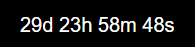
![Widget Reverse Countdown](admin/mytime-plainreverse-countdown.png)

A widget that shows the elapsed time from a given point in time

##### Widget Properties of Reverse Countdown plain

| Datapoint      | Description                                                                                                                                                                                                                                                                              |
| -------------- | ---------------------------------------------------------------------------------------------------------------------------------------------------------------------------------------------------------------------------------------------------------------------------------------- |
| `ISO datetime` | A DateTime-String of the start time. The expression must be interpretable by the javascript function new Date(expression). See also <https://developer.mozilla.org/en-US/docs/Web/JavaScript/Reference/Global_Objects/Date/parse> Example: 2022-01-10 23:12 or 2022-01-104T23:12:00.000Z |
| `Format`       | Formats the timer output. default is mm:ss. Please see chapter [Datetime Format](#format-of-the-datetime-to-format-the-output-in-the-widget) for details                                                                                                                                 |
| `HTML-Prepend` | This text or html is prepended to the output of the widget                                                                                                                                                                                                                               |
| `HTML-Append`  | This text or html is appended to the output of the widget                                                                                                                                                                                                                                |

#### Widget Countdown Circle

![Widget Countdown Circle](admin/mytime-circle-countdown.png)

A countdown widget in a ring/circle design.

##### Widget Properties of Countdown Circle

| Attribute                | Description                                                                                                                                                                                                 |
| ------------------------ | ----------------------------------------------------------------------------------------------------------------------------------------------------------------------------------------------------------- |
| `Object ID`              | The timer datapoint of a countdown datapoint.                                                                                                                                                               |
| `notimetext`             | Disables the time text over the polar clock                                                                                                                                                                 |
| `Format`                 | Formats the timer output. default is mm:ss. for details see Chapter [Datetime Format](#format-of-the-datetime-to-format-the-output-in-the-widget). ReversevSetting for growing or shrinking the ring/circle |
| `reverse`                | The width of the ring or circle.                                                                                                                                                                            |
| `partring`               | The largest selected ring is displayed proportionally and not in full.                                                                                                                                      |
| `Width`                  | The width of the ring or circle.                                                                                                                                                                            |
| `Ring gap`               | Gap in pixel between the rings                                                                                                                                                                              |
| `Ring Caps`              | Setting for the ends of the ring/circle: round or straight                                                                                                                                                  |
| `background`             | Backgroundcolor of the ring/circle                                                                                                                                                                          |
| `foreground`             | Foregroundcolor of the ring/circle                                                                                                                                                                          |
| `countdown_color_second` | Foregroundcolor of the second ring/circle                                                                                                                                                                   |
| `countdown_color_hour`   | Foregroundcolor of the hour ring/circle                                                                                                                                                                     |
| `countdown_color_day`    | Foregroundcolor of the day ring/circle                                                                                                                                                                      |
| `countdown_color_week`   | Foregroundcolor of the week ring/circle                                                                                                                                                                     |
| `countdown_color_month`  | Foregroundcolor of the month ring/circle                                                                                                                                                                    |
| `countdown_color_year`   | Foregroundcolor of the second ring/circle                                                                                                                                                                   |
| `showsec`                | Show the ring of seconds                                                                                                                                                                                    |
| `showmin`                | Show the ring of minutes                                                                                                                                                                                    |
| `showhrs`                | Show the ring of minutes                                                                                                                                                                                    |
| `showday`                | Show the ring of days                                                                                                                                                                                       |
| `showmonth`              | Show the ring of months (not together with the weeks)                                                                                                                                                       |
| `showweek`               | Show the ring of weeks (not together with the months)                                                                                                                                                       |
| `showyear`               | Show the ring of years                                                                                                                                                                                      |

When multiple parts are selected, there must be no gaps between them.

Example:

Valid: year, month, day | hour, minute, second
Irvalid: year, minute, second

**The actual action state (cdstop,cdrun,cdpause,cdend)
of the countdown is available as CSS-Class selector:**

```css
#w00000 .timer.cdend {
    color: red;
}
#w00000 .timer.cdrun {
    color: green;
}
```

#### Widget Countdown FlipClock

![Widget Countdown FlipClock](admin/mytime-flip-countdown.png)

A countdown widget in a airport flip board style.
Only 100 day - 1 second is supported.
Individual conversion to selected units is not performed here.

##### Widget Properties of Countdown FlipClock

| Attribute             | Description                                   |
| --------------------- | --------------------------------------------- |
| `Object ID`           | The timer datapoint of a countdown datapoint. |
| `showsec`             | Shows the seconds-part.                       |
| `showmin`             | Shows the minute-part.                        |
| `showhrs`             | Shows the hours-part.                         |
| `showday`             | Shows the day-part.                           |
| `color`               | Color of the countdowntimer                   |
| `background_color`    | Backgroundcolor of the countdowntimer         |
| `countdown_dot_color` | Color of the dots of the countdowntimer       |

When multiple parts are selected, there must be no gaps between them.

Example:

Valid: year, month, day | hour, minute, second
Irvalid: year, minute, second

The display size can be controlled via the CSS `font-size` setting.

**The actual action state (cdstop,cdrun,cdpause,cdend)
of the countdown is available as CSS-Class selector:**

```css
#w00000 .timer.cdend {
    color: red;
}
#w00000 .timer.cdrun {
    color: green;
}
```

#### Widget Countdown NixieClock

![Widget Countdown NixieClock](admin/mytime-nixie-countdown.png)

A countdown widget in a Nixie-Tube/LED style

##### Widget Properties of Countdown NixieClock

| Attribute                  | Description                                          |
| -------------------------- | ---------------------------------------------------- |
| Object ID                  | The timer datapoint of a countdown datapoint.        |
| countdown_showsec          | Shows the seconds-part.                              |
| countdown_showmin          | Shows the minute-part.                               |
| countdown_showhrs          | Shows the hours-part.                                |
| countdown_showday          | Shows the day-part.                                  |
| countdown_showmonth        | Shows the monthy-part. (not together with the weeks) |
| countdown_showweek         | Shows the week-part. (not together with the months)  |
| countdown_showyear         | Shows the year-part.                                 |
| countdown_color_active     | Color of the countdowntimer                          |
| countdown_color_inactive   | Color of the inactiv digits                          |
| countdown_opacity_inactive | Opacity of the color of the inactive digits          |
| countdown_glowcolor        | Color of the glow around thie Nixie-digits           |

When multiple parts are selected, there must be no gaps between them.

Example:

Valid: year, month, day | hour, minute, second
Irvalid: year, minute, second

##### Tips

###### Top/Bottom Margins

The used Lato font is slightly slanted downwards, creating uneven top and
bottom margins. This can be adjusted using the height and a negative top margin.
The widget uses a height of 1em. The height can be set directly in the widget properties.

A CSS class must be created for the negative margin.

```css
#w00000 .cdclock {
    margin-top: -5px;
}
```

###### Widget size

The display size can be controlled via the CSS `font-size` setting.

###### Centering the Nixie Clock

To center the clock, an additional CSS class is required, as the
corresponding settings cannot be configured in the widget settings:

```css
#w00000 {
    display: flex;
    justify-content: center;
}
```

#### Widget Clock plain

![Widget Clock plain](admin/mytime-plain-clock.png)

A configurable widget for displaying the current date and time as plain text.
The time can be taken either from the browser client or from
the synchronized ioBroker server time.

##### Widget Properties of Clock plain

| Attribute            | Description                                                                                  |
| -------------------- | -------------------------------------------------------------------------------------------- |
| `clock_time_source`  | Selects `client` for the browser time or `server` for the synchronized ioBroker server time. |
| `clock_format`       | Defines the date and time format. The default is `DD.MM.YYYY HH:mm:ss`.                      |
| `clock_html_prepend` | Text or HTML inserted before the formatted date and time.                                    |
| `clock_html_append`  | Text or HTML appended after the formatted date and time.                                     |

The following placeholders can be used in `clock_format`:

| Placeholder | Description                         |
| ----------- | ----------------------------------- |
| `YYYY`      | Four-digit year                     |
| `YY`        | Two-digit year                      |
| `MM` / `M`  | Month with / without leading zero   |
| `DD` / `D`  | Day with / without leading zero     |
| `HH` / `H`  | Hours with / without leading zero   |
| `mm` / `m`  | Minutes with / without leading zero |
| `ss` / `s`  | Seconds with / without leading zero |

The display size can be controlled via the CSS `font-size` setting.

#### Widget Clock FlipClock

![Widget Clock FlipClock](admin/mytime-flip-clock.png)

A configurable date and time widget in an airport flip board style.
Each date and time component can be shown or hidden individually.

##### Widget Properties of Clock FlipClock

| Attribute                | Description                                                                                  |
| ------------------------ | -------------------------------------------------------------------------------------------- |
| `clock_time_source`      | Selects `client` for the browser time or `server` for the synchronized ioBroker server time. |
| `clock_date_order`       | Selects `DMY`, `MDY`, or `YMD` as the order of the date components.                          |
| `clock_showyear`         | Shows the two-digit year component.                                                          |
| `clock_showmonth`        | Shows the month component.                                                                   |
| `clock_showday`          | Shows the day component.                                                                     |
| `clock_showhours`        | Shows the hours component.                                                                   |
| `clock_showminutes`      | Shows the minutes component.                                                                 |
| `clock_showseconds`      | Shows the seconds component.                                                                 |
| `clock_color`            | Sets the color of the digits.                                                                |
| `clock_background_color` | Sets the background color of the flip cards.                                                 |
| `clock_dot_color`        | Sets the color of the separators between the components.                                     |

The time components are always displayed after the selected date components
in the order hours, minutes, seconds.
The display size can be controlled via the CSS `font-size` setting.

#### Widget Clock NixieClock

![Widget Clock NixieClock](admin/mytime-nixie-clock.png)

A configurable date and time widget in a Nixie-Tube/LED style.
Each date and time component can be shown or hidden individually.

##### Widget Properties of Clock NixieClock

| Attribute                | Description                                                                                  |
| ------------------------ | -------------------------------------------------------------------------------------------- |
| `clock_time_source`      | Selects `client` for the browser time or `server` for the synchronized ioBroker server time. |
| `clock_date_order`       | Selects `DMY`, `MDY`, or `YMD` as the order of the date components.                          |
| `clock_showyear`         | Shows the two-digit year component.                                                          |
| `clock_showmonth`        | Shows the month component.                                                                   |
| `clock_showday`          | Shows the day component.                                                                     |
| `clock_showhours`        | Shows the hours component.                                                                   |
| `clock_showminutes`      | Shows the minutes component.                                                                 |
| `clock_showseconds`      | Shows the seconds component.                                                                 |
| `clock_color_active`     | Sets the color of the active Nixie digits.                                                   |
| `clock_color_inactive`   | Sets the color of the inactive Nixie digits.                                                 |
| `clock_opacity_inactive` | Sets the opacity of the inactive digits.                                                     |
| `clock_glowcolor`        | Sets the color of the glow around the active digits.                                         |

The time components are always displayed after the selected date components
in the order hours, minutes, seconds.
The display size can be controlled via the CSS `font-size` setting.

#### Widget Wordclock

![Widget Wordclock](admin/mytime-wordclock.png)

A widget to show a wordclock with many options

##### Widget Properties of Wordclock

| Datapoint           | Description                                              |
| ------------------- | -------------------------------------------------------- |
| `language`          | Some different languages for the wordclock are available |
| `letterActivated`   | Color for the highlighted words                          |
| `letterDeactivated` | Color for the normal letters                             |
| `wordclockMargin`   | Margin between the wordclock and the LEDs                |
| `withMinutes`       | Show the Minute-LEDs in the Corner of the wordclock      |
| `minuteSize`        | Size in Pixels of the Minute LEDs                        |
| `minuteColor`       | color of the Minute LED                                  |
| `withSeconds`       | Show the Seconds-LEDs of the wordclock                   |
| `secondSize`        | Size in Pixels of the Seconds LEDs                       |
| `secondColor`       | color of the Seconds LED                                 |
| `timezone`          | The time of the selected timezone is displayed           |

**The actual action state (cdstop,cdrun,cdpause,cdend)
of the countdown is available as CSS-Class selector:**

```css
#w00000 .timer.cdend {
    color: red;
}
#w00000 .timer.cdrun {
    color: green;
}
```

## Todo

- 7segment display
- rolling numbers
- customizable fonts
- ts: timerules for exclusion (time range, single dates)
- ~~add timezone for wordclock~~
- ~~wordclock timer~~
- ~~timed scheduler: plan single date/time and recurring events like outlook~~
- ~~Nixie style~~
- ~~flip board display (airport-display)~~
- ~~new command to set only target time without date~~
- ~~countdown circle widget with option to disable countdown text
- ~~Groupseperator '.' in Name~~
- ~~Polar clock~~
- ~~circle reverse~~
- ~~circle with round caps~~

## Changelog

<!--
  Placeholder for the next version (at the beginning of the line):
  ### **WORK IN PROGRESS**
-->
### 3.0.1 (2026-08-10)

- improve and fix jsonConfig
- switch from build to dist directory
- extend log output for onMessage error
- improve getServerTime timer in widget
- rename subsubdirectory widgets to widgetTypes
- improve race condition with states

### 3.0.0 (2026-08-09)

- update to react 19
- fix repochecker

### 2.5.1 (2026-07-24)

- seperate flipclock css classes from timeandweather adapter

### 2.5.0 (2026-07-21)

- Flip clock size is now adjustable via font-size.
- Defined better initial sizes and defaults for various widgets.

### 2.4.1 (2026-07-20)

- add new clock widgets
- fix prod and dev build
- reengineered widgets

[Older changelogs can be found there](CHANGELOG_OLD.md)

## License

MIT License

Copyright (c) 2020-2026 oweitman <oweitman@gmx.de>

Permission is hereby granted, free of charge, to any person obtaining a copy
of this software and associated documentation files (the "Software"), to deal
in the Software without restriction, including without limitation the rights
to use, copy, modify, merge, publish, distribute, sublicense, and/or sell
copies of the Software, and to permit persons to whom the Software is
furnished to do so, subject to the following conditions:

The above copyright notice and this permission notice shall be included in all
copies or substantial portions of the Software.

THE SOFTWARE IS PROVIDED "AS IS", WITHOUT WARRANTY OF ANY KIND, EXPRESS OR
IMPLIED, INCLUDING BUT NOT LIMITED TO THE WARRANTIES OF MERCHANTABILITY,
FITNESS FOR A PARTICULAR PURPOSE AND NONINFRINGEMENT. IN NO EVENT SHALL THE
AUTHORS OR COPYRIGHT HOLDERS BE LIABLE FOR ANY CLAIM, DAMAGES OR OTHER
LIABILITY, WHETHER IN AN ACTION OF CONTRACT, TORT OR OTHERWISE, ARISING FROM,
OUT OF OR IN CONNECTION WITH THE SOFTWARE OR THE USE OR OTHER DEALINGS IN THE
SOFTWARE.
