heart-switch-react-native
A heart-shaped toggle switch component for React Native. Inspired by heart-switch
## 🚀 Getting Started
### ⚡️ Quick Start
```shell
npm install heart-switch-react-native react-native-reanimated react-native-svg react-native-worklets
```
```jsx
import { useState } from 'react';
import { HeartSwitch } from 'heart-switch-react-native';
function Example() {
const [checked, setChecked] = useState(false);
return (
{
setChecked(event);
}}
/>
);
}
```
### 💻 Live Demo
https://snack.expo.dev/@rafalmeida73/heart-switch-react-native
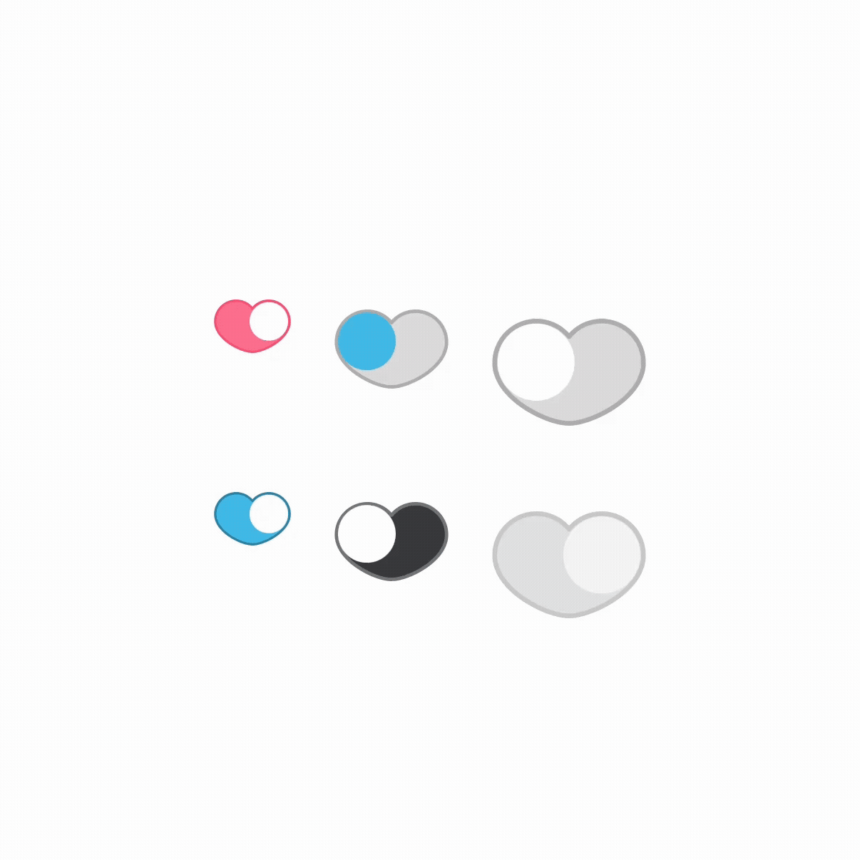
## ⚙️ Configuration
`HeartSwitch` supports the following props:
| Prop | Type | Default value | Description |
| ------------------- | --------------------- | ------------- | ----------------------------------------------------------------------------------------------------- |
| size | string | `md` | The size of the toggle switch. Available sizes: `sm`, `md`, `lg` |
| checked | boolean | `false` | Controls whether the switch is in the "on" (true) or "off" (false) state |
| onChange | function | - | Callback function called when the switch state changes. Receives the new boolean state as a parameter |
| duration | number | `300` | Duration of the animation in milliseconds when the switch toggles |
| disabled | boolean | `false` | When true, prevents user interaction and applies disabled styling |
| circleColor | string | `#f0f0f0` | Color of the circular toggle element that moves within the switch |
| fillColor | string | `#ff708f` | Background fill color of the heart when active (checked=true) |
| strokeColor | string | `#ff4e74` | Border/stroke color of the heart when active (checked=true) |
| inactiveFillColor | string | `#dcdada` | Background fill color of the heart when inactive (checked=false) |
| inactiveStrokeColor | string | `#b0adad` | Border/stroke color of the heart when inactive (checked=false) |
| disabledCircleColor | string | `#f4f4f4` | Color of the circle when the switch is disabled |
| disabledFillColor | string | `#e1e1e1` | Background fill color when disabled |
| disabledStrokeColor | string | `#c8c8c8` | Border/stroke color when disabled |
| initialAnimation | boolean | `false` | When true, enables animation on initial render or when checked prop changes programmatically |
| containerProps | ViewProps | - | Additional props to pass to the container View component |
| buttonProps | TouchableOpacityProps | - | Additional props to pass to the TouchableOpacity button component |
| circleProps | ViewProps | - | Additional props to pass to the circle View component |