HC Off-canvas Nav
===============
[](https://www.npmjs.com/package/hc-offcanvas-nav) [](https://www.npmjs.com/package/hc-offcanvas-nav)
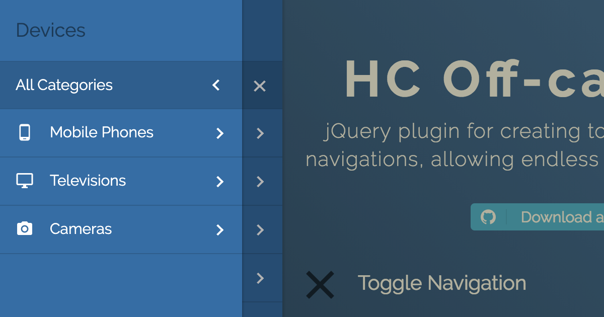
JavaScript library for creating off-canvas multi-level navigations, using ARIA. Dependency free, but also works as a jQuery plugin. [Demo](https://somewebmedia.github.io/hc-offcanvas-nav/)
### Features
- Multi-level menu support
- Endless nesting of navigation elements
- Custom content inside menu items
- Push/Slide DOM elements of choice
- Touch swipe guestures
- Different navigation positions
- No dependencies
- Flexible, simple markup
- A number of exposed [Options](#options), [Methods](#methods) and [Events](#events)
- 2 [Themes](#themes)
- Cross-browser compatibility
- Full ARIA keyboard support
- It relies on ARIA Design pattern for Dialogs
- The tab key loops through all of the keyboard focusable items within the offcanvas navigation
- You can close it using Esc
## Quick start
### Install
This package can be installed with:
- [npm](https://www.npmjs.com/package/hc-offcanvas-nav): `npm install --save hc-offcanvas-nav`
Or download the [latest release](https://github.com/somewebmedia/hc-offcanvas-nav/tags).
### Including HC Off-canvas Nav
#### Script and Css tag
```html
```
#### Webpack/Browserify
In the script, including HC Off-canvas Nav will usually look like this:
```js
const hcOffcanvasNav = require( 'hc-offcanvas-nav' );
```
#### Babel
```js
import hcOffcanvasNav from 'hc-offcanvas-nav';
```
#### AMD (Asynchronous Module Definition)
If using AMD, the module will be automatically defined as `hcOffcanvasNav`.
#### SCSS
```scss
@use 'hc-offcanvas-nav/src/scss/core';
@use 'hc-offcanvas-nav/src/scss/toggle';
@use 'hc-offcanvas-nav/src/scss/theme-default' as theme-default;
@include theme-default.styles();
```
## Usage
Be sure to call the Nav once your menu element is available in the DOM.
#### Vanilla JS
```js
document.addEventListener( 'DOMContentLoaded', function () {
var Nav = new hcOffcanvasNav( '#main-nav', {
disableAt: 1024,
customToggle: '.toggle',
navTitle: 'All Categories',
levelTitles: true,
levelTitleAsBack: true,
} );
} );
```
#### jQuery
```js
jQuery( document ).ready( function ( $ ) {
$( '#main-nav' ).hcOffcanvasNav( {
disableAt: 1024,
customToggle: $( '.toggle' ),
navTitle: 'All Categories',
levelTitles: true,
levelTitleAsBack: true,
} );
} );
```
For HC Off-canvas Nav to work as a jQuery plugin, jQuery has to be a property of global `window` object, so be careful when using it in combination with Babel/Webpack/Browserify and jQuery.
#### Example HTML menu structure
```html
```
## Themes
HC Off-canvas Nav currently has 2 themes, the default and Carbon. To use Carbon theme simply call the Carbon theme css instead of the default one:
```html
```
Or if compiling the SCSS from the `src` dir, `@include` it from there:
```scss
@use 'hc-offcanvas-nav/src/scss/core';
@use 'hc-offcanvas-nav/src/scss/toggle';
@use 'hc-offcanvas-nav/src/scss/theme-carbon' as theme-carbon;
@include theme-carbon.styles();
```
## Options
| Property | Default | Type | Description |
|----------|---------|------|-------------|
| **width** | `280` | int / str | Width of the nav. Used for `left` and `right` positions. |
| **height** | `'auto'` | int / str | Height of the nav. Used for `top` and `bottom` positions. |
| **disableAt** | `false` | int / bool | Resolution above which to hide the offcanvas menu, and show the original. |
| **pushContent** | `null` | str / Element obj | Content element (string selector or HTML Element object) that will be pushed when the navigation is open. |
| **expanded** | `false`| bool | Initialize menu in expanded mode. It won't push content. |
| **position** | `'left'` | str | Position on which the menu will open. Available options: `'left'`, `'right'`, `'top'` and `'bottom'`. |
| **swipeGestures** | `true`| bool | Enable open/close swipe gestures like in native apps. Works only for `left` and `right` positions. |
| **levelOpen** | `'overlap'` | str | Submenu levels open effect. Available options: `'overlap'`, `'expand'`, `'none'` or `false`. |
| **levelSpacing** | `40` | int | If levels are overlaped, this is the spacing between them, if they are expanding or always open, this is the text indent of the submenus. |
| **levelTitles** | `true` | bool | Show titles for submenus, which is the parent item name. Works only for overlaped levels. |
| **navTitle** | `null` | str / Element obj | Main navigation (first level) title. Can also be HTML object like an image (logo). |
| **navClass** | `''` | str | Custom navigation class. |
| **disableBody** | `true` | bool | Disable body scroll when navigation is open. |
| **closeOpenLevels** | `true` | bool | Should all open sub levels be closed when the nav closes. |
| **closeActiveLevel** | `false` | bool | Should initially active sub level (see [`data-nav-active`](#data-attributes)) be cleared when the nav closes. |
| **closeOnClick** | `true` | bool | Close the navigation when links are clicked. |
| **closeOnEsc** | `true` | bool | Close the navigation on Esc button. |
| **customToggle** | `null` | str / Element obj | Custom navigation toggle element. |
| **activeToggleClass** | `null` | str | Custom active toggle class. |
| **insertClose** | `true` | bool / int | Insert navigation close button. You can also use an integer representing 0-based index that will be the position of the button in the list. Negative numbers are also supported. |
| **insertBack** | `true` | bool / int | Insert back buttons to submenus. You can also use an integer representing 0-based index that will be the position of the button in the list. Negative numbers are also supported. Works only for overlaped levels. |
| **labelClose** | `''` | str | Label for the close button. |
| **labelBack** | `'Back'` | str | Label for the back buttons. |
| **levelTitleAsBack** | `true` | bool | Use level titles as back labels. |
| **rtl** | `false` | bool | Set the content direction to right-to-left. |
| **bodyInsert** | `'prepend'` | str | Choose to prepend or append navigation to body. |
| **keepClasses** | `true` | bool | Should original menus and their items classes be preserved or excluded. |
| **removeOriginalNav** | `false` | bool | Remove original menu from the DOM. Don't use this if planning to update the nav! |
| **ariaLabels** | `{...}` | obj | Labels for the ARIA attributes. If using HC Off-canvas Nav in different language than English, you should translate all the properties. See the next section. |
ARIA labels for the `aria-label` attributes on specific elements which will provide a text alternative to the elements that have no visible text on the screen.
```js
ariaLabels: {
open: 'Open Menu',
close: 'Close Menu',
submenu: 'Submenu'
}
```
## Methods
The HC Off-canvas Nav API offers a couple of methods to control the offcanvas and are publicly available to all active instances.
#### Vanilla JS
```js
var Nav = new hcOffcanvasNav();
```
#### jQuery
```js
var $nav = $( '#main-nav' ).hcOffcanvasNav();
var Nav = $nav.data( 'hcOffcanvasNav' );
```
### .getSettings()
Returns current settings.
```js
var currentSettings = Nav.getSettings();
```
### .isOpen()
Checks if the nav is open, and returns boolean.
```js
if ( Nav.isOpen() ) {
// do something
}
```
### .update(options, updateDOM)
Updates just the specified settings with the new ones.
```js
Nav.update( {
disableAt: 1024,
navTitle: 'All pages',
} );
```
Updates nav DOM. You don't have to pass empty settings object, the method is smart. Use this when original nav has been altered.
```js
Nav.update( true );
```
Updates both settings and nav DOM. Use this when original nav was changed and you also want to update some specific settings.
```js
Nav.update(
{
disableAt: 1024,
navTitle: 'All pages',
},
true
);
```
### .open( level, index )
Opens the nav if closed.
```js
Nav.open();
```
Open the nav and also a specific sub menu. Each level sub menu has its own index that is relative to that level, not the parent menu.
```js
Nav.open( 2, 1 );
```
Above code will open the nested menu in the example structure bellow:
```html
```
### .close()
Closes the nav if open.
```js
Nav.close();
```
### .toggle()
Toggles (open/close) the nav.
```js
Nav.toggle();
```
### .on( eventName, cb )
Attach [Event](#events) listener to the nav.
```js
Nav.on( 'close', function () {
// do something on close
} );
```
### .off( eventName, cb )
Remove [Event](#events) listener from the nav.
```js
// remove specific function
Nav.off( 'close', onCloseFunction);
// remove all event listeners
Nav.off( 'close' );
```
## Events
| Event | Description |
| --------------- | ------------------------------------------------------------------------------ |
| **open** | Triggers each time after nav is opened. |
| **open.level** | Triggers each time after any level is opened. |
| **close** | Triggers each time after nav is closed. |
| **close.once** | Triggers only the first time after nav is closed, and than it detaches itself. |
| **close.level** | Triggers each time after any level is closed. |
| **toggle** | Triggers each time nav is triggered to be opened or closed. |
All events return Event object as first argument, and the plugin Settings object as second argument.
- `open.level` and `close.level` return the newly opened level and index under the `Event.data` property.
- `toggle` event returns the action under the `Event.data` property.
Open and close events are triggered after the nav animation is over, whie toggle event gets triggered imediatelly.
Examples:
```js
// change nav open position after each close
Nav.on( 'close', function ( e, settings ) {
Nav.update( {
position: settings.position === 'left' ? 'right' : 'left',
} );
} );
// will change nav open position only once
Nav.on( 'close.once', function ( e, settings ) {
Nav.update( {
position: settings.position === 'left' ? 'right' : 'left',
} );
} );
Nav.on( 'open.level', ( e, settings ) => {
localStorage.setItem( 'NavLevel', e.data.currentLevel );
localStorage.setItem( 'NavIndex', e.data.currentIndex );
} );
Nav.on( 'close.level', ( e, settings ) => {
localStorage.setItem( 'NavLevel', e.data.currentLevel );
localStorage.setItem( 'NavIndex', e.data.currentIndex );
} );
Nav.on( 'toggle', ( e, settings ) => {
if ( e.data.action == 'open' ) {
// do something when `open` action is triggered
}
} );
```
## Data Attributes
| Attr | Accepts | HTML Element | Description |
|------|---------|--------------|-------------|
| **data-nav-active** | | `
`, `
` | The next time nav opens it will open specified sub menu (or sub menu whose parent `
` element has the attribute). Works with [`expanded`](#options) option. |
| **data-nav-highlight** | | `
 ### Features
- Multi-level menu support
- Endless nesting of navigation elements
- Custom content inside menu items
- Push/Slide DOM elements of choice
- Touch swipe guestures
- Different navigation positions
- No dependencies
- Flexible, simple markup
- A number of exposed [Options](#options), [Methods](#methods) and [Events](#events)
- 2 [Themes](#themes)
- Cross-browser compatibility
- Full ARIA keyboard support
- It relies on ARIA Design pattern for Dialogs
- The tab key loops through all of the keyboard focusable items within the offcanvas navigation
- You can close it using Esc
## Quick start
### Install
This package can be installed with:
- [npm](https://www.npmjs.com/package/hc-offcanvas-nav): `npm install --save hc-offcanvas-nav`
Or download the [latest release](https://github.com/somewebmedia/hc-offcanvas-nav/tags).
### Including HC Off-canvas Nav
#### Script and Css tag
```html
```
#### Webpack/Browserify
In the script, including HC Off-canvas Nav will usually look like this:
```js
const hcOffcanvasNav = require( 'hc-offcanvas-nav' );
```
#### Babel
```js
import hcOffcanvasNav from 'hc-offcanvas-nav';
```
#### AMD (Asynchronous Module Definition)
If using AMD, the module will be automatically defined as `hcOffcanvasNav`.
#### SCSS
```scss
@use 'hc-offcanvas-nav/src/scss/core';
@use 'hc-offcanvas-nav/src/scss/toggle';
@use 'hc-offcanvas-nav/src/scss/theme-default' as theme-default;
@include theme-default.styles();
```
## Usage
Be sure to call the Nav once your menu element is available in the DOM.
#### Vanilla JS
```js
document.addEventListener( 'DOMContentLoaded', function () {
var Nav = new hcOffcanvasNav( '#main-nav', {
disableAt: 1024,
customToggle: '.toggle',
navTitle: 'All Categories',
levelTitles: true,
levelTitleAsBack: true,
} );
} );
```
#### jQuery
```js
jQuery( document ).ready( function ( $ ) {
$( '#main-nav' ).hcOffcanvasNav( {
disableAt: 1024,
customToggle: $( '.toggle' ),
navTitle: 'All Categories',
levelTitles: true,
levelTitleAsBack: true,
} );
} );
```
For HC Off-canvas Nav to work as a jQuery plugin, jQuery has to be a property of global `window` object, so be careful when using it in combination with Babel/Webpack/Browserify and jQuery.
#### Example HTML menu structure
```html
```
## Themes
HC Off-canvas Nav currently has 2 themes, the default and Carbon. To use Carbon theme simply call the Carbon theme css instead of the default one:
```html
```
Or if compiling the SCSS from the `src` dir, `@include` it from there:
```scss
@use 'hc-offcanvas-nav/src/scss/core';
@use 'hc-offcanvas-nav/src/scss/toggle';
@use 'hc-offcanvas-nav/src/scss/theme-carbon' as theme-carbon;
@include theme-carbon.styles();
```
## Options
| Property | Default | Type | Description |
|----------|---------|------|-------------|
| **width** | `280` | int / str | Width of the nav. Used for `left` and `right` positions. |
| **height** | `'auto'` | int / str | Height of the nav. Used for `top` and `bottom` positions. |
| **disableAt** | `false` | int / bool | Resolution above which to hide the offcanvas menu, and show the original. |
| **pushContent** | `null` | str / Element obj | Content element (string selector or HTML Element object) that will be pushed when the navigation is open. |
| **expanded** | `false`| bool | Initialize menu in expanded mode. It won't push content. |
| **position** | `'left'` | str | Position on which the menu will open. Available options: `'left'`, `'right'`, `'top'` and `'bottom'`. |
| **swipeGestures** | `true`| bool | Enable open/close swipe gestures like in native apps. Works only for `left` and `right` positions. |
| **levelOpen** | `'overlap'` | str | Submenu levels open effect. Available options: `'overlap'`, `'expand'`, `'none'` or `false`. |
| **levelSpacing** | `40` | int | If levels are overlaped, this is the spacing between them, if they are expanding or always open, this is the text indent of the submenus. |
| **levelTitles** | `true` | bool | Show titles for submenus, which is the parent item name. Works only for overlaped levels. |
| **navTitle** | `null` | str / Element obj | Main navigation (first level) title. Can also be HTML object like an image (logo). |
| **navClass** | `''` | str | Custom navigation class. |
| **disableBody** | `true` | bool | Disable body scroll when navigation is open. |
| **closeOpenLevels** | `true` | bool | Should all open sub levels be closed when the nav closes. |
| **closeActiveLevel** | `false` | bool | Should initially active sub level (see [`data-nav-active`](#data-attributes)) be cleared when the nav closes. |
| **closeOnClick** | `true` | bool | Close the navigation when links are clicked. |
| **closeOnEsc** | `true` | bool | Close the navigation on Esc button. |
| **customToggle** | `null` | str / Element obj | Custom navigation toggle element. |
| **activeToggleClass** | `null` | str | Custom active toggle class. |
| **insertClose** | `true` | bool / int | Insert navigation close button. You can also use an integer representing 0-based index that will be the position of the button in the list. Negative numbers are also supported. |
| **insertBack** | `true` | bool / int | Insert back buttons to submenus. You can also use an integer representing 0-based index that will be the position of the button in the list. Negative numbers are also supported. Works only for overlaped levels. |
| **labelClose** | `''` | str | Label for the close button. |
| **labelBack** | `'Back'` | str | Label for the back buttons. |
| **levelTitleAsBack** | `true` | bool | Use level titles as back labels. |
| **rtl** | `false` | bool | Set the content direction to right-to-left. |
| **bodyInsert** | `'prepend'` | str | Choose to prepend or append navigation to body. |
| **keepClasses** | `true` | bool | Should original menus and their items classes be preserved or excluded. |
| **removeOriginalNav** | `false` | bool | Remove original menu from the DOM. Don't use this if planning to update the nav! |
| **ariaLabels** | `{...}` | obj | Labels for the ARIA attributes. If using HC Off-canvas Nav in different language than English, you should translate all the properties. See the next section. |
ARIA labels for the `aria-label` attributes on specific elements which will provide a text alternative to the elements that have no visible text on the screen.
```js
ariaLabels: {
open: 'Open Menu',
close: 'Close Menu',
submenu: 'Submenu'
}
```
## Methods
The HC Off-canvas Nav API offers a couple of methods to control the offcanvas and are publicly available to all active instances.
#### Vanilla JS
```js
var Nav = new hcOffcanvasNav();
```
#### jQuery
```js
var $nav = $( '#main-nav' ).hcOffcanvasNav();
var Nav = $nav.data( 'hcOffcanvasNav' );
```
### .getSettings()
Returns current settings.
```js
var currentSettings = Nav.getSettings();
```
### .isOpen()
Checks if the nav is open, and returns boolean.
```js
if ( Nav.isOpen() ) {
// do something
}
```
### .update(options, updateDOM)
Updates just the specified settings with the new ones.
```js
Nav.update( {
disableAt: 1024,
navTitle: 'All pages',
} );
```
Updates nav DOM. You don't have to pass empty settings object, the method is smart. Use this when original nav has been altered.
```js
Nav.update( true );
```
Updates both settings and nav DOM. Use this when original nav was changed and you also want to update some specific settings.
```js
Nav.update(
{
disableAt: 1024,
navTitle: 'All pages',
},
true
);
```
### .open( level, index )
Opens the nav if closed.
```js
Nav.open();
```
Open the nav and also a specific sub menu. Each level sub menu has its own index that is relative to that level, not the parent menu.
```js
Nav.open( 2, 1 );
```
Above code will open the nested menu in the example structure bellow:
```html
```
### .close()
Closes the nav if open.
```js
Nav.close();
```
### .toggle()
Toggles (open/close) the nav.
```js
Nav.toggle();
```
### .on( eventName, cb )
Attach [Event](#events) listener to the nav.
```js
Nav.on( 'close', function () {
// do something on close
} );
```
### .off( eventName, cb )
Remove [Event](#events) listener from the nav.
```js
// remove specific function
Nav.off( 'close', onCloseFunction);
// remove all event listeners
Nav.off( 'close' );
```
## Events
| Event | Description |
| --------------- | ------------------------------------------------------------------------------ |
| **open** | Triggers each time after nav is opened. |
| **open.level** | Triggers each time after any level is opened. |
| **close** | Triggers each time after nav is closed. |
| **close.once** | Triggers only the first time after nav is closed, and than it detaches itself. |
| **close.level** | Triggers each time after any level is closed. |
| **toggle** | Triggers each time nav is triggered to be opened or closed. |
All events return Event object as first argument, and the plugin Settings object as second argument.
- `open.level` and `close.level` return the newly opened level and index under the `Event.data` property.
- `toggle` event returns the action under the `Event.data` property.
Open and close events are triggered after the nav animation is over, whie toggle event gets triggered imediatelly.
Examples:
```js
// change nav open position after each close
Nav.on( 'close', function ( e, settings ) {
Nav.update( {
position: settings.position === 'left' ? 'right' : 'left',
} );
} );
// will change nav open position only once
Nav.on( 'close.once', function ( e, settings ) {
Nav.update( {
position: settings.position === 'left' ? 'right' : 'left',
} );
} );
Nav.on( 'open.level', ( e, settings ) => {
localStorage.setItem( 'NavLevel', e.data.currentLevel );
localStorage.setItem( 'NavIndex', e.data.currentIndex );
} );
Nav.on( 'close.level', ( e, settings ) => {
localStorage.setItem( 'NavLevel', e.data.currentLevel );
localStorage.setItem( 'NavIndex', e.data.currentIndex );
} );
Nav.on( 'toggle', ( e, settings ) => {
if ( e.data.action == 'open' ) {
// do something when `open` action is triggered
}
} );
```
## Data Attributes
| Attr | Accepts | HTML Element | Description |
|------|---------|--------------|-------------|
| **data-nav-active** | | `
### Features
- Multi-level menu support
- Endless nesting of navigation elements
- Custom content inside menu items
- Push/Slide DOM elements of choice
- Touch swipe guestures
- Different navigation positions
- No dependencies
- Flexible, simple markup
- A number of exposed [Options](#options), [Methods](#methods) and [Events](#events)
- 2 [Themes](#themes)
- Cross-browser compatibility
- Full ARIA keyboard support
- It relies on ARIA Design pattern for Dialogs
- The tab key loops through all of the keyboard focusable items within the offcanvas navigation
- You can close it using Esc
## Quick start
### Install
This package can be installed with:
- [npm](https://www.npmjs.com/package/hc-offcanvas-nav): `npm install --save hc-offcanvas-nav`
Or download the [latest release](https://github.com/somewebmedia/hc-offcanvas-nav/tags).
### Including HC Off-canvas Nav
#### Script and Css tag
```html
```
#### Webpack/Browserify
In the script, including HC Off-canvas Nav will usually look like this:
```js
const hcOffcanvasNav = require( 'hc-offcanvas-nav' );
```
#### Babel
```js
import hcOffcanvasNav from 'hc-offcanvas-nav';
```
#### AMD (Asynchronous Module Definition)
If using AMD, the module will be automatically defined as `hcOffcanvasNav`.
#### SCSS
```scss
@use 'hc-offcanvas-nav/src/scss/core';
@use 'hc-offcanvas-nav/src/scss/toggle';
@use 'hc-offcanvas-nav/src/scss/theme-default' as theme-default;
@include theme-default.styles();
```
## Usage
Be sure to call the Nav once your menu element is available in the DOM.
#### Vanilla JS
```js
document.addEventListener( 'DOMContentLoaded', function () {
var Nav = new hcOffcanvasNav( '#main-nav', {
disableAt: 1024,
customToggle: '.toggle',
navTitle: 'All Categories',
levelTitles: true,
levelTitleAsBack: true,
} );
} );
```
#### jQuery
```js
jQuery( document ).ready( function ( $ ) {
$( '#main-nav' ).hcOffcanvasNav( {
disableAt: 1024,
customToggle: $( '.toggle' ),
navTitle: 'All Categories',
levelTitles: true,
levelTitleAsBack: true,
} );
} );
```
For HC Off-canvas Nav to work as a jQuery plugin, jQuery has to be a property of global `window` object, so be careful when using it in combination with Babel/Webpack/Browserify and jQuery.
#### Example HTML menu structure
```html
```
## Themes
HC Off-canvas Nav currently has 2 themes, the default and Carbon. To use Carbon theme simply call the Carbon theme css instead of the default one:
```html
```
Or if compiling the SCSS from the `src` dir, `@include` it from there:
```scss
@use 'hc-offcanvas-nav/src/scss/core';
@use 'hc-offcanvas-nav/src/scss/toggle';
@use 'hc-offcanvas-nav/src/scss/theme-carbon' as theme-carbon;
@include theme-carbon.styles();
```
## Options
| Property | Default | Type | Description |
|----------|---------|------|-------------|
| **width** | `280` | int / str | Width of the nav. Used for `left` and `right` positions. |
| **height** | `'auto'` | int / str | Height of the nav. Used for `top` and `bottom` positions. |
| **disableAt** | `false` | int / bool | Resolution above which to hide the offcanvas menu, and show the original. |
| **pushContent** | `null` | str / Element obj | Content element (string selector or HTML Element object) that will be pushed when the navigation is open. |
| **expanded** | `false`| bool | Initialize menu in expanded mode. It won't push content. |
| **position** | `'left'` | str | Position on which the menu will open. Available options: `'left'`, `'right'`, `'top'` and `'bottom'`. |
| **swipeGestures** | `true`| bool | Enable open/close swipe gestures like in native apps. Works only for `left` and `right` positions. |
| **levelOpen** | `'overlap'` | str | Submenu levels open effect. Available options: `'overlap'`, `'expand'`, `'none'` or `false`. |
| **levelSpacing** | `40` | int | If levels are overlaped, this is the spacing between them, if they are expanding or always open, this is the text indent of the submenus. |
| **levelTitles** | `true` | bool | Show titles for submenus, which is the parent item name. Works only for overlaped levels. |
| **navTitle** | `null` | str / Element obj | Main navigation (first level) title. Can also be HTML object like an image (logo). |
| **navClass** | `''` | str | Custom navigation class. |
| **disableBody** | `true` | bool | Disable body scroll when navigation is open. |
| **closeOpenLevels** | `true` | bool | Should all open sub levels be closed when the nav closes. |
| **closeActiveLevel** | `false` | bool | Should initially active sub level (see [`data-nav-active`](#data-attributes)) be cleared when the nav closes. |
| **closeOnClick** | `true` | bool | Close the navigation when links are clicked. |
| **closeOnEsc** | `true` | bool | Close the navigation on Esc button. |
| **customToggle** | `null` | str / Element obj | Custom navigation toggle element. |
| **activeToggleClass** | `null` | str | Custom active toggle class. |
| **insertClose** | `true` | bool / int | Insert navigation close button. You can also use an integer representing 0-based index that will be the position of the button in the list. Negative numbers are also supported. |
| **insertBack** | `true` | bool / int | Insert back buttons to submenus. You can also use an integer representing 0-based index that will be the position of the button in the list. Negative numbers are also supported. Works only for overlaped levels. |
| **labelClose** | `''` | str | Label for the close button. |
| **labelBack** | `'Back'` | str | Label for the back buttons. |
| **levelTitleAsBack** | `true` | bool | Use level titles as back labels. |
| **rtl** | `false` | bool | Set the content direction to right-to-left. |
| **bodyInsert** | `'prepend'` | str | Choose to prepend or append navigation to body. |
| **keepClasses** | `true` | bool | Should original menus and their items classes be preserved or excluded. |
| **removeOriginalNav** | `false` | bool | Remove original menu from the DOM. Don't use this if planning to update the nav! |
| **ariaLabels** | `{...}` | obj | Labels for the ARIA attributes. If using HC Off-canvas Nav in different language than English, you should translate all the properties. See the next section. |
ARIA labels for the `aria-label` attributes on specific elements which will provide a text alternative to the elements that have no visible text on the screen.
```js
ariaLabels: {
open: 'Open Menu',
close: 'Close Menu',
submenu: 'Submenu'
}
```
## Methods
The HC Off-canvas Nav API offers a couple of methods to control the offcanvas and are publicly available to all active instances.
#### Vanilla JS
```js
var Nav = new hcOffcanvasNav();
```
#### jQuery
```js
var $nav = $( '#main-nav' ).hcOffcanvasNav();
var Nav = $nav.data( 'hcOffcanvasNav' );
```
### .getSettings()
Returns current settings.
```js
var currentSettings = Nav.getSettings();
```
### .isOpen()
Checks if the nav is open, and returns boolean.
```js
if ( Nav.isOpen() ) {
// do something
}
```
### .update(options, updateDOM)
Updates just the specified settings with the new ones.
```js
Nav.update( {
disableAt: 1024,
navTitle: 'All pages',
} );
```
Updates nav DOM. You don't have to pass empty settings object, the method is smart. Use this when original nav has been altered.
```js
Nav.update( true );
```
Updates both settings and nav DOM. Use this when original nav was changed and you also want to update some specific settings.
```js
Nav.update(
{
disableAt: 1024,
navTitle: 'All pages',
},
true
);
```
### .open( level, index )
Opens the nav if closed.
```js
Nav.open();
```
Open the nav and also a specific sub menu. Each level sub menu has its own index that is relative to that level, not the parent menu.
```js
Nav.open( 2, 1 );
```
Above code will open the nested menu in the example structure bellow:
```html
```
### .close()
Closes the nav if open.
```js
Nav.close();
```
### .toggle()
Toggles (open/close) the nav.
```js
Nav.toggle();
```
### .on( eventName, cb )
Attach [Event](#events) listener to the nav.
```js
Nav.on( 'close', function () {
// do something on close
} );
```
### .off( eventName, cb )
Remove [Event](#events) listener from the nav.
```js
// remove specific function
Nav.off( 'close', onCloseFunction);
// remove all event listeners
Nav.off( 'close' );
```
## Events
| Event | Description |
| --------------- | ------------------------------------------------------------------------------ |
| **open** | Triggers each time after nav is opened. |
| **open.level** | Triggers each time after any level is opened. |
| **close** | Triggers each time after nav is closed. |
| **close.once** | Triggers only the first time after nav is closed, and than it detaches itself. |
| **close.level** | Triggers each time after any level is closed. |
| **toggle** | Triggers each time nav is triggered to be opened or closed. |
All events return Event object as first argument, and the plugin Settings object as second argument.
- `open.level` and `close.level` return the newly opened level and index under the `Event.data` property.
- `toggle` event returns the action under the `Event.data` property.
Open and close events are triggered after the nav animation is over, whie toggle event gets triggered imediatelly.
Examples:
```js
// change nav open position after each close
Nav.on( 'close', function ( e, settings ) {
Nav.update( {
position: settings.position === 'left' ? 'right' : 'left',
} );
} );
// will change nav open position only once
Nav.on( 'close.once', function ( e, settings ) {
Nav.update( {
position: settings.position === 'left' ? 'right' : 'left',
} );
} );
Nav.on( 'open.level', ( e, settings ) => {
localStorage.setItem( 'NavLevel', e.data.currentLevel );
localStorage.setItem( 'NavIndex', e.data.currentIndex );
} );
Nav.on( 'close.level', ( e, settings ) => {
localStorage.setItem( 'NavLevel', e.data.currentLevel );
localStorage.setItem( 'NavIndex', e.data.currentIndex );
} );
Nav.on( 'toggle', ( e, settings ) => {
if ( e.data.action == 'open' ) {
// do something when `open` action is triggered
}
} );
```
## Data Attributes
| Attr | Accepts | HTML Element | Description |
|------|---------|--------------|-------------|
| **data-nav-active** | | `