---
name: Spacing principle
route: /principle-spacing/
---
import { Playground } from 'docz';
import { Vertical, Content } from '../..';
import * as demos from '../../demos';
# Space
The difference between pixel perfect and good enough, mostly boils down to perfect space management. Here we discuss the *spacing principle* developed in GLS.
## Spacing principle
* Fundamental rule: Don't camp on external space.
* Fundamental rule in CSS terms: Components should not have external margins.
### Issues with external margins
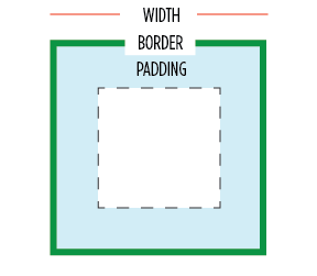
- Fundamentally external i.e. outside the width of the component in the recommended `border-box` box sizing (width of the component only includes the content,padding and border). When you add a margin to a component it ends up taking responsibility for screen area it does not control:
- Margins collapse. You set a value, but it renders as something else depending on the neighbours. E.g. the top margin on the bottom component in the example shown will disappear. This can be a maintainability nightmare.

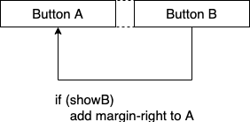
- Creates cross component dependencies. Suppose you want to conditionally render some buttons. If you are using component margins for spacing, then there is a conditional logic dependency leaking into your CSS. These dependencies quickly become unmanagable.
- Makes pixel-perfect placement impossible. Margins on components disable pixel-perfect placement as they push themselves away from borders.
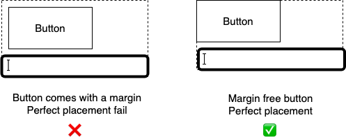
So the question: If the components are coming without margins, how are they being spaced from their neighbours e.g. how is the margin-free button and the input spaced?
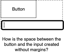
Lets discuss that next.
## How to do space correctly
Realize that a component's external space, is its parent's internal space. A parent is free to manage its internal space anyway it wants. So really space management between components, is the responsibility of the container (and we provide plenty of such containers).
### Space between children: the `spacing` prop
Remember good components don't come with bleedy margins. Since components don't use margins, our containers can easily create spacing between their children by adding margins with pure CSS (pseudocode: `CSS-selector(all children except first-child): CSS-property(margin)`).
Lets look at some examples of external-margin-free components and how they nicely compose. First a few simple margin-free components e.g. a basic react `label` and an `input` (not a part of this library, so you can use your own):
Name
Because they are both margin free, they can easily be reused in any given context. We can easily compose them to create a `Vertical(label+input)` set:
Name
In the above example, notice:
- the spacing is coming from the parent `Vertical spacing=5`. So our `input` and `label` don't have to fight each other to see whose margin wins.
- the vertical itself has no external margins. So the `Vertical(label+input)` set is once again resuseable.
We can easily compose multiple `Vertical(label+input)` into another `Vertical`, demonstrating creating a composite of composites e.g. 3 x `label+input`:
First name
Middle name
Last name
Notice that this composite of composites (`Vertical( 3 x Vertical(label+input) )`) is also external margin free, and we can continue down this path of reuse. We'll stop here, but feel free to play with the provided examples.
### Space at the border: the `padding` prop
We've talked about spacing children among each other, one final thing to talk about is how to seperate children from the parent border. The answer is to simply use padding:
Example margin free content
***Padding tip 1: Default padding on components***
> Component design tip: `padding` can be used in any component that has an explict visually designed border (e.g buttons).
You normally:
* don't put `padding` on any *layout* components that you want to *compose* into other layouts.
* put `padding` on *page level* layout components.
So a page level form layout would have padding, whereas a reusable form-component (or reusable form-component-set) would not. You can observe this pattern in the example below where the two `Vertical`s for the reuseable `First/Middle/Last` name component do not have a padding (enabling seemless reuse):
{/* Not meant to be nested further, hence padding */}
{ /* User A: Reusable child, no padding */ }
UserA first name
UserA middle name
UserA last name
{ /* User B: Reusing the same code as A, inline here, but you can componentify */ }
UserB first name
UserB middle name
UserB last name
***Padding tip 2: Prefer parent.padding at the edges over child.margin***
We've already talked about margins creating *cross component layout dependencies*. Here is a walkthrough example.
Consider a simple button on the screen:
Just a button minding its own business
Let's say the design wants you to add some space on top of the button. You can do that easily with `margin-top`:
Just a button minding its own business
Lets say there is another button that conditionally shows based on some business logic, now you would be forced to toggle off the excess margin from the second button (see the code in the below example):
I sometimes show up
{/** Because there is another button showing before this one, we've had to remove the margin top */}
Just a button minding its own business
This cross component layout dependency can be removed if the space around the border is managed by the parent (using padding):
I sometimes show up
Just a button minding its own business