Forma Video Player
===================

Complete video player solution for [react-native-video](https://github.com/react-native-community/react-native-video)  
Customizable  
Extensible

## Installation
Requires [react-native-video](https://github.com/react-native-community/react-native-video) ^2.0.0 to be installed
```
yarn add forma-video-player
```

#### exoplayer
We recommend using exoplayer with react-native-video. It is capable of playing streaming video and has overall better performance than the default player. [Follow these instructions](https://github.com/react-native-community/react-native-video/issues/668#issuecomment-312383674) for installation.
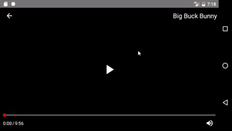

## Default Player
```
import {Player} from 'forma-video-player'

const videoProps = {
  name: 'Big Buck Bunny',
  source: {
    uri: 'https://archive.org/download/BigBuckBunny_328/BigBuckBunny_512kb.mp4'
  }
}

...

render() {
  return (
    <View style={{flex: 1}}>
      <Player videoProps={videoProps} />
    </View>
  )
}

```

![Default Player gif](https://raw.githubusercontent.com/forma-exacta/forma-video-player/master/docs/default_player.gif)

## Components
[Player](#player)

###### Layout Components
[Header](#header)  
[Body](#body)  
[Footer](#footer)  
[ControlGroup](#controlgroup)  

###### Controls
[Back](#back)  
[Mute](#mute)  
[Play](#play)  
[PlayerTime](#playertime)  
[ProgressBar](#progressbar)  
[Title](#title)  
Add your own [Custom Controls](#custom-controls)

## `Player`
```
import {Player} from 'forma-video-player'

<Player
  videoProps=Required object
  back=function
  styles=object
  theme=object
  layout=object
  integrateRedux=boolean
/>
```

#### Props

`videoProps` (**Required** object): These are the same props accepted by react-native-video's [Video](https://github.com/react-native-community/react-native-video#usage) component, with two exceptions:  

Prop | Type | Description | Default
--- | --- | --- | ---
name | string | If a [Title](#title) control is included in the layout, the name will be displayed there. | null
style | object | This property **will not** be passed to the Video component. The Video component fills its parent container by default. | n/a

The rest of the props are passed to the Video component normally. Some defaults differ from react-native-video.

> We recommend that you only use these properties to set initial values. Updating these properties will trigger a render of the entire Player tree. Instead, you should use a [Control Component](#control-components) or make your own [Custom Control](#custom-controls) to change the player state.

Prop | Type | Description | Default
--- | --- | --- | ---
source | **Required** object {uri=string} | Can be a URL or a local file | null
rate | number | 0 is paused, 1 is normal | 1.0
volume | number | 0 is muted, 1 is normal | 1.0
muted | boolean | Mutes the audio entirely | false
paused | boolean | Pauses playback entirely | true
resizeMode | string | How the video fills the player. One of 'contain', 'cover', 'stretch' | 'contain'
repeat | boolean | Automatically repeat after ending | false
playInBackground | boolean | Audio continues to play when app entering background | false
playWhenInactive | boolean | [iOS] Video continues to play when control or notification center are shown | false
ignoreSilentSwitch | string | [iOS] 'ignore' or 'obey' - When 'ignore', audio will still play with the iOS hard silent switch set to silent. When 'obey', audio will toggle with the switch. When not specified, will inherit audio settings as usual | 'ignore'
progressUpdateInterval | number | [iOS] Interval to fire onProgress | 250
onLoadStart | function | Callback when video starts to load | null
onLoad | function | Callback when video loads | null
onProgress | function | Callback every ~250ms with currentTime | null
onEnd | function | Callback when playback finishes | null
onError | function | Callback when video cannot be loaded | null
onBuffer | function | Callback when remote video is buffering | null
onTimedMetadata | function | Callback when the stream receives some metadata | null

`back` (function): This function will be called by the [Back](#back) control when it is pressed. The function can do anything, but it is intended to transition your navigation state backwards. Useful for full screen players. If this prop is not provided, the Back button will not be displayed.

`styles` (object): Define styles for the player, grouped by component name. See the [Styles](#styles) section for more details.

`theme` (object): A convenient way to define styles for multiple components at once. See the [Themes](#themes) section for more details.

`layout` (object): Override the default layout for the player. See the [Layout](#layout) section for more details.

`integrateRedux` (boolean): Use an existing store for the player redux state. You must also integrate the player reducer into your store if you do this by using `createReducer()`. See [Redux Integration](#redux-integration) for more info.
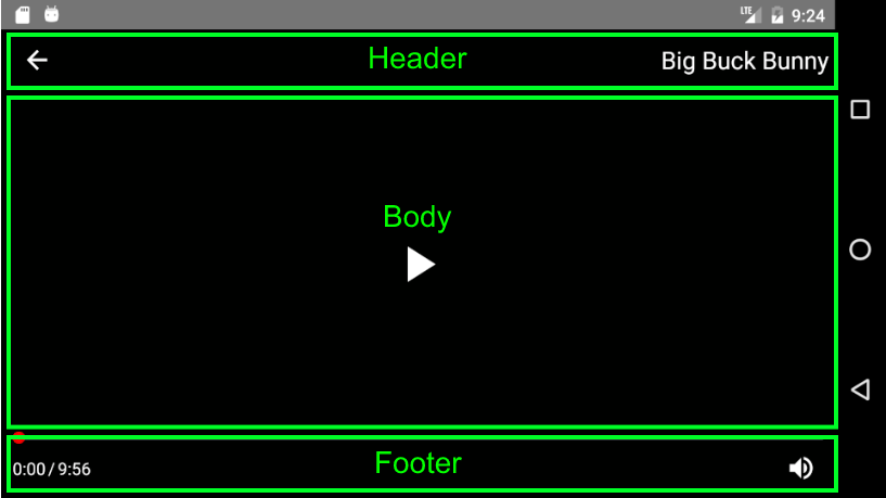
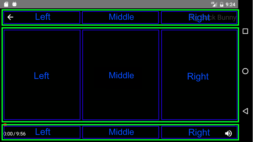

## Layout
By default, the player is laid out on a grid consisting of a [Header](#header), [Body](#body) and [Footer](#footer), each of which is divided into a Left, Middle, and Right [ControlGroup](#controlgroup)

![Layout1](https://raw.githubusercontent.com/forma-exacta/forma-video-player/master/docs/layout1.png)

![Layout2](https://raw.githubusercontent.com/forma-exacta/forma-video-player/master/docs/layout2.png)

#### Default Layout
```
{
  Header: <Header layout={{
    Left: <ControlGroup layout={[<Back />]} />,
    Center: <ControlGroup layout={[]} />,
    Right: <ControlGroup layout={[<Title />]} />,
  }} />,
  Body: <Header layout={{
    Left: <ControlGroup layout={[]} />,
    Center: <ControlGroup layout={[<Play />]} />,
    Right: <ControlGroup layout={[]} />,
  }} />,
  Footer: <Header layout={{
    Left: <ControlGroup layout={[<PlayerTime />]} />,
    Center: <ControlGroup layout={[]} />,
    Right: <ControlGroup layout={[<Mute />]} />,
  }} />
}
```

#### Custom Layout
A custom layout begins with replacing one or many of the top level layout components ([Header](#header) | [Body](#Body) | [Footer](#footer)) with your own component. This custom component can be a Layout Component with a custom layout prop, or any other React Component.

Even if you just want to add or remove one control from the player, you must replace one of the top level layout components.

##### `Example: Remove the Title control`
```
import {Player, Header, ControlGroup} from 'forma-video-player'

const customLayout = {
  Header: <Header layout={{
    Left: <ControlGroup layout={[<Back />]} />,
    Center: <ControlGroup layout={[]} />,
    Right: <ControlGroup layout={[]} />
  }} />
}

...

render() {
  return <Player layout={customLayout} ... />
}
```

In the above example, we override the Header section of the default layout and exclude the Title component. Notice we still have to define the Back component since we are replacing that section as well. Because we did not define a Body or Footer, those sections will still use the default layout.

##### null
Passing null for any of the layout sections will exclude that section

##### `Example: Exclude Header section`
```
const customLayout = {
  Header: null
}
```

##### makeHeader, makeBody, makeFooter
In order to make control customization a little bit easier, we expose some convenience methods for creating a new Header, Body, and Footer. Instead of defining the entire component tree like we did in the example above, you could just do the following:

##### `Example: Remove the Title control with makeHeader`
```
import {makeHeader} from 'forma-video-player'

const customLayout = {
  Header: makeHeader([<Back />], [], [])
}

```

The arrays passed in represent the Left, Middle, and Right sections.

#### `makeHeader(Left, Middle, Right)`  

**Arguments**
1. `Left` (array): The left section of the Header
1. `Middle` (array): The middle section of the Header
1. `Right` (array): The right section of the Header

#### `makeBody(Left, Middle, Right)`  

**Arguments**
1. `Left` (array): The left section of the Body
1. `Middle` (array): The middle section of the Body
1. `Right` (array): The right section of the Body

#### `makeFooter(Left, Middle, Right)`  

**Arguments**
1. `Left` (array): The left section of the Footer
1. `Middle` (array): The middle section of the Footer
1. `Right` (array): The right section of the Footer


## Styles
Most components accept a set of styles that can be used to customize their look. These styles should be passed to the [Player](#player) component with the `styles` prop. The styles prop accepts an object containing styles grouped by component name.

##### `Example: Custom styles object`
```
{
  Mute: {
    iconColor: 'red',
    size: 30
  },
  Title: {
    textColor: 'blue'
  }
}
```

See each [component](#components) for more details about the styles it accepts.

## Themes
Themes provide a convenient way to change multiple styles at once. The player comes packaged with a default theme, but you can change this by passing your own theme to the Player.

#### Default Theme  
```
{
  control: {
    size: 25,
    iconColor: '#ffffff',
    fontSize: 14,
    textColor: '#ffffff',
    underlayColor: '#ffffff',
    backgroundColor: 'transparent'
  }
}
```

#### Custom Themes
Custom themes should use the same structure as the default theme. Your custom theme will be deep merged with the default theme, overriding any common properties.

In the following example, the custom theme will make all controls smaller, but the other default theme styles will still be used.

##### `Example: Reduce the size of all controls`
```
const customTheme = {
  control: {
    size: 20
  }
}

...

render() {
  return <Player theme={customTheme} ... />
}
```

> **Theme styles will only be applied once when the player is created**. Updating the theme prop that is passed to the player will have no effect.

## Layout Components
Layout components are intended to affect the positioning of controls within the player.

## `Header`
Defines the top row of the player layout

```
import {Header} from 'forma-video-player'

<Header
  layout=object
/>
```

#### Props
`layout` (object): Must include a Left, Middle, and Right section

## `Body`
Defines the middle row of the player layout

```
import {Body} from 'forma-video-player'

<Body
  layout=object
/>
```

#### Props
`layout` (object): Must include a Left, Middle, and Right section

## `Footer`
Defines the bottom row of the player layout

```
import {Footer} from 'forma-video-player'

<Footer
  layout=object
/>
```

#### Props
`layout` (object): Must include a Left, Middle, and Right section

## `ControlGroup`
A control group renders an array of Controls, in their array order

```
import {ControlGroup} from 'forma-video-player'

<ControlGroup
  layout=object
/>
```

#### Props
`layout` (array): An array of components. Each will be rendered in their array order, in a row.

## Control Components

## `Back`
Back button with a left arrow icon. When pressed, this calls the `back` function passed into the [Player](#player).

```
import {Back} from 'forma-video-player'

<Back />
```

#### Styles
Name | Type | Description | Default
--- | --- | --- | ---
buttonColor | string | button fill color | 'transparent'
backgroundColor | string | container background color | [theme](#default-theme) control.backgroundColor
underlayColor | string | button color on press | [theme](#default-theme) control.underlayColor
size | number | size of the control | [theme](#default-theme) control.size
iconColor | string | color of the button icon | [theme](#default-theme) control.iconColor

## `Mute`
Toggles the player volume on and off

```
import {Mute} from 'forma-video-player'

<Mute />
```

#### Styles
Name | Type | Description | Default
--- | --- | --- | ---
buttonColor | string | button fill color | 'transparent'
backgroundColor | string | container background color | [theme](#default-theme) control.backgroundColor
underlayColor | string | button color on press | [theme](#default-theme) control.underlayColor
size | number | size of the control | [theme](#default-theme) control.size
iconColor | string | color of the button icon | [theme](#default-theme) control.iconColor

## `Play`
Toggles play/pause

```
import {Play} from 'forma-video-player'

<Play />
```

#### Styles
Name | Type | Description | Default
--- | --- | --- | ---
buttonColor | string | button fill color | 'transparent'
backgroundColor | string | container background color | [theme](#default-theme) control.backgroundColor
underlayColor | string | button color on press | [theme](#default-theme) control.underlayColor
size | number | size of the control | [theme](#default-theme) control.size
iconColor | string | color of the button icon | [theme](#default-theme) control.iconColor

## `PlayerTime`
Displays the currentTime and video duration, ie `0:00 / 2:00`

```
import {PlayerTime} from 'forma-video-player'

<PlayerTime />
```

#### Styles
Name | Type | Description | Default
--- | --- | --- | ---
backgroundColor | string | container background color | [theme](#default-theme) control.backgroundColor
fontSize | number | size of the font | [theme](#default-theme) control.fontSize
textColor | string | color of the text | [theme](#default-theme) control.textColor

## `ProgressBar`
Tracks the current time in video. Drag to seek. This component wraps Slider from [react-native-slider](https://github.com/jeanregisser/react-native-slider)

```
import {ProgressBar} from 'forma-video-player'

<ProgressBar />
```

#### Styles
Name | Type | Description | Default
--- | --- | --- | ---
thumbStyle | object | style of the thumb circle | {width: 10, height: 10, borderWidth: 1, borderColor: 'red'},
thumbTintColor | string | fill color of the thumb circle | '#f00'
trackStyle | object | styling for the progress track | {backgroundColor: '#666677ff', borderRadius: 0}
minimumTrackTintColor | string | color of the track where time has elapsed | '#f00'

## `Title`
Displays the video title

```
import {Title} from 'forma-video-player'

<Title />
```

#### Styles
Name | Type | Description | Default
--- | --- | --- | ---
backgroundColor | string | container background color | [theme](#default-theme) control.backgroundColor
fontSize | number | size of the font | [theme](#default-theme) control.fontSize
textColor | string | color of the text | [theme](#default-theme) control.textColor

## Custom Controls
Player state is maintained by a redux store. This makes it easier to pass specific pieces of player state to controls without having to worry about unwanted renders. It also makes it pretty easy to implement your own controls.

#### State
The store contains all props that can be passed to react-native-video's Video component, plus a few more:

Name | Initial Value
--- | ---
source | null
buffering | false
error | null
ignoreSilentSwitch | 'ignore'
loaded | false
loading | false
metadata | null
muted | false
paused | true
playInBackground | false
playWhenInactive | false
progress | null
progressUpdateInterval | 250
rate | 1.0
repeat | false
resizeMode | 'contain'
volume | 1.0
duration | null
ref | null
ended | false
name | null
back | null
styles | {}
theme | [defaultTheme](#default-theme)
currentTime | null

#### Actions
We also expose a setter action for each of the above that has the same name as the state it sets. See the `connectVideo` example below.

### `connectVideo([state], [actions], [mergeProps], [options])`
A wrapper around redux's `connect` method with a syntax tailored to the player's state. When a component is wrapped in connectVideo, player state will be exposed in props.player and redux actions will be exposed in props.actions.

**Arguments**
1. `state` (array): An array of string, each of which is a piece of [state](#state)
1. `actions` (object): Keys are the action name in props and values are the action methods

##### `Example: Connect to player state and actions`

```
import React, {Component} from 'react'
import {TouchableHighlight, Text} from 'react-native'
import {connectVideo, actions} from 'forma-video-player'

class Repeat extends Component {

  toggleRepeat = () => {
    const {player, actions} = this.props

    actions.repeat(!player.repeat)
  }

  render() {
    const {player} = this.props

    return (
      <TouchableHighlight onPress={this.toggleRepeat}>
        <Text style={{color: 'blue'}}>{player.repeat ? 'repeat' : 'do not repeat'}</Text>
      </TouchableHighlight>
    )
  }
}

export default connectVideo(['repeat'], {
  repeat: actions.repeat
})(Repeat)
```

### `styles(styleFn)`
Internally, this is used to connect player components to custom state and themes. You can use if for your custom controls as well.

**Arguments**
1. `styleFn` (function): a function that accepts state and theme arguments and returns an object of styles. The 'state' argument will be the styles you pass into the [Player](#player) props. The theme argument will be set to the configured theme.
  ```
    (state, theme) => ({
      styleName: 'styleValue',
      groupStyles: {
        anotherStyle: state.ControlName.anotherStyle,
        defaultToTheme: state.ControlName.undefined || theme.defaultValue
      }
    })
  ```

##### `Example: Connect to styles`
Let's use the Repeat control again

```
import React, {Component} from 'react'
import {TouchableHighlight, Text} from 'react-native'
import {connectVideo, actions, styles} from 'forma-video-player'

class Repeat extends Component {

  toggleRepeat = () => {
    const {player, actions} = this.props

    console.log(this.props)

    actions.repeat(!player.repeat)
  }

  render() {
    const {player, styles} = this.props

    return (
      <TouchableHighlight onPress={this.toggleRepeat} underlayColor={styles.underlayColor}>
        <Text style={{color: styles.text.color, fontSize: styles.text.size}}>{player.repeat ? 'repeat' : 'do not repeat'}</Text>
      </TouchableHighlight>
    )
  }
}

const connected = connectVideo(['repeat'], {
  repeat: actions.repeat
})(Repeat)

export default styles((state, theme) => ({
  underlayColor: state.Repeat.underlayColor || theme.underlayColor,   // pull from user styles or theme
  text: {
    color: state.Repeat.textColor || 'blue',                          // hardcode a default
    size: 25                                                          // hardcode style
  }
}))(connected)
```

## Redux Integration
By default, the player will manage its state internally with redux by creating its own store and Provider. This is not ideal.

If you are using redux in your application, you can integrate the Player state into your store by integrating the Player reducer with `createReducer()` and setting `integrateRedux={true}` on the Player component.

> **Important** The key in your root reducer must be `player` for the Player reducer. This is a limitation we hope to work around in the future.

##### `Example: Integrate Redux`

```
import {Player, createReducer} from 'forma-video-player'
import {createStore, combineReducers} from 'redux'
import {Provider} from 'react-redux'

const store = createStore(combineReducers({
  player: createReducer()
}))

const videoProps = {
  name: 'Big Buck Bunny',
  source: {
    uri: 'https://archive.org/download/BigBuckBunny_328/BigBuckBunny_512kb.mp4'
  }
}

...

render() {
  return (
    <Provider store={store}>
      <View style={{flex: 1}}>
        <Player integrateRedux={true} videoProps={videoProps} />
      </View>
    </Provider>
  )
}
```

## Roadmap
* Add more style / theme options
* Support for multiple mounted players
