# Expo App UI

A UI component library for Expo React Native. Copy components directly into your project and customize them to your needs.

## 🏗️ Designed for production

Every component is built for **real apps** — not demos:

- **TypeScript strict mode** with explicit prop interfaces
- **Accessibility wired in** — `accessibilityRole`, `accessibilityState`, `accessibilityValue`, `accessibilityLiveRegion`, hit slop on touch targets
- **New Architecture (Fabric) compatible** — tested on Expo SDK 52+ with `newArchEnabled: true`
- **Minimal peer dependencies** — most components depend on nothing beyond `react-native` itself, keeping your screens lightweight
- **Best-practice patterns** — controlled/uncontrolled modes where it matters, `useNativeDriver` where possible, no legacy bridge APIs
- **Full code ownership** — components are copied into your project; modify, theme, or fork freely
- **Automated test suite** for the CLI (57+ tests across unit and integration)

The goal: when you copy a component in, you're shipping production code on day one. Customize it, don't fight it.

## ✅ Compatibility

| Tool                | Supported                          |
| ------------------- | ---------------------------------- |
| Expo SDK            | **52, 53, 54+** (latest)           |
| React Native        | **0.74+**                          |
| New Architecture    | **✅ Fabric + TurboModules**       |
| Old Architecture    | ✅ Still supported                 |
| Platforms           | iOS · Android · Web (where noted)  |
| TypeScript          | ✅ Strict mode                     |

All components are tested against Expo SDK 54 with the **New Architecture enabled** (`newArchEnabled: true` in `app.json`). Components that wrap a third-party library (e.g. `react-native-reanimated`) inherit that library's New Architecture support — these are documented per component.

## 🎉 Recently Added Components

We've just added **4 new components** to the library:

- **Accordion** - Expandable accordion with smooth animations
- **Auto Scroll Cards** - Carousel with auto-scrolling and manual swipe
- **Birthdate Picker** - Native-style date picker with month/day/year wheels
- **Calendar** - Flexible calendar with single date and range selection

Try them out:
```bash
npx expo-app-ui add accordion
npx expo-app-ui add auto-scroll-cards
npx expo-app-ui add birthdate-picker
npx expo-app-ui add calender
```

## Component Showcase

<div align="center">
  
<img src="https://expo-ui.thunderdevelops.in/examples/buttons-example.png" alt="Button Component" width="150" />
<img src="https://expo-ui.thunderdevelops.in/examples/custom-modal-example.gif" alt="Custom Modal" width="150" />
<img src="https://expo-ui.thunderdevelops.in/examples/otp-input-example.gif" alt="OTP Input" width="150" />
<img src="https://expo-ui.thunderdevelops.in/examples/top-loading-bar-example.gif" alt="Top Loading Bar" width="150" />
<img src="https://expo-ui.thunderdevelops.in/examples/accordion-example.gif" alt="Accordion" width="150" />
<img src="https://expo-ui.thunderdevelops.in/examples/auto-scroll-cards-example.gif" alt="Auto Scroll Cards" width="150" />
<img src="https://expo-ui.thunderdevelops.in/examples/celender-example.gif" alt="Calendar" width="150" />

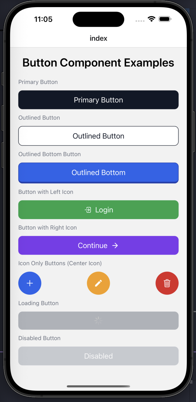
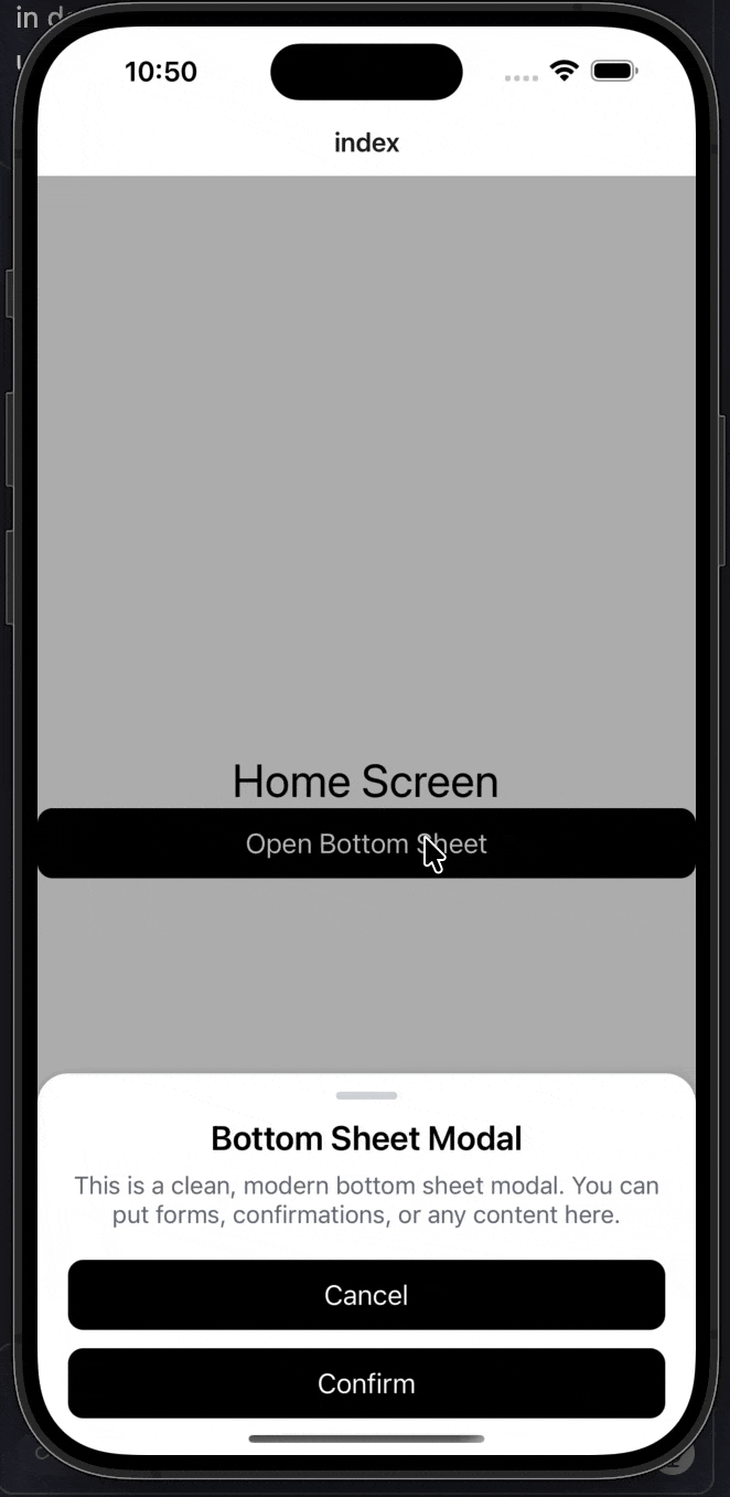
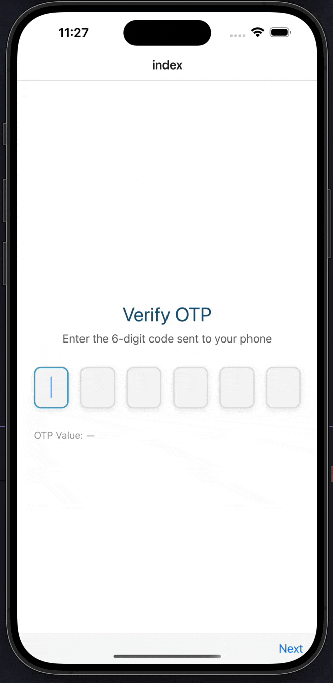
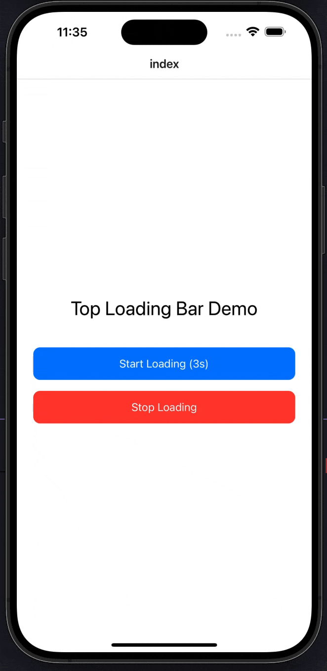
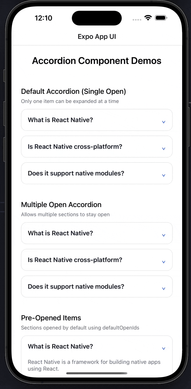
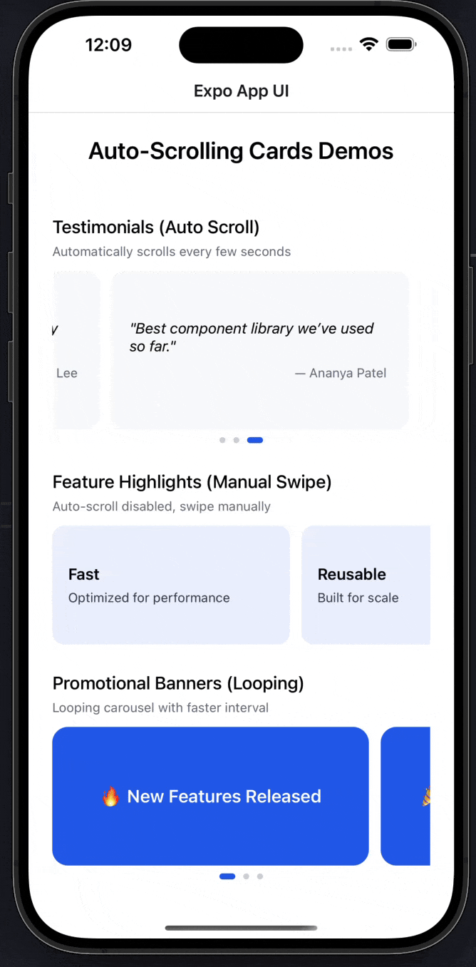
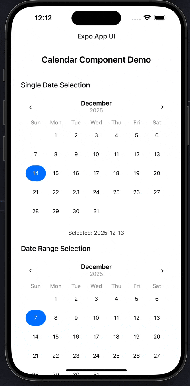
*Button • Custom Modal • OTP Input • Loading Bar • Accordion • Auto Scroll Cards • Calendar*

</div>

## 📚 Documentation

**👉 [View Full Documentation →](https://expo-ui.thunderdevelops.in)**

For complete documentation, usage examples, API references, and detailed instructions, visit our documentation site:

**https://expo-ui.thunderdevelops.in**

The documentation includes:
- 📖 Getting Started Guide
- 🎨 Component Documentation
- 🛠️ CLI Commands Reference
- 💡 Usage Examples
- 🔧 Configuration Guides

## Quick Start

### Installation

You can use this library directly with npx:

```bash
npx expo-app-ui add <component-name>
```

Or install it globally:

```bash
npm install -g expo-app-ui
```

Then use:

```bash
expo-app-ui add <component-name>
```

## Usage

### Adding Components

Add a component to your project:

```bash
npx expo-app-ui add custom-text
```

This will:
- Copy the component template to `components/ui/custom-text.tsx` in your project
- Automatically detect and add required dependencies (helpers, constants)
- Preserve all imports and dependencies
- Allow you to customize the component as needed

**Example:**
```bash
npx expo-app-ui add button
# Automatically adds normalizeSize helper and theme constants if needed
```

### Adding Helpers, Constants, and Contexts

```bash
# Add a helper
npx expo-app-ui add normalizeSize

# Add constants
npx expo-app-ui add theme

# Add contexts (e.g., top loading bar)
npx expo-app-ui add top-loading-bar
```

### Listing Available Items

```bash
npx expo-app-ui list
```

### Overwriting Existing Files

```bash
npx expo-app-ui add custom-text --overwrite
```

> 📖 **For detailed usage instructions, examples, and API documentation, visit [expo-ui.thunderdevelops.in](https://expo-ui.thunderdevelops.in)**

## Project Structure

After adding components, your project structure will look like:

```
your-project/
├── components/
│   └── ui/
│       ├── CustomText.tsx
│       ├── Button.tsx
│       └── ... (other components)
├── helpers/
│   └── normalizeSize.ts
├── constants/
│   └── theme.ts
└── ...
```

## Auto-Dependency Detection

The CLI automatically detects when a component requires:
- `normalizeSize` helper (from `@/helper/normalizeSize`)
- `theme` constants (from `@/constants/theme`)
- Related components or contexts

When you add a component that uses these dependencies, they will be automatically added to your project.

> 📖 **Learn more about auto-dependency detection in the [documentation](https://expo-ui.thunderdevelops.in/docs/cli)**

## Component Templates

Components are copied directly into your project, so you have full control:

- ✅ **Own your code** - Components are part of your codebase
- ✅ **Customizable** - Modify components to fit your needs
- ✅ **Auto-dependencies** - Required helpers and constants are added automatically
- ✅ **Type-safe** - Full TypeScript support

## Path Aliases

Components use path aliases like `@/components/ui/custom-text` and `@/constants/theme`. Make sure your Expo project has these configured:

**tsconfig.json:**
```json
{
  "compilerOptions": {
    "baseUrl": ".",
    "paths": {
      "@/*": ["./*"]
    }
  }
}
```

**babel.config.js:**
```javascript
module.exports = {
  plugins: [
    [
      'module-resolver',
      {
        root: ['./'],
        alias: {
          '@': './',
        },
      },
    ],
  ],
};
```

> 📖 **See the [Getting Started guide](https://expo-ui.thunderdevelops.in/docs/getting-started) for detailed setup instructions**

## Available Components

**Core**
- `custom-text` - A customizable Text component with font, color, and spacing props
- `button` - A flexible button component with variants and icon support
- `box-view` - A layout component with flexbox props

**Display**
- `badge` - Compact label for status, counts, and tags
- `avatar` - User avatar with image and initials fallback
- `skeleton` - Animated placeholder for loading states
- `profile-pic` - A profile picture component with fallback
- `progress-bar` - A progress bar component with variants

**Inputs & Forms**
- `switch` - Animated toggle switch
- `checkbox` - Accessible checkbox with indeterminate state
- `radio-group` - Single-select radio group
- `slider` - Touch-driven value slider
- `otp-input` - An OTP input component
- `birthdate-picker` - A native-style date picker for selecting birthdates

**Navigation**
- `tabs` - Three tab styles (underline, pills, segmented)

**Overlays**
- `dialog` - Confirmation/alert dialog with actions
- `tooltip` - Long-press tooltip
- `custom-modal` - An animated modal component
- `bottom-sheet` - Modal bottom sheet with swipe-to-dismiss
- `toast` - Top/bottom auto-dismissing notification
- `snackbar` - Bottom snackbar with optional action

**Feedback & Motion**
- `loading-bar` - An animated top loading bar component
- `marquee` - A scrolling marquee component
- `accordion` - An expandable accordion component with smooth animations
- `auto-scroll-cards` - A carousel component with auto-scrolling and manual swipe
- `calendar` - A flexible calendar component with single date and range selection
- `calender` - ⚠️ Deprecated typo alias of `calendar`

## Available Contexts

- `top-loading-bar-context` - React Context for managing top loading bar state

## Available Helpers

- `normalizeSize` - Normalizes font sizes based on device font scale

## Available Constants

- `theme` - Theme constants including colors, fonts, and sizes

> 📖 **View complete documentation, props, examples, and usage for all components at [expo-ui.thunderdevelops.in/docs/components](https://expo-ui.thunderdevelops.in/docs/components)**

## Contributing

To add new components, helpers, constants, or contexts:

1. **Components**: Create a new `.tsx` file in the `templates/components/ui/` directory
2. **Contexts**: Create a new `.tsx` file in the `templates/context/` directory
3. **Helpers**: Create a new `.ts` file in the `templates/helpers/` directory
4. **Constants**: Create a new `.ts` file in the `templates/constants/` directory
5. Use kebab-case for filenames (e.g., `my-component.tsx`)
6. The item will be automatically available via the CLI

> 📖 **For contribution guidelines and best practices, visit the [documentation](https://expo-ui.thunderdevelops.in)**

## License

MIT
