# 🥒 Emoji Picker React (v4)
**The most popular, fully customizable emoji picker for React apps.**
**[🔴 Live Demo](https://ealush.com/emoji-picker-react)** | **[🐛 Report a Bug](https://github.com/ealush/emoji-picker-react/issues)**

---
## ✨ Features
- 🎨 **Fully Customizable**: Control styles via CSS variables.
- 🌗 **Dark Mode**: Native support for light, dark, and auto themes.
- 🖱️ **Interactivity**: Custom click handlers and reactions picker mode.
- 🌍 **Multi-Language**: Built-in support for dozens of languages.
- 🦄 **Custom Emojis**: seamless support for custom image-based emojis.
- 📦 **Zero-Config**: Works out of the box with sensible defaults.
- 📱 **Responsive**: Mobile-friendly design.
- 🍎 **Multiple Styles**: Support for Apple, Google, Facebook, Twitter, and Native system emojis.
---
## 🚀 Getting Started
### Installation
```bash
npm install emoji-picker-react
```
### Basic Usage
Render the component in your app. It works immediately with no required props.
```jsx
import EmojiPicker from 'emoji-picker-react';
function App() {
return (
console.log(emojiObject)} />
);
}
```
---
## 📚 Props Reference
The following is a complete list of all props accepted by `EmojiPicker`.
### 🎛️ General Configuration
| Prop | Type | Default | Description |
| ----------------- | ------------ | ------------------ | -------------------------------------------------------------------------------------------- |
| `open` | `boolean` | `true` | Controls the visibility of the picker. |
| `theme` | `Theme` | `Theme.LIGHT` | The visual theme. Options: `'light'`, `'dark'`, `'auto'`. |
| `emojiStyle` | `EmojiStyle` | `EmojiStyle.APPLE` | The emoji set to use. Options: `'apple'`, `'google'`, `'facebook'`, `'twitter'`, `'native'`. |
| `emojiVersion` | `string` | `null` | Limit emojis to a specific unicode version (e.g., `"14.0"`). |
| `lazyLoadEmojis` | `boolean` | `false` | If true, emoji images are loaded only when they scroll into view. |
| `autoFocusSearch` | `boolean` | `true` | Focuses the search input automatically when the picker mounts. |
| `emojiData` | `object` | `undefined` | Pass imported locale data here for internationalization. |
### 📐 Dimensions & Styling
| Prop | Type | Default | Description |
| ----------- | --------------- | -------- | ------------------------------------------ |
| `width` | `string` | `number` | `350` |
| `height` | `string` | `number` | `450` |
| `style` | `CSSProperties` | `{}` | Inline styles applied to the root element. |
| `className` | `string` | `""` | CSS class applied to the root element. |
### 🖱️ Events & Interaction
| Prop | Type | Description |
| ------------------ | -------------------------------------------------------- | -------------------------------------------------------------------- |
| `onEmojiClick` | `(emojiData: EmojiClickData, event: MouseEvent) => void` | Callback triggered when a user clicks an emoji. |
| `onReactionClick` | `(emojiData: EmojiClickData, event: MouseEvent) => void` | Callback triggered when a user clicks a reaction (in reaction mode). |
| `onSkinToneChange` | `(skinTone: SkinTones) => void` | Callback triggered when the user selects a new skin tone. |
### 🔎 Search & Categories
| Prop | Type | Default | Description |
| ------------------------ | ------------------------ | ------------------------- | -------------------------------------------------------------------- |
| `searchDisabled` | `boolean` | `false` | If true, the search bar is completely removed. |
| `searchPlaceholder` | `string` | `"Search"` | Placeholder text for the search input. |
| `searchClearButtonLabel` | `string` | `"Clear"` | Aria label for the search clear button. |
| `categories` | `CategoryConfig[]` | _(All)_ | Array of category objects to customize order or visibility. |
| `suggestedEmojisMode` | `SuggestionMode` | `SuggestionMode.FREQUENT` | Logic for "Suggested" category. Options: `'recent'`, `'frequent'`. |
| `defaultSkinTone` | `SkinTones` | `SkinTones.NEUTRAL` | The initial skin tone. |
| `skinTonesDisabled` | `boolean` | `false` | If true, users cannot change the skin tone. |
| `skinTonePickerLocation` | `SkinTonePickerLocation` | `SEARCH` | Location of the skin tone trigger. Options: `'SEARCH'`, `'PREVIEW'`. |
### 🦄 Customization & Advanced
| Prop | Type | Default | Description |
| --------------- | ------------------------------------------------ | ----------------------- | ------------------------------------------------------------------------ |
| `customEmojis` | `CustomEmoji[]` | `[]` | Array of custom image-based emojis to inject. |
| `hiddenEmojis` | `string[]` | `[]` | Array of unified IDs (e.g., `'1f921'`) to hide from the picker. |
| `previewConfig` | `PreviewConfig` | `{ showPreview: true }` | Configuration for the bottom preview bar. |
| `getEmojiUrl` | `(unified: string, style: EmojiStyle) => string` | - | Function to override the default CDN URL for emoji images. |
| `categoryIcons` | `CategoryIcons` | `{}` | Map `Categories` enum values to custom React nodes for navigation icons. |
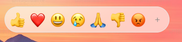
### ❤️ Reactions Picker Mode
| Prop | Type | Default | Description |
| ---------------------- | ---------- | --------------- | ------------------------------------------------------------------------ |
| `reactionsDefaultOpen` | `boolean` | `false` | If true, mounts in "Reactions" mode (single row) instead of full picker. |
| `reactions` | `string[]` | _(Default Set)_ | Array of unified IDs to display in the reactions bar. |
| `allowExpandReactions` | `boolean` | `true` | If true, shows a `+` button to switch from reactions to full picker. |
---
## 🛠️ Detailed Configuration
### CSS Variables
Override default variables by targeting `.EmojiPickerReact` or `aside.EmojiPickerReact`.
### CSS Variables
You can customize the picker by overriding CSS variables.
**[🎨 View Full List of CSS Variables](CSS_VARIABLES.md)**
### Custom Emojis Data Structure
When passing `customEmojis`, use this format:
```ts
{
id: string; // Unique ID
names: string[]; // Search keywords
imgUrl: string; // Image source
}
```
### Preview Config
Control the footer preview area using `previewConfig`:
```ts
{
defaultEmoji: string; // Default: "1f60a"
defaultCaption: string; // Default: "What's your mood?"
showPreview: boolean; // Default: true
}
```
### Custom Category Icons
You can customize the navigation icons using one of two methods.
**Method 1: The `categoryIcons` prop**
Map `Categories` enum values to valid React nodes:
```tsx
import EmojiPicker, { Categories } from 'emoji-picker-react';
,
[Categories.SMILEYS_PEOPLE]: ,
}}
/>;
```
**Method 2: The `categories` configuration array**
Define the icon directly within the category configuration object:
```tsx
import EmojiPicker, { Categories } from 'emoji-picker-react';
,
},
{
category: Categories.SMILEYS_PEOPLE,
name: 'Smileys & People',
icon: ,
},
]}
/>;
```
> **Note:** If both methods are used for the same category, the icon from the `categories` configuration takes precedence over the `categoryIcons` prop.
---
## 🌍 Internationalization (i18n)
Import the dictionary you need and pass it to the `emojiData` prop.
```javascript
import EmojiPicker from 'emoji-picker-react';
import es from 'emoji-picker-react/dist/data/emojis-es'; // Spanish
function App() {
return ;
}
```
View Supported Languages
- `emojis-bn` (Bengali 🇧🇩)
- `emojis-da` (Danish 🇩🇰)
- `emojis-de` (German 🇩🇪)
- `emojis-en-gb` (English, GB 🇬🇧)
- `emojis-en` (English, US 🇺🇸)
- `emojis-es-mx` (Spanish, Mexico 🇲🇽)
- `emojis-es` (Spanish 🇪🇸)
- `emojis-et` (Estonian 🇪🇪)
- `emojis-fi` (Finnish 🇫🇮)
- `emojis-fr` (French 🇫🇷)
- `emojis-hi` (Hindi 🇮🇳)
- `emojis-hu` (Hungarian 🇭🇺)
- `emojis-it` (Italian 🇮🇹)
- `emojis-ja` (Japanese 🇯🇵)
- `emojis-ko` (Korean 🇰🇷)
- `emojis-lt` (Lithuanian 🇱🇹)
- `emojis-ms` (Malay 🇲🇾)
- `emojis-nb` (Norwegian Bokmål 🇳🇴)
- `emojis-nl` (Dutch 🇳🇱)
- `emojis-pl` (Polish 🇵🇱)
- `emojis-pt` (Portuguese 🇵🇹)
- `emojis-ru` (Russian 🇷🇺)
- `emojis-sv` (Swedish 🇸🇪)
- `emojis-th` (Thai 🇹🇭)
- `emojis-uk` (Ukrainian 🇺🇦)
- `emojis-zh-hant` (Traditional Chinese 🇹🇼)
- `emojis-zh` (Simplified Chinese 🇨🇳)
---
## ⚠️ Troubleshooting
### Server-Side Rendering (Next.js / Remix)
This package relies on the `window` object and must be rendered on the client.
**Next.js Example:**
```javascript
import dynamic from 'next/dynamic';
const Picker = dynamic(() => import('emoji-picker-react'), { ssr: false });
```
### Vite
If you encounter `global is not defined`, add this to your HTML:
```html
```
---
## 🤝 Contributing
We welcome contributions! Please check out the [Contributing Guide](https://github.com/ealush/emoji-picker-react/blob/master/CONTRIBUTING.md) for how to run the project locally.
**Shout Outs:**
Design inspiration by [Pavel Bolo](https://pavelbolo.com).
_If you enjoy using `emoji-picker-react`, check out [Vest validation framework](https://vestjs.dev)._