# Easy-email-extensions
## Introduction
Provide default UI components, when they don’t meet your needs, you can refer to it and write your own
## usage
```sh
$ npm install --save easy-email-extensions
```
or
```sh
$ yarn add easy-email-extensions
```
```js
import React from 'react';
import { BlockManager, BasicType, AdvancedType } from 'easy-email-core';
import { EmailEditor, EmailEditorProvider } from 'easy-email-editor';
import { ExtensionProps, StandardLayout } from 'easy-email-extensions';
import { useWindowSize } from 'react-use';
import 'easy-email-editor/lib/style.css';
import 'easy-email-extensions/lib/style.css';
const categories: ExtensionProps['categories'] = [
{
label: 'Content',
active: true,
blocks: [
{
type: AdvancedType.TEXT,
},
{
type: AdvancedType.IMAGE,
payload: { attributes: { padding: '0px 0px 0px 0px' } },
},
{
type: AdvancedType.BUTTON,
},
{
type: AdvancedType.SOCIAL,
},
{
type: AdvancedType.DIVIDER,
},
{
type: AdvancedType.SPACER,
},
{
type: AdvancedType.HERO,
},
{
type: AdvancedType.WRAPPER,
},
],
},
{
label: 'Layout',
active: true,
displayType: 'column',
blocks: [
{
title: '2 columns',
payload: [
['50%', '50%'],
['33%', '67%'],
['67%', '33%'],
['25%', '75%'],
['75%', '25%'],
],
},
{
title: '3 columns',
payload: [
['33.33%', '33.33%', '33.33%'],
['25%', '25%', '50%'],
['50%', '25%', '25%'],
],
},
{
title: '4 columns',
payload: [[['25%', '25%', '25%', '25%']]],
},
],
},
];
const initialValues = {
subject: 'Welcome to Easy-email',
subTitle: 'Nice to meet you!',
content: BlockManager.getBlockByType(BasicType.PAGE)!.create({}),
};
export default function App() {
const { width } = useWindowSize();
const smallScene = width < 1400;
return (
{({ values }) => {
return (
);
}}
);
}
```
## Extensions
- `AttributePanel`
- Basic block configuration panel
- 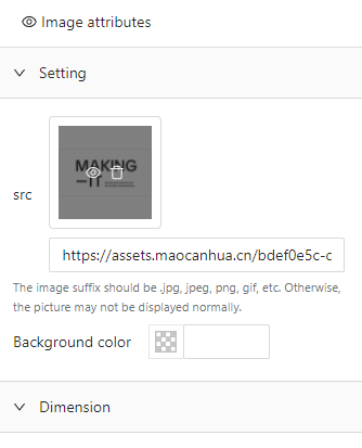 - You can add or overwrite
```tsx
import { BlockAttributeConfigurationManager } from 'easy-email-extensions';
BlockAttributeConfigurationManager.add({
[BasicType.TEXT]: () =>
- You can add or overwrite
```tsx
import { BlockAttributeConfigurationManager } from 'easy-email-extensions';
BlockAttributeConfigurationManager.add({
[BasicType.TEXT]: () => will be overwrite `Text`
,
});
```
- `InteractivePrompt`
- block hover and focus style
- 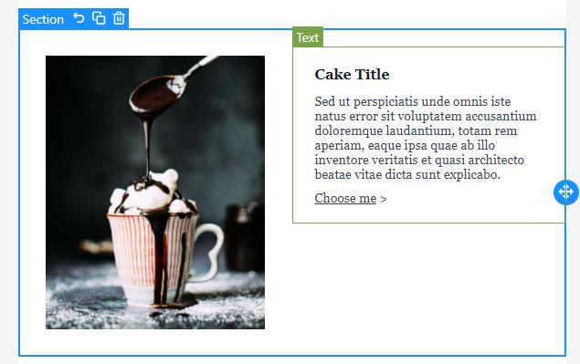 - No configuration items
- `BlockLayer`
-
- No configuration items
- `BlockLayer`
- 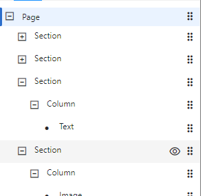 - No configuration items
- `ShortcutToolbar`
-
- No configuration items
- `ShortcutToolbar`
- 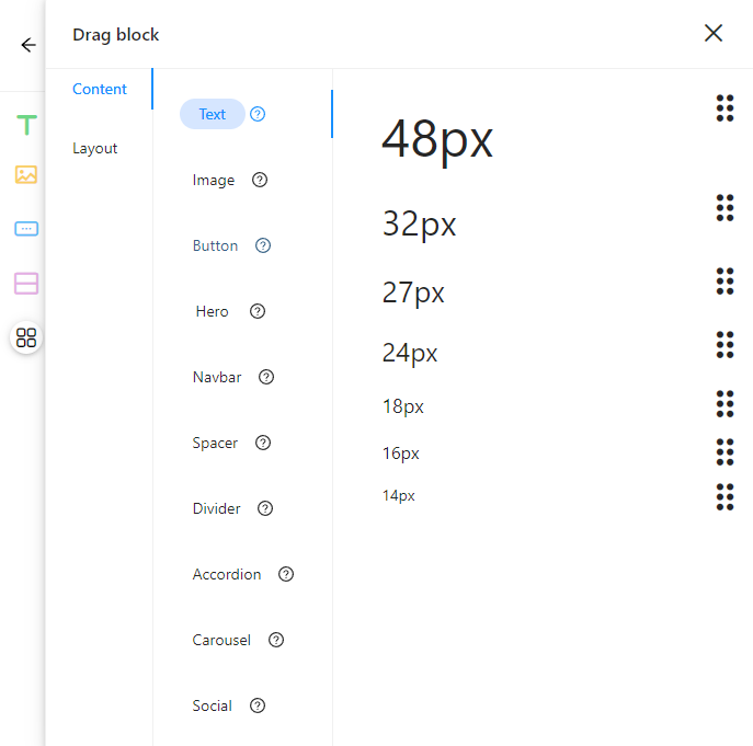 - You can add or overwrite popover's preset blocks
```tsx
import { BasicType } from 'easy-email-core';
import {
BlockMarketManager,
BlockMaskWrapper,
} from 'easy-email-extensions';
BlockMarketManager.addCategories([
{
title: 'Custom',
name: 'custom',
blocks: [
{
type: BasicType.TEXT,
title: 'Text',
description: 'This block allows you to display text in your email.',
component: () => {
return (
- You can add or overwrite popover's preset blocks
```tsx
import { BasicType } from 'easy-email-core';
import {
BlockMarketManager,
BlockMaskWrapper,
} from 'easy-email-extensions';
BlockMarketManager.addCategories([
{
title: 'Custom',
name: 'custom',
blocks: [
{
type: BasicType.TEXT,
title: 'Text',
description: 'This block allows you to display text in your email.',
component: () => {
return (
20px
);
},
},
],
},
]);
```
- `SimpleLayout`
- props
- showSourceCode
- defaultShowLayer
- `StandardLayout`
- props
- compact
- categories
- showSourceCode