Common/Popper
=============
A wrapper around [popper.js](https://popper.js.org), a tooltip style container which uses absolute positioning to place elements relative to other elements.
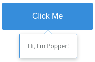
```jsx
Hi, I'm Popper!
```
### Props
**target={string|function|element}**
Specifies which element where the popper will be positioned. Possible values:
* string: The ID of the target element.
* element: Reference to the target element.
* function: Returns the target as an HTMLElement.
**placement={string}**
Specifies where to place the popper in relation to the target element. Possible values:
* One of: 'auto', 'auto-start', 'auto-end', 'top', 'top-start', 'top-end', 'right', 'right-start', 'right-end', 'bottom', 'bottom-start', 'bottom-end', 'left', 'left-start', or 'left-end'.
**offsetX={number|string}**
Shifts the popper on its X axis. Possible values:
* number: The offset value in pixels.
* string: The offset value as a unit. Valid units are 'px', '%', '%r', '%p', 'vw', and 'vh'.
**offsetY={number|string}**
Shifts the popper on its Y axis. Possible values:
* number: The offset value in pixels.
* string: The offset value as a unit. Valid units are 'px', '%', '%r', '%p', 'vw', and 'vh'.
**opened={bool}**
True to display the popper or false to hide it.
**arrow={bool}**
Whether an arrow is added to the popper.
**eventsEnabled={bool}**
Add resize/scroll events and recalculate position of the popper when they are triggered. Set to false by default for performance reasons.
**preventOverflow={bool}**
Prevents the popper from being positioned outside the boundary. The `eventsEnabled` prop should be set to true when using this prop.
**detached={bool}**
True to attach the popper to the document.body. The `eventsEnabled` prop should be set to _true_ when using this prop.
**closeOnClickOutside={bool}**
Close the popper when the user clicks outside of it.
**onCreate={func}**
Called when the internal popper.js instance is created.
**onUpdate={func}**
Called when the internal popper.js instance is updated.
**onOpen={func}**
Called when the popper is opened.
**onClose={func}**
Called when the popper is closed.
### Methods
**open([target])**
Opens the popper. When given the popper will use the `target` parameter as the target element.
**close([target])**
Closes the popper. When given the popper will use the `target` parameter as the target element.
**toggle([target])**
Toggles the popper opened or closed. When given the popper will use the `target` parameter as the target element.
### Examples
This example creates a popper and uses a button to toggle it opened and closed. The popper will become attached to the button by passing the button instance (e.g. `this`) to the `popper.toggle()` method.
```jsx
import React from 'react';
import PropTypes from 'prop-types';
import { render } from 'react-dom';
import { Popper } from 'Components/Common';
class Button extends React.Component {
render() {
const { popper, children, ...props} = this.props;
return (
)
}
}
class App extends React.Component {
render() {
return (