Buttons/SplitButton
===================
Renders a button with a left side and right side, where clicking the right side opens a popper.
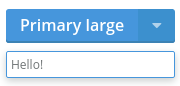
```jsx
Primary large
Hello!
```
### Props
**size={string}**
One of "large", "medium", or "small".
**type={string}**
One of "primary", "secondary", or "cta".
**disabled={bool}**
Whether or not the button is disabled or not.
**onClick={func}**
Called when the _left side_ of the button is clicked.
### CSS
Adds `dp-split-button` to the root element.
### Examples
```jsx
import React from 'react';
import { render } from 'react-dom';
import { SplitButton, ButtonPopper } from 'Components/Buttons';
const App = () => (
Click Me
I am popper.
);
render(, document.getElementById('mount'));
```