---
layout: doc
title: deliteful/Checkbox
---
# deliteful/Checkbox
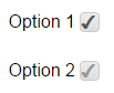
The `deliteful/Checkbox` widget represents a form-aware 2-state widget similar to the HTML5 input type="checkbox" element.
It provides all the standard facilities of a native input and supports deliteful theming capability.
*Example*
##### Table of Contents
[Element Instantiation](#instantiation)
[Element Configuration](#configuration)
[Element Styling](#styling)
[Element Events](#events)
[Enterprise Use](#enterprise)
[See also](#seealso)
## Element Instantiation
See [`delite/Widget`](/delite/docs/master/Widget.md) for full details on how instantiation lifecycle is working.
### Declarative Instantiation
```html
```
### Programmatic Instantiation
```js
require([
"deliteful/Checkbox"
], function (Checkbox) {
var cb = new Checkbox({checked:true});
cb.placeAt(document.body);
cb = new Checkbox({disabled:true, name: "option1"});
cb.placeAt(document.body);
});
```
## Element Configuration
The state of a Checkbox widget (checked or unchecked) is defined by the `checked` property, inherited from the
`deliteful/Toggle` class.
In addition, the Checkbox widget supports the following form-related properties of an HTML5 input element of
type "checkbox": `name`, `value`, `disabled` and `alt`, inherited from `delite/FormWidget`.
## Element Styling
### Supported themes
This widget provides default styling for the following delite themes:
* bootstrap
* ios
* holodark
### CSS Classes
CSS classes are bound to the structure of the widget declared in its template `deliteful/Checkbox/Checkbox.html`.
The following table lists all the CSS classes that can be used to style the checkbox.
|class name/selector|applies to|
|----------|----------|
|d-checkbox|Checkbox widget node
|d-checkbox::before|Checkmark node
In addition, the following classes are used in combination with the classes above:
|class name/selector|applies to|
|----------|----------|
|d-checked|Checkbox and checkmark nodes in checked state
|d-focused|Checkbox widget node in focus state
|d-disabled|Checkbox and checkmark nodes in disabled state
|d-rtl|Checkbox and checkmark nodes in right-to-left configuration
## Element Events
The widget `deliteful/Checkbox` provides a `change` event when its state is changed following a user interaction.
|event name|dispatched|cancelable|bubbles|properties|
|----------|----------|----------|-------|----------|
|change|on state change|No |Yes|standard HTML5 Event propeties|
## Enterprise Use
### Accessibility
|type|status|comment|
|----|------|-------|
|Keyboard|yes|Value is toggled when the space bar is pressed.|
|Visual Formatting|ok|Support high contrast on Firefox and Internet Explorer desktop browsers.|
|Screen Reader|yes|Tested with JAWS and VoiceOver|
### Browser Support
This widget supports all supported browsers without any degraded behavior.
## See also
### Samples
- deliteful/samples/Buttons.html