# Date Range Picker 4
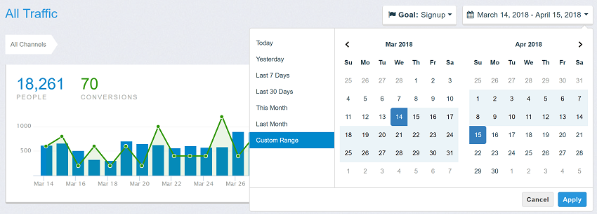
This date range picker component creates a dropdown menu from which a user can
select a range of dates. I created it while building the UI for [Improvely](http://www.improvely.com),
which needed a way to select date ranges for reports.
Features include limiting the selectable date range, localizable strings and date formats,
a single date picker mode, a time picker, and predefined date ranges.
## Browser setup
Copy `daterangepicker.js` and `daterangepicker.css` to your site.
```html
```
## Package and framework usage
```js
import DateRangePicker from 'daterangepicker';
import 'daterangepicker/daterangepicker.css';
const picker = new DateRangePicker(inputElement, options, (start, end, label) => {
console.log(start.format('YYYY-MM-DD'), end.format('YYYY-MM-DD'), label);
});
```
Create the picker after its element mounts and call `picker.remove()` when it unmounts. In React, create it in `useEffect` and return the cleanup function. In Vue, use `onMounted` and `onBeforeUnmount`. In Angular, use `ngAfterViewInit` and `ngOnDestroy`. Importing the module is safe during server rendering. TypeScript declarations ship with the package. CommonJS callers can use `require('daterangepicker')`. Browser modules can import the standalone `daterangepicker.mjs` directly.
Use `setStartDate`, `setEndDate` and `setRanges` to update a mounted picker. Pass `null` to `setRanges` to remove the preset list. A second constructor call on the same element replaces the first picker. `DateRangePicker.getInstance(element)` returns its current instance.
## Existing installations
Keep the application's existing jQuery and Moment script tags when replacing the picker file. The classic build registers `$.fn.daterangepicker` and the lowercase `window.daterangepicker` constructor. With Moment available, callbacks and date properties use genuine Moment objects with the application's locale and plugins. CommonJS also discovers installed legacy peers. Applications that use these libraries directly should declare them as their own dependencies.
For ES modules that keep jQuery or Moment private to the module, register the imported copies once before initializing legacy widgets:
```js
import $ from 'jquery';
import moment from 'moment';
import DateRangePicker from 'daterangepicker';
DateRangePicker.installJQuery($, moment);
$('#dates').daterangepicker(options);
```
The plugin supports chaining, `$.fn.daterangepicker.defaultOptions`, `.data('daterangepicker')`, and namespaced events with the picker as the second argument. Native listeners receive the picker in `event.detail`. A committed input value dispatches a bubbling `change` event. Standalone date values support mutable date arithmetic, comparisons, cloning, formatting, and conversion to JavaScript dates with `toDate()`.
## Additional options and interactions
- `singleCalendar: true` displays one calendar for selecting both ends of a range. Both time selectors remain available when time selection is enabled.
- `minSpan` sets the minimum elapsed span in the same units as `maxSpan`. For example, `{ days: 2 }` makes Wednesday the earliest end for a Monday start. Use compatible minimum and maximum spans. The configured maximum date and maximum span take precedence if the bounds conflict.
- `applyOnRangeClick: false` lets the user adjust a preset before pressing Apply. Presets apply immediately by default. Date-only auto-apply mode always commits the preset.
- `selectStart.daterangepicker` and `selectEnd.daterangepicker` expose in-progress calendar selections. `calendarRendered.daterangepicker` fires after both month grids have been drawn.
- Press Down Arrow from the input to focus the calendar or preset list. Use the arrow keys to move between days and Enter or Space to select. Escape in the calendar cancels the edit.
- Set options with HTML data attributes such as `data-single-date-picker="true"`. JavaScript options override the attributes.
## Development
Edit `src/picker.js` for picker behavior and `src/dates.js` for standalone date handling. Run `npm ci`, `npm run build`, and `npm test` to rebuild both distributions and exercise the browser and legacy interfaces.
## Documentation website
Set the HTTP server's document root to `website/` and open `/` to see [the v4 documentation](website/index.html). The checked-in files serve directly without a build or redirect. The framework demos ship with local browser bundles. Their source and rebuild commands are in the [examples guide](example/integrations/README.md).
Install the documentation build dependencies with `npm ci` and `npm --prefix example/integrations ci`. Run `npm run docs:build` to refresh the library files, demos and downloadable archive in `website/`. The build also exports the same layout to `dist/docs/`.
The public documentation is available at [daterangepicker.com](https://daterangepicker.com).
## [See It In a Live Application](https://awio.iljmp.com/5/drpdemogh)
## License
The MIT License (MIT)
Copyright (c) 2012-2026 Dan Grossman
Permission is hereby granted, free of charge, to any person obtaining a copy
of this software and associated documentation files (the "Software"), to deal
in the Software without restriction, including without limitation the rights
to use, copy, modify, merge, publish, distribute, sublicense, and/or sell
copies of the Software, and to permit persons to whom the Software is
furnished to do so, subject to the following conditions:
The above copyright notice and this permission notice shall be included in
all copies or substantial portions of the Software.
THE SOFTWARE IS PROVIDED "AS IS", WITHOUT WARRANTY OF ANY KIND, EXPRESS OR
IMPLIED, INCLUDING BUT NOT LIMITED TO THE WARRANTIES OF MERCHANTABILITY,
FITNESS FOR A PARTICULAR PURPOSE AND NONINFRINGEMENT. IN NO EVENT SHALL THE
AUTHORS OR COPYRIGHT HOLDERS BE LIABLE FOR ANY CLAIM, DAMAGES OR OTHER
LIABILITY, WHETHER IN AN ACTION OF CONTRACT, TORT OR OTHERWISE, ARISING FROM,
OUT OF OR IN CONNECTION WITH THE SOFTWARE OR THE USE OR OTHER DEALINGS IN
THE SOFTWARE.