# Tabs
Tabs present custom content inside a new Tab of an existing Tabbed Area section
within the Rancher UI.
Tabs are added to Rancher via the `addTab` method.
## addTab
*(Rancher version v2.7.2)*
This method adds a tab to the UI.
Method:
```ts
plugin.addTab(where: String, when: LocationConfig, options: Object);
```
_Arguments_
`where` string parameter admissable values for this method:
| Key | Type | Description |
|---|---|---|
|`TabLocation.RESOURCE_DETAIL`| String | Location for a Tab on a Resource Detail page |
`when` Object admissable values:
`LocationConfig` as described above for the [LocationConfig object](./common#locationconfig).
### TabLocation.RESOURCE_DETAIL options
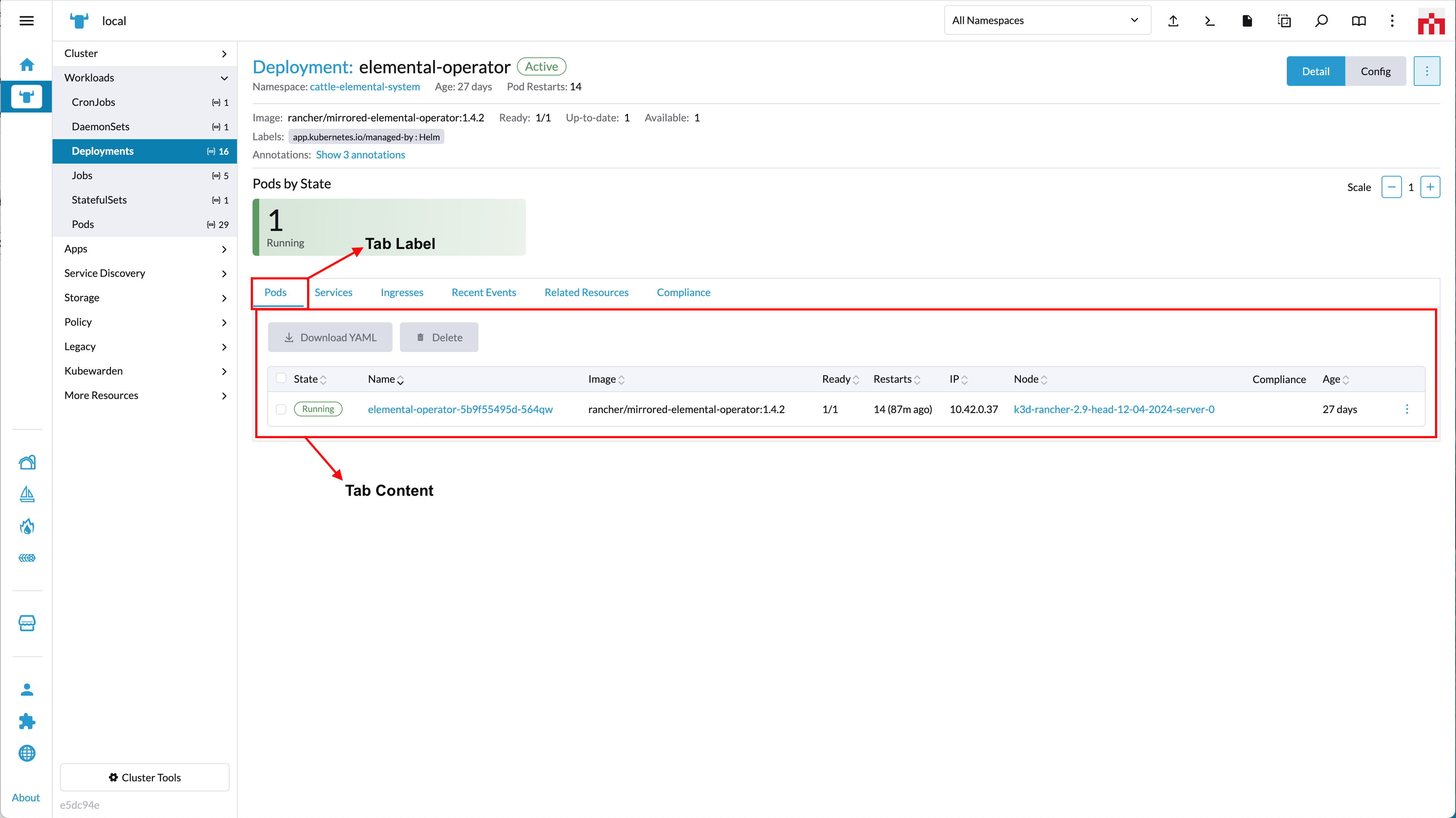
`options` config object. Admissable parameters for the `options` with `'TabLocation.RESOURCE_DETAIL'` are:
| Key | Type | Description |
|---|---|---|
|`name`| String | Query param name used in url when tab is active/clicked |
|`label`| String | Text for the tab label |
|`labelKey`| String | Same as "label" but allows for translation. Will superseed "label" |
|`weight`| Int | Defines the order on which the tab is displayed in relation to other tabs in the component |
|`showHeader`| Boolean | Whether the tab header is displayed or not |
|`tooltip`| String | Tooltip message (on tab header) |
|`component`| Function | Component to be rendered as content on the tab |
Usage example:
```ts
plugin.addTab(
TabLocation.RESOURCE_DETAIL,
{ resource: ['pod'] },
{
name: 'some-name',
labelKey: 'plugin-examples.tab-label',
label: 'some-label',
weight: -5,
showHeader: true,
tooltip: 'this is a tooltip message',
component: () => import('./MyTabComponent.vue')
}
);
```