UI Components
View
Horizontal navbar main color
Horizontal navbar alternative color
Horizontal navbar
Examples for diffetent types of navigation based on text-only, icon-only and text + icon
Submenus
Examples for several levels in the top-level navigation (Alarm Insight > Alarm Analysis > Frequent Alarms)
Combined navbar
Example application where black top navigation and gray side navigation are used
Pagination
Menus
Dropdowns
Tabs
Breadcumbs
Empty forms look like this
Subtabs
Tree table
Tree trable
| Column A | Column B | Column C | Column D | |
|---|---|---|---|---|
| Node | 1 | c | info | |
| Node | 1-1 | c | info | |
| Node | 1-2 | c | info | |
| Node | 1-2-1 | c | info | |
| Node | 2 | c | info |
Selections
Checkboxes
Use checkboxes for multiple options
Example for indeterminate state
Radio buttons
Use radios for only one options
Sliders
Sliders allow you to select/visualize values within ranges
Toggles
Toggles are checkbox-like components that are used to select between two states
Tags
Buttons
Buttons light background
Normal
Hover
Active
Disabled
Buttons dark background
Normal
Hover
Active
Disabled
Buttons branding
Normal
Hover
Active
Disabled
Buttons branding alt
Normal
Hover
Active
Disabled
Toggle buttons
Toggle buttons
Toggle buttons enhanced
Multi-select
Multi-select enhanced
Toggle buttons
Toggle buttons
Toggle buttons enhanced
Multi-select
Multi-select enhanced
Dropdown light background
Dropdown button
Dropdown button disabled
Dropdown button inverted
Select
Dropdown dark background
Dropdown button
Dropdown button disabled
Dropdown button inverted
Select
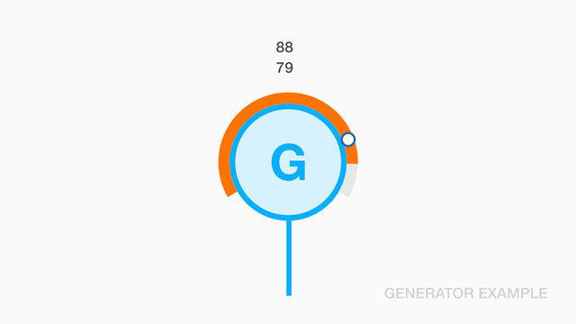
Icon/button generator
Topbar generator
Forms
Form text area
Empty forms look like this
Form with required fields
Alternatives for visualizing required fields
Form with icon
Empty forms look like this
Form with loader spinner
Empty forms look like this
Form search
Empty forms look like this
Form with notes light background
Empty forms look like this
Form with notes dark background
Empty forms look like this
Pickers
Date pickers
Date pickers are difficult to find
Calendar
Date pickers are difficult to find
Progress and activity indicators
Progress / Loading
Progress indicators are something nice to have
Spinners
Spinners are not always required
Animations
Simple animations using FontAwesome and some CSS3.
Status info
See how cool button we can have with embedded status info
Notifications
Notifications on black topbar
Notifications on gray topbar
Fancy error messages
Alerts
Alerts are awesome
Fancy alerts
Fancy alerts on the top right of the screen
High contrast
High contrast with buttons
Discrete
Discrete with buttons
Pop-ups / Dialogs
See how cool modal we developed
Tooltips
Remember to use tooltips for quick help to users
Popovers
Popovers are nice but tricky elements to implement
Gauges
Animated gauge
Graphs
Linechart with finder
Connectivity using visual data mining
Scatterplots
Scatterplots as used by Mr. Hans "Gapminder" Rosling
Barchart
Barcharts are a nice way to present KPIs