# custom-bootstrap-card

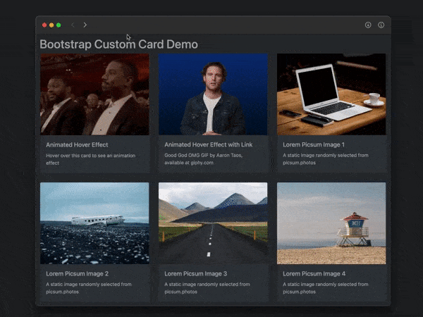
A responsive custom Bootstrap 4 card component with hover animation effects
---

![custom card screenshot](https://cdn.jsdelivr.net/npm/custom-bootstrap-card/docs/bootstrap-custom-card-dynamic-600x450.gif)

## Features

* responds to window width and height
* responds to dark/light preference (optional)
* animates upon hover (zoom in with box shadow)
* animates upon touch on non-hover devices (iPhone, etc.)
* displays alternate image upon hover/touch (optional)
* displays Open link button upon hover/touch (optional)

## Usage

In HTML head:
```html
<!-- link Bootstrap CSS [REQUIRED] -->
<link rel="stylesheet"
href="https://cdn.jsdelivr.net/npm/bootstrap@4.6.0/dist/css/bootstrap.css">

<!-- link for dark mode support [OPTIONAL] -->
<link rel="stylesheet"
href="https://cdn.jsdelivr.net/npm/bootsdark@latest/dist/bootsdark.min.css">
```
In HTML body:
```html
<div id="exampleCards" class="row tms-cards">
      <!-- cards will go here -->
</div>

<script type="module">
  import {addCard} from
    'https://cdn.jsdelivr.net/npm/custom-bootstrap-card/src/bootstrap-card.js';

  addCard({
    containerId: "exampleCards",
    imageUrl: "https://picsum.photos/400/300",
    imageAlt: "sample picsum image",
    title: "Random Image Number",
    text: "A random image from picsum.photos",
    href: "https://example.com",
    imgHoverURL: "https://via.placeholder.com/400x300?text=hover+image"
  });
</script>
```
## Custom Styles

Override default styling by placing:
```html
<style id="tms-card-style">
    ...
</style>
```
in the document's `<head>` section.

