     
[Vite demo](https://convex-feedback-vite.vercel.app/) • [Expo demo](https://convex-feedback-expo.vercel.app/) • [React Native demo](https://convex-feedback-native.vercel.app/)
# convex-feedback-ui
| Expo | React Native |
| --------------------------------------------------------------------------------------------------- | ------------------------------------------------------------------------------------------------------------- |
| 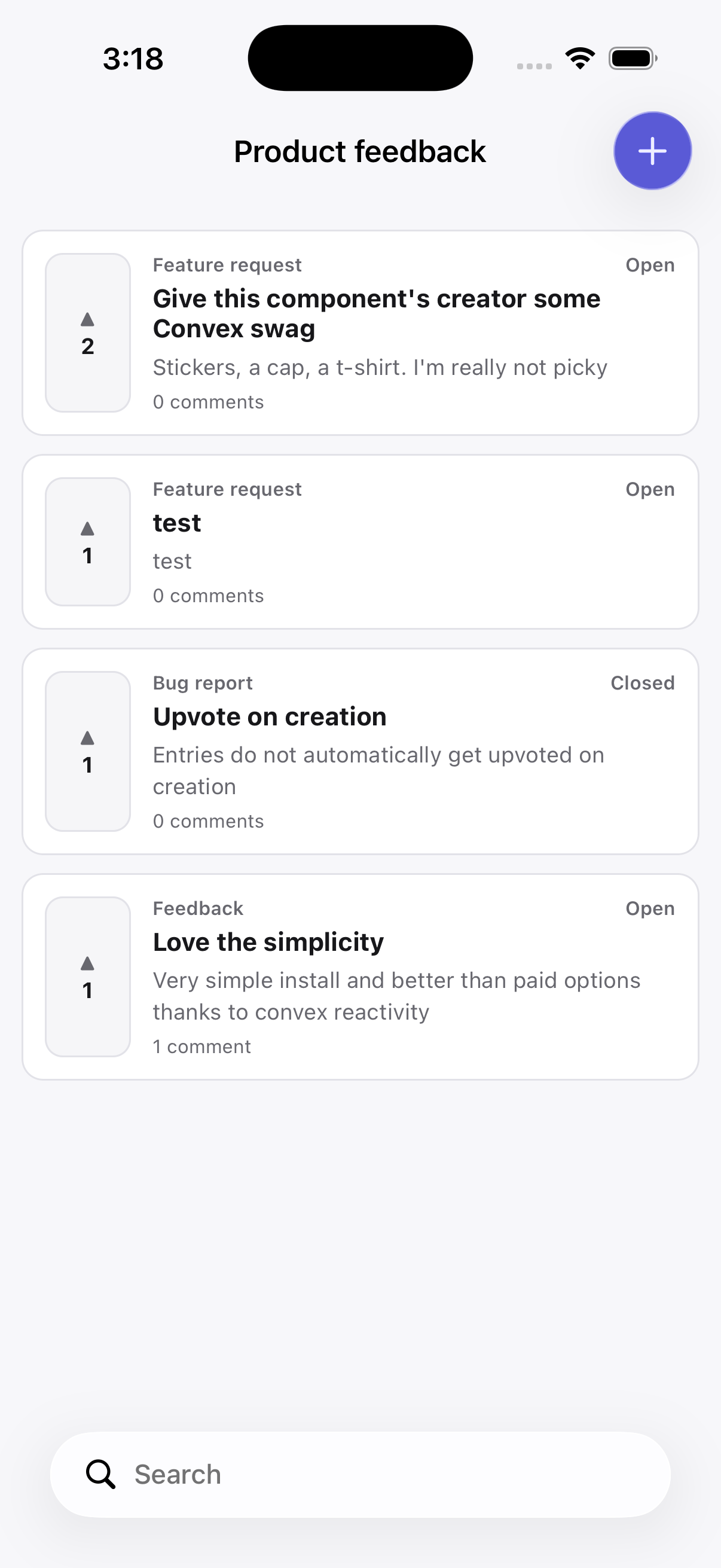 | 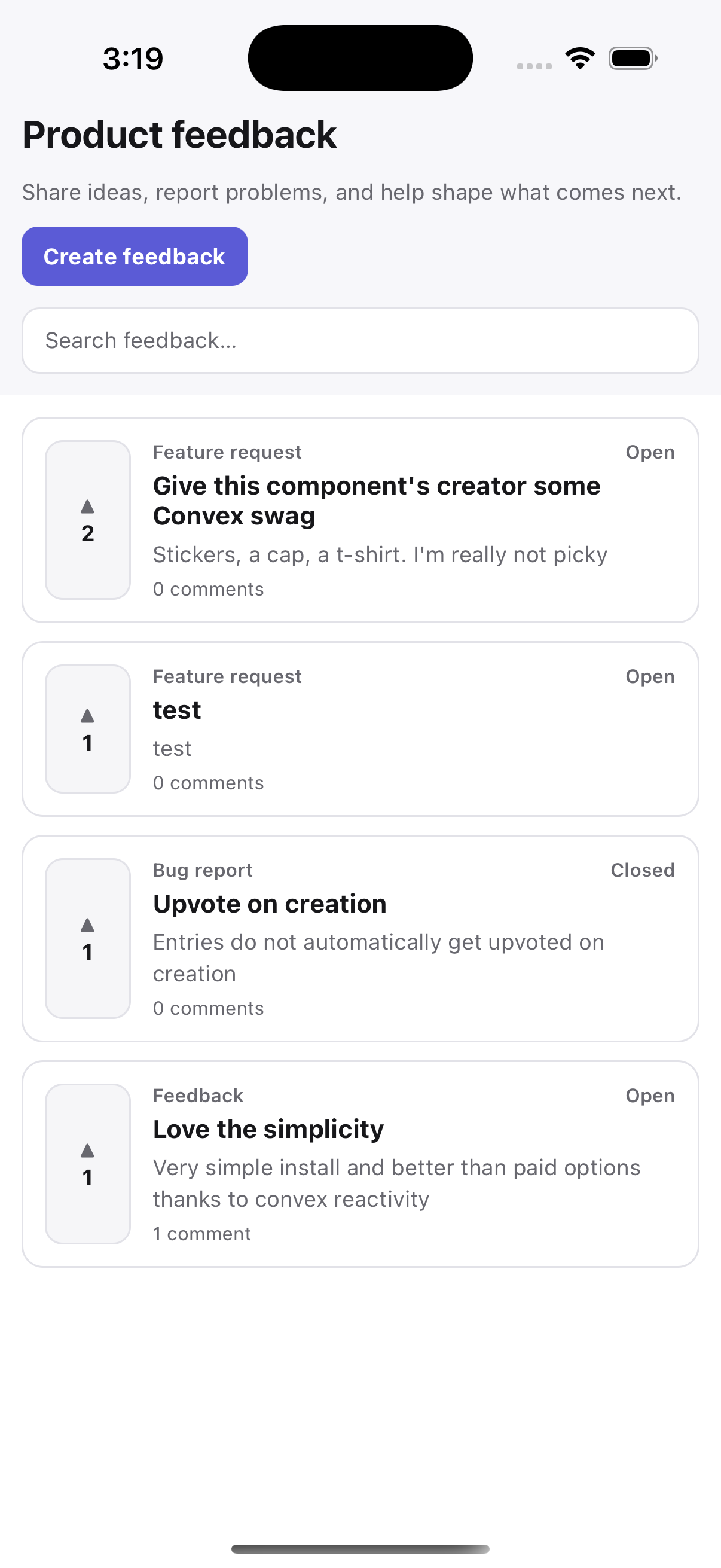 |
Optional React DOM, React Native, and Expo Router UI for `convex-feedback`.
This package provides the public feedback and roadmap experience. Internal priority and roadmap management live in the forkable [Clerk admin panel](../../apps/admin/withClerk/README.md), which uses the headless hooks directly.
The package is intentionally layered:
```text
convex-feedback hooks
↓
compound UI primitives
↓
prebuilt FeedbackScreen
↓
optional Expo Router integration
```
Use the prebuilt screen for a complete feedback board, compose primitives for custom layouts, or ignore this package entirely and use the headless `convex-feedback` hooks directly.
Authentication, host business rules, and lifecycle callbacks stay in the
headless host wrapper. The UI package receives the generated hooks; see the
[`convex-feedback` lifecycle callback reference](../convex-feedback/README.md#lifecycle-callbacks)
for callback configuration and transaction behavior.
## React DOM
```tsx
import { FeedbackScreen } from "convex-feedback-ui";
import { feedbackHooks } from "./hooks/feedbackHooks";
import "convex-feedback-ui/styles.css";
;
```
Use `RoadmapScreen` for the public roadmap and its attached feedback entries:
```tsx
import { RoadmapScreen } from "convex-feedback-ui";
navigate(`/feedback/${entryId}`)}
onUnauthenticated={() => openSignIn()}
/>;
```
Roadmap browsing and attached-entry reads work without authentication. The
`onUnauthenticated` callback is used for create, vote, like, and comment
actions in the prebuilt screens; the host decides how to present sign-in.
The default stylesheet:
- has no Tailwind dependency;
- uses namespaced `cf-*` classes;
- uses low-specificity `:where(...)` selectors;
- uses CSS custom properties for theme values;
- allows normal host CSS, Tailwind, or CSS-module classes to override defaults;
- can be omitted entirely if you want to provide your own styling.
On entry detail, the prebuilt feedback screens show an Edit action only when the server identifies the current viewer as the entry author. The form edits the title and details; entry type remains admin-controlled. The backend rechecks authorship when the update mutation runs, so hiding the action is
only a presentation convenience and is not the authorization boundary. Stack-enabled Expo screens place this action in the native right toolbar; non-stacked native screens keep it alongside the entry details.
In stack mode, opening the action pushes a native form-sheet editor on iOS (and a modal stack screen on Android) with cancel and save controls in the top toolbar. Edit-screen copy is configurable through `messages.form`.
Key colors can be overridden directly:
```tsx
```
Or provide theme tokens through `FeedbackProvider`.
## React Native
Use the `/native` entry point for React Native projects that do not use Expo Router, or whenever you want the standard React Native implementation without native stack integration:
```tsx
import { FeedbackScreen } from "convex-feedback-ui/native";
;
```
The native `FeedbackScreen` includes the feedback UI using React Native components.
The native roadmap exports also include the reusable `RoadmapBoard` and `RoadmapScreenContent`. Their `topInset` defaults to `0`, while `bottomInset` defaults to the bottom safe-area inset. These props describe space occupied by host navigation chrome: an explicit `bottomInset` is the total space, including the safe area, and replaces the default even when set to `0`. NativeTabs normally bounds content above its tab bar, so it should be left unset there.
## Expo Router
Expo Router projects can use the `/expo` entry point:
```tsx
import { FeedbackScreen } from "convex-feedback-ui/expo";
;
```
The Expo version uses the same native feedback UI, but adds optional Expo Router stack integration.
By default, `useStack` is enabled:
```tsx
```
When enabled, the prebuilt screen can integrate with the current Expo Router stack, including native stack configuration, toolbar actions, back behavior, and native search UI.
> [!WARNING]
> If the filter toolbar button is intermittently broken, especially on iOS 26+, pass `Host` from `@expo/ui/swift-ui` to `BottomToolbarWrapper`:
>
> ```tsx
> import { Host } from "@expo/ui/swift-ui";
>
> ;
> ```
>
> The same `BottomToolbarWrapper={Host}` prop is available on `FeedbackStackLayout` for routed Expo navigation.
Stack options can be customized through `StackOptions`:
```tsx
```
iOS toolbar actions keep their package-provided SF Symbols. Android accepts
host-provided image sources; when an image is omitted, the action falls back to
its text label:
```tsx
```
### Roadmap stack insets
The stack-enabled Expo `RoadmapScreen` and routed `RoadmapStackLayout` use a transparent native header by default. The board automatically reserves the measured native-stack header height; if that context is unavailable, the fallback is 44 points on iOS or 56 points on Android, plus the top safe-area inset. If `headerTransparent` is `false`, the native stack already places the board below the header and the automatic top inset is `0`. Set `topInset` to override that space, including with `0`.
The routed and stack-enabled roadmap also renders its native bottom search toolbar on iOS 26 and newer and includes its standard 44-point height in the default `bottomInset`. Android and older iOS versions do not receive an empty toolbar. If your host draws a toolbar or tab bar over the screen, pass `bottomInset` as the total occupied height, including the safe area; an explicit value replaces the automatic default, including `0`. NativeTabs content is already bounded above the tab bar, so omit `bottomInset` there.
### Using the Expo screen without stack integration
Expo projects do not have to use the native stack integration.
Set `useStack={false}` to use the standard native feedback layout instead:
```tsx
```
When `useStack={false}`, the Expo convenience screen behaves like the regular React Native screen.
`StackOptions` is only available when stack integration is enabled.
### Routed Expo navigation
For real stacked routes, use the additive routed API. Expo Router discovers
routes from the application's `app` directory, so the host application supplies
small route files while the package supplies their layouts and screens:
```text
app/feedback/
├── _layout.tsx
├── index.tsx
├── [entryId]/
│ ├── index.tsx
│ └── edit.tsx
└── new/
├── _layout.tsx
└── index.tsx
```
The layout owns the feedback providers and keeps them mounted across the board,
entry-detail, and create-entry routes:
```tsx
// app/feedback/_layout.tsx
import {
FeedbackStackLayout,
feedbackStackSettings,
} from "convex-feedback-ui/expo";
import { feedbackHooks } from "../../feedback";
export const unstable_settings = feedbackStackSettings;
export default function Layout() {
return (
);
}
```
Each page file only needs to re-export its package screen:
```tsx
// app/feedback/index.tsx
export { FeedbackBoardScreen as default } from "convex-feedback-ui/expo";
// app/feedback/[entryId]/index.tsx
export { FeedbackEntryScreen as default } from "convex-feedback-ui/expo";
// app/feedback/[entryId]/edit.tsx
export { FeedbackEditScreen as default } from "convex-feedback-ui/expo";
// app/feedback/new/_layout.tsx
import {
FeedbackCreateStackLayout,
feedbackCreateStackSettings,
} from "convex-feedback-ui/expo";
export const unstable_settings = feedbackCreateStackSettings;
export default FeedbackCreateStackLayout;
// app/feedback/new/index.tsx
export { CreateFeedbackScreen as default } from "convex-feedback-ui/expo";
```
`FeedbackStackLayout` uses these route names by default:
```ts
{
board: "index",
entry: "[entryId]/index",
edit: "[entryId]/edit",
create: "new",
}
```
Names can be partially overridden when the files use a different structure.
```tsx
const routes = {
entry: "entry/[entryId]",
edit: "entry/[entryId]/edit",
create: "create",
};
export const unstable_settings = createFeedbackStackSettings(routes);
export default function Layout() {
return ;
}
```
The board's search and loaded list remain mounted when another screen is pushed, so returning restores the prior query and scroll position. The create route is a modal navigator by default. Duplicate suggestions push the main entry-detail route, with the create modal remaining available behind it. After creation, the complete modal is dismissed and the created entry replaces it on the board stack.
See `packages/example-expo-routed` for a complete application.
### Routed public roadmap
The public roadmap has a matching routed Expo API. Create a board and item
page under your app's route directory:
```text
app/roadmap/
├── _layout.tsx
├── index.tsx
└── [roadmapId].tsx
```
```tsx
// app/roadmap/_layout.tsx
import {
RoadmapStackLayout,
roadmapStackSettings,
} from "convex-feedback-ui/expo";
import { feedbackHooks } from "../../feedback";
export const unstable_settings = roadmapStackSettings;
export default function Layout() {
return ;
}
// app/roadmap/index.tsx
export { RoadmapBoardScreen as default } from "convex-feedback-ui/expo";
// app/roadmap/[roadmapId].tsx
export { RoadmapItemScreen as default } from "convex-feedback-ui/expo";
```
Use `onEntryOpen` on `RoadmapStackLayout` when attached feedback should push
the host application's routed feedback detail page. The roadmap item page
uses the existing entry-card and entry-detail implementations when no host
entry route is supplied. The board title and search field are rendered by the
Expo Router Stack, and `RoadmapBoard` is exported from the native entry points
for sharing the admin-style stage layout with custom cards.
On this routed stack, `topInset` and `bottomInset` can be supplied on
`RoadmapStackLayout` to replace the automatic header and bottom-toolbar
spacing.
## Diagnostic metadata
Prebuilt screens can collect creation-time diagnostic metadata for feedback entries. Collection is disabled by default and never applies to comments.
Enable the platform defaults for every entry kind:
```tsx
```
Or combine global defaults with per-kind behavior:
```tsx
({
kind,
accountTier: await getAccountTier(),
}),
},
},
}}
/>
```
- A kind-specific `standard` selection replaces the global selection. Global and kind-specific `additional` values are merged, with kind-specific keys taking precedence.
- A kind set to `false` disables all metadata collection for that kind.
- Collection happens only when the user finally submits.
- Unavailable or failed collection sources are omitted without blocking feedback submission.
- Web defaults include `platform`, `user agent`, `language`, `timezone`, `screen` and `viewport` dimensions, and `device pixel ratio`.
- React Native defaults include `platform`, `OS` version, available device model, screen `dimensions`, `pixel ratio`, and `font scale`.
- The Expo entry point additionally uses `expo-constants` for app `version`, `build` number, `application ID`, `Expo runtime version`, and execution `environment` when available.
- Generic React Native apps can provide app `version` and `build` values through `additional`.
Metadata is stored in separate `standard` and `additional` sections. It is omitted from list and search results and from non-admin reads. When the host's server-side actor resolver identifies an admin, `getEntry` includes the metadata and the entry detail screen shows a metadata viewer.
The platform collectors and `formatMetadataKey` helper are exported from their respective package entry points for custom integrations.
## Choosing an API
For a complete implementation with minimal setup:
```text
Web → convex-feedback-ui
React Native → convex-feedback-ui/native
Expo Router → convex-feedback-ui/expo
```
For custom layouts, use the primitives exposed by the relevant entry point instead of the prebuilt `FeedbackScreen`.
The prebuilt screens are convenience APIs. They are built from the same public primitives available to consumers, so applications are not required to adopt the prebuilt layout or navigation behavior.
You can also import the prebuilt screen components directly if you only want certain parts without reaching for primitives.
## Using primitives
Web and native expose the same conceptual compounds:
- `FeedbackBoard.*`
- `FeedbackEntry.*`
- `FeedbackForm.*`
- `Comment.*`
`FeedbackBoard.State` is the centered container used for loading and empty
states. The prebuilt screen accepts optional `loading` and `emptyState` nodes.
The loading node replaces the default loading indicator/copy; the empty-state
node renders above the default empty-state message. Native implementations use
`ActivityIndicator` by default when no loading node is supplied. `ChoiceChips` is the shared
single-selection primitive used for entry kinds and the web/native board's
Open/Closed filter.
Example:
```tsx
```
Containers accept arbitrary children, so layout remains controlled by the host application.
Native primitives can also be composed directly:
```tsx
{entries.map((entry) => (
{/* custom entry layout */}
))}
```
Using primitives directly is the recommended escape hatch when the prebuilt screen's navigation, search, layout, or presentation does not fit the host application.
## Replacing primitive implementations
Interactive leaf primitives accept typed render-function children. This is the escape hatch for shadcn, Radix-derived controls, Expo UI, or application-specific native controls.
```tsx
{({ active, count, toggle }) => (
)}
```
The render function replaces the entire visual implementation while preserving state and action wiring. Regular children replace only the default content where supported.
This pattern is intentionally used instead of relying on a DOM-specific `asChild` clone mechanism, so it works across React DOM and React Native.
## Localization and copy customization
The package has no i18n runtime dependency. All package-owned text is represented by `FeedbackMessages` and has English defaults.
Override only what you need:
```tsx
`${count} Antworten anzeigen`,
},
}}
/>
```
This is compatible with i18next, react-intl, Lingui, custom dictionaries, or plain static objects. Call your application's translation function when building the `messages` object.
The board status filter uses `messages.statuses.open` and
`messages.statuses.closed` for its two options, and
`messages.board.statusFilter` for its accessible label.
Precedence for copy is:
```text
local primitive label/children
→ FeedbackProvider / FeedbackScreen messages
→ built-in English messages
```
User-generated entry and comment content is never translated, normalized for display, or rewritten.
## Lazy replies
The prebuilt screens preserve the backend lazy-loading model. Top-level comments mount one paginated query. A `CommentBranch` only mounts its `ReplyList` after the user expands that comment. Each reply with children repeats the same pattern.
This means deep threads do not create queries until the relevant branch is opened.
## Sorting
Pass `commentSort="top" | "newest" | "oldest"` to the prebuilt screen for globally correct server ordering.
For custom presentation ordering, provide:
```tsx
transformComments={(comments) =>
[...comments].sort(myComparator)
}
```
That transform only affects comments already loaded at the current direct-child level. It is deliberately not described as a globally paginated server sort.
## Localization invariant
When adding visible package copy:
1. add it to `FeedbackMessages`;
2. add an English default;
3. consume it through the UI context;
4. update localization contract tests if the shape changes.
Do not hardcode new visible sentences inside a primitive or prebuilt screen.
## Monorepo development
From the repository root, run:
```bash
npm install
npm run codegen
npm run test:all
```