---
id: overlay-provider
sidebar_position: 1
title: OverlayProvider
---
import Tabs from '@theme/Tabs';
import TabItem from '@theme/TabItem';
import AttachmentPickerBottomSheetHandleHeight from '../common-content/core-components/overlay-provider/props/attachment_picker_bottom_sheet_handle_height.mdx';
import AttachmentPickerBottomSheetHeight from '../common-content/core-components/overlay-provider/props/attachment_picker_bottom_sheet_height.mdx';
import AttachmentPickerErrorButtonText from '../common-content/core-components/overlay-provider/props/attachment_picker_error_button_text.mdx';
import AttachmentPickerErrorText from '../common-content/core-components/overlay-provider/props/attachment_picker_error_text.mdx';
import AttachmentSelectionBarHeight from '../common-content/core-components/overlay-provider/props/attachment_selection_bar_height.mdx';
import I18nInstance from '../common-content/core-components/overlay-provider/props/i18n_instance.mdx';
import ImageGalleryCustomComponents from '../common-content/core-components/overlay-provider/props/image_gallery_custom_components.mdx';
import ImageGalleryGridHandleHeight from '../common-content/core-components/overlay-provider/props/image_gallery_grid_handle_height.mdx';
import ImageGalleryGridSnapPoints from '../common-content/core-components/overlay-provider/props/image_gallery_grid_snap_points.mdx';
import NumberOfAttachmentImagesToLoadPerCall from '../common-content/core-components/overlay-provider/props/number_of_attachment_images_to_load_per_call.mdx';
import NumberOfAttachmentPickerImageColumns from '../common-content/core-components/overlay-provider/props/number_of_attachment_picker_image_columns.mdx';
import NumberOfImageGalleryGridColumns from '../common-content/core-components/overlay-provider/props/number_of_image_gallery_grid_columns.mdx';
import Value from '../common-content/core-components/overlay-provider/props/value.mdx';
import AttachmentPickerBottomSheetHandle from '../common-content/core-components/overlay-provider/props/attachment_picker_bottom_sheet_handle.mdx';
import AttachmentPickerError from '../common-content/core-components/overlay-provider/props/attachment_picker_error.mdx';
import AttachmentPickerErrorImage from '../common-content/core-components/overlay-provider/props/attachment_picker_error_image.mdx';
import CameraSelectorIcon from '../common-content/core-components/overlay-provider/props/camera_selector_icon.mdx';
import FileSelectorIcon from '../common-content/core-components/overlay-provider/props/file_selector_icon.mdx';
import ImageOverlaySelectedComponent from '../common-content/core-components/overlay-provider/props/image_overlay_selected_component.mdx';
import ImageSelectorIcon from '../common-content/core-components/overlay-provider/props/image_selector_icon.mdx';
import OverlayReactionList from '../common-content/core-components/overlay-provider/props/overlay_reaction_list.mdx';
import OverlayReactions from '../common-content/core-components/overlay-provider/props/overlay_reactions.mdx';
The `OverlayProvider` is the top level Stream Chat for React Native component and wraps all other components provided by the SDK.
The `OverlayProvider` allows users to interact with messages on long press above the underlying views, use the full screen image viewer, and use the `AttachmentPicker` as a keyboard-esk view.
## Basic Usage
The `OverlayProvider` should wrap all other Stream Chat for React Native components and in most cases the majority of your application.
:::note
For detailed implementation instructions of the `OverlayProvider` with navigation please refer to the [Stream Chat with Navigation](../basics/stream_chat_with_navigation.mdx).
:::
```tsx {7,11}
import { StreamChat } from 'stream-chat';
import { ChannelList, Chat, OverlayProvider } from 'stream-chat-react-native';
const client = StreamChat.getInstance('api_key');
export const App = () =>
;
```
## Context Providers
`OverlayProvider` contains providers for the `AttachmentPickerContext`, `ImageGalleryContext`, `MessageOverlayContext`, `OverlayContext`, `ThemeContext`, and `TranslationContext`.
These can be accessed using the corresponding hooks.
| Context | Hook |
| - | - |
| `AttachmentPickerContext` | `useAttachmentPickerContext` |
| `ImageGalleryContext` | `useImageGalleryContext` |
| `MessageOverlayContext` | `useMessageOverlayContext` |
| `OverlayContext` | `useOverlayContext` |
| `ThemeContext` | `useTheme` |
| `TranslationContext` | `useTranslationContext` |
## UI Customizations
You can override any of the components rendered in overlay using props on `OverlayProvider` or `Channel`.
Custom components provided to `Channel` are hoisted to the overlay for use in displaying messages within the `OverlayProvider`.
Customizing these components requires no interaction with the `OverlayProvider`.
Components only rendered within the overlay can be overridden and modified via props on the `OverlayProvider`.
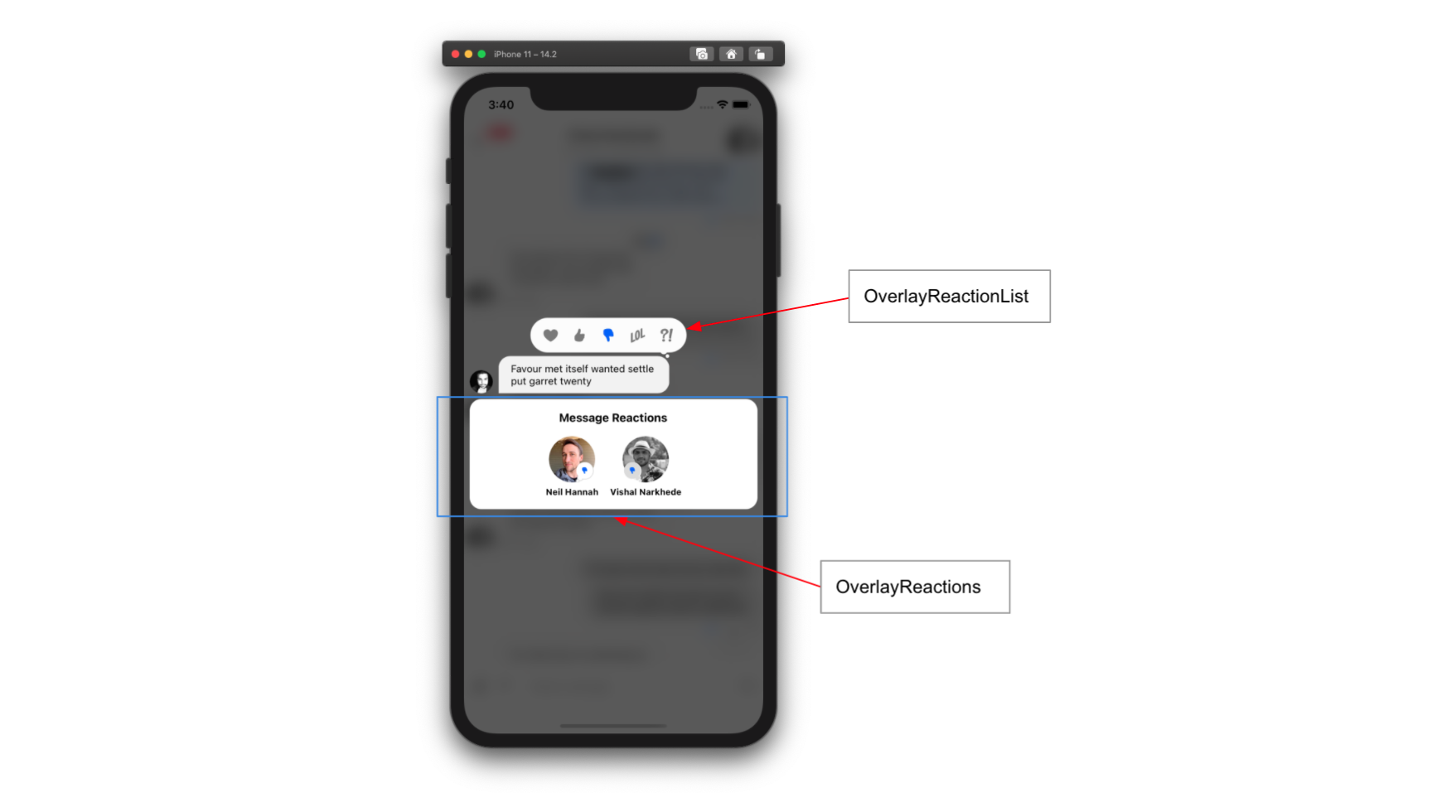
Removing the `OverlayReactionList` can be done easily by replacing it with a function that returns null.
```tsx
null}>
```
## Props
The `OverlayProvider` can be used with no props provided but there are a plethora of props for customizing the components in the overlay.
### attachmentPickerBottomSheetHandleHeight
### attachmentPickerBottomSheetHeight
### attachmentPickerErrorButtonText
### attachmentPickerErrorText
### attachmentSelectionBarHeight
### bottomInset
Height of items located below the `MessageInput` when present.
This inset determines the underlying shift to the `MessageList` when it is opened.
:::tip
This can also be set via the `setBottomInset` function provided by the `useAttachmentPickerContext` hook.
:::
| Type | Default |
| - | - |
| number | 0 |
### i18nInstance
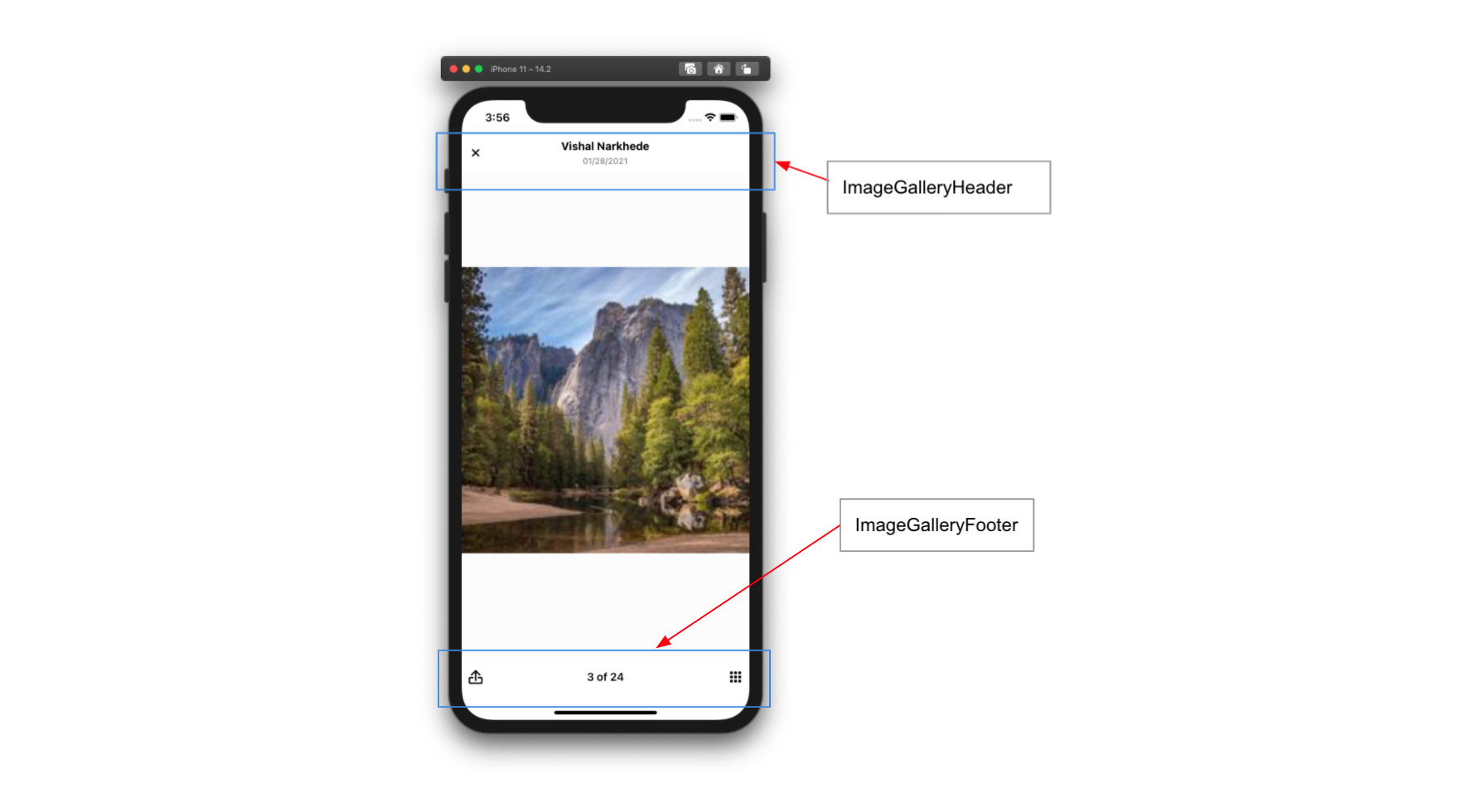
### imageGalleryCustomComponents
### imageGalleryGridHandleHeight
### imageGalleryGridSnapPoints
### numberOfAttachmentImagesToLoadPerCall
### numberOfAttachmentPickerImageColumns
### numberOfImageGalleryGridColumns
### topInset
Distance from the top of the screen the attachment picker should open to when expanded.
This is often set to the header height.
:::tip
This can also be set via the `setTopInset` function provided by the `useAttachmentPickerContext` hook.
:::
| Type | Default |
| - | - |
| number | 0 |
### value
### AttachmentPickerBottomSheetHandle
### AttachmentPickerError
### AttachmentPickerErrorImage
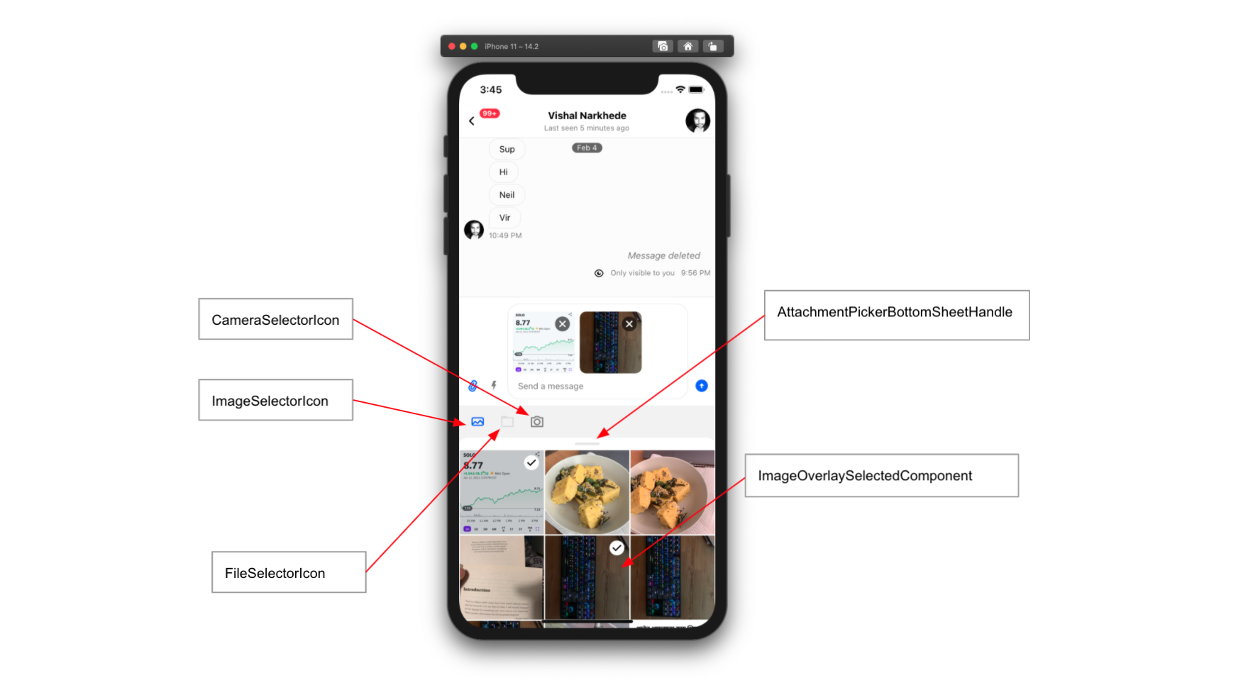
### CameraSelectorIcon
### FileSelectorIcon
### ImageOverlaySelectedComponent
### ImageSelectorIcon
### OverlayReactionList
### OverlayReactions