![GitHub](https://img.shields.io/github/license/getmindspun/bootstrap-avatar?label=License)

# Bootstrap Avatar

A collection of fixed and responsive CSS for styling avatars.

## Demo
https://getmindspun.github.io/bootstrap-avatar

## Installation

### jsDelivr CDN
```html
<link href="https://cdn.jsdelivr.net/npm/bootstrap-avatar@latest/dist/avatar.min.css" rel="stylesheet">
```
The CDN version can be used without Bootstrap if desired.

### Bootstrap build
The package contains a file named `_avatar.scss` which may be incorporated into the
standard Bootstrap build tools.

Install via npm:
```html
npm install bootstrap-avatar
```

Add the following line (or similar) to your top-level scss file:
```scss
@import "node_modules/bootstrap-avatar/scss/avatar";
```

This package assumes the default Bootstrap breakpoints i.e. $grid-breakpoints in the SCSS.

## Examples

### Avatar with Bootstrap icons

![Avatar circle icon](https://static.ghoststead.com/projects/bootstrap-avatar/avatar-circle-icon.png)

```html
<img class="avatar avatar-16 bg-light rounded-circle text-white p-1"
     src="https://raw.githubusercontent.com/twbs/icons/main/icons/person.svg">
<img class="avatar avatar-24 bg-light rounded-circle text-white p-1"
     src="https://raw.githubusercontent.com/twbs/icons/main/icons/person-fill.svg">
<img class="avatar avatar-32 bg-light rounded-circle text-white p-2"
     src="https://raw.githubusercontent.com/twbs/icons/main/icons/person-fill.svg">
<img class="avatar avatar-48 bg-light rounded-circle text-white p-2"
     src="https://raw.githubusercontent.com/twbs/icons/main/icons/person-fill.svg">
<img class="avatar avatar-64 bg-light rounded-circle text-white p-2"
     src="https://raw.githubusercontent.com/twbs/icons/main/icons/person-fill.svg">
<img class="avatar avatar-96 bg-light rounded-circle text-white p-2"
     src="https://raw.githubusercontent.com/twbs/icons/main/icons/person-fill.svg">
<img class="avatar avatar-128 bg-light rounded-circle text-white p-2"
     src="https://raw.githubusercontent.com/twbs/icons/main/icons/person-fill.svg">
```

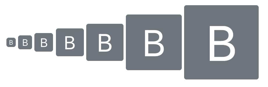
### Avatar with rounded text
### Avatar with Bootstrap icons
![Avatar circle icon](https://static.ghoststead.com/projects/bootstrap-avatar/avatar-rounded-text.png)

```html
<span class="avatar avatar-16 bg-secondary text-white rounded-2">b</span>
<span class="avatar avatar-24 bg-secondary text-white rounded-2">b</span>
<span class="avatar avatar-32 bg-secondary text-white rounded-2">b</span>
<span class="avatar avatar-48 bg-secondary text-white rounded-2">b</span>
<span class="avatar avatar-64 bg-secondary text-white rounded-2">b</span>
<span class="avatar avatar-96 bg-secondary text-white rounded-2">b</span>
<span class="avatar avatar-128 bg-secondary text-white rounded-2">b</span>
```

### Responsive avatars
You can create avatars that resize basic on the viewport width:
```html
<svg xmlns="http://www.w3.org/2000/svg" fill="currentColor" class="avatar avatar-16 avatar-md-24 avatar-lg-32 avatar-xl-64 avatar-xxl-128 text-primary" viewBox="0 0 16 16">
    <path d="M13.468 12.37C12.758 11.226 11.195 10 8 10s-4.757 1.225-5.468 2.37A6.987 6.987 0 0 0 8 15a6.987 6.987 0 0 0 5.468-2.63z"></path>
    <path fill-rule="evenodd" d="M8 9a3 3 0 1 0 0-6 3 3 0 0 0 0 6z"></path>
    <path fill-rule="evenodd" d="M8 1a7 7 0 1 0 0 14A7 7 0 0 0 8 1zM0 8a8 8 0 1 1 16 0A8 8 0 0 1 0 8z"></path>
</svg>
```

This example uses the Bootstrap [person-circle](https://icons.getbootstrap.com/icons/person-circle/) icon as an inline SVG then
adds the responsive classes `-md-24`, `-lg-32` etc so that the image grows with screen size.

These examples and others can be found on the [demo page](https://getmindspun.github.io/bootstrap-avatar).

## Development
### Setup
* Clone the repo
* Run `npm i`

### Build
The CSS files are generated from `style.css` via:
```shell
npm run build
```

### Serve
```shell
npm run serve
```

The above commands serves a local version of the [demo page](https://getmindspun.github.io/bootstrap-avatar).

---
This repository is maintained by [Mindspun](https://www.mindspun.com).
