# Responsive Vertical Navigation Tabs for Boostrap 4
[](https://app.travis-ci.com/tromgy/bootstrap-4-vertical-tabs)
## New! 💥
If you use Bootstrap 5, a new package is available for that: [bootstrap-5-vertical-tabs](https://www.npmjs.com/package/bootstrap-5-vertical-tabs)
A stylesheet that implements [vertically-oriented navigation tabs](https://b4vtabs.netlify.com) with Bootstrap 4.
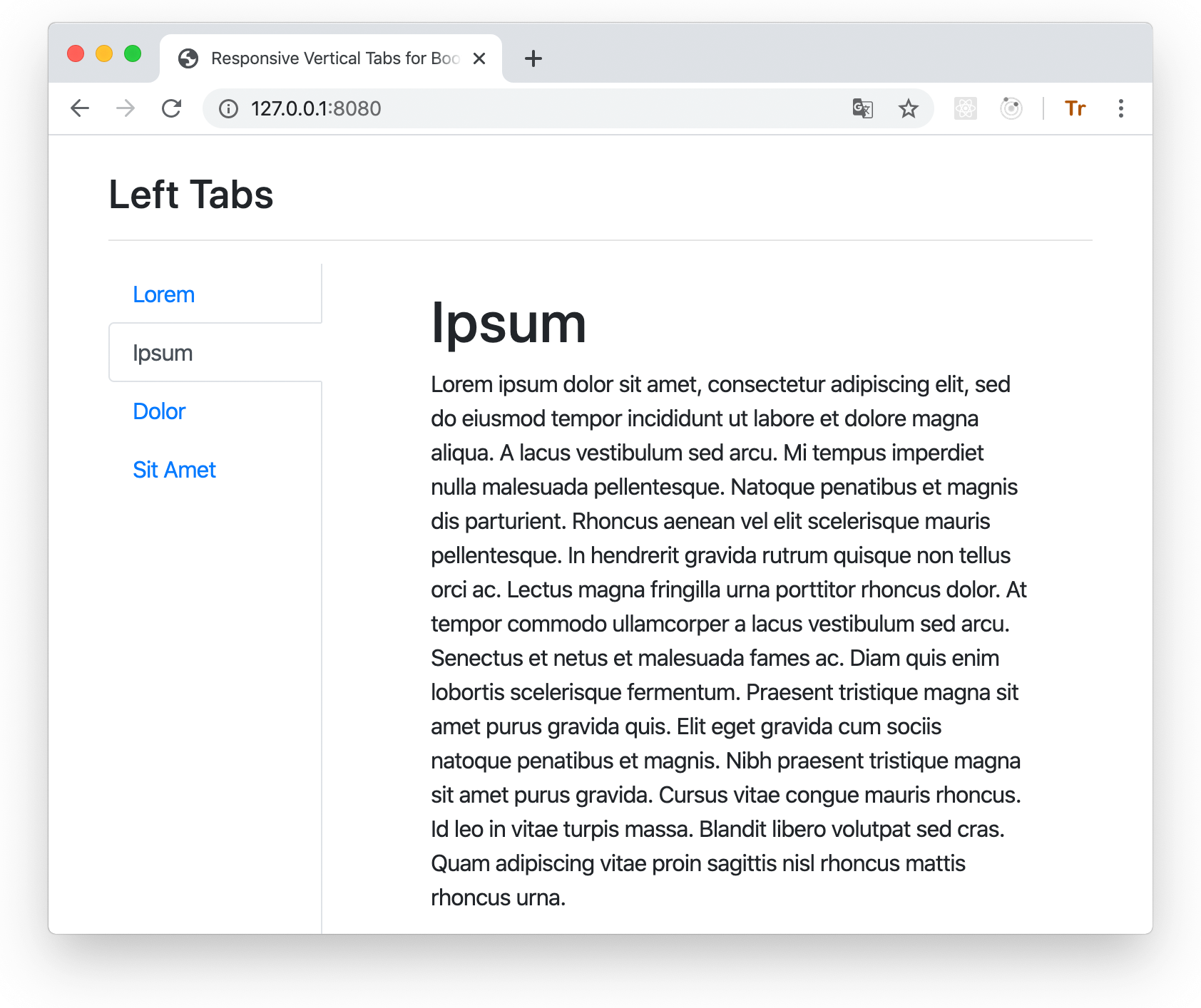
This package was inspired by the [original](https://github.com/dbtek/bootstrap-vertical-tabs) bootstrap vertical tabs.
However, that package does not work with Bootstrap 4.
## Installation
This package depends on Bootstrap 4, so it is assumed that you already have it installed and/or included
in your HTML.
You can use this package either by directly embedding its pre-built stylesheet in your HTML **after the boostrap styles** like this:
```HTML
```
or (recommended) install and build it yourself:
```bash
npm install bootstrap-4-vertical-tabs node-sass node-sass-import --save-dev
```
## Building
This assumes that you use SCSS stylesheets.
### 1. In your stylesheet either:
```SCSS
@import "bootstrap-4-vertical-tabs/scss/custom-variables";
@import "bootstrap-4-vertical-tabs/scss/responsive-vertical-tabs";
```
### or (recommended) define your own values for the custom variables, and then `@import` **responsive-vertical-tabs.scss**.
It requires the following variables to be defined:
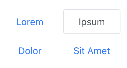
- `$vertical-tabs-min` - this value specifies the minimum view width for display of vertical tabs, below this width vertical
tabs turn into regular horizontal tabs:
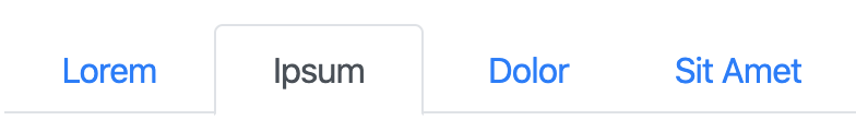
- `$horizontal-tabs-min` - if the view is narrower than this value, horizontal tabs turn into nav-pills-like buttons:
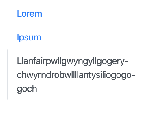
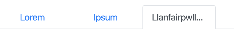
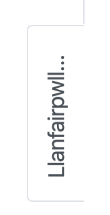
- `$fixed-tab-size` - specify this based on the expected text length to be displayed on the tabs.
A (long) text that (always) fits into a vertical tab, will get ellipsis-_ed_ when it doesn't fit into
horizontal or sideways tabs:
Vertical | Horizontal | Sideways
------------------------------------------------------------------------------|---------------------------------------------------------------------------------------|------------------------------------------------------------------------------------------------
||
changing the value of this variable can allow you to control if and how tab captions might be truncated. The recommended values are between 4 and 12 rem.
- `$left-tabs-text-align` and `$right-tabs-text-align` - these specify the text alignment for vertical left/right tabs.
When tabs are displayed as horizontal or nav-pills, the text is always center-aligned.
Check the **custom-variables.scss** stylesheet for the default values.
### 2. Compile with node-sass
```bash
npx node-sass --importer node_modules/node-sass-import .scss
 - `$horizontal-tabs-min` - if the view is narrower than this value, horizontal tabs turn into nav-pills-like buttons:
 - `$fixed-tab-size` - specify this based on the expected text length to be displayed on the tabs.
A (long) text that (always) fits into a vertical tab, will get ellipsis-_ed_ when it doesn't fit into
horizontal or sideways tabs:
Vertical | Horizontal | Sideways
------------------------------------------------------------------------------|---------------------------------------------------------------------------------------|------------------------------------------------------------------------------------------------
- `$fixed-tab-size` - specify this based on the expected text length to be displayed on the tabs.
A (long) text that (always) fits into a vertical tab, will get ellipsis-_ed_ when it doesn't fit into
horizontal or sideways tabs:
Vertical | Horizontal | Sideways
------------------------------------------------------------------------------|---------------------------------------------------------------------------------------|------------------------------------------------------------------------------------------------
 |
| |
| changing the value of this variable can allow you to control if and how tab captions might be truncated. The recommended values are between 4 and 12 rem.
- `$left-tabs-text-align` and `$right-tabs-text-align` - these specify the text alignment for vertical left/right tabs.
When tabs are displayed as horizontal or nav-pills, the text is always center-aligned.
Check the **custom-variables.scss** stylesheet for the default values.
### 2. Compile with node-sass
```bash
npx node-sass --importer node_modules/node-sass-import .scss
changing the value of this variable can allow you to control if and how tab captions might be truncated. The recommended values are between 4 and 12 rem.
- `$left-tabs-text-align` and `$right-tabs-text-align` - these specify the text alignment for vertical left/right tabs.
When tabs are displayed as horizontal or nav-pills, the text is always center-aligned.
Check the **custom-variables.scss** stylesheet for the default values.
### 2. Compile with node-sass
```bash
npx node-sass --importer node_modules/node-sass-import .scss