# wxc-cell
> Weex表单元素布局组件,可用于表单信息展示、输入
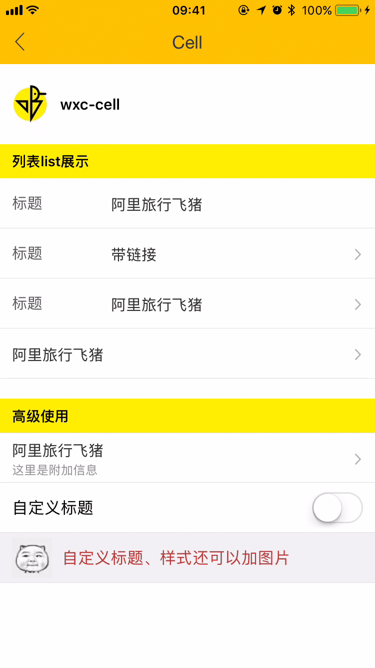
- 规则
- 单元格,可用作展示列表信息、链接或者表单等
- 可以设置label、标题、描述、跳转、箭头显示和点击事件回调功能
- 可以设置子元素传入
-----
## [Demo预览](https://h5.m.taobao.com/trip/wxc-cell/index.html?_wx_tpl=https%3A%2F%2Fh5.m.taobao.com%2Ftrip%2Fwxc-cell%2Fdemo%2Findex.native-min.js)
 ## 安装
```
npm install weex-ui --save
```
## 使用方法
```
## 安装
```
npm install weex-ui --save
```
## 使用方法
```
列表list展示
不配置label
配置附加信息
不显示箭头
自定义子元素
```
更详细代码可以参考组件demo代码
### 可配置参数
| 名称 | 类型 | 默认值 | 备注 |
|-------------|------------|--------|-----|
| label | `String` | '' | label(常用于描述cell) |
| title | `String` | '' | 标题 |
| desc | `String` | '' | 描述字段,展示说明信息 |
| link | `String` | '' | 跳转链接,无链接不跳转 |
| has-arrow | `Bool` | `false` | 是否显示箭头 |
| has-top-border | `Bool` | `false` | 是否有上边框 |
| has-bottom-border | `Bool` | `true` | 是否有下边框 |
| has-vertical-indent | `Bool` | `true` | 是否有垂直间距 |
| has-margin | `Bool` | `false` | cell之间是否有margin |
| spm | `String` | '' |cell链接带入spm|
### slot卡槽
1. ``:label卡槽,不传入使用文案
2. ``:title卡槽, 不传入使用文案
3. ``:有时候可以需要传入输入框、checkbox情况
详细可见demo代码
### 事件回调
```
//点击事件回调 `v-on:wxcCellDivClick="wxcCellDivClick"`
```
## 版本历史