# bpk-component-text-link
> Backpack React Native text link component.
## Default
| Day | Night |
| --- | --- |
| 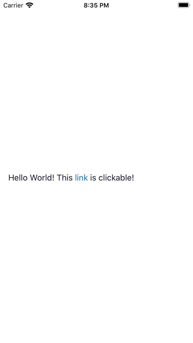 |
| 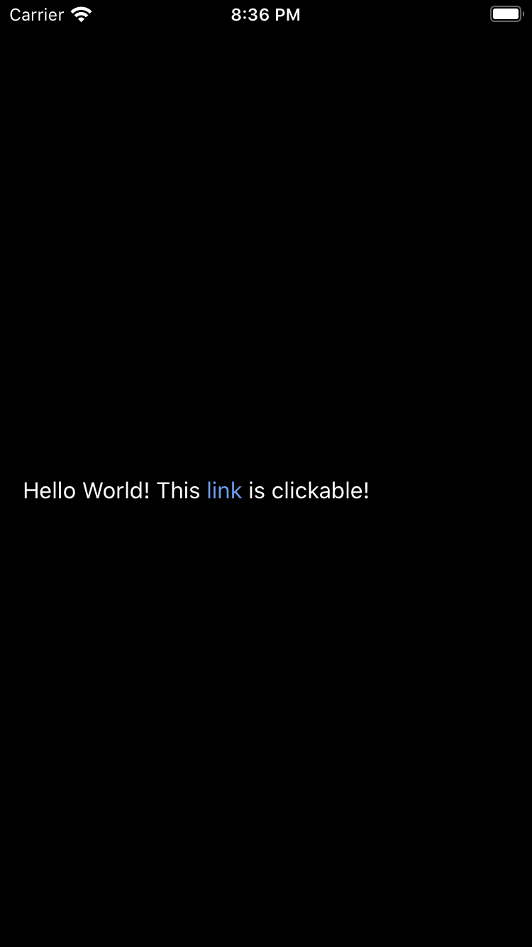 |
|
|
| 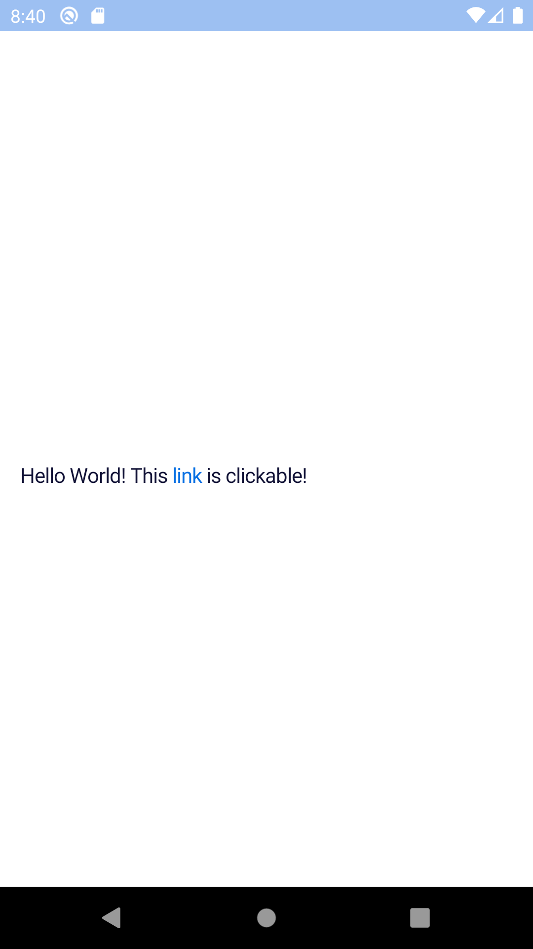 |
| 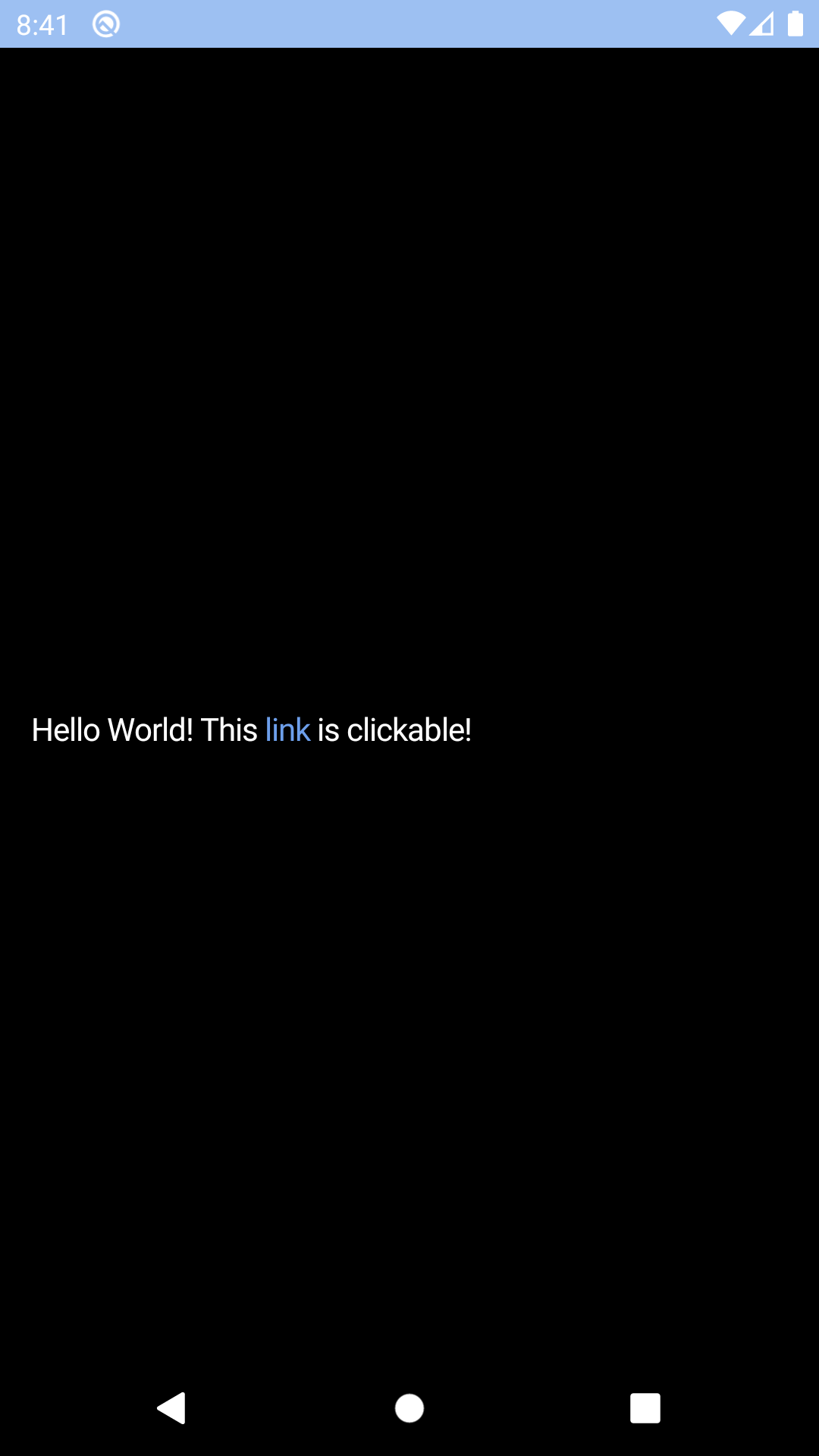 |
## Installation
Check the main [Readme](https://github.com/skyscanner/backpack-react-native#usage) for a complete installation guide.
## Usage
```js
import React from 'react';
import { StyleSheet, View } from 'react-native';
import { spacingBase } from '@skyscanner/bpk-foundations-react-native/tokens/base.react.native';
import BpkTextLink from 'backpack-react-native/bpk-component-text-link';
const styles = StyleSheet.create({
container: {
flex: 1,
justifyContent: 'center',
padding: spacingBase,
}
});
export default () => (
Check out the {}}>website
);
```
## Props
### BpkTextLink
This component creates a pressable instance of the `BpkText` component and accepts the same props as [`BpkText`](/components/text/?platform=native), alongside the following:
| Property | PropType | Required | Default Value |
| ------------------- | ------------------------- | -------- | ------------- |
| accessibilityLabel | string | true | null |
| children | node | true | - |
| onPress | func | true | - |
| theme | See [Theme Props](#theme-props) below | false | null |
## Theme Props
* `linkTextColor`
|
## Installation
Check the main [Readme](https://github.com/skyscanner/backpack-react-native#usage) for a complete installation guide.
## Usage
```js
import React from 'react';
import { StyleSheet, View } from 'react-native';
import { spacingBase } from '@skyscanner/bpk-foundations-react-native/tokens/base.react.native';
import BpkTextLink from 'backpack-react-native/bpk-component-text-link';
const styles = StyleSheet.create({
container: {
flex: 1,
justifyContent: 'center',
padding: spacingBase,
}
});
export default () => (
Check out the {}}>website
);
```
## Props
### BpkTextLink
This component creates a pressable instance of the `BpkText` component and accepts the same props as [`BpkText`](/components/text/?platform=native), alongside the following:
| Property | PropType | Required | Default Value |
| ------------------- | ------------------------- | -------- | ------------- |
| accessibilityLabel | string | true | null |
| children | node | true | - |
| onPress | func | true | - |
| theme | See [Theme Props](#theme-props) below | false | null |
## Theme Props
* `linkTextColor`