# bpk-component-calendar
> Backpack React Native calendar component.
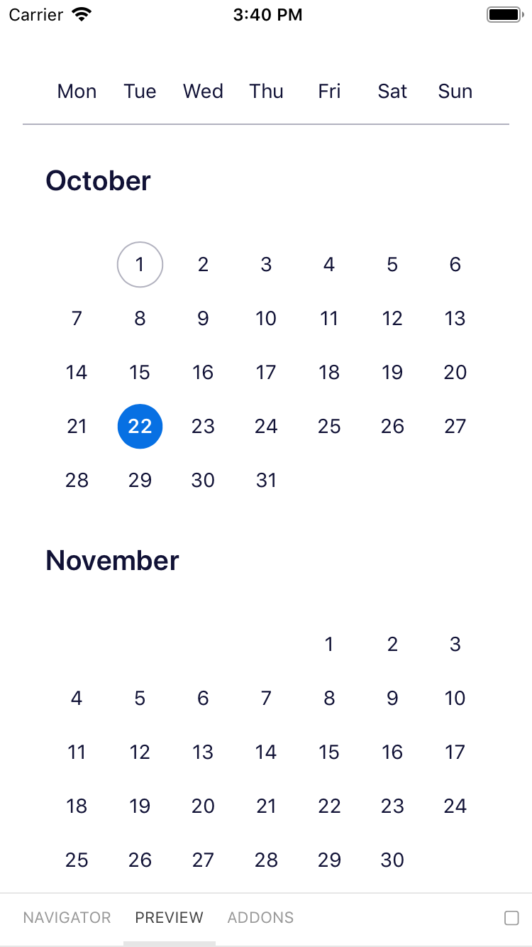
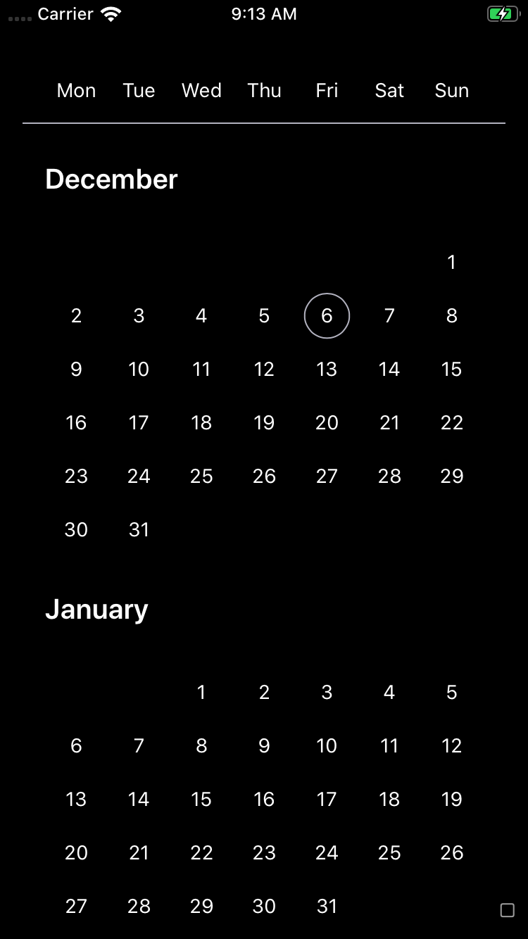
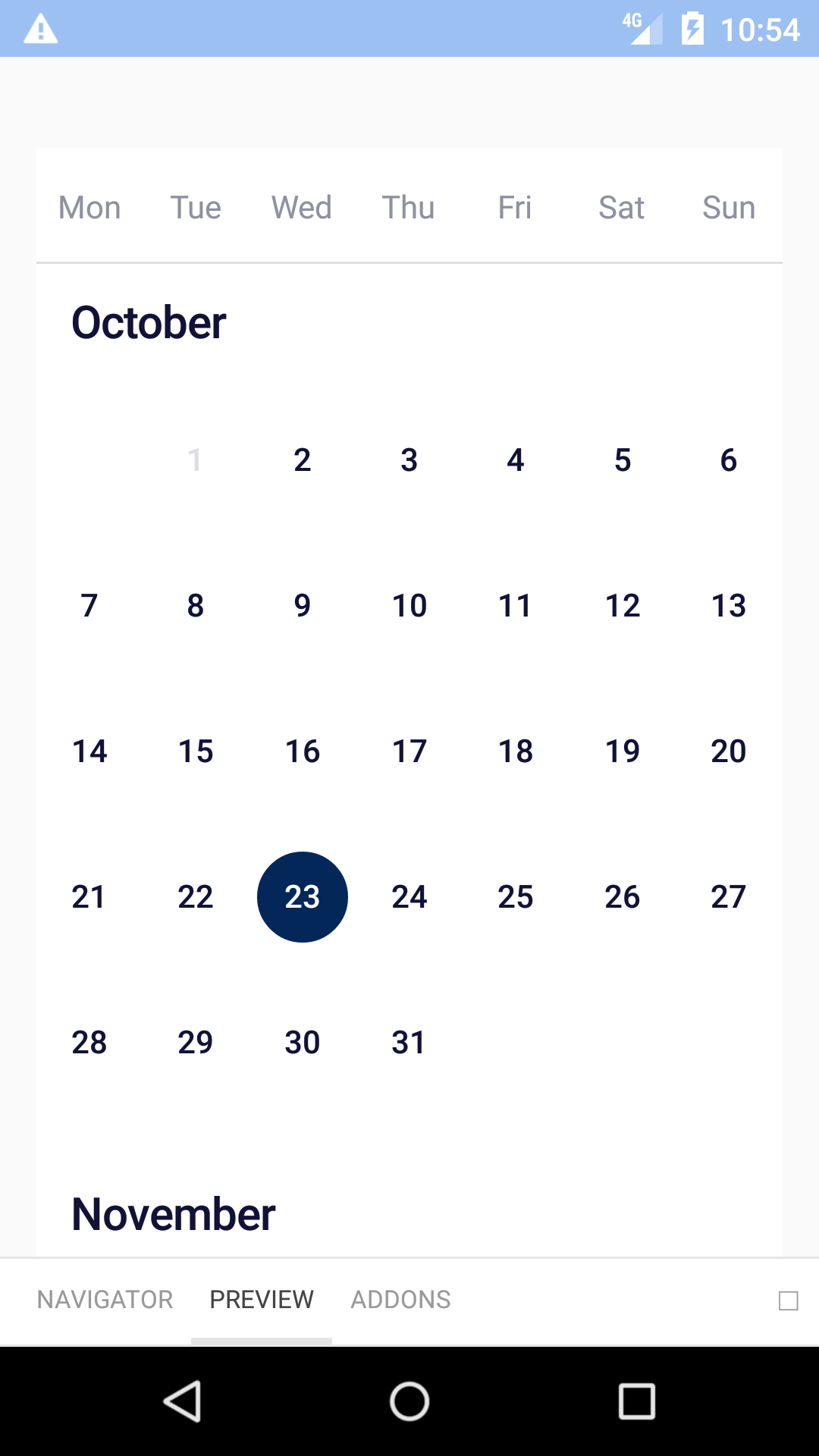
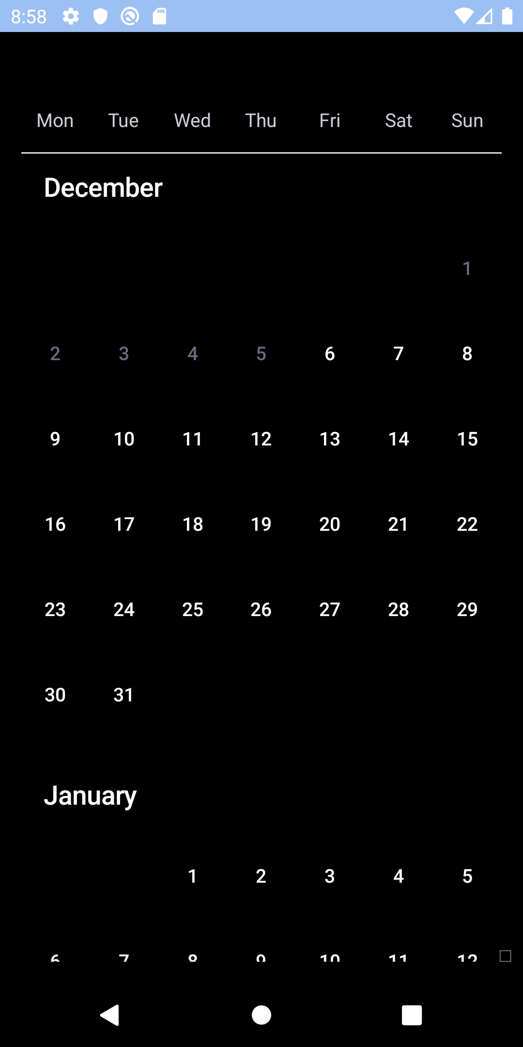
## Single
| Day | Night |
| --- | --- |
|  |
|  |
|
|
|  |
|  |
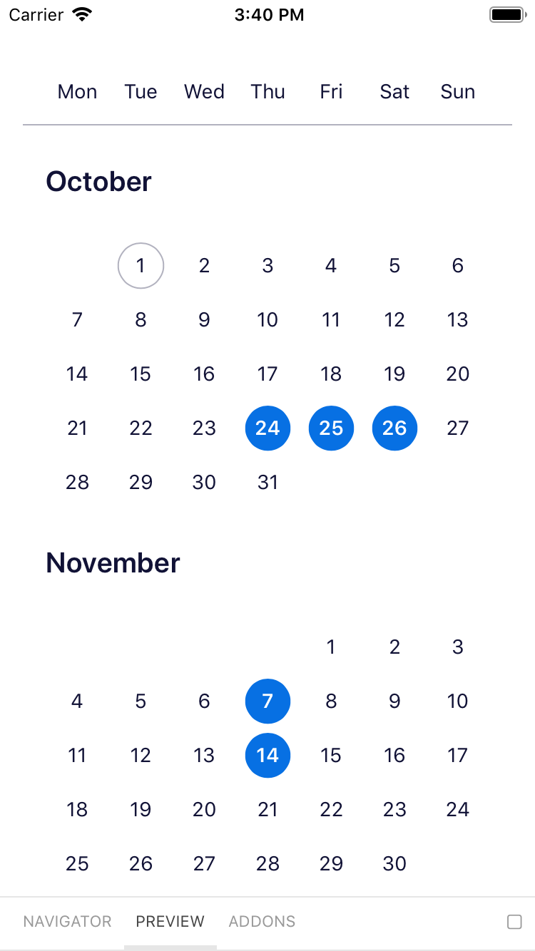
## Multiple
| Day | Night |
| --- | --- |
|
|
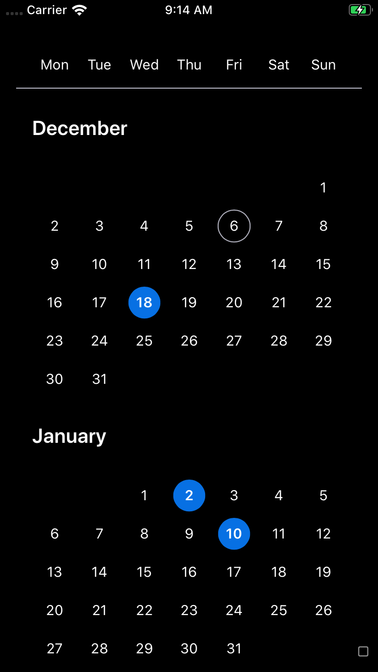
## Multiple
| Day | Night |
| --- | --- |
|  |
|  |
|
|
|  | |
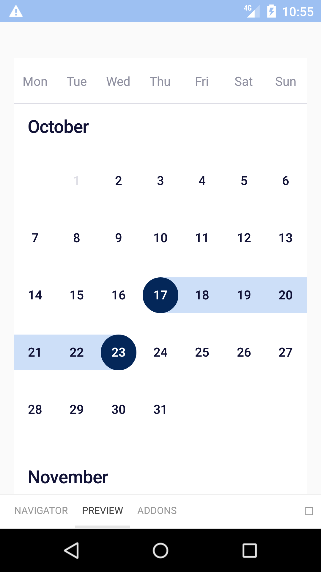
## Range
| Day | Night |
| --- | --- |
|
| |
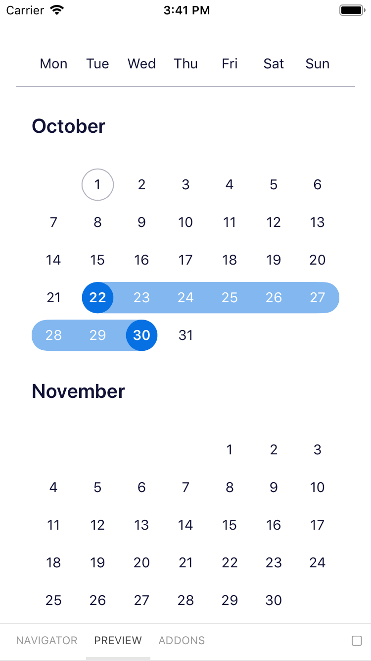
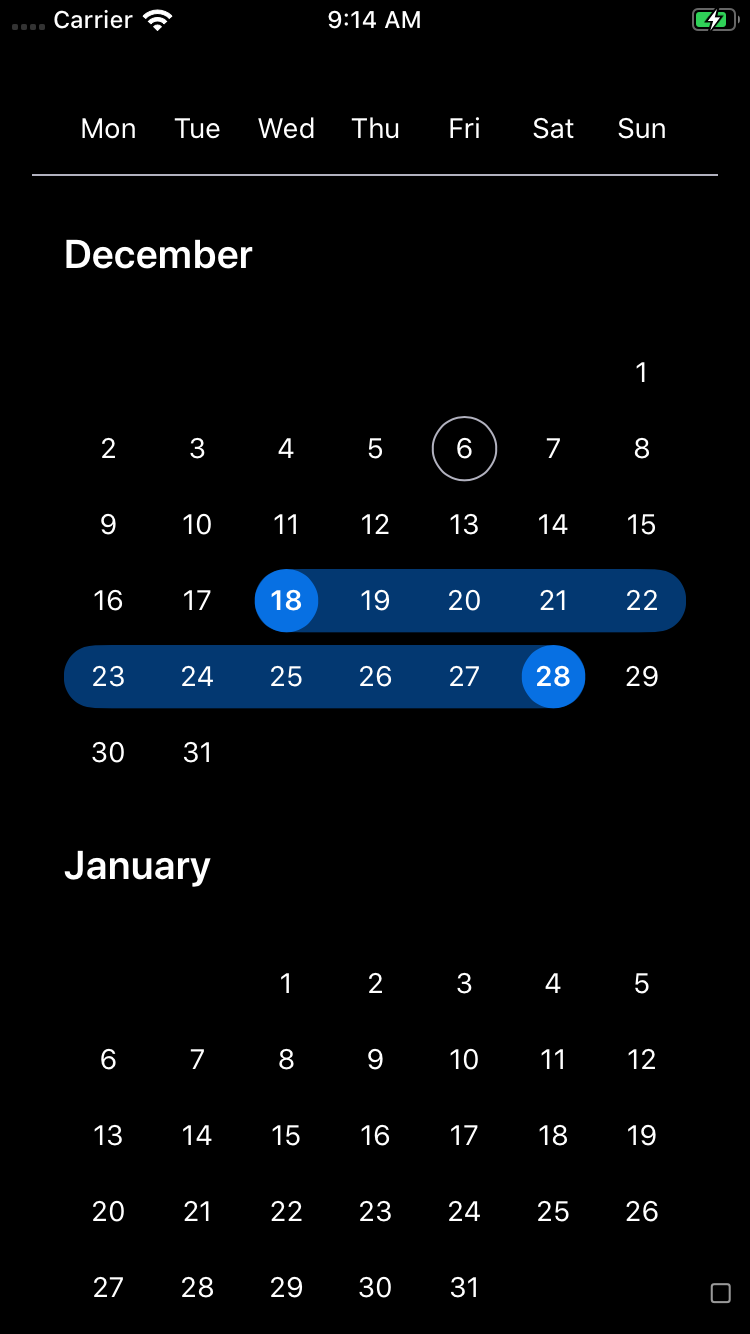
## Range
| Day | Night |
| --- | --- |
|  |
|  |
|
|
|  |
| 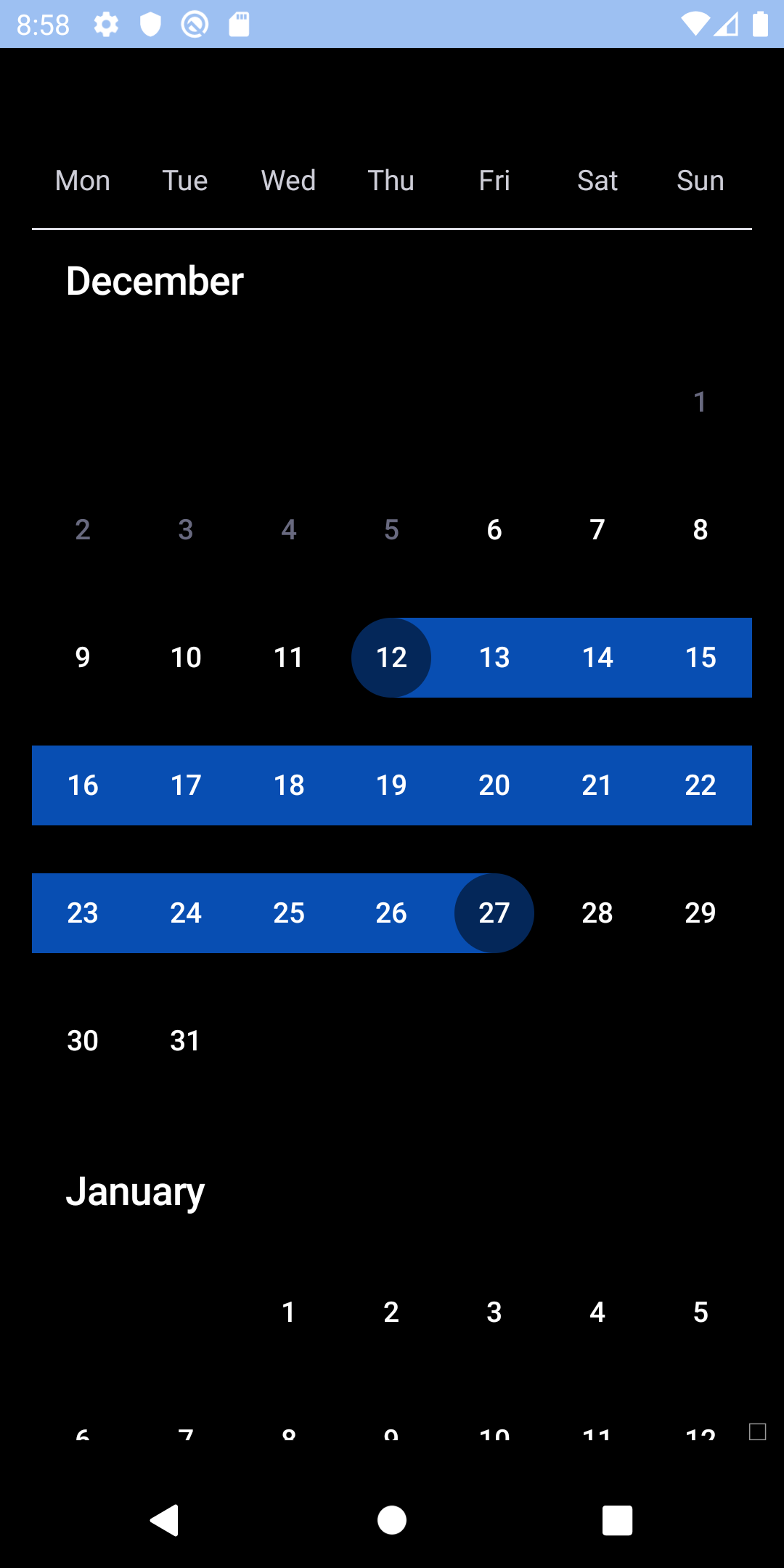 |
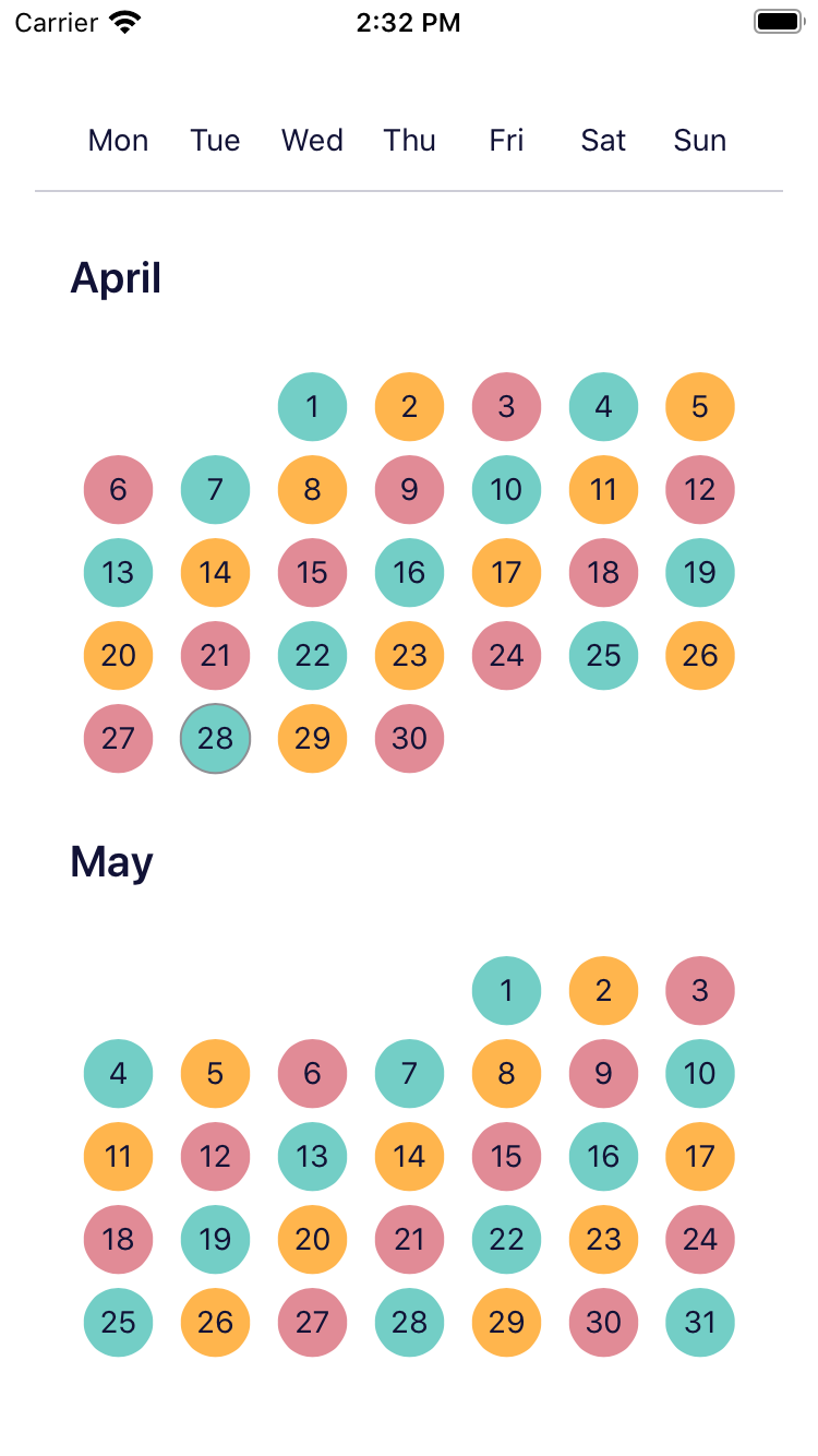
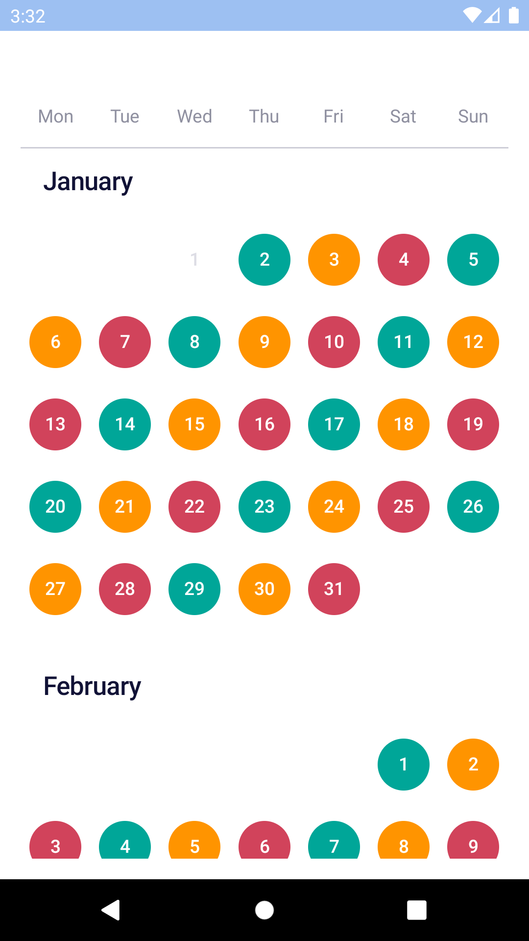
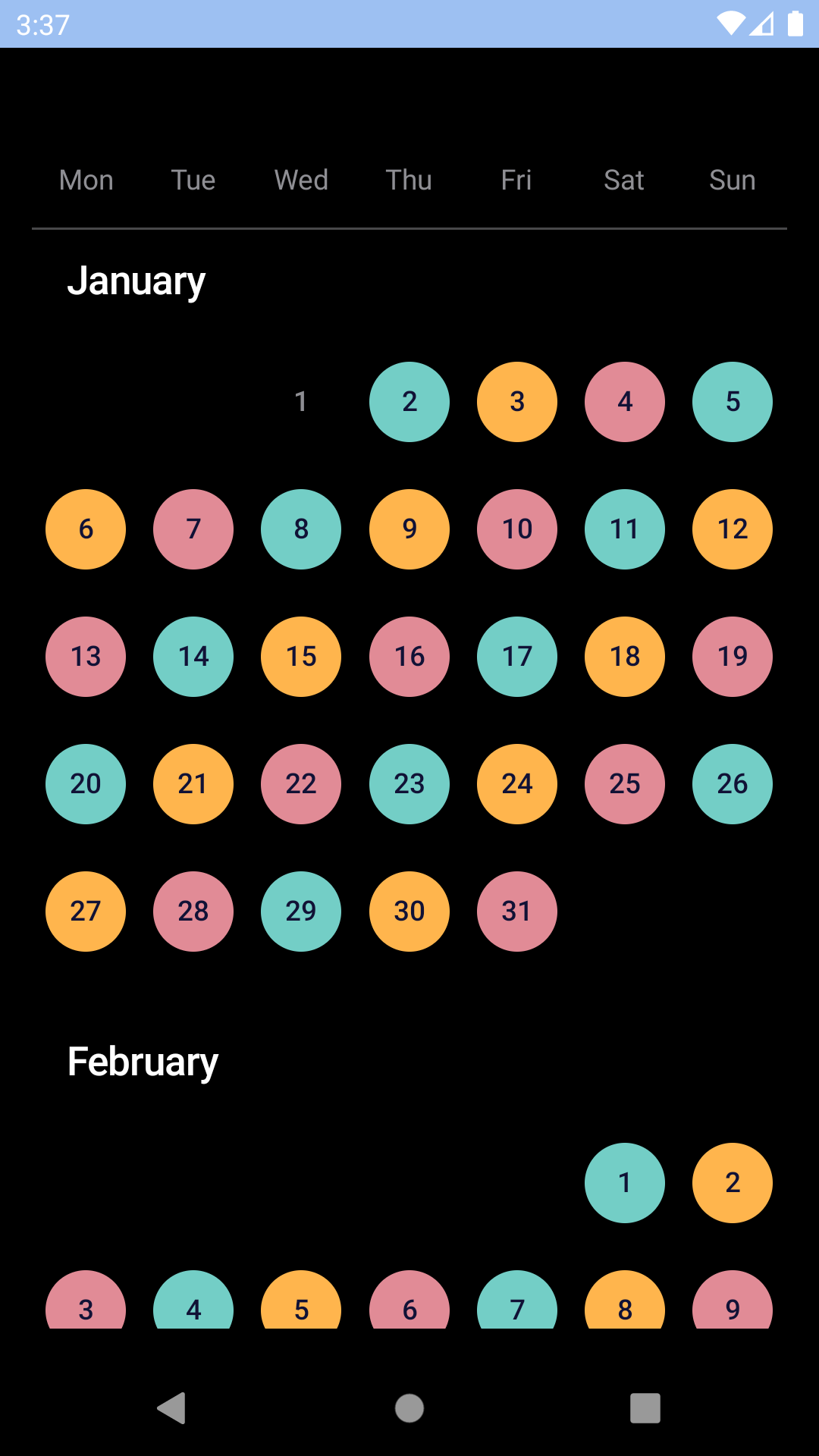
## Custom colours
| Day | Night |
| --- | --- |
|
|
## Custom colours
| Day | Night |
| --- | --- |
|  |
| 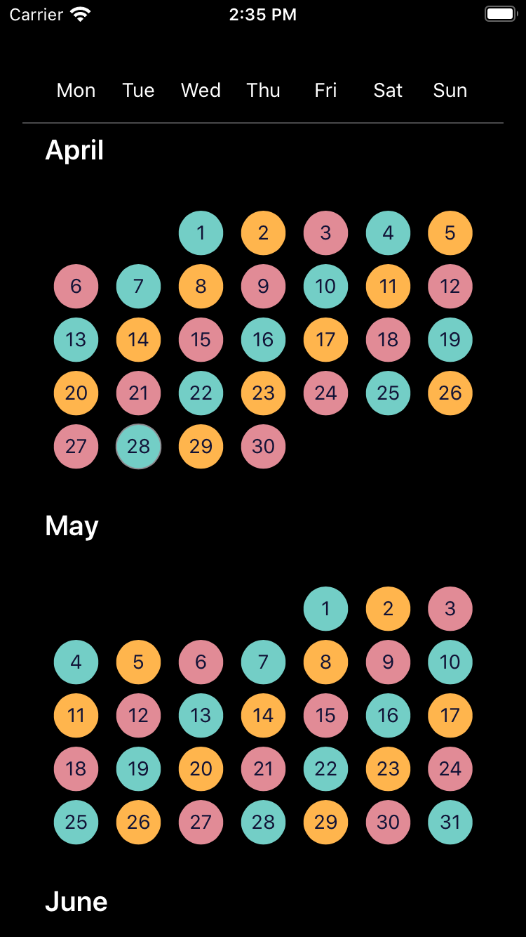 |
|
|
|  |
|  |
## Installation
Check the main [Readme](https://github.com/skyscanner/backpack-react-native#usage) for a complete installation guide.
## Time Zones
`BpkCalendar` uses dates at the `UTC` midnight boundary exclusively for selected dates and expects that format for `minDate` and `maxDate`. If `BpkCalendar` is used with dates that are **not** `UTC` it will behave in undefined ways and most likely not work.
To create dates to be used with the component we recommend the following
```javascript
// Min date of the calendar at 2019-01-02
const minDate = new Date(Date.UTC(2019, 0, 2));
// Dates can also be provided as timestamps
const minDate = Date.UTC(2019, 0, 2);
```
To format the dates for display use
```javascript
const locale = 'en-gb';
const formattedDate = date.toLocaleDateString(locale, { timeZone: 'UTC' });
```
## Usage
```js
import React, { Component } from 'react';
import { StyleSheet, View } from 'react-native';
import { spacingBase } from '@skyscanner/bpk-foundations-react-native/tokens/base.react.native';
import BpkCalendar, { makeRangeSelection } from 'backpack-react-native/bpk-component-calendar';
const rangeSelection = makeRangeSelection({
startDateSelectHint: I18n.translate('CALENDAR_RANGE_START_DATE_SELECT_HINT_LABEL'),
endDateSelectHint: I18n.translate('CALENDAR_RANGE_END_DATE_SELECT_HINT_LABEL'),
startDateSelectedState: I18n.translate('CALENDAR_RANGE_START_DATE_SELECTED_STATE_LABEL'),
endDateSelectedState: I18n.translate('CALENDAR_RANGE_END_DATE_SELECTED_STATE_LABEL'),
endAndStartDateSelectedState: I18n.translate('CALENDAR_RANGE_END_AND_START_DATE_SELECTED_STATE_LABEL'),
dateBetweenStartAndEndSelectedState: I18n.translate('CALENDAR_RANGE_DATE_BETWEEN_START_AND_END_SELECTED_STATE_LABEL'),
makeNextSelectionPrompt: I18n.translate('CALENDAR_RANGE_NEXT_SELECTION_PROMPT_LABEL'),
});
class App extends Component {
constructor(props) {
super(props);
this.state = { selectedDates: [] };
}
handleNewDates = newDates => {
this.setState({
selectedDates: newDates,
});
};
render() {
return (
);
}
}
```
### Footer view
NOTE: this is only supported for Android, it will have no effect on iOS.
The Android calendar supports the notion of a footer view for each month, we provide a `highlightedDaysFooterView`
implementation to show a list of highlighted days for each month:
```js
import React from 'react';
import BpkCalendar, {
makeRangeSelection,
highlightedDaysFooterView,
colorBucketHighlight,
DateMatchers,
} from 'backpack-react-native/bpk-component-calendar';
const rangeSelection = makeRangeSelection({
startDateSelectHint: I18n.translate('CALENDAR_RANGE_START_DATE_SELECT_HINT_LABEL'),
endDateSelectHint: I18n.translate('CALENDAR_RANGE_END_DATE_SELECT_HINT_LABEL'),
startDateSelectedState: I18n.translate('CALENDAR_RANGE_START_DATE_SELECTED_STATE_LABEL'),
endDateSelectedState: I18n.translate('CALENDAR_RANGE_END_DATE_SELECTED_STATE_LABEL'),
endAndStartDateSelectedState: I18n.translate('CALENDAR_RANGE_END_AND_START_DATE_SELECTED_STATE_LABEL'),
dateBetweenStartAndEndSelectedState: I18n.translate('CALENDAR_RANGE_DATE_BETWEEN_START_AND_END_SELECTED_STATE_LABEL'),
makeNextSelectionPrompt: I18n.translate('CALENDAR_RANGE_NEXT_SELECTION_PROMPT_LABEL'),
});
const App = () => (
)
```
## Props
### BpkCalendar
| Property | PropType | Required | Default Value |
| --------------------- | ---------------------- | -------- | ---------------------- |
| locale | string | true | - |
| selectionType | Object | true | null |
| colorBuckets | arrayOf(ColorBucket) | false | undefined |
| disabledDates | DateMatcher | false | null |
| maxDate | oneOf(Date, number) | false | today + 1 year |
| minDate | oneOf(Date, number) | false | today |
| onChangeSelectedDates | function | false | null |
| selectedDates | arrayOf(Date, number) | false | \[] |
| androidFooterView | object | false | undefined |
#### selectionType
This prop expects an object created by one of these three functions:
* `makeSingleSelection`
* `makeRangeSelection`
* `makeMultipleSelection`
They each require a single argument providing the necessary translated strings for assistive technology. Consult the Flow types for or the [migration guide for version 14.0.0](/docs/14.0.0-calendar-accessibility-migration.md) for further details.
#### selectedDates
- When `selectionType` is created by `makeSingleSelection`, you should only include zero or one entries in the `selectedDates` array.
- When `selectionType` is created by `makeRangeSelection`, you should only include zero, one or two entries in the `selectedDates` array.
## API
#### Table of Contents
- [DateMatchers](#datematchers)
- [range](#range)
- [Parameters](#parameters)
- [Examples](#examples)
- [after](#after)
- [Parameters](#parameters-1)
- [Examples](#examples-1)
- [before](#before)
- [Parameters](#parameters-2)
- [Examples](#examples-2)
- [any](#any)
- [Parameters](#parameters-3)
- [Examples](#examples-3)
- [colorBucket](#colorbucket)
- [Parameters](#parameters-4)
- [Examples](#examples-4)
- [colorBucketNegative](#colorbucketnegative)
- [Parameters](#parameters-5)
- [colorBucketNeutral](#colorbucketneutral)
- [Parameters](#parameters-6)
- [colorBucketPositive](#colorbucketpositive)
- [Parameters](#parameters-7)
- [colorBucketHighlight](#colorbuckethighlight)
- [Parameters](#parameters-8)
- [highlightedDaysFooterView](#highlighteddaysfooterview)
- [Parameters](#parameters-9)
### DateMatchers
#### range
Creates a range matcher to be used in `BpkCalendar`.
A range matcher will match any date in between start and end date, inclusive.
##### Parameters
- `firstDate` **([Date](https://developer.mozilla.org/docs/Web/JavaScript/Reference/Global_Objects/Date) \| [Number](https://developer.mozilla.org/docs/Web/JavaScript/Reference/Global_Objects/Number))** the range start
- `endDate` **([Date](https://developer.mozilla.org/docs/Web/JavaScript/Reference/Global_Objects/Date) \| [Number](https://developer.mozilla.org/docs/Web/JavaScript/Reference/Global_Objects/Number))** the range end
##### Examples
```javascript
```
Returns **DateMatcher** a range date matcher.
#### after
Creates an after matcher to be used in `BpkCalendar`.
An after matcher will match all dates after the provided date.
##### Parameters
- `date` **([Date](https://developer.mozilla.org/docs/Web/JavaScript/Reference/Global_Objects/Date) \| [Number](https://developer.mozilla.org/docs/Web/JavaScript/Reference/Global_Objects/Number))** the date to match.
##### Examples
```javascript
```
Returns **DateMatcher** an after date matcher.
#### before
Creates a before matcher to be used in `BpkCalendar`.
A before matcher will match all dates before the provided date.
##### Parameters
- `date` **([Date](https://developer.mozilla.org/docs/Web/JavaScript/Reference/Global_Objects/Date) \| [Number](https://developer.mozilla.org/docs/Web/JavaScript/Reference/Global_Objects/Number))** the date to match.
##### Examples
```javascript
```
Returns **DateMatcher** an before date matcher.
#### any
Creates an any matcher to be used in `BpkCalendar`.
An any matcher will match if the date is equal to any of the dates provided.
##### Parameters
- `dates` **...([Date](https://developer.mozilla.org/docs/Web/JavaScript/Reference/Global_Objects/Date) \| [Number](https://developer.mozilla.org/docs/Web/JavaScript/Reference/Global_Objects/Number))** the list of dates to match.
##### Examples
```javascript
```
Returns **DateMatcher** an any date matcher.
### colorBucket
Creates a new color bucket to be used in BpkCalendar.
A color bucket is used to define custom colours for calendar days.
NOTE: Your are responsible for ensuring multiple color buckets don't
overlap, in case they do the last one applied (last in the list) will
take precedence.
#### Parameters
- `color` **[string](https://developer.mozilla.org/docs/Web/JavaScript/Reference/Global_Objects/String)** The background color
- `days` **DateMatcher** The days in this bucket
- `textStyle` **TextStyle?** The text style. Valid values are `light` or `dark`.
Changes how the text looks based on the background color, where light or dark refers
to the background colour. (optional, default `undefined`)
#### Examples
```javascript
```
Returns **ColorBucket** A new color bucket
### colorBucketNegative
A negative cell style which is suitable to indicate for example
a date which has a comparatively high price among the dates in
the calendar.
#### Parameters
- `days` **DateMatcher** The days in this bucket
Returns **ColorBucket** the negative bucket
### colorBucketNeutral
A neutral cell style which is suitable to indicate for example
a date which has a comparatively average price among the dates in
the calendar.
#### Parameters
- `days` **DateMatcher** The days in this bucket
Returns **ColorBucket** the neutral bucket
### colorBucketPositive
A positive cell style which is suitable to indicate for example
a date which has a comparatively low price among the dates in
the calendar.
#### Parameters
- `days` **DateMatcher** The days in this bucket
Returns **ColorBucket** the positive bucket
### colorBucketHighlight
A cell style which is suitable to indicate a highlighted day, e.g. a holiday.
Use this in conjunction with `highlightedDaysFooterView` to
show a footer with the list of highlighted days for a month.
**NOTE: This is an Android only feature.**
#### Parameters
- `days` **DateMatcher** The days in this bucket
Returns **ColorBucket** the highlighted bucket
### highlightedDaysFooterView
Creates a footer view to show a list of highlighted days.
**NOTE: This is an Android only feature.**
#### Parameters
- `viewDef` **[Object](https://developer.mozilla.org/docs/Web/JavaScript/Reference/Global_Objects/Object)** the view definition.
Returns **[Object](https://developer.mozilla.org/docs/Web/JavaScript/Reference/Global_Objects/Object)** a footer view.
|
## Installation
Check the main [Readme](https://github.com/skyscanner/backpack-react-native#usage) for a complete installation guide.
## Time Zones
`BpkCalendar` uses dates at the `UTC` midnight boundary exclusively for selected dates and expects that format for `minDate` and `maxDate`. If `BpkCalendar` is used with dates that are **not** `UTC` it will behave in undefined ways and most likely not work.
To create dates to be used with the component we recommend the following
```javascript
// Min date of the calendar at 2019-01-02
const minDate = new Date(Date.UTC(2019, 0, 2));
// Dates can also be provided as timestamps
const minDate = Date.UTC(2019, 0, 2);
```
To format the dates for display use
```javascript
const locale = 'en-gb';
const formattedDate = date.toLocaleDateString(locale, { timeZone: 'UTC' });
```
## Usage
```js
import React, { Component } from 'react';
import { StyleSheet, View } from 'react-native';
import { spacingBase } from '@skyscanner/bpk-foundations-react-native/tokens/base.react.native';
import BpkCalendar, { makeRangeSelection } from 'backpack-react-native/bpk-component-calendar';
const rangeSelection = makeRangeSelection({
startDateSelectHint: I18n.translate('CALENDAR_RANGE_START_DATE_SELECT_HINT_LABEL'),
endDateSelectHint: I18n.translate('CALENDAR_RANGE_END_DATE_SELECT_HINT_LABEL'),
startDateSelectedState: I18n.translate('CALENDAR_RANGE_START_DATE_SELECTED_STATE_LABEL'),
endDateSelectedState: I18n.translate('CALENDAR_RANGE_END_DATE_SELECTED_STATE_LABEL'),
endAndStartDateSelectedState: I18n.translate('CALENDAR_RANGE_END_AND_START_DATE_SELECTED_STATE_LABEL'),
dateBetweenStartAndEndSelectedState: I18n.translate('CALENDAR_RANGE_DATE_BETWEEN_START_AND_END_SELECTED_STATE_LABEL'),
makeNextSelectionPrompt: I18n.translate('CALENDAR_RANGE_NEXT_SELECTION_PROMPT_LABEL'),
});
class App extends Component {
constructor(props) {
super(props);
this.state = { selectedDates: [] };
}
handleNewDates = newDates => {
this.setState({
selectedDates: newDates,
});
};
render() {
return (
);
}
}
```
### Footer view
NOTE: this is only supported for Android, it will have no effect on iOS.
The Android calendar supports the notion of a footer view for each month, we provide a `highlightedDaysFooterView`
implementation to show a list of highlighted days for each month:
```js
import React from 'react';
import BpkCalendar, {
makeRangeSelection,
highlightedDaysFooterView,
colorBucketHighlight,
DateMatchers,
} from 'backpack-react-native/bpk-component-calendar';
const rangeSelection = makeRangeSelection({
startDateSelectHint: I18n.translate('CALENDAR_RANGE_START_DATE_SELECT_HINT_LABEL'),
endDateSelectHint: I18n.translate('CALENDAR_RANGE_END_DATE_SELECT_HINT_LABEL'),
startDateSelectedState: I18n.translate('CALENDAR_RANGE_START_DATE_SELECTED_STATE_LABEL'),
endDateSelectedState: I18n.translate('CALENDAR_RANGE_END_DATE_SELECTED_STATE_LABEL'),
endAndStartDateSelectedState: I18n.translate('CALENDAR_RANGE_END_AND_START_DATE_SELECTED_STATE_LABEL'),
dateBetweenStartAndEndSelectedState: I18n.translate('CALENDAR_RANGE_DATE_BETWEEN_START_AND_END_SELECTED_STATE_LABEL'),
makeNextSelectionPrompt: I18n.translate('CALENDAR_RANGE_NEXT_SELECTION_PROMPT_LABEL'),
});
const App = () => (
)
```
## Props
### BpkCalendar
| Property | PropType | Required | Default Value |
| --------------------- | ---------------------- | -------- | ---------------------- |
| locale | string | true | - |
| selectionType | Object | true | null |
| colorBuckets | arrayOf(ColorBucket) | false | undefined |
| disabledDates | DateMatcher | false | null |
| maxDate | oneOf(Date, number) | false | today + 1 year |
| minDate | oneOf(Date, number) | false | today |
| onChangeSelectedDates | function | false | null |
| selectedDates | arrayOf(Date, number) | false | \[] |
| androidFooterView | object | false | undefined |
#### selectionType
This prop expects an object created by one of these three functions:
* `makeSingleSelection`
* `makeRangeSelection`
* `makeMultipleSelection`
They each require a single argument providing the necessary translated strings for assistive technology. Consult the Flow types for or the [migration guide for version 14.0.0](/docs/14.0.0-calendar-accessibility-migration.md) for further details.
#### selectedDates
- When `selectionType` is created by `makeSingleSelection`, you should only include zero or one entries in the `selectedDates` array.
- When `selectionType` is created by `makeRangeSelection`, you should only include zero, one or two entries in the `selectedDates` array.
## API
#### Table of Contents
- [DateMatchers](#datematchers)
- [range](#range)
- [Parameters](#parameters)
- [Examples](#examples)
- [after](#after)
- [Parameters](#parameters-1)
- [Examples](#examples-1)
- [before](#before)
- [Parameters](#parameters-2)
- [Examples](#examples-2)
- [any](#any)
- [Parameters](#parameters-3)
- [Examples](#examples-3)
- [colorBucket](#colorbucket)
- [Parameters](#parameters-4)
- [Examples](#examples-4)
- [colorBucketNegative](#colorbucketnegative)
- [Parameters](#parameters-5)
- [colorBucketNeutral](#colorbucketneutral)
- [Parameters](#parameters-6)
- [colorBucketPositive](#colorbucketpositive)
- [Parameters](#parameters-7)
- [colorBucketHighlight](#colorbuckethighlight)
- [Parameters](#parameters-8)
- [highlightedDaysFooterView](#highlighteddaysfooterview)
- [Parameters](#parameters-9)
### DateMatchers
#### range
Creates a range matcher to be used in `BpkCalendar`.
A range matcher will match any date in between start and end date, inclusive.
##### Parameters
- `firstDate` **([Date](https://developer.mozilla.org/docs/Web/JavaScript/Reference/Global_Objects/Date) \| [Number](https://developer.mozilla.org/docs/Web/JavaScript/Reference/Global_Objects/Number))** the range start
- `endDate` **([Date](https://developer.mozilla.org/docs/Web/JavaScript/Reference/Global_Objects/Date) \| [Number](https://developer.mozilla.org/docs/Web/JavaScript/Reference/Global_Objects/Number))** the range end
##### Examples
```javascript
```
Returns **DateMatcher** a range date matcher.
#### after
Creates an after matcher to be used in `BpkCalendar`.
An after matcher will match all dates after the provided date.
##### Parameters
- `date` **([Date](https://developer.mozilla.org/docs/Web/JavaScript/Reference/Global_Objects/Date) \| [Number](https://developer.mozilla.org/docs/Web/JavaScript/Reference/Global_Objects/Number))** the date to match.
##### Examples
```javascript
```
Returns **DateMatcher** an after date matcher.
#### before
Creates a before matcher to be used in `BpkCalendar`.
A before matcher will match all dates before the provided date.
##### Parameters
- `date` **([Date](https://developer.mozilla.org/docs/Web/JavaScript/Reference/Global_Objects/Date) \| [Number](https://developer.mozilla.org/docs/Web/JavaScript/Reference/Global_Objects/Number))** the date to match.
##### Examples
```javascript
```
Returns **DateMatcher** an before date matcher.
#### any
Creates an any matcher to be used in `BpkCalendar`.
An any matcher will match if the date is equal to any of the dates provided.
##### Parameters
- `dates` **...([Date](https://developer.mozilla.org/docs/Web/JavaScript/Reference/Global_Objects/Date) \| [Number](https://developer.mozilla.org/docs/Web/JavaScript/Reference/Global_Objects/Number))** the list of dates to match.
##### Examples
```javascript
```
Returns **DateMatcher** an any date matcher.
### colorBucket
Creates a new color bucket to be used in BpkCalendar.
A color bucket is used to define custom colours for calendar days.
NOTE: Your are responsible for ensuring multiple color buckets don't
overlap, in case they do the last one applied (last in the list) will
take precedence.
#### Parameters
- `color` **[string](https://developer.mozilla.org/docs/Web/JavaScript/Reference/Global_Objects/String)** The background color
- `days` **DateMatcher** The days in this bucket
- `textStyle` **TextStyle?** The text style. Valid values are `light` or `dark`.
Changes how the text looks based on the background color, where light or dark refers
to the background colour. (optional, default `undefined`)
#### Examples
```javascript
```
Returns **ColorBucket** A new color bucket
### colorBucketNegative
A negative cell style which is suitable to indicate for example
a date which has a comparatively high price among the dates in
the calendar.
#### Parameters
- `days` **DateMatcher** The days in this bucket
Returns **ColorBucket** the negative bucket
### colorBucketNeutral
A neutral cell style which is suitable to indicate for example
a date which has a comparatively average price among the dates in
the calendar.
#### Parameters
- `days` **DateMatcher** The days in this bucket
Returns **ColorBucket** the neutral bucket
### colorBucketPositive
A positive cell style which is suitable to indicate for example
a date which has a comparatively low price among the dates in
the calendar.
#### Parameters
- `days` **DateMatcher** The days in this bucket
Returns **ColorBucket** the positive bucket
### colorBucketHighlight
A cell style which is suitable to indicate a highlighted day, e.g. a holiday.
Use this in conjunction with `highlightedDaysFooterView` to
show a footer with the list of highlighted days for a month.
**NOTE: This is an Android only feature.**
#### Parameters
- `days` **DateMatcher** The days in this bucket
Returns **ColorBucket** the highlighted bucket
### highlightedDaysFooterView
Creates a footer view to show a list of highlighted days.
**NOTE: This is an Android only feature.**
#### Parameters
- `viewDef` **[Object](https://developer.mozilla.org/docs/Web/JavaScript/Reference/Global_Objects/Object)** the view definition.
Returns **[Object](https://developer.mozilla.org/docs/Web/JavaScript/Reference/Global_Objects/Object)** a footer view.