# bpk-component-button-link
> Backpack React Native button link component.
## Default
| Day | Night |
| --- | --- |
| 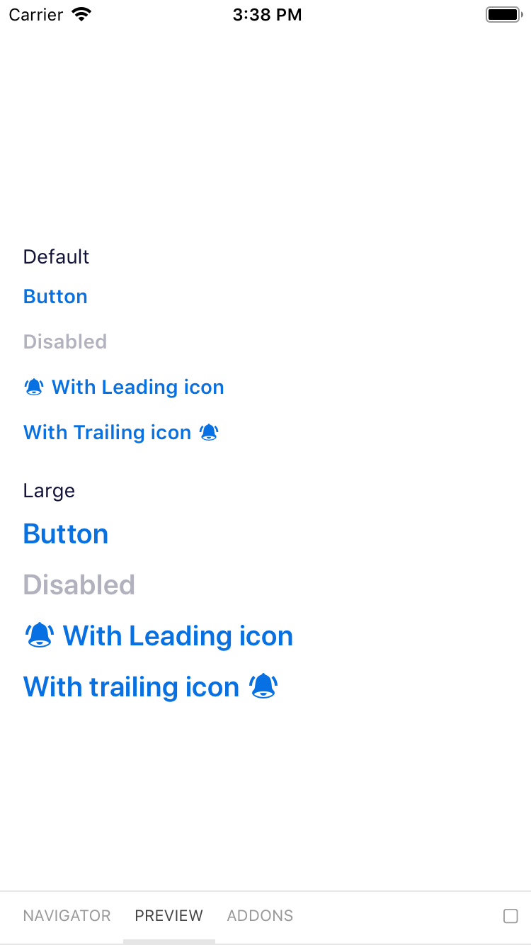 |
| 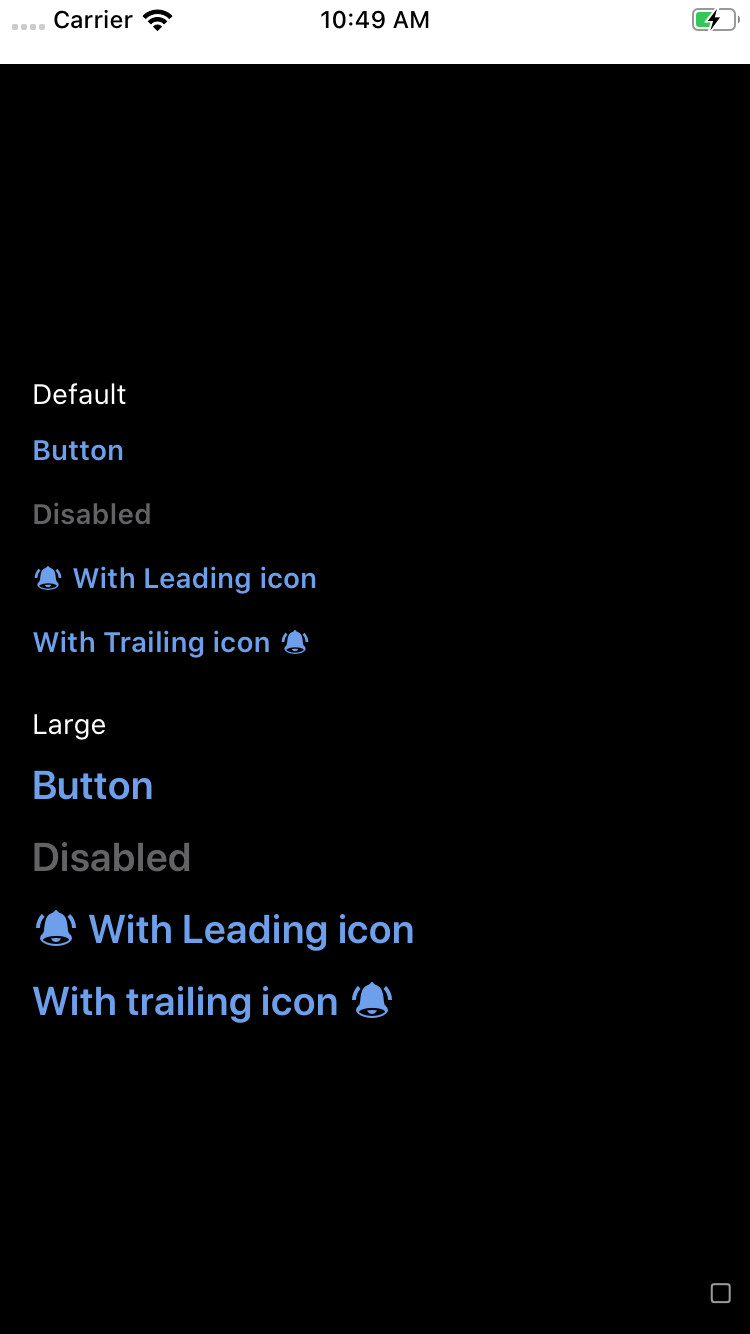 |
|
|
| 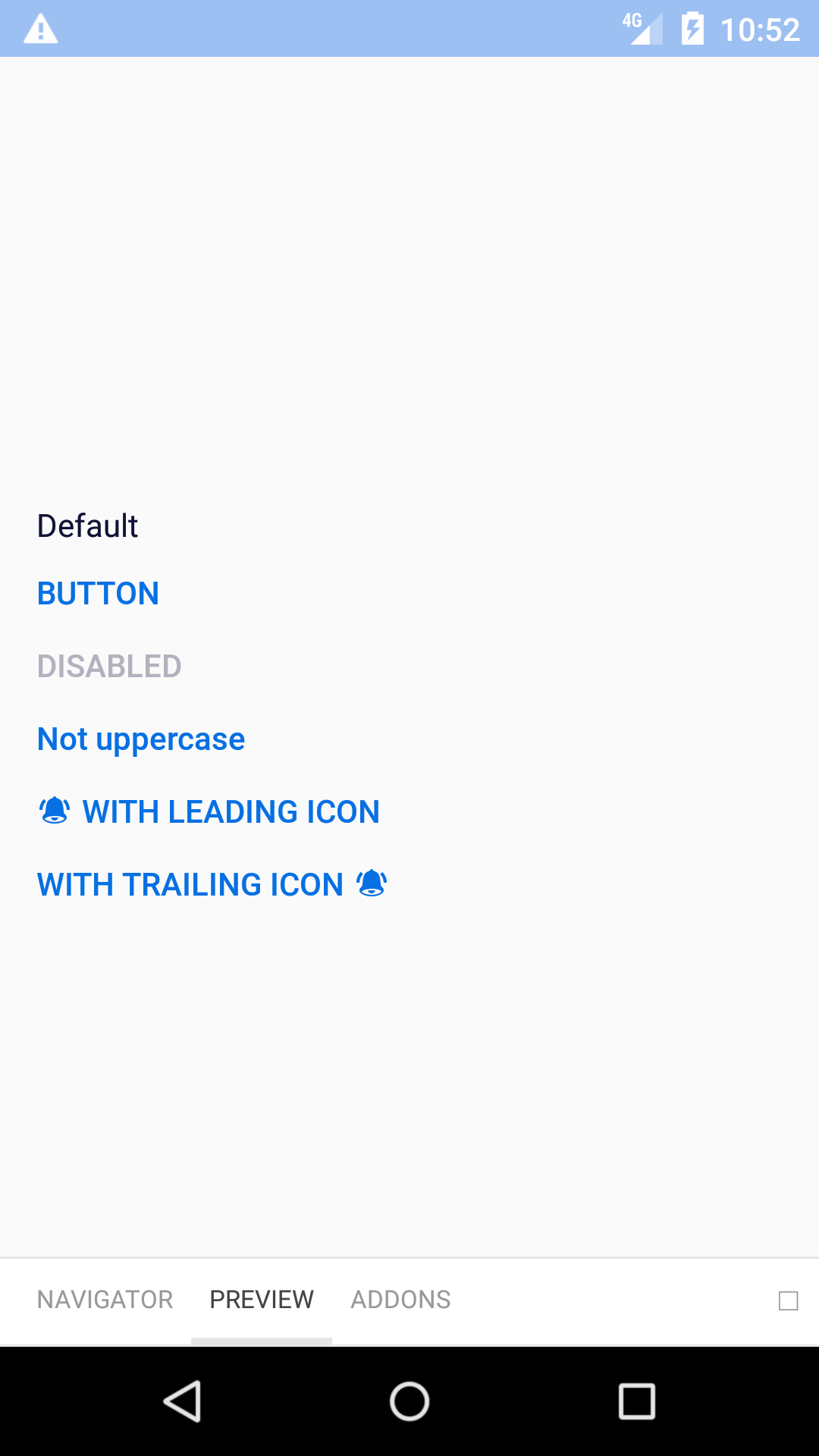 |
| 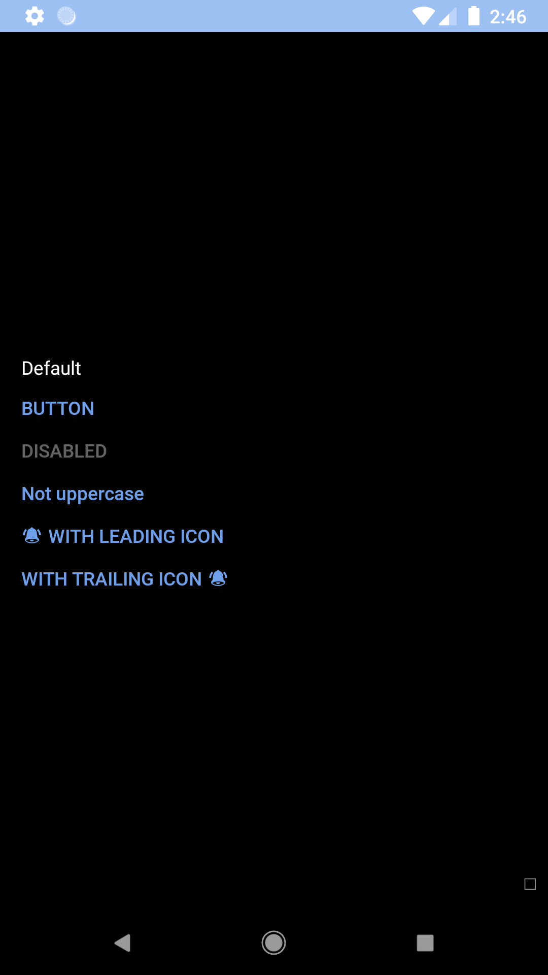 |
## Installation
Check the main [Readme](https://github.com/skyscanner/backpack-react-native#usage) for a complete installation guide.
## Usage
```js
import { View } from 'react-native';
import React, { Component } from 'react';
import BpkButtonLink from 'backpack-react-native/bpk-component-button-link';
import { spacingBase } from '@skyscanner/bpk-foundations-react-native/tokens/base.react.native';
const styles = StyleSheet.create({
container: {
flex: 1,
justifyContent: 'center',
padding: spacingBase,
}
});
export default class App extends Component {
render() {
return (
{}} />
{}} />
{}} />
{}} />
{}} />
);
}
}
```
## Props
| Property | PropType | Required | Default Value |
| ----------------------------------- | ------------------------------------------------------------------------- | -------- | ------------- |
| onPress | func | true | - |
| title | string | true | - |
| disabled | bool | false | false |
| accessibilityLabel | string | false | props.title |
| icon | oneOf(string, element) Strings must be a [BpkIcon](/components/web/icons) | false | null |
| iconAlignment | oneOf('leading', 'trailing') | false | trailing |
| large (iOS only) | bool | false | false |
| borderlessBackground (Android only) | bool | false | true |
| uppercase (Android only) | bool | false | true |
| theme | See [Theme Props](#theme-props) below | false | null |
| textProps | object | false | null |
## Theme Props
* `buttonLinkTextColor`
|
## Installation
Check the main [Readme](https://github.com/skyscanner/backpack-react-native#usage) for a complete installation guide.
## Usage
```js
import { View } from 'react-native';
import React, { Component } from 'react';
import BpkButtonLink from 'backpack-react-native/bpk-component-button-link';
import { spacingBase } from '@skyscanner/bpk-foundations-react-native/tokens/base.react.native';
const styles = StyleSheet.create({
container: {
flex: 1,
justifyContent: 'center',
padding: spacingBase,
}
});
export default class App extends Component {
render() {
return (
{}} />
{}} />
{}} />
{}} />
{}} />
);
}
}
```
## Props
| Property | PropType | Required | Default Value |
| ----------------------------------- | ------------------------------------------------------------------------- | -------- | ------------- |
| onPress | func | true | - |
| title | string | true | - |
| disabled | bool | false | false |
| accessibilityLabel | string | false | props.title |
| icon | oneOf(string, element) Strings must be a [BpkIcon](/components/web/icons) | false | null |
| iconAlignment | oneOf('leading', 'trailing') | false | trailing |
| large (iOS only) | bool | false | false |
| borderlessBackground (Android only) | bool | false | true |
| uppercase (Android only) | bool | false | true |
| theme | See [Theme Props](#theme-props) below | false | null |
| textProps | object | false | null |
## Theme Props
* `buttonLinkTextColor`