# bpk-component-banner-alert
> Backpack React Native banner alert component.
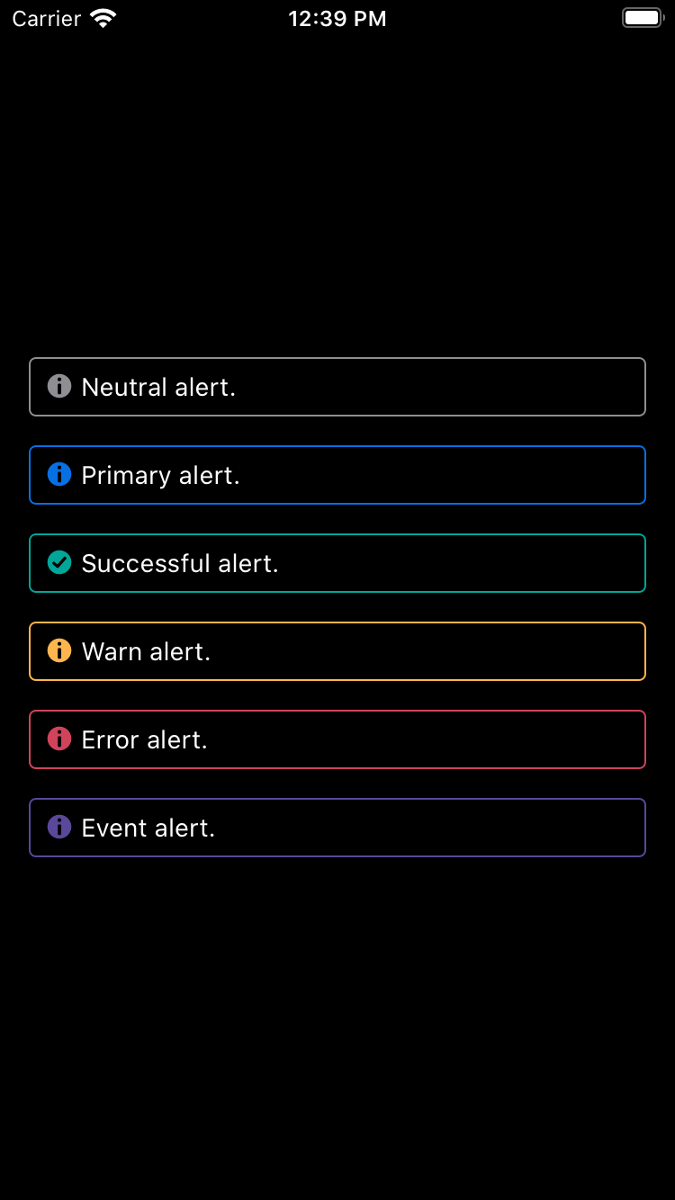
## Default
| Day | Night |
| --- | --- |
| 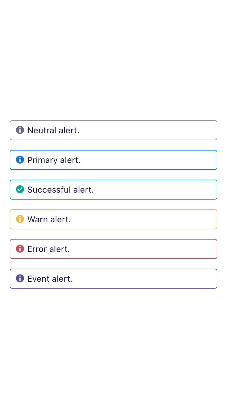 |
|  |
|
|
|  |
|  |
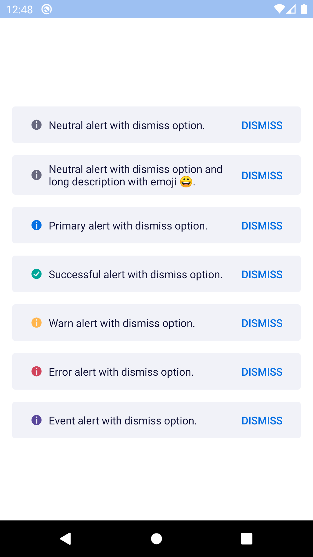
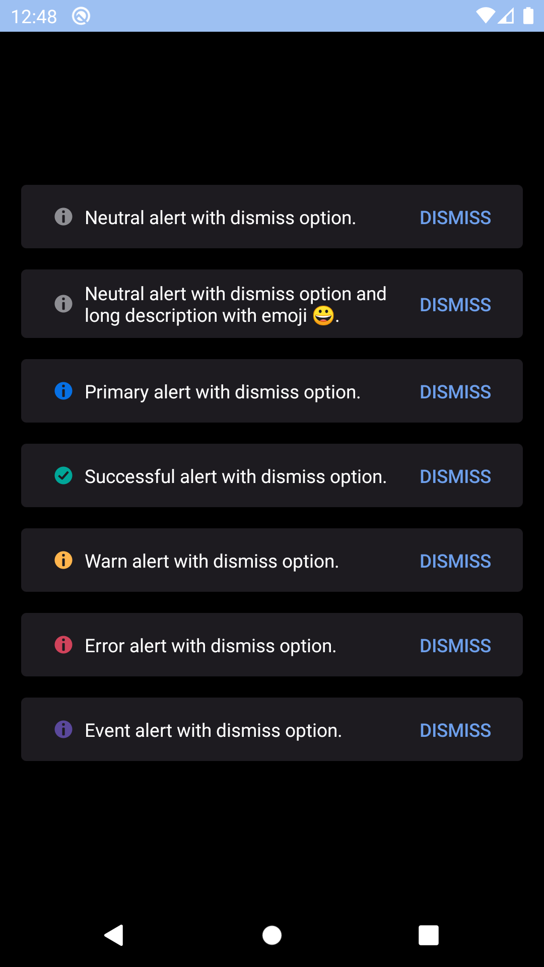
## Dismissable
| Day | Night |
| --- | --- |
|
|
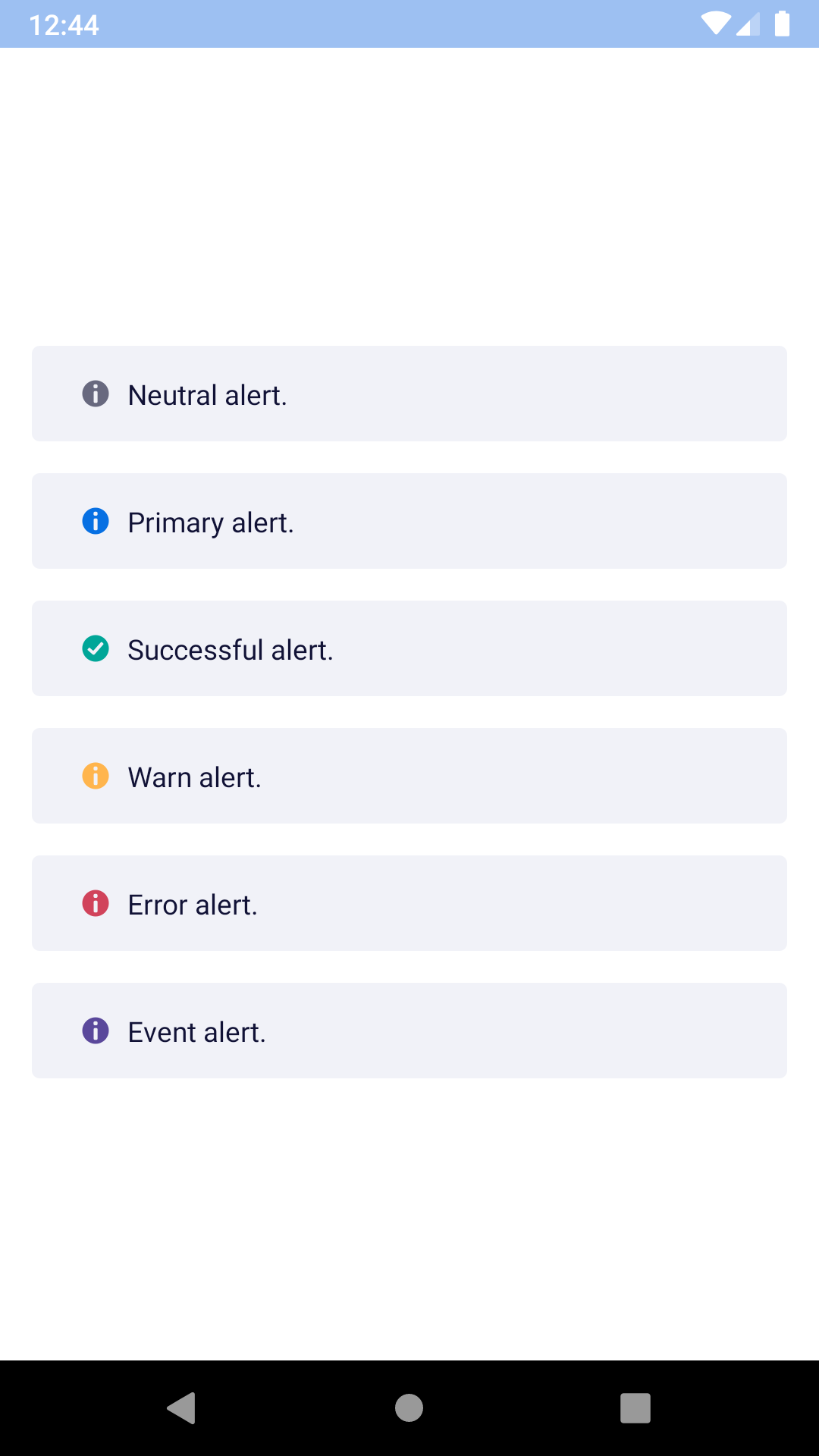
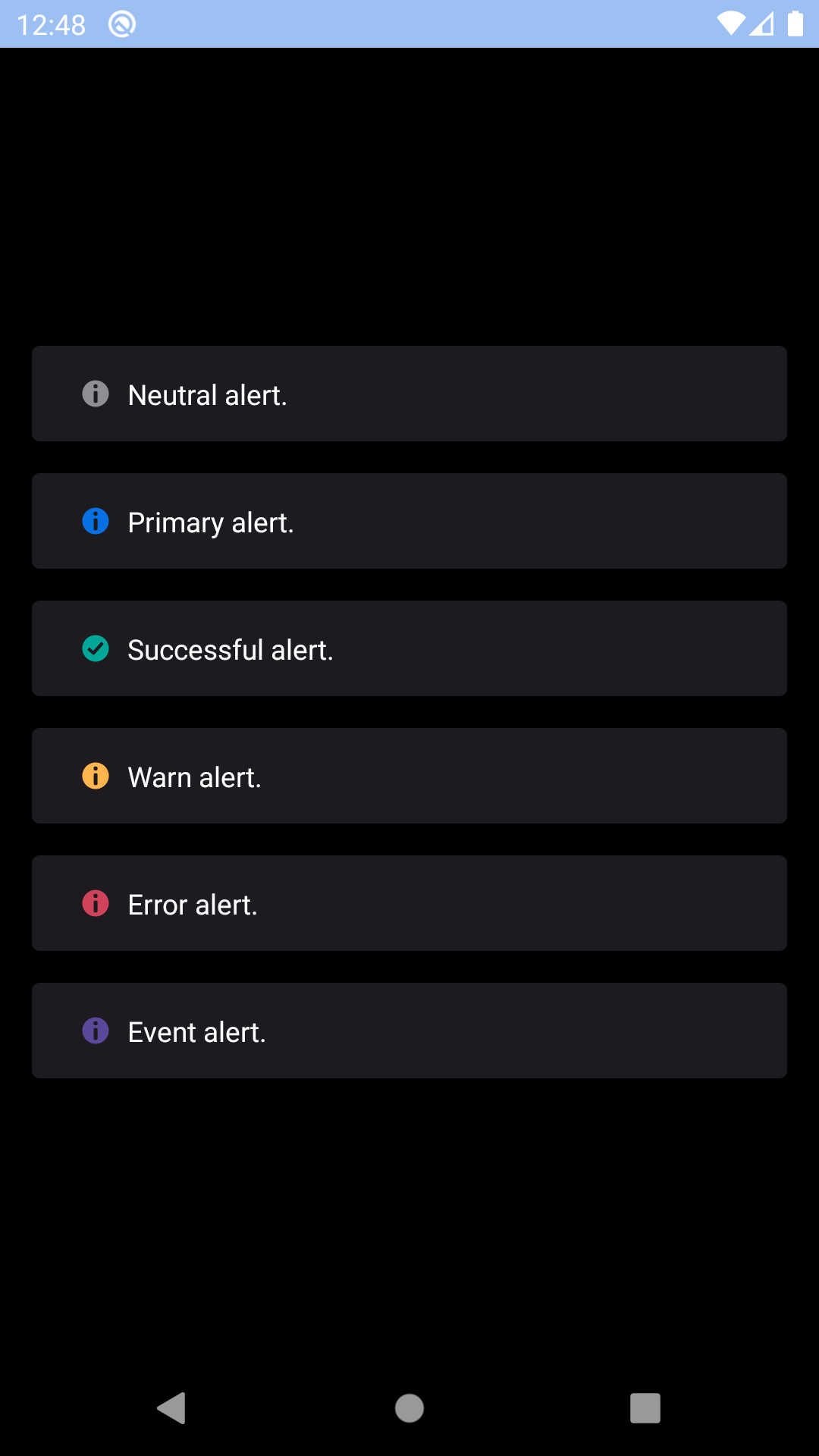
## Dismissable
| Day | Night |
| --- | --- |
| 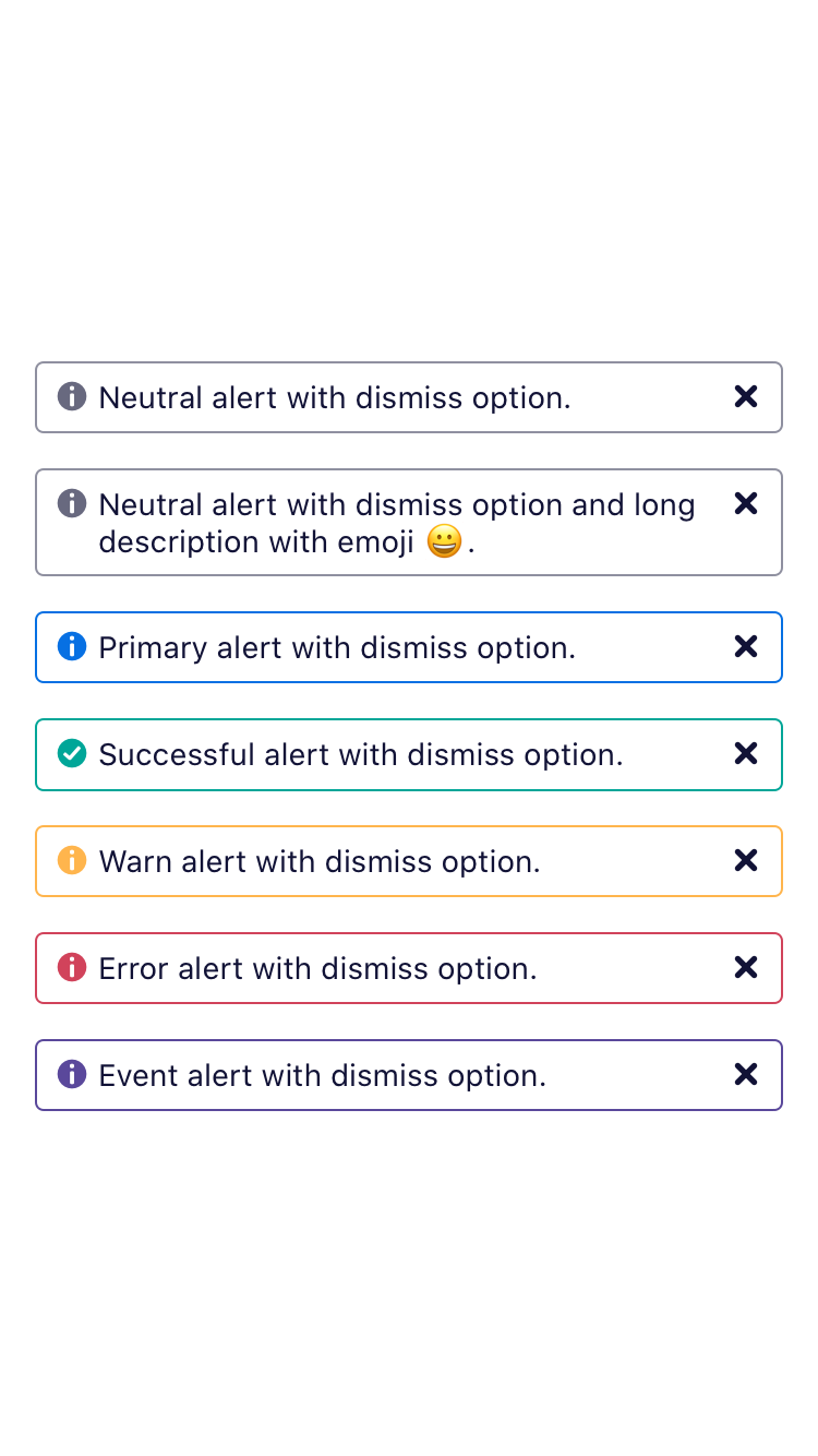 |
| 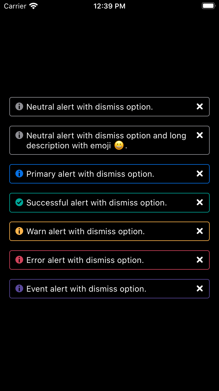 |
|
|
|  |
|  |
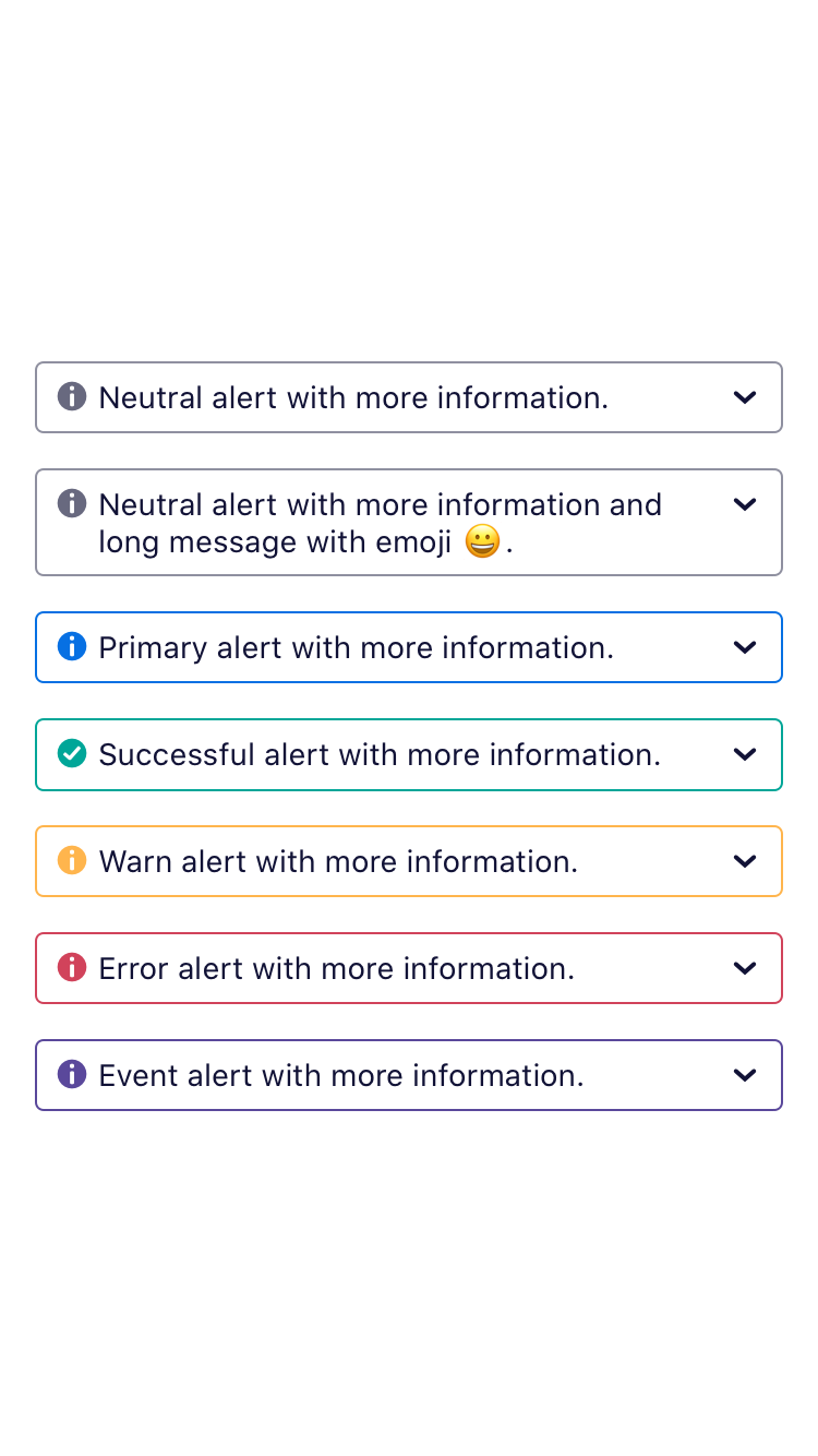
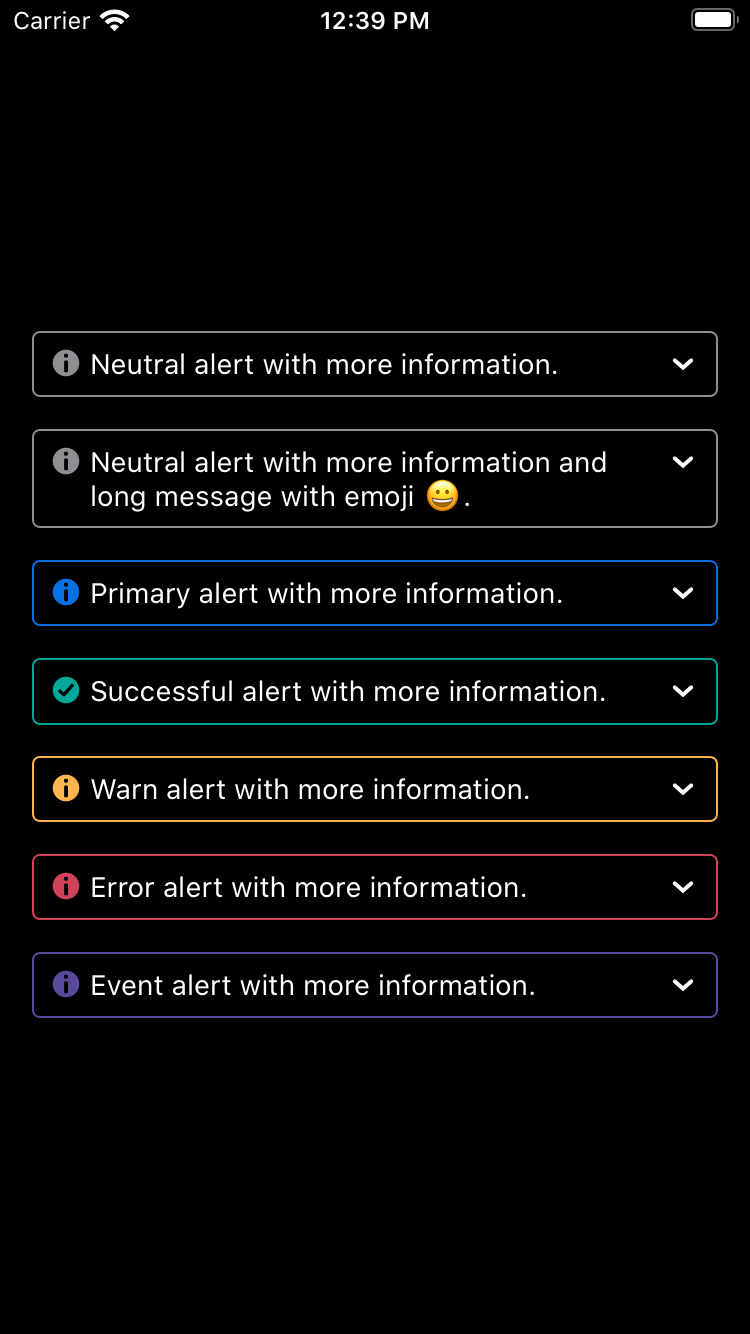
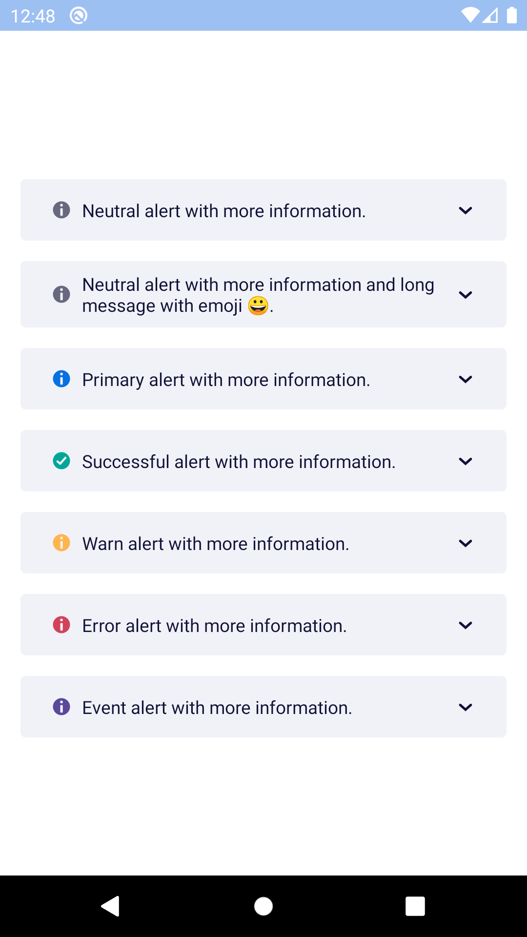
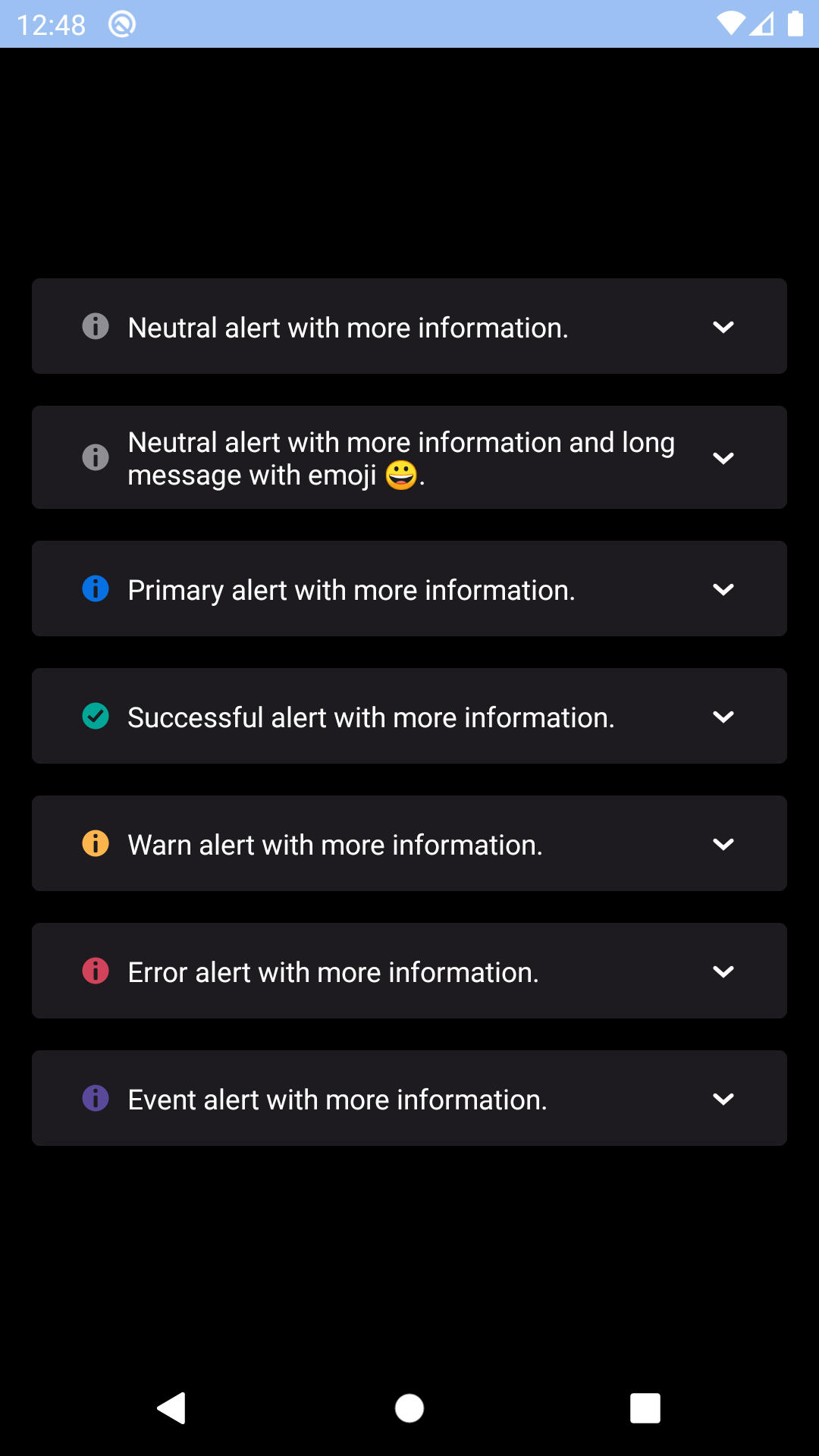
## Expandable
| Day | Night |
| --- | --- |
|
|
## Expandable
| Day | Night |
| --- | --- |
|  |
|  |
|
|
|  |
|  |
## Installation
Check the main [Readme](https://github.com/skyscanner/backpack-react-native#usage) for a complete installation guide.
## Usage
```js
import React, { Component } from 'react';
import { View, StyleSheet } from 'react-native';
import BpkText from 'backpack-react-native/bpk-component-text';
import { spacingBase } from '@skyscanner/bpk-foundations-react-native/tokens/base.react.native';
import BpkBannerAlert, { ALERT_TYPES } from 'backpack-react-native/bpk-component-banner-alert';
const styles = StyleSheet.create({
container: {
flex: 1,
justifyContent: 'center',
padding: spacingBase,
},
bannerAlert: {
marginBottom: spacingBase,
},
});
export default class App extends Component {
constructor() {
super();
this.state = {
showDismissable: true,
expanded: false,
};
}
onDismiss = () => {
this.setState({ showDismissable: false });
};
onExpandablePress = () => {
this.setState({ expanded: !this.state.expanded });
};
render() {
return (
Lorem ipsum dolor sit amet, consectetur adipiscing elit. Quisque
sagittis sagittis purus, id blandit ipsum. Pellentesque nec diam nec
erat condimentum dapibus. Nunc diam augue, egestas id egestas ut,
facilisis nec mi. Donec et congue odio, nec laoreet est. Integer
rhoncus varius arcu, a fringilla libero laoreet at.
);
}
}
```
## Props
| Property | PropType | Required | Default Value |
| ------------------------- | ------------------ | -------- | ------------- |
| message | string or Node | true | - |
| type | oneOf(ALERT_TYPES) | true | - |
| animateOnEnter | bool | false | false |
| animateOnLeave | bool | false | false |
| children | node | false | null |
| dismissable | bool | false | false |
| dismissButtonLabel | string | false | null |
| expanded | bool | false | false |
| onDismiss | func | false | null |
| onToggleExpanded | func | false | null |
| show | bool | false | true |
| toggleExpandedButtonLabel | string | false | null |
| bannerStyle | style | false | null |
### Prop Details
#### bannerStyle
These styles will be applied to the banner alerts outer `View` container, but still within it's animation container. This is useful for maintaining smooth animations whilst applying top/bottom margin.
|
## Installation
Check the main [Readme](https://github.com/skyscanner/backpack-react-native#usage) for a complete installation guide.
## Usage
```js
import React, { Component } from 'react';
import { View, StyleSheet } from 'react-native';
import BpkText from 'backpack-react-native/bpk-component-text';
import { spacingBase } from '@skyscanner/bpk-foundations-react-native/tokens/base.react.native';
import BpkBannerAlert, { ALERT_TYPES } from 'backpack-react-native/bpk-component-banner-alert';
const styles = StyleSheet.create({
container: {
flex: 1,
justifyContent: 'center',
padding: spacingBase,
},
bannerAlert: {
marginBottom: spacingBase,
},
});
export default class App extends Component {
constructor() {
super();
this.state = {
showDismissable: true,
expanded: false,
};
}
onDismiss = () => {
this.setState({ showDismissable: false });
};
onExpandablePress = () => {
this.setState({ expanded: !this.state.expanded });
};
render() {
return (
Lorem ipsum dolor sit amet, consectetur adipiscing elit. Quisque
sagittis sagittis purus, id blandit ipsum. Pellentesque nec diam nec
erat condimentum dapibus. Nunc diam augue, egestas id egestas ut,
facilisis nec mi. Donec et congue odio, nec laoreet est. Integer
rhoncus varius arcu, a fringilla libero laoreet at.
);
}
}
```
## Props
| Property | PropType | Required | Default Value |
| ------------------------- | ------------------ | -------- | ------------- |
| message | string or Node | true | - |
| type | oneOf(ALERT_TYPES) | true | - |
| animateOnEnter | bool | false | false |
| animateOnLeave | bool | false | false |
| children | node | false | null |
| dismissable | bool | false | false |
| dismissButtonLabel | string | false | null |
| expanded | bool | false | false |
| onDismiss | func | false | null |
| onToggleExpanded | func | false | null |
| show | bool | false | true |
| toggleExpandedButtonLabel | string | false | null |
| bannerStyle | style | false | null |
### Prop Details
#### bannerStyle
These styles will be applied to the banner alerts outer `View` container, but still within it's animation container. This is useful for maintaining smooth animations whilst applying top/bottom margin.