# bpk-component-alert
> Backpack React Native alert component.
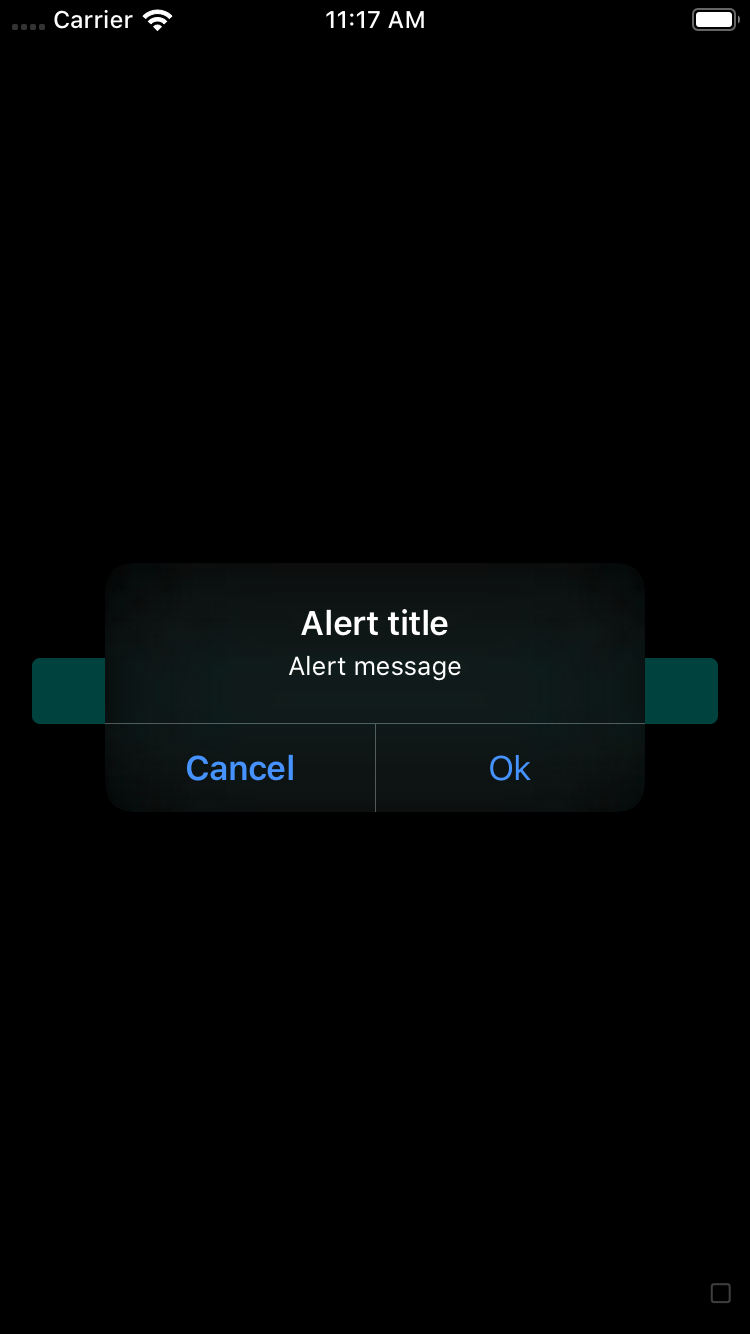
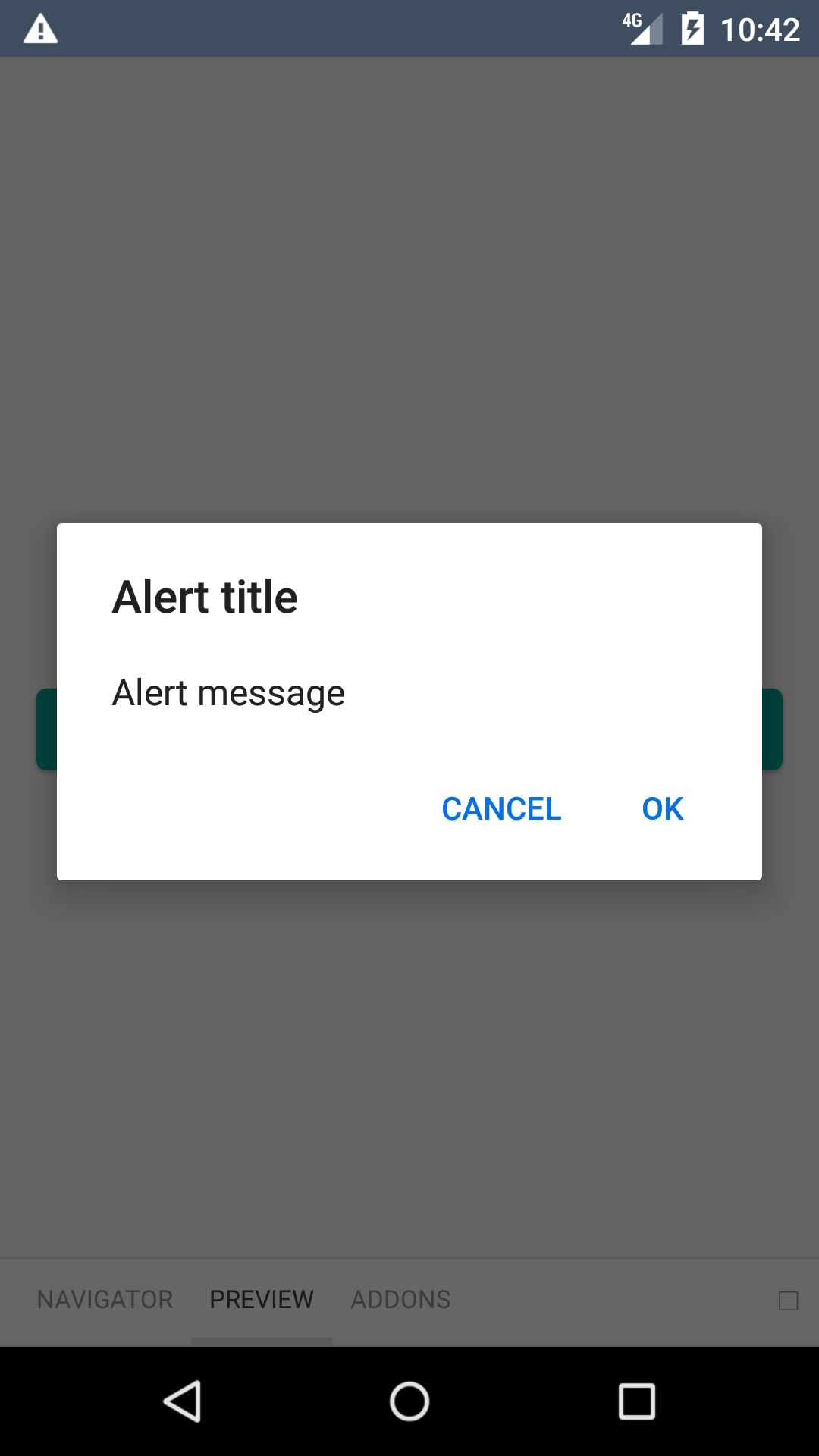
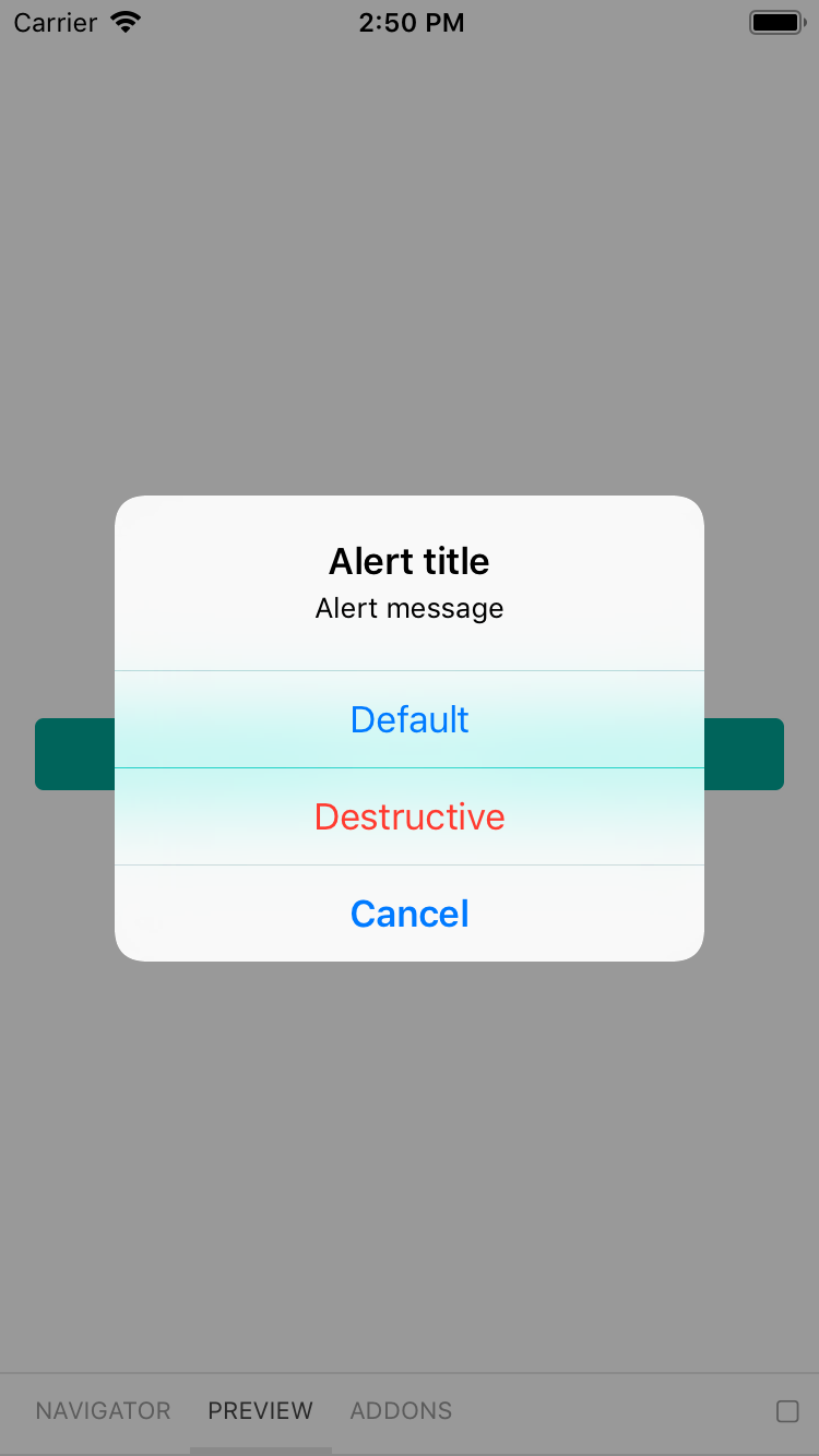
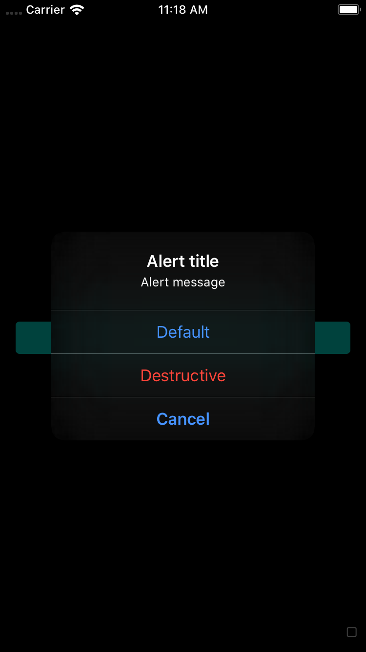
## Default
| Day | Night |
| --- | --- |
| 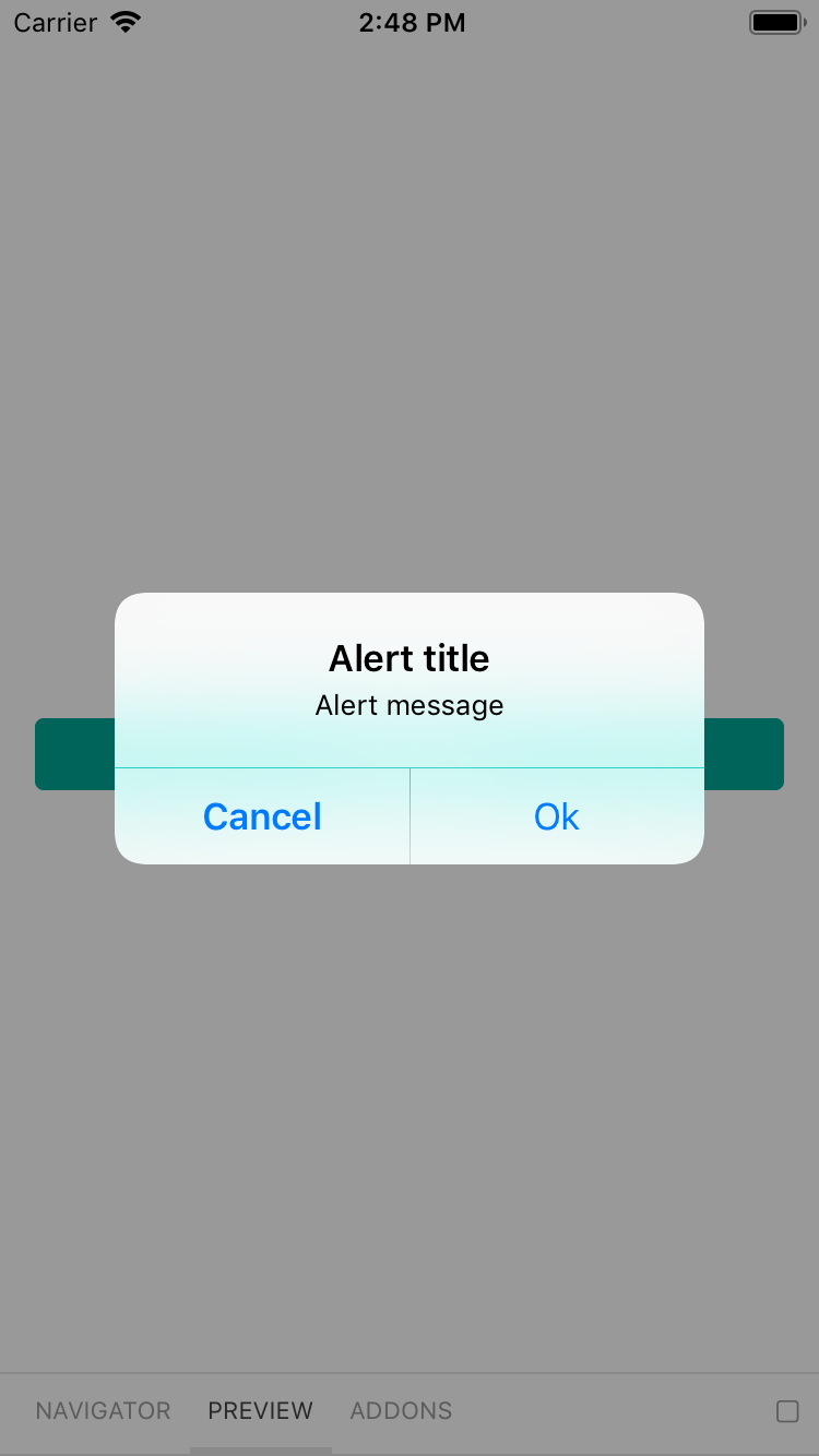 |
|  |
|
|
|  |
| 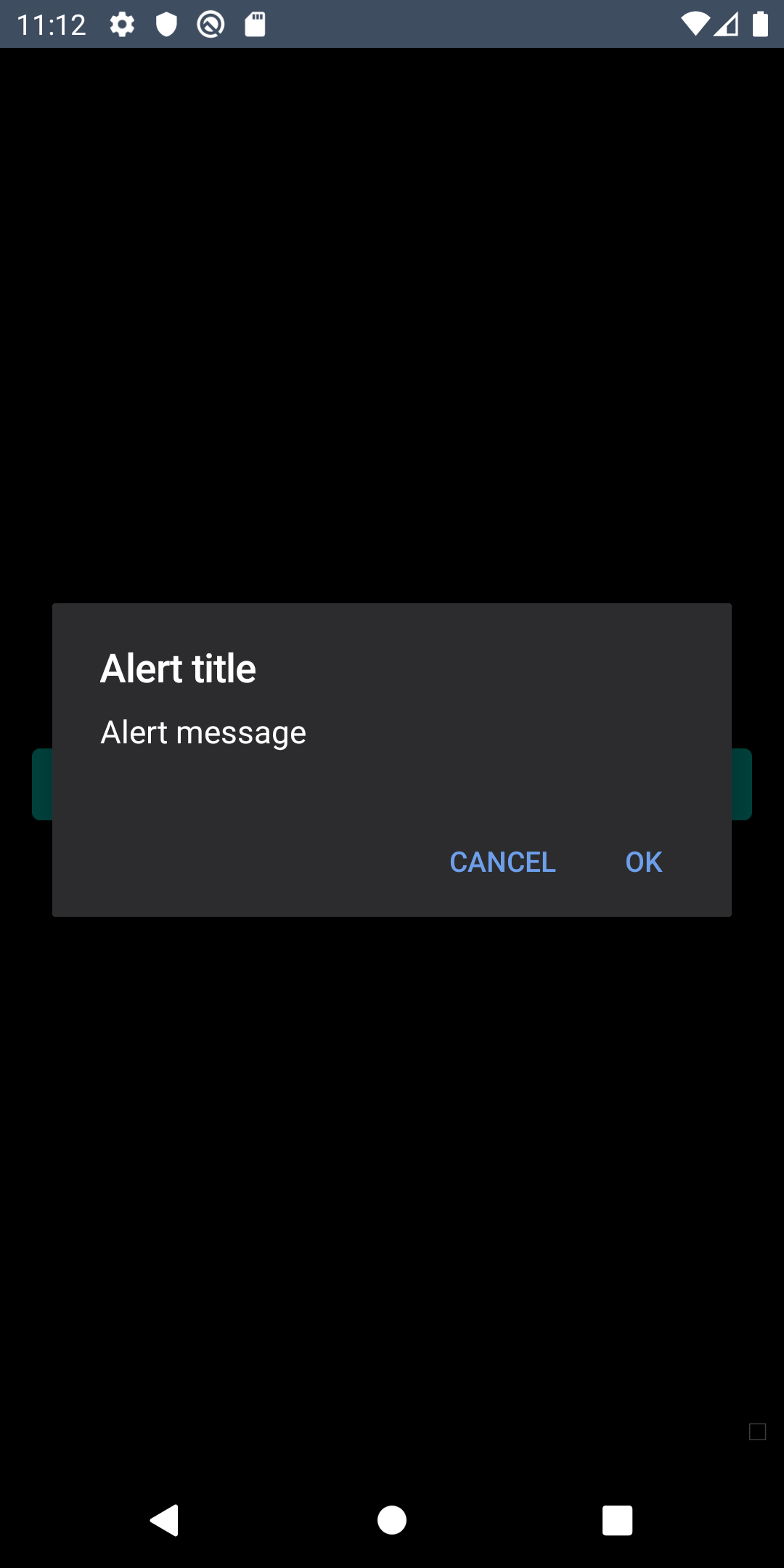 |
## Cancelable
| Day | Night |
| --- | --- |
|
|
## Cancelable
| Day | Night |
| --- | --- |
|  |
| |
|
|
|  |
| |
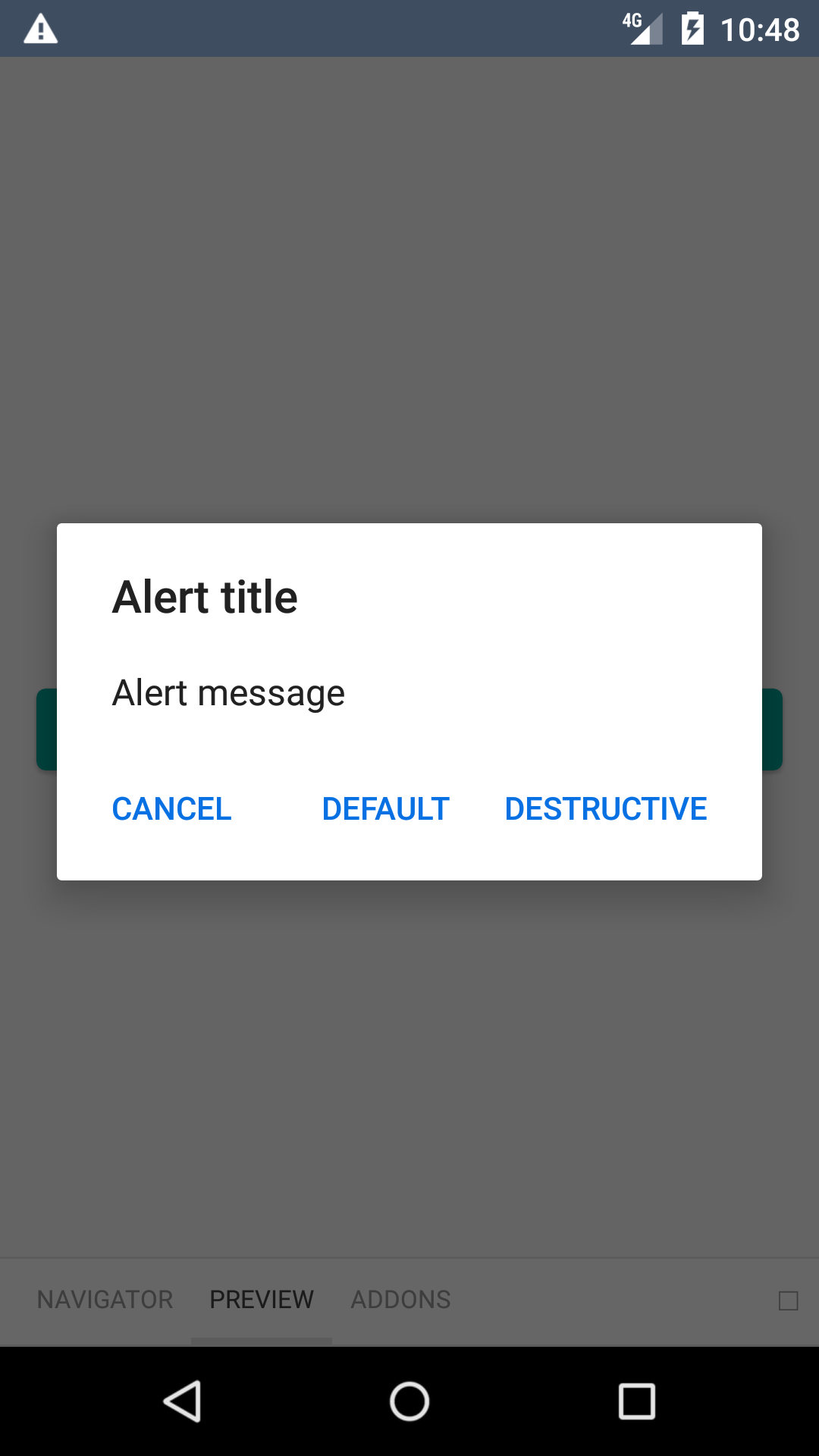
## Three button
| Day | Night |
| --- | --- |
|
|
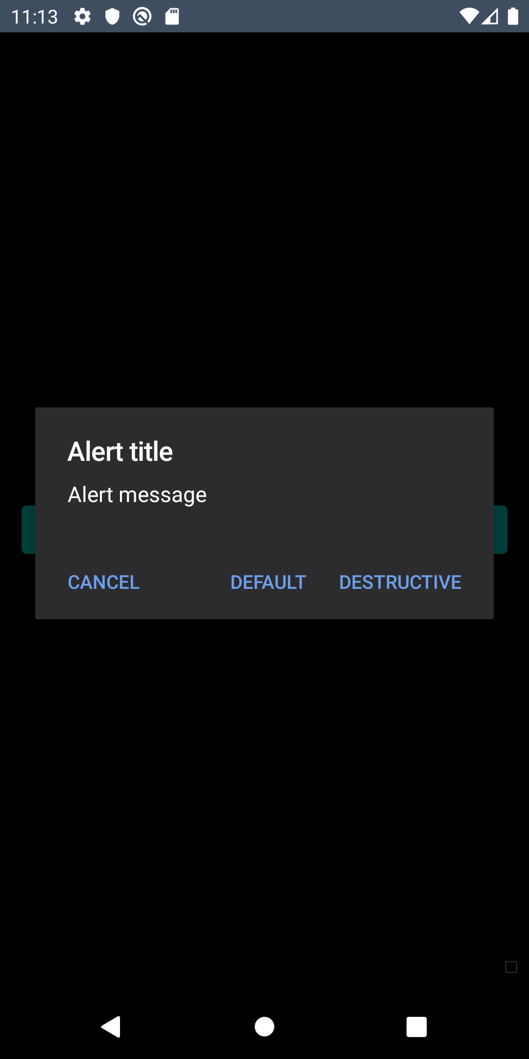
## Three button
| Day | Night |
| --- | --- |
|  |
| |
|
|
|  |
| |
## Installation
Check the main [Readme](https://github.com/skyscanner/backpack-react-native#usage) for a complete installation guide.
## Usage
```js
import BpkAlert
import React, { Component } from 'react';
import BpkAlert from 'backpack-react-native/bpk-component-alert';
BpkAlert.alert(
'Alert title',
'Alert message',
[
{
text: 'Cancel',
onPress: () => console.log('negative button pressed'),
style: 'cancel',
},
{ text: 'Default', onPress: () => console.log('positive button press') },
{
text: 'Destructive',
onPress: () => console.log('Destructive button press'),
style: 'destructive',
},
],
{ cancelable: false },
);
```
## Theming and Dark mode
### Android
To use the correct Backpack font and colours, the dialog needs to be themed in the native side. Bellow is an example theme you can use:
```xml
```
|
## Installation
Check the main [Readme](https://github.com/skyscanner/backpack-react-native#usage) for a complete installation guide.
## Usage
```js
import BpkAlert
import React, { Component } from 'react';
import BpkAlert from 'backpack-react-native/bpk-component-alert';
BpkAlert.alert(
'Alert title',
'Alert message',
[
{
text: 'Cancel',
onPress: () => console.log('negative button pressed'),
style: 'cancel',
},
{ text: 'Default', onPress: () => console.log('positive button press') },
{
text: 'Destructive',
onPress: () => console.log('Destructive button press'),
style: 'destructive',
},
],
{ cancelable: false },
);
```
## Theming and Dark mode
### Android
To use the correct Backpack font and colours, the dialog needs to be themed in the native side. Bellow is an example theme you can use:
```xml
```