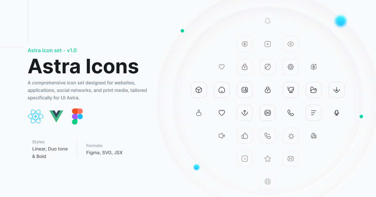
A comprehensive icon library designed for modern web applications, featuring 880 beautifully crafted icons across multiple styles.
## ✨ Features
- **900+ Total Icons** - Comprehensive collection for all your UI needs
- **5 Distinct Styles** - Linear, Bold, Duotone, Brand, and 3D icons
- **288 Unique Icons** - Each available in multiple styles
- **32 3D Icons** - Modern three-dimensional style icons
- **18 Brand Icons** - Popular company and service logos
- **Framework Support** - Official React and Vue packages
- **TypeScript Support** - Fully typed for better developer experience
- **Tree Shakeable** - Import only the icons you need
- **Customizable** - Easy to style with CSS or utility classes
- **Accessible** - Built with accessibility in mind
## 📦 Installation
### React
```bash
npm install @astraicons/react
# or
yarn add @astraicons/react
# or
pnpm add @astraicons/react
```
### Vue
```bash
npm install @astraicons/vue
# or
yarn add @astraicons/vue
# or
pnpm add @astraicons/vue
```
## 🚀 Quick Start
### React
```jsx
import { HomeIcon } from '@astraicons/react/linear';
import { HeartIcon } from '@astraicons/react/bold';
import { StarIcon } from '@astraicons/react/duotone';
import { AppleIcon } from '@astraicons/react/brand';
import { CubeIcon } from '@astraicons/react/3d';
function MyComponent() {
return (
);
}
```
### Vue
```vue
```
### Direct SVG Usage
Copy the SVG source from [uiastra.com](https://uiastra.com) and embed it directly into your HTML:
```html
```
## 🎨 Icon Styles
### Linear
Outline style icons with consistent 1.5px stroke width. Perfect for modern, minimalist interfaces.
```jsx
import { ActivityIcon, BellIcon, CameraIcon } from '@astraicons/react/linear';
```
### Bold
Filled or bold stroke icons for emphasis and better visibility at smaller sizes.
```jsx
import { ActivityIcon, BellIcon, CameraIcon } from '@astraicons/react/bold';
```
### Duotone
Two-tone icons that combine filled and outline styles for depth and visual interest.
```jsx
import { ActivityIcon, BellIcon, CameraIcon } from '@astraicons/react/duotone';
```
### Brand
Company and service logos including social media platforms and popular brands.
```jsx
import { AppleIcon, GoogleIcon, TwitterIcon } from '@astraicons/react/brand';
```
### 3D
Modern three-dimensional style icons with depth and perspective for contemporary interfaces.
```jsx
import { CubeIcon, FolderIcon, BoxIcon } from '@astraicons/react/3d';
```
## 📋 Icon Naming Convention
Icons follow a consistent naming pattern:
- Upper camel case (PascalCase)
- Always end with `Icon` suffix
- Descriptive names for easy discovery
Examples:
- `HomeIcon`
- `ShoppingCartIcon`
- `ArrowRightIcon`
- `UserProfileIcon`
## 🔧 Customization
### Using Tailwind CSS
```jsx
```
### Using Inline Styles
```jsx
```
### Using CSS
```css
.custom-icon {
width: 2rem;
height: 2rem;
color: #3B82F6;
}
```
```jsx
```
## 📚 Documentation
- [Full Icon List](./ICON_LIST.md) - Complete alphabetical list of all 877 icons
- [Icons by Category](./ICON_CATEGORIES.md) - Icons organized by functional groups
- [Browse React Icons](https://unpkg.com/browse/@astraicons/react/) - View all React icons on UNPKG
- [Browse Vue Icons](https://unpkg.com/browse/@astraicons/vue/) - View all Vue icons on UNPKG
- [Interactive Gallery](https://uiastra.com) - Search and preview all icons
## 🌐 Browser Support
- Chrome (latest)
- Firefox (latest)
- Safari (latest)
- Edge (latest)
- Opera (latest)
## 📦 Package Details
### React Package
- **Package**: `@astraicons/react`
- **Version**: 1.0.1
- **Size**: ~14MB unpacked
- **Files**: 3,524 (JS + TypeScript definitions)
- **Tree-shakeable**: ✅
- **TypeScript**: ✅
- **Peer Dependencies**: React >= 16
### Vue Package
- **Package**: `@astraicons/vue`
- **Version**: 1.0.1
- **Size**: ~14MB unpacked
- **Files**: 3,524 (JS + TypeScript definitions)
- **Tree-shakeable**: ✅
- **TypeScript**: ✅
- **Peer Dependencies**: Vue >= 3
## 🤝 Contributing
We welcome contributions to improve the library! However, please note:
- ✅ **Bug fixes** - Report or fix issues with existing icons
- ✅ **TypeScript improvements** - Enhance type definitions
- ✅ **Documentation** - Improve guides and examples
- ✅ **Performance** - Optimize build process or package size
- ❌ **New icons** - We're not accepting new icon contributions at this time
### Development Setup
```bash
# Clone the repository
git clone https://github.com/uiastra/astraicons.git
cd astraicons
# Install dependencies
npm install
# Build all packages
npm run build
# Build specific style
npm run build-linear
npm run build-bold
npm run build-duotone
npm run build-brand
npm run build-3d
```
## 🙏 Credits
- Icon design and curation by [UI Astra](https://uiastra.com)
- Build system inspired by [Heroicons](https://github.com/tailwindlabs/heroicons)
- Created with ❤️ for the developer community
## 📄 License
This library is MIT licensed. See [LICENSE](./LICENSE) for details.
---