# antd-colorpicker
[![NPM version][npm-image]][npm-url]
[![Build][github-build]][github-build-url]
![npm-typescript]
[![License][github-license]][github-license-url]
Package helps you to add colorpicker to [Antd Design](https://www.npmjs.com/package/antd) form.
[React-color](https://www.npmjs.com/package/react-color) is used as colorpicker.
[**Live Demo**](https://gapon2401.github.io/antd-colorpicker/)
## Installation:
```bash
npm install antd-colorpicker --save-dev
```
or
```bash
yarn add -D antd-colorpicker
```
## Usage :
Add `Colorpicker` to your form inside `Form.Item`:
```js
import React from 'react'
import { Button, Form } from 'antd'
import { Colorpicker, ColorPickerValue } from 'antd-colorpicker'
import 'antd/dist/antd.css'
const App = () => {
const initialValues = { color: { r: 26, g: 14, b: 85, a: 1 } }
const handleOnFinish = (values: { color: ColorPickerValue }) => {
console.log(values)
}
return (
)
}
export default App
```
### Properties
| Property | Description | Type | Default |
|---------------|-----------------------------------------------------------------------------------------------------------------|-------------------------------------------------------------------------------------------------------------------------------------------------------------------------------------------------------------------------------------------------------------------|--------------|
| picker | Type of the picker | BlockPicker
ChromePicker
CirclePicker
CompactPicker
GithubPicker
GooglePicker
HuePicker
MaterialPicker
PhotoshopPicker
SketchPicker
SliderPicker
SwatchesPicker
TwitterPicker | SketchPicker |
| popup | Use popup for colorpicker. Component [Popover](https://ant.design/components/popover/) | boolean | false |
| onColorResult | Function that changes the color value, which will be returned | function(color) | undefined |
| blockStyles | Relevant only when `popup=true`. CSS styles for block, which changes the color after picking it at popup window | CSSProperties | { } |
| popoverProps | Properties for `Popover` component | [object](https://ant.design/components/popover/#API) | { } |
| ...rest | Custom properties for react-color pickers | [props](http://casesandberg.github.io/react-color/) | |
## Examples
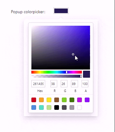
### Popup window
```js
```
### Change block, which fires popup window
```js
```
### Choose one of the 13 types of picker
You can use one of the following: `BlockPicker` | `ChromePicker` | `CirclePicker` | `CompactPicker` | `GithubPicker` | `GooglePicker` | `HuePicker` | `MaterialPicker` | `PhotoshopPicker` | `SketchPicker` | `SliderPicker` | `SwatchesPicker` | `TwitterPicker`
```js
```
### Customize the result value of the color
By default you will have the following color result:
```json
{
"hsl": {
"h": 250.3448275862069,
"s": 0.1594202898550725,
"l": 0.346725,
"a": 1
},
"hex": "#4f4a67",
"rgb": {
"r": 79,
"g": 74,
"b": 103,
"a": 1
},
"hsv": {
"h": 250.3448275862069,
"s": 0.2750000000000001,
"v": 0.402,
"a": 1
},
"oldHue": 250.3448275862069,
"source": "hsv"
}
```
Let's try to change it, to get what we want:
```js
color.rgb} />
```
The result value will be:
```json
{
"r": 79,
"g": 74,
"b": 103,
"a": 1
}
```
## How to use the component outside the form?
You have to define `value` and `onChange` (or `onChangeComplete`) props.
This is how your component may look like:
```js
import React, { useState } from 'react'
import { AnyColorFormat, Colorpicker } from 'antd-colorpicker'
const App = () => {
const [color, setColor] = useState({
r: 0,
g: 0,
b: 0,
a: 0.5,
})
const onChange = (color: AnyColorFormat) => {
setColor(color)
}
return (
)
}
export default App
```
[npm-url]: https://www.npmjs.com/package/antd-colorpicker
[npm-image]: https://img.shields.io/npm/v/antd-colorpicker
[github-license]: https://img.shields.io/github/license/gapon2401/antd-colorpicker
[github-license-url]: https://github.com/gapon2401/antd-colorpicker/blob/master/LICENSE
[github-build]: https://github.com/gapon2401/antd-colorpicker/actions/workflows/publish.yml/badge.svg
[github-build-url]: https://github.com/gapon2401/antd-colorpicker/actions/workflows/publish.yml
[npm-typescript]: https://img.shields.io/npm/types/antd-colorpicker