# Angular SignaturePad
This project provides components and utils for digital signatures.
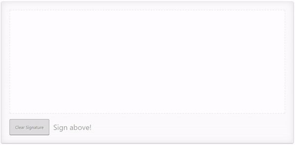
Use it to draw smooth signatures based on HTML5 canvas and uses variable width Bézier curve interpolation.
[SignaturePad](https://github.com/szimek/signature_pad) is used a the vanilla implementation.
# DEMO
- [ ] [Live Demo](https://biophoton.github.io/angular-signature-pad)
- [ ] [cli-project](https://github.io/BioPhoton/angular-signature-pad)
## Quick code example
``` html
// app.component.html
```
## Installing
1. Load library
``` bash
$ npm install angular-signature-pad --save
```
2. Import module
``` typescript
// src/app/app.module.ts
...
// IMPORT YOUR LIBRARY
import { AngularSignaturePadModule } from 'angular-signature-pad';
@NgModule({
imports: [
...
AngularSignaturePadModule.forRoot()
]
...
})
export class AppModule { }
```
3. Use Component
```typescript
// src/app/app.component.html
value:
{{sigPad.value | json}}
```
## Styles
To apply the default styles just import the `styles.scss` file from the `node_modules/angular-signature-pad` folder.
```scss
// src/styles.scss
@import "../node_modules/angular-signature-pad/styles";
```
### Custom styles
The SignaturePadCard and SignaturePadCardGroup component have a default styling set over the `[theme]` property.
It is applied over the `.raised` class internally.
To create your own theme create a class i.e. `.my-theme` and combine
it with the default class of the signature pad. `.signature-pad-card.my-theme`.
Apply it to the component over the `[theme]` property binding.
1. Create styles
```scss
.signature-pad-card.my-theme {
...
.signature-pad {
...
}
.signature-pad-canvas {
...
}
.actions {
...
.clear {
...
}
}
.feedback {
...
}
}
```
2. Apply styles to the theme property binding
```html
```
## Components
## Validators