# angular-material-image-uploader
[](https://www.npmjs.com/package/angular-material-image-uploader)
[](https://angular.dev)
[](https://github.com/00Arun/AngularImageUploader/blob/master/image-uploader/projects/angular-material-image-uploader/LICENSE)
Angular Material image uploader with a built-in batch cropper.
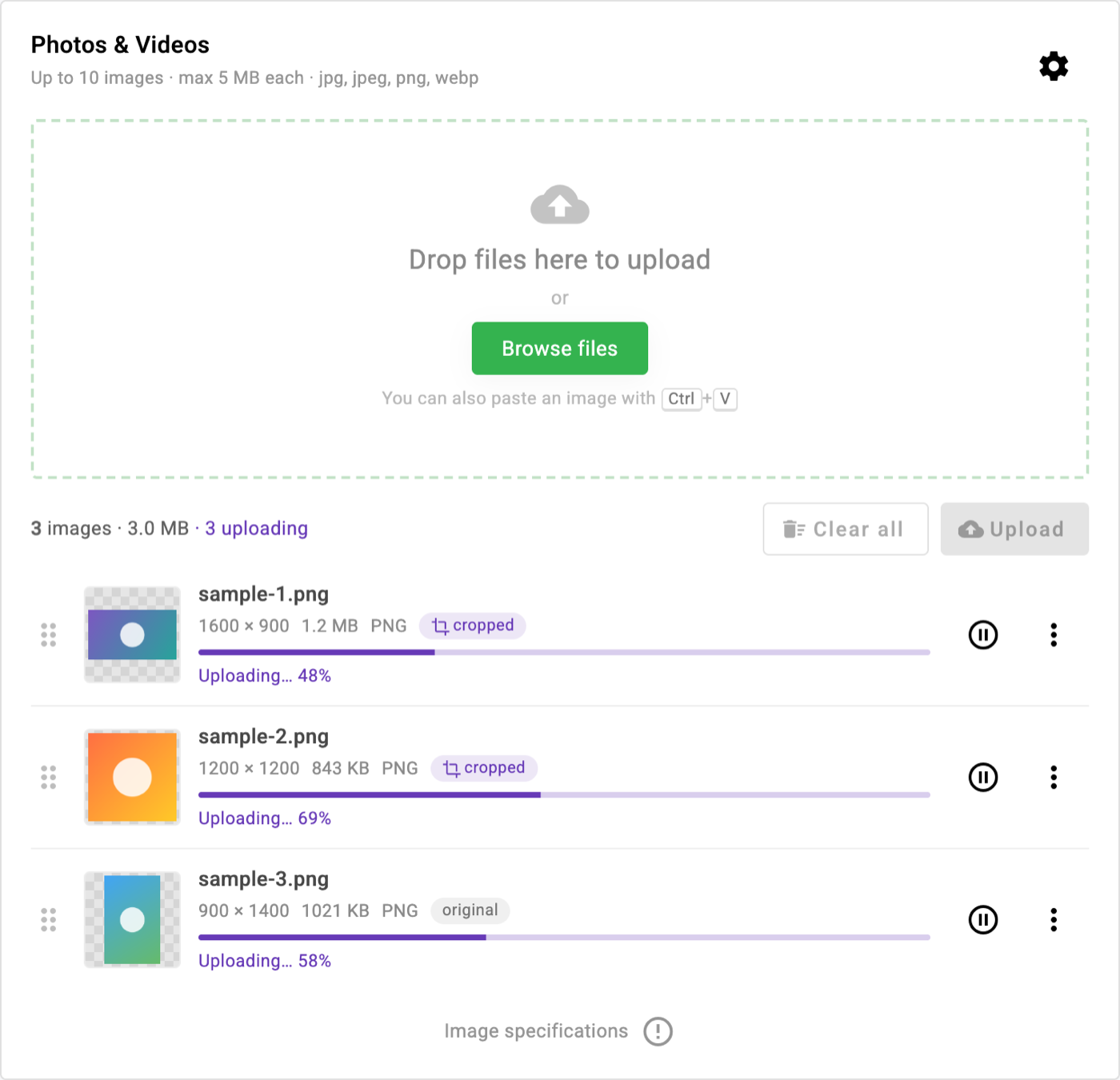
- Drag & drop, file picker, clipboard paste (Ctrl/Cmd+V)
- Single or multiple upload, max files, max size, allowed types, duplicate check
- Batch cropper: "2 of 5" progress, thumbnail strip, Crop & next / Use original / Remove
- Free-form or fixed aspect ratios (1:1, 4:3, 3:2, 16:9, 9:16), round crop, rotate, flip, zoom
- Output as PNG / JPEG / WebP with quality and optional downscale, live preview with size estimate
- Item list with thumbnails and metadata, preview lightbox, re-crop, download, drag to reorder
- Upload with per-item progress, cancel, retry, "Upload all", optional auto upload
- Every setting is set from the parent; an optional in-page settings panel lets users change them at runtime
- Angular 22, standalone components, signals, zoneless-ready
> **v2 is a rewrite for Angular 22.** v1.x targets Angular 9. See [Upgrading from v1](#upgrading-from-v1).
## Screenshots
| Drop zone | Batch cropper |
| --- | --- |
| 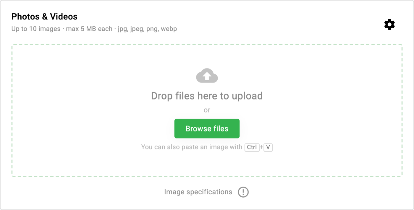 | 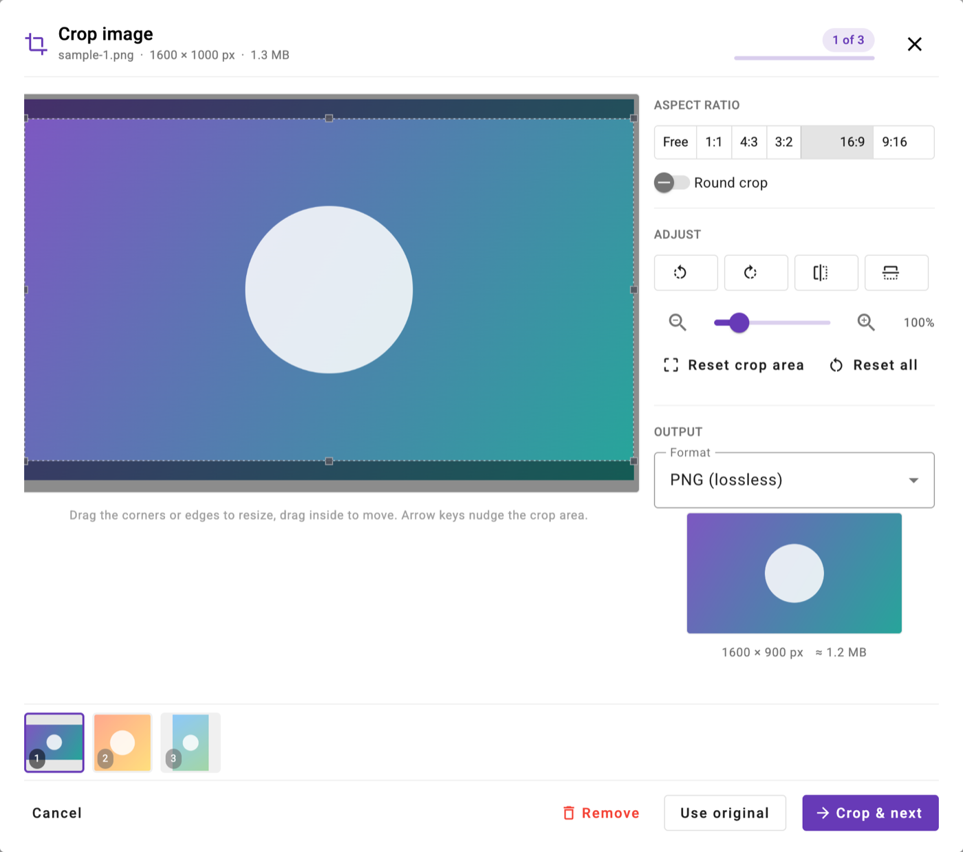 |
| Settings panel | Preview |
| --- | --- |
| 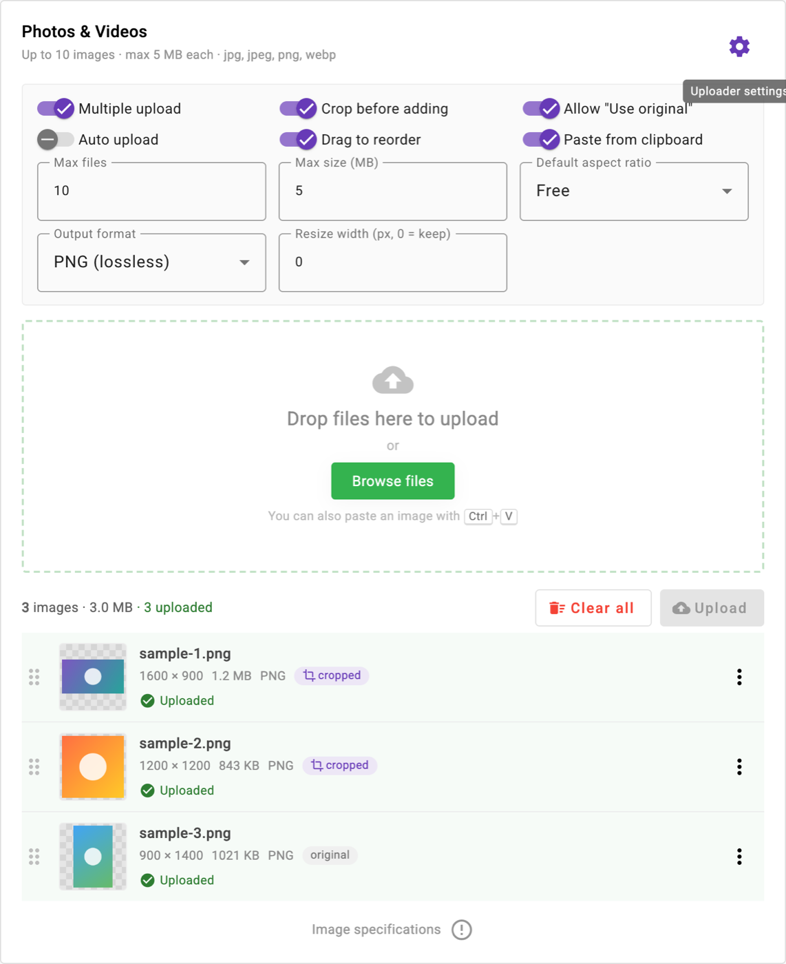 | 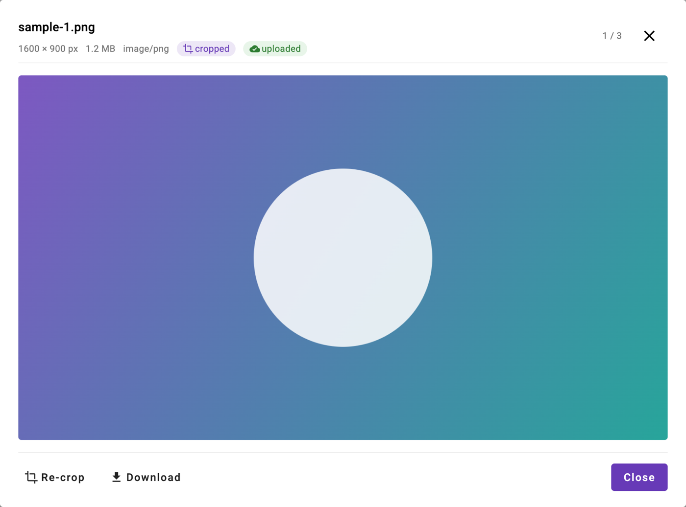 |
## Installation
```bash
npm install angular-material-image-uploader @angular/material @angular/cdk ngx-image-cropper ngx-toastr
```
Peer dependencies: Angular 22 (`core`, `common`, `forms`, `animations`, `platform-browser`),
Angular Material and CDK 22, `ngx-image-cropper` 9, `ngx-toastr` 20+, `rxjs` 7.8.
`ngx-toastr` declares an Angular 21 peer range, so install with `--legacy-peer-deps` if npm complains.
### 1. Providers
```ts
// main.ts / app.config.ts
import { provideAngularMaterialImageUploader } from 'angular-material-image-uploader';
bootstrapApplication(App, {
providers: [provideAngularMaterialImageUploader()]
});
```
`provideAngularMaterialImageUploader()` registers Material animations, `HttpClient` and `ngx-toastr`.
Pass a partial toastr `GlobalConfig` to change the toast position or behaviour. If your app already
provides those three, you can skip this helper.
### 2. Styles
In `angular.json`:
```json
"styles": [
"@angular/material/prebuilt-themes/deeppurple-amber.css",
"node_modules/ngx-toastr/toastr.css",
"src/styles.scss"
]
```
In `index.html` (Material Icons and the Roboto font):
```html
```
### 3. Component
```ts
import { Component } from '@angular/core';
import { ImageUploaderComponent, UploadItem, UploaderConfig } from 'angular-material-image-uploader';
@Component({
selector: 'app-root',
imports: [ImageUploaderComponent],
template: `
`
})
export class App {
/** Configuration **/
showSettingsButton = true; // false hides the gear icon and the in-page settings panel
config: Partial = {
multiple: true,
maxFiles: 10,
maxFileSizeMB: 5,
allowedTypes: ['jpg', 'jpeg', 'png', 'webp'],
cropBeforeAdd: true,
allowSkipCrop: true,
defaultAspectRatio: 'free',
outputFormat: 'png',
outputQuality: 90,
resizeToWidth: 0,
autoUpload: false,
allowReorder: true,
allowPaste: true,
uploadUrl: ''
};
imageDetails: UploadItem[] = [];
getImageDetails(items: UploadItem[]) { this.imageDetails = items; }
onUploaded(item: UploadItem) { console.log('uploaded', item.name, item.file); }
}
```
## API
### Inputs
| Input | Type | Default | Description |
| --- | --- | --- | --- |
| `config` | `Partial` | `DEFAULT_UPLOADER_CONFIG` | Any subset of the options below. Missing keys use the defaults. |
| `showSettingsButton` | `boolean` | `true` | Show the gear icon that opens the in-page settings panel. Set `false` to lock the settings to what you pass in `config`. |
### `UploaderConfig`
| Option | Type | Default | Description |
| --- | --- | --- | --- |
| `multiple` | `boolean` | `true` | Allow several images. `false` keeps one image and replaces it on the next pick. |
| `maxFiles` | `number` | `10` | Maximum number of images in the list (multiple mode only). |
| `maxFileSizeMB` | `number` | `5` | Per-file size limit in MB. |
| `allowedTypes` | `string[]` | `['jpg','jpeg','png','webp']` | Accepted image subtypes. |
| `cropBeforeAdd` | `boolean` | `true` | Open the cropper for every picked image before it is added. |
| `allowSkipCrop` | `boolean` | `true` | Show a "Use original" button in the cropper. |
| `defaultAspectRatio` | `'free' \| '1:1' \| '4:3' \| '3:2' \| '16:9' \| '9:16'` | `'free'` | Aspect ratio the cropper starts with. Users can switch in the dialog. |
| `outputFormat` | `'png' \| 'jpeg' \| 'webp'` | `'png'` | Format of the cropped file. |
| `outputQuality` | `number` | `90` | Quality (1-100) for JPEG / WebP. |
| `resizeToWidth` | `number` | `0` | Downscale cropped output to this width in px. `0` keeps the original scale. |
| `autoUpload` | `boolean` | `false` | Start uploading as soon as an image is added. |
| `allowReorder` | `boolean` | `true` | Drag-and-drop reordering of the list. |
| `allowPaste` | `boolean` | `true` | Accept images pasted from the clipboard anywhere on the page. |
| `uploadUrl` | `string` | `''` | POST endpoint for uploads. Empty simulates the upload in the UI. |
### Outputs
| Output | Payload | Description |
| --- | --- | --- |
| `imageDetails` | `UploadItem[]` | Emits the whole list whenever an image is added, edited, reordered, uploaded, or removed. |
| `uploadComplete` | `UploadItem` | Emits when an item's upload finishes. |
### `UploadItem`
| Field | Type | Description |
| --- | --- | --- |
| `id` | `string` | Stable id for the list entry |
| `name`, `type`, `size` | `string`, `string`, `number` | Of the file that will be uploaded |
| `width`, `height` | `number` | Pixel dimensions |
| `originalFile` | `File` | The file as picked, kept for re-cropping |
| `file` | `File` | Cropped output, or the original if cropping was skipped |
| `previewUrl` | `string` | Data URL for thumbnails / previews |
| `cropped` | `boolean` | Whether `file` is a crop |
| `status` | `'ready' \| 'uploading' \| 'done' \| 'error'` | Upload state |
| `progress` | `number` | 0-100 |
| `error` | `string?` | Message when `status` is `'error'` |
### Uploading
When `uploadUrl` is set, each item is POSTed as `multipart/form-data` with fields
`file`, `originalName` and `cropped`, and the progress bar reflects real upload progress.
When it is empty, uploads are simulated so the UI works without a backend.
Use `(uploadComplete)` or `(imageDetails)` to send files yourself if you prefer.
## Upgrading from v1
| v1 (Angular 9) | v2 (Angular 22) |
| --- | --- |
| `AngularMaterialUploaderModule` in `imports` | Import the standalone `ImageUploaderComponent`; add `provideAngularMaterialImageUploader()` to providers |
| `[allowImageType]`, `[sizeLimit]`, `[Iscrop]` | Still accepted, but prefer `[config]="{ allowedTypes, maxFileSizeMB, cropBeforeAdd }"` |
| `(imageDetails)` emitted `{ Url, DisplayName }[]` | Emits `UploadItem[]` (see above) |
| `@angular/flex-layout` required | No longer needed |
The selector `app-angular-material-uploader` is unchanged.
## License
MIT