# analogue-time-picker
A small and simple time picker based on google material UI
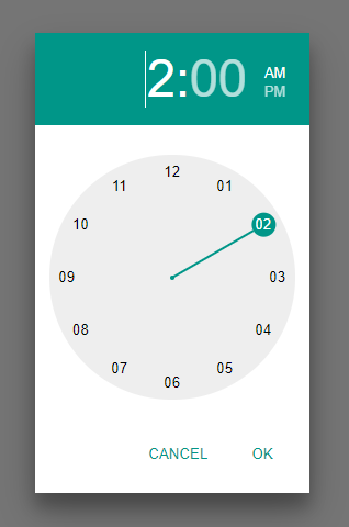
* 12h and 24h versions
* Mobile and desktop enabled
* Custom styles, and works with material UI
* Responsive
* Accessable
* No dependencies
## How to use
## Demo
https://shanegh.github.io/analogue-time-picker/demo/
### Use
```javascript
import { timePickerInput } from 'analogue-time-picker'
var input = document.getElementById("myInput");
timePickerInput({ inputElement: input });
```
## Style
The time picker has a default style. You can override by
* Adding a material UI stylesheet (e.g. https://code.getmdl.io/1.3.0/material.cyan-teal.min.css)
* Override the material UI styles used:
* `.atp .mdl-color--primary { background-color: green; } .atp .mdl-button--primary { color: green; }`
## Size
The size of the time picker is specified by the **width** and the **font size**.
The clock has a fixed aspect ratio, so the width will determine the width and the height of the component. The font size specifies the size and spacing of the figures.
* Retain the default size of `300px`.
* Add a `width` paramater to the time picker: `timePicker({ width: "300px" })`. The font size is then generated automatically.
* Specify the width on the parent element
```javascript
var parent = document.getElementById("theParent");
parent.style.width = "300px";
parent.style.fontSize = "16px";
timePicker({ element: parent });
```
## API
analog-time-picker exposes 3 functions: `timePicker`, `timePickerModal` and `timePickerInput`.
### timePicker
Create a timepicker contained in the "element" property of the output.
```javascript
var timePicker = timePicker({
element: document.getElementById("parentElement"),
mode: 12,
width: "300px",
time: { hour: 13, minute: 0 }
});
```
**Inputs**
| Name | Type | Optional | Description | Default |
| - | - | - | - | - |
| element | HTMLElement | true | An element to append the time picker html to. | undefined |
| mode | number/string | true | 12 hour or 24 hour mode. Accepts 12, 24, "12", "24". | The default browser culture of the user |
| width | number/string | true | The width of the component. Will also be used to calculate the font size. If `%` or `em` are used, the font sized cannot be auto calculated, and must be specified manually via css | "300px" |
| time | {hour: number | string, minute: number | string} or Date | true | The initial time of the component in 24h format | { hour: 0, minute: 0 } |
| focus | boolean | true | If set to true, the "hours" input will be focused on render. | false |
**Output**
| Name | Type | Description |
| - | - | - |
| element | HTMLElement | The element which contains the time picker |
| setWidth | (width: number | string) => void | See width input. |
| getTime | () => {hour: number, minute: number} | Return the current time |
| setTime | (hours?: number | string, minutes?: number | string) => void | Set the current time programmatically |
| set12h | () => void | Set the clock to 12 hour mode. If the clock is in 12h mode, the times used in getTime, setTime and onOk will still be in 24h format |
| set24h | () => void | Set the clock to 24 hour mode |
| showHours | () => void | Show the hour hand |
| showMinutes | () => void | Show the minute hand |
| ok | () => void | Dispose of the time picker and invoke any "onOk" event handlers |
| cancel | () => void | Dispose of the time picker and invoke any "onCancel" event handlers |
| onTimeChanged | (callback: (hour: number, minute: number) => void) => void | Add an event handler for when the time changes |
| onOk | (callback: (hour: number, minute: number) => void) => void | Add an event handler for when the set time operation completes successfully |
| onCancel | (callback: () => void) => void | Add an event handler for when the set time operation is canceled |
| onDispose | (callback: () => void) => void | Add an event handler for when the time picker is disposed of |
| dispose | () => void | Manually dispose of the time picker |
### timePickerModal
Create a timepicker and render in a modal popup
```javascript
var timePickerModal = timePickerModal({
mode: 12,
width: "300px",
time: { hour: 13, minute: 0 }
});
```
**Inputs**
| Name | Type | Optional | Description | Default |
| - | - | - | - | - |
| mode | number/string | true | 12 hour or 24 hour mode. Accepts 12, 24, "12", "24". | The default browser culture of the user |
| width | number/string | true | The width of the component. Will also be used to calculate the font size. If `%` or `em` are used, the font sized cannot be auto calculated, and must be specified manually | "300px" |
| time | obj or Date | true | The initial time of the component in 24h format | { hour: 0, minute: 0 } |
**Output**
See [timePicker](#timepicker) output
### timePickerInput
Create a timepicker from an `` element. The timepicker renders when the input is focused and adds it value to the input when closed.
```javascript
var timePickerModal = timePickerInput({
inputElement: document.getElementById("myInput"),
mode: 12,
width: "300px",
time: { hour: 13, minute: 0 }
});
```
**Inputs**
| Name | Type | Optional | Description | Default |
| - | - | - | - | - |
| inputElement | HTMLInputElement | false | The input to specify as a time picker | n/a |
| mode | number/string | true | 12 hour or 24 hour mode. Accepts 12, 24, "12", "24". | The default browser culture of the user |
| width | number/string | true | The width of the component. Will also be used to calculate the font size. If `%` or `em` are used, the font sized cannot be auto calculated, and must be specified manually | "300px" |
| time | obj or Date | true | The initial time of the component in 24h format | { hour: 0, minute: 0 } |
**Output**
| Name | Type | Description |
| - | - | - |
|getTime | () => {hour: number, minute: number}|If the time picker is open, get it's time. Otherwise, get the time in the ``. If the input cannot be parsed, returns null|
|setTime | (hour: number | string, minute: number | string, force?: boolean) => void|Set the time in the time picker if open, otherwise, set the time in the input. If paramater `force === true`, set the time in the input either way|
|dispose | () => void|Dispose of the time picker input|