# Vue Simple Alert
#### 🗃 A simple vue alert. Perfect for all your alert scenarios.
A light weight vue plugin built groundup.
[](https://www.npmjs.com/package/@vuesimple/vs-alert)
[](https://img.shields.io/npm/dt/@vuesimple/vs-alert.svg)


### 📺 Live Demo
Demo: [Link](https://vuesimple.netlify.app)
### 🛠 Install
```bash
npm i @vuesimple/vs-alert
```
### 🚀 Usage
```html
Success
```
### 🌎 CDN
```html
```
```javascript
// Main/Entry file
app.use(VsAlert.plugin);
```
```html
Success
```
 Nuxt.js
Nuxt Code Snippet
After installation,
- Create a file `/plugins/vs-alert.js`
```javascript
import Vue from 'vue';
import VsAlert from '@vuesimple/vs-alert';
Vue.component('vs-alert', VsAlert);
```
- Update `nuxt.config.js`
```javascript
module.exports = {
...
plugins: [
{ src: '~plugins/vs-alert', mode: 'client' }
...
]
}
```
- In the page/ component
```html
Success
```
**Note**
- For older Nuxt versions, use `...` tag.
- You can also do
`import VsAlert from '@vuesimple/vs-alert'`
& add in `component:{VsAlert}` and use it within component, without globally installing in plugin folder.
### ⚙ Props
| Name | Type | Default | Description |
| --------- | ------- | ------- | --------------------------------------------------------------------- |
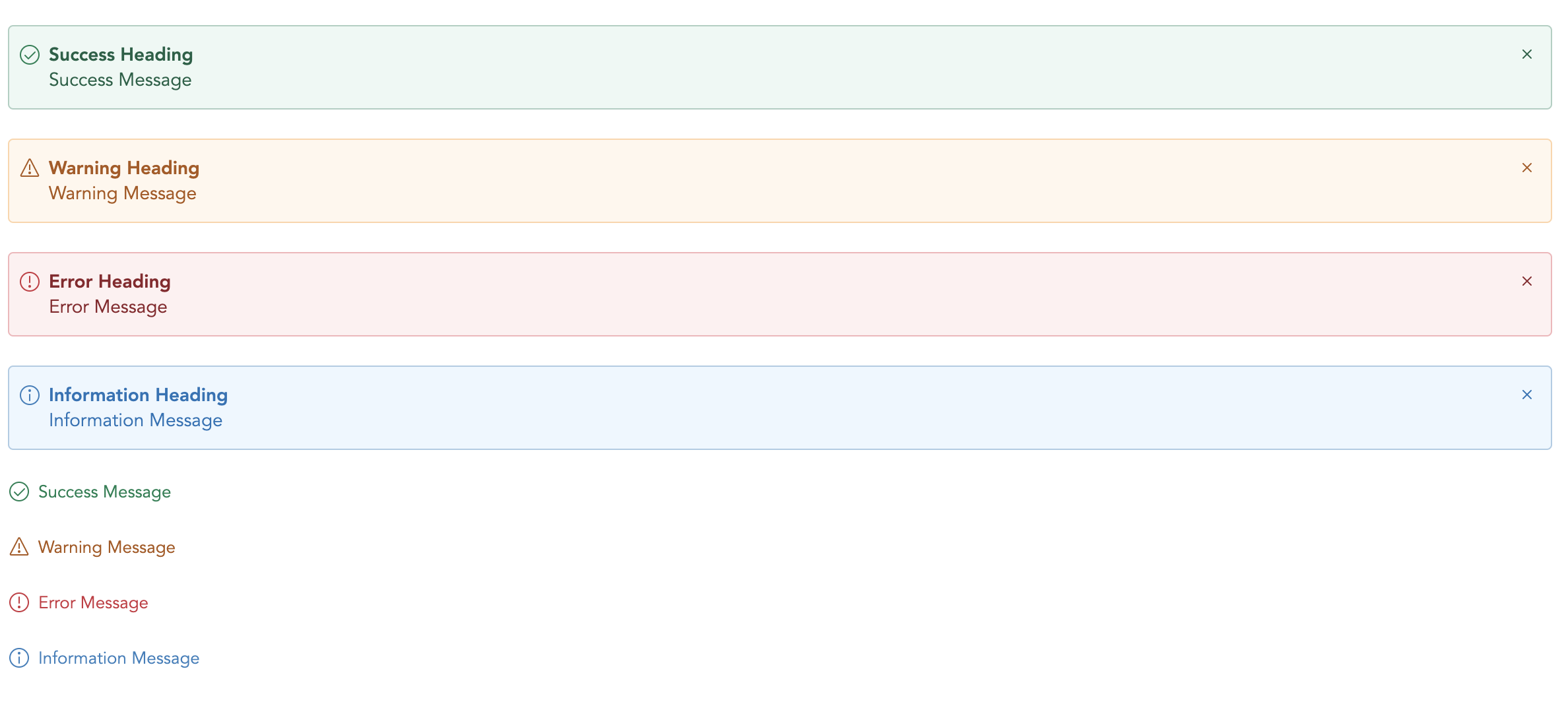
| variant | String | - | Type of alert to be shown. (success, warning, error, info, secondary) |
| title | String | - | The alert title (text only). For HTML, use the header slot. |
| showClose | Boolean | false | Show alert close icon |
| small | Boolean | false | Applies reduced padding |
| toast | Boolean | false | Applies toast design |
| noBg | Boolean | false | Remove background color |
### 🔥 Events
| Name | Description |
| ----- | ---------------------------------------------------------------------------- |
| close | Emitted when the alert close icons is clicked. Listen for it using `@close`. |
### 📎 Slots
You can define own item markup via slots:
| Name | Description |
| --------- | --------------------------------------------- |
| (default) | Holds the alert content and can contain HTML. |
| icon | Slot to add custom icon for type |
| title | Slot to add custom title |