# @vaadin/details
A web component that provides an expandable panel for showing and hiding content.
[Documentation + Live Demo ↗](https://vaadin.com/docs/latest/components/details)
[](https://www.npmjs.com/package/@vaadin/details)
```html
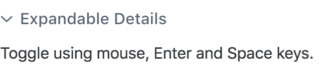
Expandable Details
Toggle using mouse, Enter and Space keys.
```
[ ](https://vaadin.com/docs/latest/components/details)
## Installation
Install the component:
```sh
npm i @vaadin/details
```
Once installed, import the component in your application:
```js
import '@vaadin/details';
```
## Contributing
Read the [contributing guide](https://vaadin.com/docs/latest/contributing) to learn about our development process, how to propose bugfixes and improvements, and how to test your changes to Vaadin components.
## License
Apache License 2.0
Vaadin collects usage statistics at development time to improve this product.
For details and to opt-out, see https://github.com/vaadin/vaadin-usage-statistics.
](https://vaadin.com/docs/latest/components/details)
## Installation
Install the component:
```sh
npm i @vaadin/details
```
Once installed, import the component in your application:
```js
import '@vaadin/details';
```
## Contributing
Read the [contributing guide](https://vaadin.com/docs/latest/contributing) to learn about our development process, how to propose bugfixes and improvements, and how to test your changes to Vaadin components.
## License
Apache License 2.0
Vaadin collects usage statistics at development time to improve this product.
For details and to opt-out, see https://github.com/vaadin/vaadin-usage-statistics.