import { forwardRef, ReactElement, ReactNode } from 'react';
import InternalTextField from './TextField/InternalTextField';
import VRInternalTextField from './TextField/VRInternalTextField';
import useExperimentalTheme from './utils/useExperimentalTheme';
// deals with strings, but we only want numbers for this component.
// So we parse what we get from InternalTextField and we stringify what we give it.
type Handler = any;
const parseHandlerValue =
(handler?: Handler) =>
({
event,
value,
}:
| {
event: React.ChangeEvent;
value: string;
}
| {
event: React.FocusEvent;
value: string;
}
| {
event: React.KeyboardEvent;
value: string;
}) => {
const parsedValue = parseFloat(value);
handler?.({
event,
value: Number.isFinite(parsedValue) ? parsedValue : undefined,
});
};
type Props = {
/**
* Indicate if autocomplete should be available on the input.
*/
autoComplete?: 'on' | 'off';
/**
* Available for testing purposes, if needed. Consider [better queries](https://testing-library.com/docs/queries/about/#priority) before using this prop.
*/
dataTestId?: string;
/**
* Indicate if the input is disabled.
*/ disabled?: boolean;
/**
* For most use cases, pass a string with a helpful error message (be sure to localize!). In certain instances it can be useful to make some text clickable; to support this, you may instead pass a React.Node to wrap text in [Link](https://gestalt.pinterest.systems/web/link) or [TapArea](https://gestalt.pinterest.systems/web/taparea).
*/
errorMessage?: ReactNode;
/**
* More information for the user about how to complete the form field.
*/
helperText?: string;
/**
* A unique identifier for the input.
*/
id: string;
/**
* The label for the input. Be sure to localize the text.
*/
label?: string;
/**
* Whether the label should be visible or not. If `hidden`, the label is still available for screen reader users, but does not appear visually.
*/
labelDisplay?: 'visible' | 'hidden';
/**
* The upper bound of valid input, inclusive.
*/
max?: number;
/**
* The lower bound of valid input, inclusive.
*/
min?: number;
/**
* Mobile only prop. Optionally specify the action label to present for the enter key on virtual keyboards. See the [enterKeyHint variant](https://gestalt.pinterest.systems/web/numberfield#EnterKeyHint) for more info.
*
*/
mobileEnterKeyHint?: 'enter' | 'done' | 'go' | 'next' | 'previous' | 'search' | 'send';
/**
* A unique name for the input.
*/
name?: string;
/**
* Callback triggered when the user blurs the input.
*/
onBlur?: (arg1: { event: React.FocusEvent; value: number | undefined }) => void;
/**
* Callback triggered when the value of the input changes, whether by keyboard entry or the input's arrows.
*/
onChange: (arg1: {
event: React.ChangeEvent;
value: number | undefined;
}) => void;
/**
* Callback triggered when the user focuses the input.
*/
onFocus?: (arg1: {
event: React.FocusEvent;
value: number | undefined;
}) => void;
/**
* Callback triggered when the user presses any key while the input is focused.
*/
onKeyDown?: (arg1: {
event: React.KeyboardEvent;
value: number | undefined;
}) => void;
/**
* Placeholder text shown the the user has not yet input a value.
*/
placeholder?: string;
/**
* Indicate if the input is readOnly. See the [readOnly example](https://gestalt.pinterest.systems/web/textfield#Read-only) for more details.
*/
readOnly?: boolean;
/**
* Ref that is forwarded to the underlying input element.
*/
ref?: ReactElement; // eslint-disable-line react/no-unused-prop-types,
/**
* Defines the height of NumberField: sm: 32px, md: 40px (default), lg: 48px. See the [size variant](https://gestalt.pinterest.systems/web/NumberField#Size) for more details.
*/
size?: 'sm' | 'md' | 'lg';
/**
* Indicates the amount the value will increase or decrease when using the input's arrows.
*/
step?: number;
/**
* The current value of the input.
*/
value?: number | undefined;
};
/**
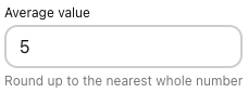
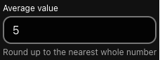
* [NumberField](https://gestalt.pinterest.systems/web/numberfield) allows for numerical input.
*
* 
* 
*
*/
const NumberFieldWithForwardRef = forwardRef(function NumberField(
{
autoComplete,
dataTestId,
disabled = false,
mobileEnterKeyHint,
errorMessage,
helperText,
id,
label,
labelDisplay = 'visible',
max,
min,
name,
onBlur,
onChange,
onFocus,
onKeyDown,
placeholder,
readOnly = false,
size = 'md',
step,
value,
}: Props,
ref,
) {
const theme = useExperimentalTheme();
if (theme.MAIN) {
return (
);
}
return (
);
});
NumberFieldWithForwardRef.displayName = 'NumberField';
export default NumberFieldWithForwardRef;