import { ComponentProps } from 'react';
import cx from 'classnames';
import styles from './Badge.css';
import Box from './Box';
import Flex from './Flex';
import Icon from './Icon';
import IconCompact from './IconCompact';
import TapArea from './TapArea';
import TextUI from './TextUI';
import Tooltip from './Tooltip';
import useFocusVisible from './useFocusVisible';
import useExperimentalTheme from './utils/useExperimentalTheme';
import useInteractiveStates from './utils/useInteractiveStates';
import { Indexable } from './zIndex';
type TooltipProps = {
accessibilityLabel?: string;
idealDirection?: 'up' | 'right' | 'down' | 'left';
text: string;
zIndex?: Indexable;
};
export type TypeOptions =
| 'info'
| 'error'
| 'warning'
| 'success'
| 'neutral'
| 'recommendation'
| 'darkWash'
| 'lightWash';
type InteractiveTypeOptions =
| 'interactive-info'
| 'interactive-error'
| 'interactive-warning'
| 'interactive-success'
| 'interactive-neutral'
| 'interactive-recommendation'
| 'interactive-darkWash'
| 'interactive-lightWash';
type Props = {
/**
* Available for testing purposes, if needed. Consider [better queries](https://testing-library.com/docs/queries/about/#priority) before using this prop.
*/
dataTestId?: string;
/**
* Badge position relative to its parent element. See the [positioning](https://gestalt.pinterest.systems/web/badge#Positioning) variant to learn more.
*/
position?: 'middle' | 'top';
/**
* Text displayed inside of the Badge. Sentence case is preferred.
*/
text: string;
/**
* Adds a [Tooltip](https://gestalt.pinterest.systems/web/tooltip) on hover/focus of the Badge. To convey the interaction, it also displays an Icon. See the [type](https://gestalt.pinterest.systems/web/badge#Type) variant to learn more.
*/
tooltip?: TooltipProps;
/**
* Determines the style of the badge. See the [type](https://gestalt.pinterest.systems/web/badge#Type) variant to learn more.
*/
type?: TypeOptions;
};
/**
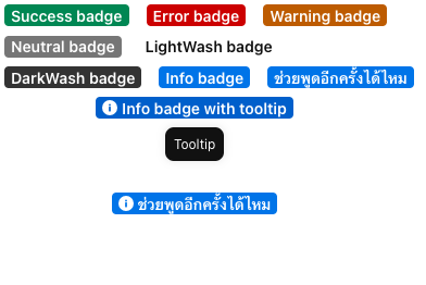
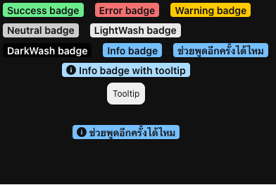
* [Badge](https://gestalt.pinterest.systems/web/badge) is a label that indicates status or importance. Badges should provide quick recognition.
*
* 
* 
*
*/
export default function Badge({
dataTestId,
position = 'middle',
text,
type = 'info',
tooltip,
}: Props) {
const theme = useExperimentalTheme();
const dataTestIdIcon = dataTestId && `${dataTestId}-icon`;
const dataTestIdText = dataTestId && `${dataTestId}-text`;
const dataTestIdTooltip = dataTestId && `${dataTestId}-tooltip`;
const { isFocusVisible } = useFocusVisible();
const shouldUseTooltip = tooltip?.text;
const ICON_MAP = theme.MAIN
? Object.freeze({
'info': 'compact-info-circle-fill',
'error': 'compact-workflow-status-problem',
'warning': 'compact-workflow-status-warning',
'success': 'compact-check-circle-fill',
'neutral': 'compact-lock',
'recommendation': 'compact-sparkle',
'darkWash': 'compact-info-circle-fill',
'lightWash': 'compact-info-circle-fill',
})
: Object.freeze({
'info': 'info-circle',
'error': 'workflow-status-problem',
'warning': 'workflow-status-warning',
'success': 'check-circle',
'neutral': 'lock',
'recommendation': 'sparkle',
'darkWash': 'info-circle',
'lightWash': 'info-circle',
});
const COLOR_ICON_MAP = Object.freeze({
'info': 'info',
'error': 'error',
'warning': 'warning',
'success': 'success',
'neutral': theme.MAIN ? 'default' : 'inverse',
'recommendation': 'recommendation',
'darkWash': 'light',
'lightWash': 'dark',
});
const COLOR_TEXT_MAP = Object.freeze({
'info': theme.MAIN ? 'inverse' : 'shopping',
'error': theme.MAIN ? 'inverse' : 'error',
'warning': theme.MAIN ? 'inverse' : 'warning',
'success': theme.MAIN ? 'inverse' : 'success',
'neutral': theme.MAIN ? 'inverse' : 'inverse',
'recommendation': theme.MAIN ? 'inverse' : 'recommendation',
'darkWash': 'light',
'lightWash': 'dark',
});
let styleType: TypeOptions | InteractiveTypeOptions = type;
if (shouldUseTooltip) {
styleType = `interactive-${type}`;
}
const { handleOnBlur, handleOnFocus, handleOnMouseEnter, handleOnMouseLeave, isFocused } =
useInteractiveStates();
const badgeComponent = (
{shouldUseTooltip ? (
{theme.MAIN ? (
['icon']}
inline
size="16"
/>
) : (
['icon']}
inline
size="14"
/>
)}
) : null}
{text}
);
if (theme.MAIN)
return shouldUseTooltip ? (
{badgeComponent}
) : (
{badgeComponent}
);
return shouldUseTooltip ? (
{badgeComponent}
) : (
{badgeComponent}
);
}
Badge.displayName = 'Badge';