# SVAR Vue Menu Component
[Website](https://svar.dev/vue/core/) • [Getting Started](https://docs.svar.dev/vue/core/category/menu) • [Demos](https://docs.svar.dev/vue/core/samples-menu/#/base/willow)
[](https://www.npmjs.com/package/@svar-ui/vue-menu)
[](https://github.com/svar-widgets/vue-menu/blob/main/license.txt)
[](https://www.npmjs.com/package/@svar-ui/vue-menu)
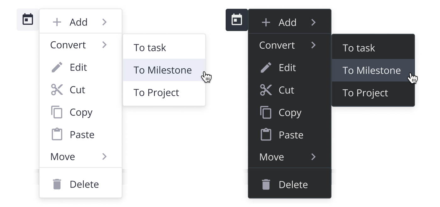
**SVAR Vue Menu** is a flexible menu component for adding navigation and interaction menus to your Vue 3 applications. The component is easy-to-customize, TypeScript-ready, and complements [SVAR Vue Core](https://svar.dev/vue/core/) library. Both light and dark themes available.
SVAR Vue Menu can be used as:
- Action Menu: Provides a compact list of actions (e.g. edit, delete, share.) that appears when a user clicks on a UI element.
- Basic Menu: A simple, hierarchical menu that displays options for navigation or actions.
- Context Menu: A right-click (or long-press) menu offering context-specific options for a selected element.
- DropDown Menu: A dropdown attached to buttons or other clickable elements, expanding on click.
- Menu Bar: A horizontal top-level menu providing access to grouped commands, with support for dropdowns and sub-menus.
Along with the **Menu** component, you can use the following SVAR Vue components to build a unified app interface:
- [Core](https://github.com/svar-widgets/vue-core) - a collection of customizable Vue UI components and form controls;
- [Toolbar](https://github.com/svar-widgets/vue-toolbar) - toolbar component with configurable, responsive layouts;
- [Tasklist](https://github.com/svar-widgets/vue-tasklist) - basic to-do list component to add, edit, check or delete tasks;
- [Comments](https://github.com/svar-widgets/vue-comments) - nice-looking comments section with bubbles or flow views;
- [File uploader](https://github.com/svar-widgets/vue-uploader) - simple file uploader component.
### :hammer_and_wrench: How to Use
To start using the components from the **Menu** package, simply import the package and include the desired component in your Vue file:
```vue
```
See the [getting started guide](https://docs.svar.dev/vue/core/category/menu) to quickly set up and begin using SVAR Menu components in your Vue projects.
### :speech_balloon: Need Help?
[Post an Issue](https://github.com/svar-widgets/vue-menu/issues/) or use our [community forum](https://forum.svar.dev).