# Global Forms

The forms component provides a range of form elements and inputs that allow users to enter information. It also includes error messages. It is designed to make it as simple as possible to create an HTML form.

## When to use this component
Use the forms component when users need to submit information or data. This could be in order to complete a task or as part of a service we provide. For example, when an author needs to enter the title of their manuscript when submitting to a journal.


## How it works
The forms component does not include any JavaScript. States (such as an invalid/error state) are defined at a data level. If you're using client-side processing, you might benefit from compiling the form’s handlebars template in the browser.


## Installation
To use the forms component, enter the following command in your Terminal:

```
npm install @springernature/global-forms
```

Then include the necessary Sass files in your project:

```scss
// Include this with your other components
@import '@springernature/global-forms/scss/50-components/forms';

// Include these with your utilities (if not already there)
@import '@springernature/brand-context/default/scss/60-utilities/buttons.scss';
@import '@springernature/brand-context/default/scss/60-utilities/spacing.scss';
```

Then you will need to register the handlebars partials in the `/view` folder. There are 2 options for rendering form fields: 

1. Compile fields independently, using their respective templates from the `view/fields` folder.
2. Organise your data into arrays of fieldsets and fields and loop over these arrays, assigning the `globalFormFieldset` and `globalFormField` partials respectively.

Here is an example base template implementation:

```html
<form id="my-form" action="/something">
    {{#each myFields}}
        {{> globalFormField}}
    {{/each}}
</form>
```

For this example, you might have 2 simple inputs for a name and password:

```json
"myFields": {
    [
        {
            "template": "globalFormText",
            "label": "Your name",
            "id": "your-name",
            "name": "your-name",
        },
        {
            "template": "globalFormPassword",
            "name": "password",
            "label": "Your password",
            "id": "password"
        }
    ]
}
```


## Fields and fieldsets

### Fields

Form fields are made up of a control (the input) and an associated label. They can also include hint text to provide extra guidance when filling out a field. 

The `template` property sets the type of field - for example, `"template": "globalFormText"` renders a text input field if that is what you have registered the view/fields/globalFormText.hbs template as.

This component supports several [standard form field attributes](https://github.com/springernature/frontend-toolkits/blob/main/toolkits/global/packages/global-forms/view/globalFormAttributes.hbs). For example, to include a `readonly` attribute on your text input, you can include a property of the same name on the data:

```json
{
    "template": "globalFormText",
    "label": "Your email address",
    "id": "your-email",
    "name": "your-email",
    "readonly": true
}
```

### Fieldsets

Use a fieldset to group fields together under its `fields` property. Use a `legend` property to label the fieldset itself.

![Panel](https://user-images.githubusercontent.com/15365576/209008283-cf253e6c-2ef8-4af1-8751-8a04da67c317.png)

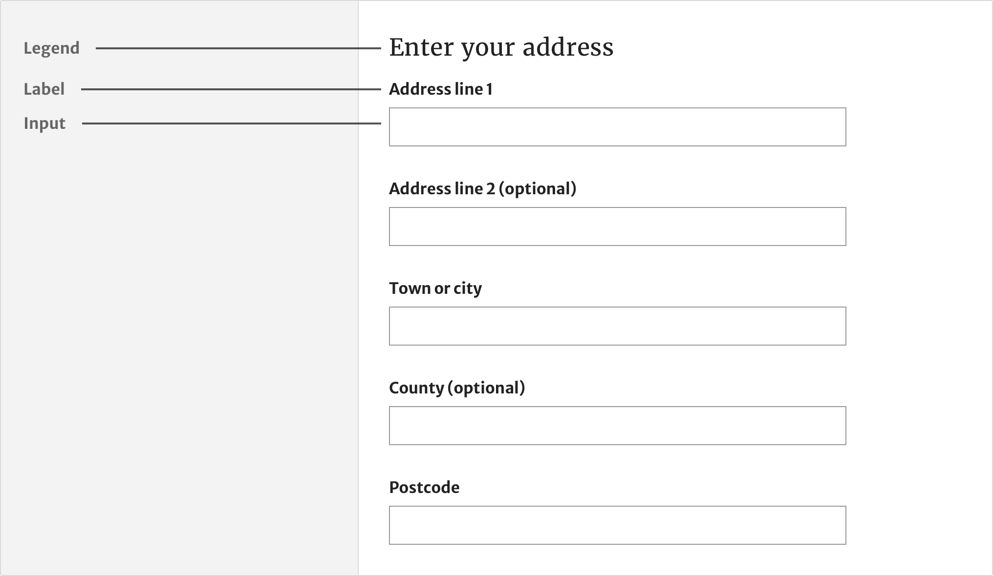
There are 2 ways to add fieldsets to your form:
1. Create a field with the template value of `globalFormFieldset` and an array of fields using its `fields` property.
2. Create an array of fieldsets and loop over them, assigning the globalFormFieldset partial.

#### (1) The fieldset field

```json
{
    "template": "globalFormFieldset",
    "legend": "<h1>Login</h1>",
    "fields": [
        ...
    ]
```
    
#### (2) A fieldset array
In this case, each fieldset is an object:

```json
"myFieldsets": [
    {
        "legend": "<h2>One fieldset</h2>",
        "fields": [
            ...
        ]
    },
    {
        "legend": "<h2>Another, different fieldset</h2>",
        "fields": [
            ...
        ]
    }    
]
```

And the accompanying template would apply the `globalFormFieldset` partial to each fieldset:

```html
{{#each myFieldsets}}
    {{> globalFormFieldset}}
{{/each}}
```


## Legends

Use HTML to style the legend and add semantic meaning. In most cases, legends should be headings, with the heading level determined by the page structure.

![Legends](https://user-images.githubusercontent.com/15365576/210399801-a3078572-c8cb-4826-93bb-02b2aabb9fbc.png)

```json
"fieldsets": {
    [
        {
            "legend": "<h2>My level 2 legend</h2>",
            "fields": [
                ...
            ]
        }
    ]
}
```

Do not use a fieldset without an accompanying legend. If a legend is not appropriate, neither is a fieldset; just use fields without a fieldset parent.

A fieldset can include one or more nested fieldsets. If you are including headings in your fieldsets, be careful to use a heading level that reflects the nesting level. For example, if a fieldset’s legend uses `<h2>`, any child fieldset within it should use `<h3>` or no heading level at all.

## Validation

### Required and optional fields

![Optional fields](https://user-images.githubusercontent.com/15365576/210429547-3736bd66-8676-4336-bfdd-c8e3c57a9932.png)

Avoid asking for information unless you really need it. To support this, form fields are set to `required` by default.

You do not need to mark fields as required. If a user tries to submit the form without filling in a required field, browser validation will show them an error message.

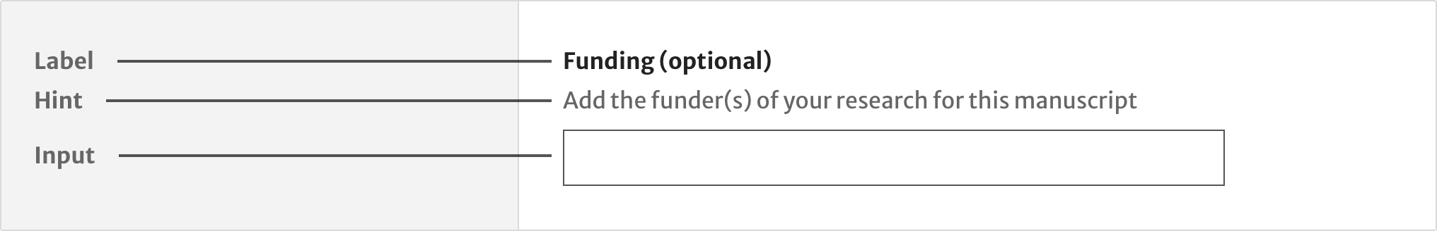
If you need to ask for optional information, set `optional: true`. This will remove `required` and `aria-required="true"` and append the text “(optional)” to the field’s label. 

### Error messages

Error messages inform the user when there’s a problem with the information they’ve provided and how they can fix it.

Error messages are displayed inline, underneath the label and above the input of the relevant field. Error messages are prefixed with a cross icon. This helps to make the error more obvious to users who cannot perceive the red colour. 

![Error messages](https://user-images.githubusercontent.com/15365576/210441442-39bf66c2-f61b-4d7a-b1c8-dd4f3d36465f.png)

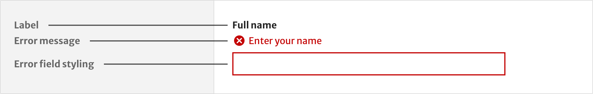
Each field can have an `error` property. The inclusion of the property means the field is in an error state. The property value (a string) defines the error message the user sees.

```json
{
    "template": "globalFormText",
    "label": "Full name",
    "id": "full-name",
    "name": "full-name",
    "error": "Enter your name"
}
```

### Error summary

![Error summary](https://user-images.githubusercontent.com/15365576/210442372-8f8547d9-27eb-4425-90f4-f1237bea0e59.png)

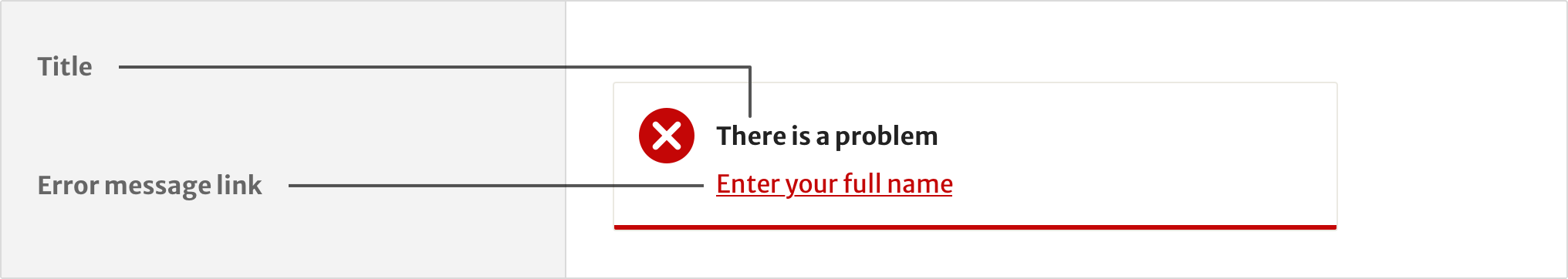
Summarise errors using a top level `errorSummary` property. Each error in the errors array must point to the `id` of the input it relates to and repeat its `error` message:

```json
"errorSummary": {
    "id": "summary",
    "title": "There is a problem",
    "errors": [
        {
            "id": "full-name-error",
            "error": "Enter your full name"
        },
        {
            "id": "checkbox-terms-error",
            "error": "Agree to the terms to continue"
        }
    ]
}
```

## Text input

![Text input](https://user-images.githubusercontent.com/15365576/210444579-d18323f6-a79f-4752-9ff3-06bc698f838f.png)

### When to use this form element

Use the text input field when you need to let users enter text that’s no longer than a single line, such as their name or email address.

### How it works

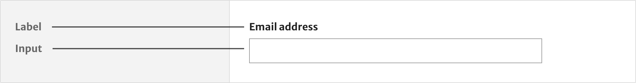
All text inputs must have visible labels. Labels are positioned above the input and are written in sentence case.

#### Avoid placeholder text

The text input component does not support placeholder text. 

Placeholder text:

- disappears when a user enters information - which makes it hard for some people to remember what it said
- can be mistaken by some users for information they’ve entered

Instead, add a hint above the input, when you need one, using a `hint` property.

#### Hints

![Hints](https://user-images.githubusercontent.com/15365576/210446292-047bb015-34b4-4b50-a29a-567d95b41faa.png)

The `hint` property adds hint text under the main label text but **inside** the `<label>`. This means it is automatically available to screen reader software.

```json
"hint": "Add the funder(s) of your research for this manuscript"
```

Placing the hint text above the text input will prevent users from mistaking it as a value and skipping the field.

#### Data properties

Data attributes are supported for unit testing purposes. You can add them using a `dataAttrs` array.

```json
{
    "template": "globalFormText",
    "label": "Your email address",
    "id": "your-email",
    "name": "your-email",
    "dataAttrs": {
        "test": "someValue"
    }
}
```

This would create the following attribution: `data-test="someValue"`.

#### Datalist

Text input fields can have a `datalist` property, which lets you implement autocomplete. This takes 2 properties: `id` and `options` (an array):

```json
"datalist": {
    "id": "my-datalist",
    "options": [
        "monkey",
        "horse",
        "emu",
        "platypus",
        "cockroach",
        "whale"
    ]
}
```

This builds a standard `datalist` field, with `options`, and associates it with the input. If a `datalist` already exists in the markup, provide just the `id` and forego the `option` property. If you want to use a custom-built autocomplete solution using JavaScript, omit the `datalist` property from the field altogether.


## Radios

![Radios](https://user-images.githubusercontent.com/15365576/210527456-7584ec3c-2c80-43f5-abd9-6583e6896bdd.png)

### When to use this form element

Use the radios field (`globalFormRadios`) when users need to pick a single option from a list.

### How it works

#### Radio groups

Radios define choices with an `inputs` array:

```json
{
    "template": "globalFormRadios",
    "legend": "How should we contact you?",
    "inputs": [
        {
            "label": "Email",
            "value": "Email",
            "name": "contact"
        },
        {
            "label": "Phone",
            "value": "Phone",
            "name": "contact"
        }
    ]
}
```

Each input in the inputs array must have the same `name` value, as shown by `name: contact` in the previous example.

Radios are automatically grouped together in a fieldset. Use the `legend` property to describe the radio group.

#### Radios with a conditionally revealed input

You can show users a field when they select a particular radio or checkbox. For example, revealing a text input field to ask a follow up question to the option they’ve selected.

![Radios with conditional reveal](https://user-images.githubusercontent.com/15365576/210528482-1e65a8a4-435f-4014-8dd9-4d892d1af709.png)

These fields can have any properties of a standard form field. Set these properties using the `fields` property, like this:

```json
{
    "label": "Email",
    "value": "Email",
    "name": "contact",
    "fields": [
        {
            "template": "globalFormText",
            "label": "Email address",
            "id": "email-address",
            "name": "email-address"
        }
    ]
}
```


## Checkboxes

![Checkboxes](https://user-images.githubusercontent.com/15365576/210582422-a2b6d806-b5bb-41c6-bb0e-a4dd914567ea.png)

### When to use this form element

Use checkboxes to let users pick one or more options from a list.

### When not to use this form element

Do not use checkboxes if users can only choose one option. Instead, use radios.

### How it works

Unlike radios, which are always used in sets of 2 or more, you can have a single checkbox field. To give users a set of checkbox choices, organise the checkboxes into a `fieldset`:

```json
{
    "legend": "<h2>Which subject categories apply to your manuscript?</h2>",
    "fields": [
        {
            "template": "globalFormCheckbox",
            "label": "Biological sciences",
            "id": "biological-sciences",
            "name": "biological-sciences"
        },
        {
            "template": "globalFormCheckbox",
            "label": "Earth and environmental sciences",
            "id": "earth-sciences",
            "name": "earth-sciences"            
        },
        {
            "template": "globalFormCheckbox",
            "label": "Health sciences",
            "id": "health-sciences",
            "name": "health-sciences"            
        },
        {
            "template": "globalFormCheckbox",
            "label": "Physical sciences",
            "id": "physical-sciences",
            "name": "physical-sciences"            
        }
    ]
}
```


## Selects

![Selects](https://user-images.githubusercontent.com/15365576/210582769-2eb6fc0e-ce10-40f4-b6a0-d037e5c55c0a.png)

### When to use this form element

Research shows that [some people find selects difficult to use](https://www.lukew.com/ff/entry.asp?1950).

Only use selects when there’s no other option.

### When not to use this form element

Aim to use alternatives such as: 

- Radios, for relatively short lists of options
- A text input with autocomplete where the range of options is large 

### How it works

`Select` fields (using the `<select>` element) define the user’s options with an `options` property, which must be an array. The `selected` property can be used to preselect an option:

```json
"options": [
    {
        "label": "Author affiliation",
        "value": "University of Tokyo"
    },
    {
        "label": "University of Tokyo",
        "value": "University of Tokyo",
        "selected": true
    }
]
```


## File upload

![File upload](https://user-images.githubusercontent.com/15365576/210588295-d3e3119e-a3b0-44ca-be3a-8ee33416378b.png)

### When to use this form element

File upload allows users to select and upload a file of their choosing. Use this element when it is a necessary part of a service. For example, an author manuscript as part of the publication process.

### How it works

The standard `accept` attribute is supported. Use this for filtering out file types that are not applicable for submission.


## Buttons

![Buttons](https://user-images.githubusercontent.com/15365576/210589049-ff61646f-c7c5-4dcf-9fc4-2b011b53ced0.png)

### When to use this form element

Use a button to let a user perform an action such as:

- Progressing to the next section of a form
- Submitting a completed form

Use the primary button styling for the main call to action on a page.

### How it works

A `template` of `buttons` defines a set of button controls, displayed inline (using Flexbox and `gap` for tidy wrapping). The `type` property for each individual button corresponds to the `type` HTML attribute. For example, here is how you would include a submit button:

```json
"fields": [
    ...
    {
        "template": "globalFormButtons",
        "buttons": [
            {
                "type": "submit",
                "label": "Submit",
                "modifiers": ["primary"]
            }
        ]
    }
]
```

The `modifiers` property is an array. Each value should match one of these modifiers from the brand context’s button utility styles:

- primary
- secondary
- tertiary
- contrast
- ghost
- xsmall
- small
- large
- full-width


## Hidden inputs

### How it works
You can hide any field from visibility (also from screen reader software and keyboard interaction) using `hidden: true`. If you want to use a field of `type="hidden`", you need to use `template: globalFormHidden`. It is recommended you also apply `hidden: true` to such fields because it will remove the inter-field margin. In the following example, note the `label` is omitted since hidden fields are not user facing.

```json
{
    "template": "globalFormHidden",
    "id": "hidden-field",
    "name": "hidden-field",
    "hidden": true,
}
```


## Inline fields

![Inline fields](https://user-images.githubusercontent.com/15365576/210591214-da46fdcf-5c55-435a-bf8c-be1424db4595.png)

### When to use this form element

Use inline fields when you need to ask users for information that is part of a continuous set, such as a date or credit card number.

### When not to use this form element

Do not use inline fields for an entire form, as this will make it harder for users to scan the page.


### How it works

Display fields in a horizontal line using the following `template` value:

```json
"template": "globalFormInlineFields"
```

For example, here’s a possible field definition for a search bar, comprising an input and submit button:

```json
{
    "template": "globalFormInlineFields",
    "gap": "1em",
    "fields": [
        {
            "template": "globalFormText",
            "name": "search",
            "id": "search",
            "label": "Search",
            "hideLabel": true
        },
        {
            "template": "globalFormButton",
            "type": "submit",
            "label": "Search",
            "modifiers": ["secondary"]
        }
    ]
}
```

- `fields`: Individual fields are defined in a `fields` array.
- `gap`: The gap between the fields; any valid CSS `gap` value.
- `hideLabel`: You can visually hide labels with the `hideLabel` property without removing them from screen reader output. Only do this if there is another visual form of label (the “Search” label of the submit button in this case). 
- `nowrap`: Not used in the previous example. Stop the individual fields from wrapping (beware of narrow viewports).


## Help improve this page

If you’ve got a question, idea or suggestion about how to improve this component or guidance, post in the [#ask-Elements Slack channel](https://springernature.slack.com/archives/CNBTFLBLP).


