# Svelte Sourcegraph UI library
**Status:** In development.
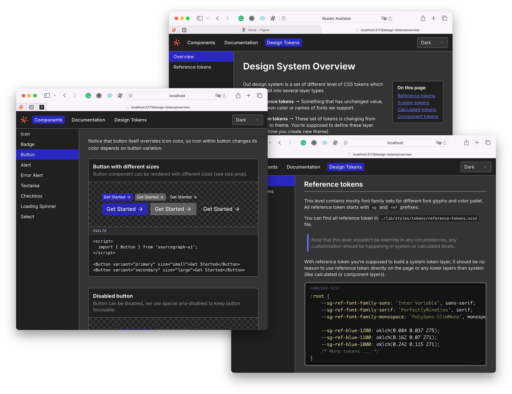
Demo staging is at [tech.sourcegraph.com](https://tech.sourcegraph.com)
 The main place where Sourcegraph UI components live. This shared UI-kit package
provides set of styled UI components, Design Tokens and frontend documentation.
## Install
1. Install package via NPM
```shell
pnpm add @sourcegraph/uikit
```
2. Make sure you add sourcegraph root provider component (somewhere in the root of you app).
It adds global styles and scopes all design tokes to this provider element, it also tracks
theme mode (light/dark) and sets standard theme tokens.
```sveltehtml
```
3. Later in UI you can freely use components from the package, for full set of components see
[Components documentation page](https://tech.sourcegraph.com/components/icon)
```ts
import {
Button,
Form,
FormField,
// All other Sourcegraph components
} from '@sourcegraph/uikit'
```
## Project structure
- `/src/lib` – the main folder where all published to NPM artifacts live, this includes components,
design tokens and all other code that will be accessible under `@sourcegraph/uikit`.
- `/src/routes` – demo pages for [tech.sourcegraph.com](https://tech.sourcegraph.com/) staging.
Note: this folder isn't a part of `@sourcegraph/uikit` package.
- `/src/layouts` – internal UI helper for demo staging routes.
Note: this folder isn't a part of `@sourcegraph/uikit` package.
If you want to add yet another UI component
1. Go to `/src/lib` and creates your component file and export it via index.ts in `components/index.ts`
2. If this component requires demo page, create a designated folder in the `src/routes/(app)/components`
directory with demo page for newly created components, you can take a look at `Icon` component demo
page as a reference for you demo.
3. Add demo page URL in the `/src/routes/(app)/components/layout.ts` file. (`navigationEntries` field)
## Developing
Once you've created a project and installed dependencies with `pnpm install` , start
a development server:
```bash
pnpm run dev
# or start the server and open the app in a new browser tab
pnpm run dev -- --open
```
Everything inside `src/lib` is part of your library, everything inside `src/routes`
can be used as a showcase or preview app.
## Building
To build your library:
```bash
pnpm package
```
To create a production version of your showcase app:
```bash
pnpm build
```
You can preview the production build with `pnpm preview`.
Deployment happens automatically every time we merge PRs into the main branch via GitHub action.
The stage preview is available at https://tech.sourcegraph.com
## When making a PR
Once you open a PR in this repository
- The Changesets bot will check your PR diff for changesets artefacts (MD files in the `.changeset` directory)
and will remind you to add changeset entries.
- You may add a changeset entry for your PR with `pnpm changeset`. Note that this is an optional step,
if your PR doesn't change anything about the package itself or you don't want to have any changelog entry
it's fine to just merge your PR without changesets.
- After your PR is merged we run the release workflow which will create a PR with version release changes
(package version change, free up changeset directory and updating `CHANGELOG.md` file accordingly)
- After this release PR is merged changeset will publish @sourcegraph/uikit to NPM registry
Note: that we don't need to merge this release PR after each PR with changeset, changeset/action will accumulate
changesets in one PR and update the version appropriately according to SEMVER changesets.
The main place where Sourcegraph UI components live. This shared UI-kit package
provides set of styled UI components, Design Tokens and frontend documentation.
## Install
1. Install package via NPM
```shell
pnpm add @sourcegraph/uikit
```
2. Make sure you add sourcegraph root provider component (somewhere in the root of you app).
It adds global styles and scopes all design tokes to this provider element, it also tracks
theme mode (light/dark) and sets standard theme tokens.
```sveltehtml
```
3. Later in UI you can freely use components from the package, for full set of components see
[Components documentation page](https://tech.sourcegraph.com/components/icon)
```ts
import {
Button,
Form,
FormField,
// All other Sourcegraph components
} from '@sourcegraph/uikit'
```
## Project structure
- `/src/lib` – the main folder where all published to NPM artifacts live, this includes components,
design tokens and all other code that will be accessible under `@sourcegraph/uikit`.
- `/src/routes` – demo pages for [tech.sourcegraph.com](https://tech.sourcegraph.com/) staging.
Note: this folder isn't a part of `@sourcegraph/uikit` package.
- `/src/layouts` – internal UI helper for demo staging routes.
Note: this folder isn't a part of `@sourcegraph/uikit` package.
If you want to add yet another UI component
1. Go to `/src/lib` and creates your component file and export it via index.ts in `components/index.ts`
2. If this component requires demo page, create a designated folder in the `src/routes/(app)/components`
directory with demo page for newly created components, you can take a look at `Icon` component demo
page as a reference for you demo.
3. Add demo page URL in the `/src/routes/(app)/components/layout.ts` file. (`navigationEntries` field)
## Developing
Once you've created a project and installed dependencies with `pnpm install` , start
a development server:
```bash
pnpm run dev
# or start the server and open the app in a new browser tab
pnpm run dev -- --open
```
Everything inside `src/lib` is part of your library, everything inside `src/routes`
can be used as a showcase or preview app.
## Building
To build your library:
```bash
pnpm package
```
To create a production version of your showcase app:
```bash
pnpm build
```
You can preview the production build with `pnpm preview`.
Deployment happens automatically every time we merge PRs into the main branch via GitHub action.
The stage preview is available at https://tech.sourcegraph.com
## When making a PR
Once you open a PR in this repository
- The Changesets bot will check your PR diff for changesets artefacts (MD files in the `.changeset` directory)
and will remind you to add changeset entries.
- You may add a changeset entry for your PR with `pnpm changeset`. Note that this is an optional step,
if your PR doesn't change anything about the package itself or you don't want to have any changelog entry
it's fine to just merge your PR without changesets.
- After your PR is merged we run the release workflow which will create a PR with version release changes
(package version change, free up changeset directory and updating `CHANGELOG.md` file accordingly)
- After this release PR is merged changeset will publish @sourcegraph/uikit to NPM registry
Note: that we don't need to merge this release PR after each PR with changeset, changeset/action will accumulate
changesets in one PR and update the version appropriately according to SEMVER changesets.