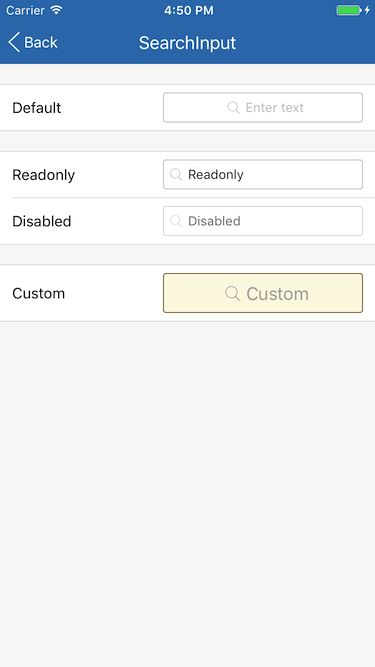
# `` 搜索输入框
SearchInput 组件定义一个搜索输入框, 与 Input 的区别是有多一个放大镜图标, 在内容为空时且不在编辑状态时居中显示, 否则左对齐。
## Props
| Prop | Type | Default | Note |
|---|---|---|---|
| [TextInput props...](https://facebook.github.io/react-native/docs/textinput.html) | | | SearchInput 组件继承 View 组件的全部属性。
| style | 同View.style | | 组件样式, 也就是组件的容器 View 的样式。
| inputStyle | 同TextInput.style | | 输入框样式。
| iconSize | number | | 放大镜图标长宽尺寸, 默认值在 Theme 中设置。
| disabled | bool | false | 是否禁用, 为 true 时组件显示为半透明且不可触摸。
| underlineColorAndroid | string | 'rgba(0, 0, 0, 0)' | 继承自 TextInput 并修改默认值。
## Events
| Event Name | Returns | Notes |
|---|---|---|
| [TextInput events...](https://facebook.github.io/react-native/docs/textinput.html) | | SearchInput 组件继承 TextInput 组件的全部事件。
## Example
简单用法
```
```
只读
```
```
禁用
```
```
自定义
```
this.setState({valueCustom: text})}
/>
```
## Screenshots