# `` 气泡
Popover 组件定义一个气泡, 是一个可在边框任意位置显示一个三角形箭头的圆角矩形容器, 常用于聊天信息显示或弹出提示等。
## Props
| Prop | Type | Default | Note |
|---|---|---|---|
| [View props...](https://facebook.github.io/react-native/docs/view.html) | | | Popover 组件继承 View 组件的全部属性。
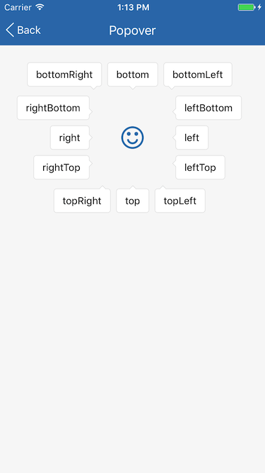
| arrow | string | 'none' | 三角形箭头的位置。
- none: 无
- topLeft: 上边左侧
- top: 上边居中
- topRight: 上边右侧
- rightTop: 右边上侧
- right: 右边居中
- rightBottom: 右边下侧
- bottomRight: 下边右侧
- bottom: 下边居中
- bottomLeft: 下边左侧
- leftBottom: 左边下侧
- left: 左边居中
- leftTop: 左边上侧
显示效果参见[Screenshots](#screenshots)。
| paddingCorner | number | | 三角形箭头与角点距离, 与 arrow 值有关, 如 arrow = 'topLeft' 时表示三角形箭头与左上角的距离, 默认值在 Theme 中设置。
## Example
简单用法
```
```
自定义
```
let blackStyle = {
backgroundColor: 'rgba(0, 0, 0, 0.8)',
paddingTop: 8,
paddingBottom: 8,
paddingLeft: 12,
paddingRight: 12,
};
let shadowStyle = {
shadowColor: '#777',
shadowOffset: {width: 1, height: 1},
shadowOpacity: 0.5,
shadowRadius: 2,
};
...
```
## Screenshots