# Input
Entering content via mouse or keyboard is the most basic form field packaging.
## Code demo
Input field:
```xml
```
## Attribute
### `label`
Provide an input experience similar to Metiral Design.
```html
```
### `placeholder`
Consistent with native 'placeholder'.
```html
```
### `disabled`
The input box can be disabled by disabled. After disabled, the events on the button become invalid.
```html
```
### `value`
Sets or returns the value of the 'value' property of the input box.
### `type`
Currently support 'password', 'number' these types, set will appear additional 'ui' controls.
#### Password entry field
The password can be switched between plain text and ciphertext.
```html
```
### `icon`
You can set an 'icon' to represent the tag identifier.
```html
```
#### Digital input box
Numeric input box, similar to the native 'input[type=number]', support 'min', 'max', 'step' attributes, support keyboard up and down keys to switch numbers.
```html
```
### name
Valid when associated with the form component, the field name collected when the form is submitted
### status
- error
Default color value: `#ff4d4f`
```xml
```
- warning
Default color value:`#ff7875`
```xml
```
## `event`
Common callback events.
### onchange
Triggered when text changes.
```html
```
```js
const input = document.createElement('r-input');
input.setAttribute('label', 'home');
const func = (e) => {
console.log(e);
};
input.addEventListener('change', func);
```
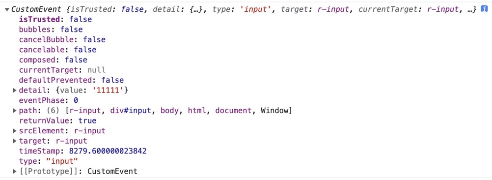
### oninput
Triggered when text changes.
```js
const input = document.createElement('r-input');
input.setAttribute('label', 'home');
const func = (e) => {
console.log(e);
};
input.addEventListener('input', func);
```
The e parameter structure of the event