Button Component




## Description
Buttons communicate an action a user can take. They are typically placed throughout your UI, in places like dialogs, forms, cards, and toolbars.
[Pitaya-framework](https://github.com/pitaya-foundation/pitaya-framework) template component.
_This documentation assumes you are at least slightly familiar with [aurelia](https://aurelia.io/) and its usage. If not, we highly suggest you take a look at its [Quick Start](https://aurelia.io/docs/tutorials/creating-a-todo-app) section first to get a better understanding of the approaches that are presented it here._
## Screenshot
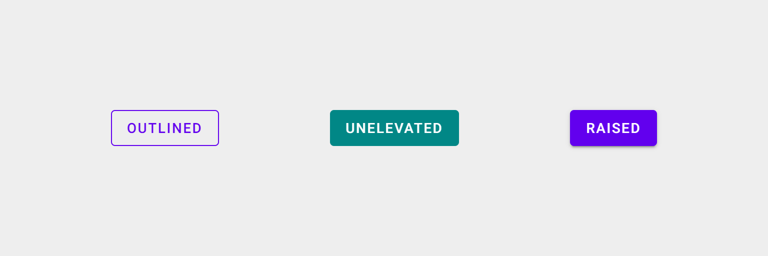
## [Demo](https://demo.pitaya-framework.com/#/button?component=only)
## Installation
```bash
npm install @pitaya-components/master-component --save
```
## Basic Usage
### Importing the component into your project
##### Aurelia App initialization
```ts
export function configure( aurelia )
{
aurelia.use
.standardConfiguration()
.plugin( "@pitaya-components/button" )
.feature( "resources" );
aurelia.start().then( () => aurelia.setRoot() );
}
```
### Usage in HTML
Our components are build to use them in your views HTML.
Furthermore they can be accessed afterwards in the corresponding view model.
##### Template
```html
BUTTON LABEL
...
```
##### View model
```ts
import {PiButton} from "@pitaya-components/button";
export class MyView
{
public button: PiButton;
public buttonClickHandler()
{
this.button.disabled = true;
}
}
```
## Variants
### Simple component
Put different variants here
```html
BUTTON LABEL
```
## Event handlers
Attaching an event handler is as simple as adding `on-.call="()"`.
The function that you specify has to be defined as a method on the view model class, so that aurelias template engine can use it.
##### Template
```html
BUTTON LABEL
```
##### View model
```ts
export class MyView
{
public buttonClickHandler(event: CustomEvent, component: PiButton)
{
console.log("Event detail:", event.detail);
}
}
```
You also can pass any parameter you like.
Specifying `event` or `component` just tells the component that you wish to receive a specific object in your handler via parameter, but if you define something else, it will be passed down to your function just like one would expect.
##### Template
```html
BUTTON LABEL
```
##### View model
```ts
export class MyView
{
public buttonClickHandler(message: string)
{
console.log(message);
}
}
```
## Bindables
A bindable is part of a core functionality of aurelia which basically allows you to configure a component from within your HTML code.
They can be set/accessed via HTML attribute, but also programmatically.
##### Template
```html
```
##### View model
```ts
import {PiButton} from "@pitaya-components/button";
export class MyView
{
public button: PiButton;
public someMethod()
{
this.button.rounded = true;
}
}
```
### Bindable properties
| Attribute / Property | Type
| --- | ---
| `name` | `string`
| `left-icon` | `string`
| `right-icon` | `string`
| `variant` | `"raised" \| "unelevated" \| "outlined"`
| `color-base` | `"primary" \| "secondary"`
| `type` | `"submit" \| "reset"`
| `disabled` | `boolean`
| `density` | `3 \| 2 \| 1`
| `rounded` | `boolean`
| `on-click` | `( component?: PiButton, event?: CustomEvent ) => void`
## Methods and properties
| Signature | Description
| --- | --- |
| `name: string` | Sets the HTML name attribute if the underlying button HTMLElement
| `leftIcon: string` | Sets the left icon
| `rightIcon: string` | Sets the right icon
| `variant: "raised" \| "unelevated" \| "outlined"` | Switches between different possible variants
| `colorBase: "primary" \| "secondary"` | Sets the basic color scheme
| `type: "submit" \| "reset"` | Sets the HTML type attribute if the underlying button HTMLElement
| `disabled: boolean` | Disables the component
| `density: 3 \| 2 \| 1` | Sets how slim the component should appear
| `rounded: boolean` | Detetermines if the component should habe rounded corners
| `onClick: ( component?: PiButton, event?: CustomEvent ) => void` | Listens for the "click" event
## Style Customization
### SASS mixins
With this component we are relying on the [PLACEHOLDER] component of [MDC](https://github.com/material-components/material-components-web/tree/master/packages/mdc-button).
Check out the [documentation](https://github.com/material-components/material-components-web/tree/master/packages/mdc-button#sass-mixins) to learn how to use their SASS mixins.
## Changes
The main repository uses tagged [Releases](https://github.com/pitaya-components/master-component/releases) to communicate changes between versions.
## FAQ
**Q:** Why another JavaScript framework? \
**A:** Read [this article](https://github.com/pitaya-components/master-component) for a detailed overview of ours goals.
## Reach Out!
Find us on [Twitter](https://twitter.com/...) for the latest news, and please consider giving us a ?? star on [GitHub](https://github.com/pitaya-components/master-component)!
## Support
For contributions in the form of bug fixes and changes, feel free to use [Pull Requests](https://github.com/pitaya-components/master-component/pulls) or send us a DM on Twitter to discuss how best to approach your issue.
## License
The Master component source code is licensed under the MIT license.