# Vue2 Clock Picker
A simple clock picker component for `vue v2.x`.
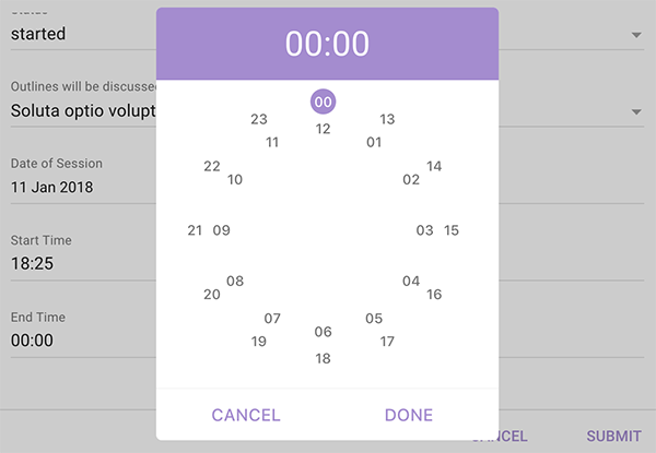
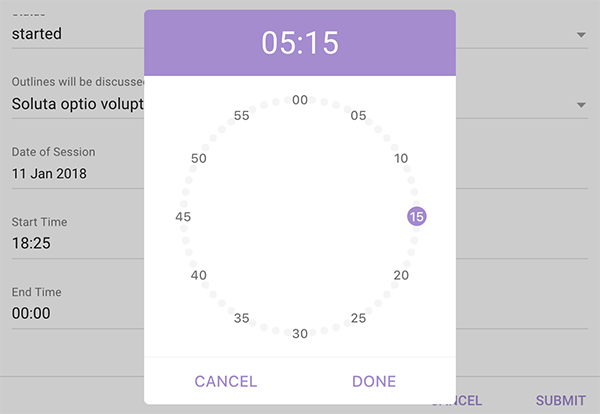
### Installation
```
$ npm install @pencilpix/vue2-clock-picker --save
```
or
```
$ yarn add @pencilpix/vue2-clock-picker
```
- __In Browser:__
1. via plugin
```html
```
2. via per component
```html
```
- __Module:__
1. per component
```js
import VueClockPicker from '@pencilpix/vue2-clock-picker';
import '@pencilpix/vue2-clock-picker/dist/vue2-clock-picker.min.css';
export default {
// ...
components: {
VueClockPicker,
}
// ...
}
```
2. global plugin
```js
import '@pencilpix/vue2-clock-picker/dist/vue2-clock-picker.min.css';
const VueClockPickerPlugin = require('@pencilpix/vue2-clock-picker/dist/vue2-clock-picker.plugin.js')
Vue.use(VueClockPickerPlugin)
```
### Usage
once component is installed it can be used as:
```html
```
#### props
prop | type | default
---------------|--------------|-------------
id | `String` | input id and label for value. default is randomly unique like: `clock_picker_input_jj17bvjklhwhxvm`
placeholder | `String` | input placeholder default `''`
name | `String` | input name default `''`
label | `String` | label text will be hidden if not set. default `''`
input-class | `String` | css custom class to be applied to input. default `clock-picker__input`.
input-container-class | `String`| css custom class to be applied to input container. default `clock-picker__input-container`.
input-value-class | `String`| css custom class to be applied to input container when input contains value. default `clock-picker__input--has-value`.
input-focus-class | `String` | css custom class to be applied to input container when the input is focused. default `clock-picker__input--focused`.
input-error-class | `String` | css custom class to be applied to input container when the value not match `HH:MM` or the input is required and the value is empty. default `clock-picker__input--error`.
label-class | `String | custom class name of label. default: `clock-picker__label`
value | `String` | initial value of input. default `''`
required | `Boolean` | set it to true if time field is required. default `false`
disabled-from | `String` | value of time to disable from until `disabled-to` value or to the end. default `null`.
disabled-to | `String` | value of time to disable from `disabled-to` time value or from 00:00 to, default `null`.
done-text | `String` | done button text, default `done`.
cancel-text | `String` | cancel button text, default `cancel`.
active-color | `String` | active value bg color, header of dialog bg, center color and line color. Default: `#a48bd1`.
active-text-color | `String` | active value color and actions color. default: `white`.
color | `String` | regular text color. default: `#757575`.
disabled-color | `String` | disabled actions and values color, default: `#ddd`.
close-on-esc | `Boolean` | enable close on `ESC` key press, default `false`.
close-on-overlay | `Boolean` | enable closing dialog on overlay click, default `false`.
font | `String` | font family used in canvas, default `Roboto, arial, san-serif`
#### events
event | when
----------------|--------------
beforeOpen | just before opening the dialog.
open | just after opening the dialog.
beforeClose | just before closing the dialog.
close | just after closing the dialog.
timeset | after the value of input is set. and it will recieve the value as `01:02`
cancel | when cancel dialog button is clicked and it will receive the value found at cancel time.
#### methods
method | behavior
-----------|-----------
open | open the dialog
close | close the dialog
getValue | return the current value of the input as `02:00`
setValue | set the current value of input and it accept `String` with valid time `HH:MM`
validate | check for errors. it can be used just before submit the form.