<nav>
  <span>Contents:</span>
  <a href="#{{ this.marked.headerPrefix }}tokens">Tokens</a>
  <a href="#{{ this.marked.headerPrefix }}elements">Elements</a>
  <a href="#{{ this.marked.headerPrefix }}components">Components</a>
  <a href="#{{ this.marked.headerPrefix }}objects">Objects</a>
  <a href="#{{ this.marked.headerPrefix }}utilities">Utilities</a>
</nav>

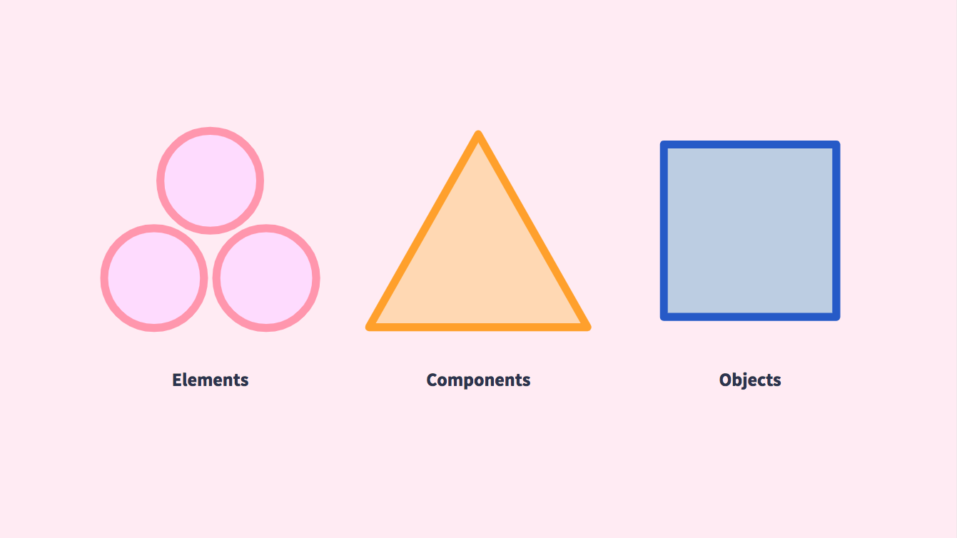
All of the Patterns source is organized into four directories: <a href="#{{ this.marked.headerPrefix }}elements">Elements</a>, <a href="#{{ this.marked.headerPrefix }}components">Components</a>, <a href="#{{ this.marked.headerPrefix }}objects">Objects</a>, and <a href="#{{ this.marked.headerPrefix }}utilities">Utilities</a>. This naming convention is influenced by “[BEMIT: Taking the BEM Naming Convention a Step Further](https://csswizardry.com/2015/08/bemit-taking-the-bem-naming-convention-a-step-further/).” Our four buckets included Elements, Components, Objects, and Utilities. If you are familiar with Brad Frost’s [Atomic Design Methodology](http://atomicdesign.bradfrost.com/chapter-2/), this structure will sound very familiar. All patterns are based on design <a href="#{{ this.marked.headerPrefix }}tokens">tokens</a> that define visual properties on a micro scale.
![Elements, Components, Objects](https://raw.githubusercontent.com/cityofnewyork/patterns-docs/main/images/naming-01.png)

## Tokens

Design Tokens are the variables that store visual properties such as color, spacing, typography styling, etc. They are shared from JavaScript to Sass files. They are also passed to the <a href="#{{ this.marked.headerPrefix }}utilities">Utility</a> configuration for customization of CSS utilities.

## Elements

Elements are the smallest building blocks and include colors, icons, buttons, links, layouts, and more. They can be seen within <a href="#{{ this.marked.headerPrefix }}components">Components</a> and <a href="#{{ this.marked.headerPrefix }}utilities">Utilities</a>. They are often customized default HTML tags (`<button>`,  `<table>`, `<ul>`, `<a>`, etc.). They require smaller amounts of markup and styling to customize.

## Components

Components are smaller patterns that require more complex markup and styling than elements. They may appear more than once in a single view. Often, they include multiple elements such as buttons, lists, links, etc.. Component CSS classes are denoted with the `.c-` prefix.

## Objects

Objects are the most complex patterns and require more custom styling, markup, and JavaScript to function. They may only appear once in a single view. They can be global elements (`<footer>`) or appear only in certain views. Object CSS classes are denoted with the `.o-` prefix.

![Elements and Components within Objects](https://raw.githubusercontent.com/cityofnewyork/patterns-docs/main/images/naming-02.png)

## Utilities

Utilities are reusable single-attribute styles used to customize markup so that fewer patterns need to be written. They are not tied to any element, component, or object, but they can help override styling in certain contexts and build views more efficiently. It is recommended to use the [Tailwindcss Utility Framework](https://tailwindcss.com/) for creating utilities based on design <a href="#{{ this.marked.headerPrefix }}tokens">tokens</a>, however, it is optional.

![Utilities](https://raw.githubusercontent.com/cityofnewyork/patterns-docs/main/images/naming-03.png)
