# Using Searchkit's Theme
We provide an out of the box theme to get developers started quickly.
## Getting Started
To use Searchkit's theme, add the `theme.css` file onto your site. You can use either the CDN link or the `theme.css` file in searchkit's release folder. If using the CDN link, please change the version number which matches your Searchkit version.
```html
```
## Layout Areas
```html
// layout components
import {
Layout, TopBar, LayoutBody, LayoutResults,
ActionBar, ActionBarRow, SideBar
} from "searchkit"
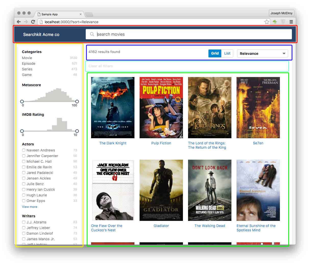
// red area
// yellow area
// blue area
// aqua area
// green area
```
When you include searchkit's `theme.css`, we provide you a basic layout.
## Layout Max width
You can control the max-width of the layout by adding `size` prop to the `layout` component.
* `` : max-width of 960px
* `` : max-width of 1280px
If no size class is applied, layout will use the full width of the browser.
## Grid / List Hit Items
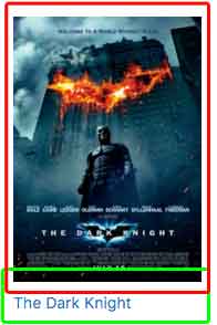
We provide out of the box styles for Hit items for Grid and List Views. See `ViewSwitcherHits` component.
### Example
```jsx
const MovieHitsGridItem = (props)=> {
const {bemBlocks, result} = props
let url = "http://www.imdb.com/title/" + result._source.imdbId
const source:any = _.extend({}, result._source, result.highlight)
return (
Released in {source.year}, rated {source.imdbRating}/10
// blue area
Genres:
Writers:
Actors:
// yellow area
)
}
```
and to use these display components, use the `ViewSwitcherHits` component to switch between views.
```jsx
```
## Using one view type
If you only want to use the grid view or list view, you need to specify on the `hits` component, the `mod` prop to be either `sk-hits-list` for list components or `sk-hits-grid` for grid components.
```jsx
```
 We provide an out of the box theme to get developers started quickly.
## Getting Started
To use Searchkit's theme, add the `theme.css` file onto your site. You can use either the CDN link or the `theme.css` file in searchkit's release folder. If using the CDN link, please change the version number which matches your Searchkit version.
```html
```
## Layout Areas
```html
// layout components
import {
Layout, TopBar, LayoutBody, LayoutResults,
ActionBar, ActionBarRow, SideBar
} from "searchkit"
We provide an out of the box theme to get developers started quickly.
## Getting Started
To use Searchkit's theme, add the `theme.css` file onto your site. You can use either the CDN link or the `theme.css` file in searchkit's release folder. If using the CDN link, please change the version number which matches your Searchkit version.
```html
```
## Layout Areas
```html
// layout components
import {
Layout, TopBar, LayoutBody, LayoutResults,
ActionBar, ActionBarRow, SideBar
} from "searchkit"
 ```jsx
const MovieHitsGridItem = (props)=> {
const {bemBlocks, result} = props
let url = "http://www.imdb.com/title/" + result._source.imdbId
const source:any = _.extend({}, result._source, result.highlight)
return (
)
}
```
```jsx
const MovieHitsGridItem = (props)=> {
const {bemBlocks, result} = props
let url = "http://www.imdb.com/title/" + result._source.imdbId
const source:any = _.extend({}, result._source, result.highlight)
return (
)
}
```
 ```jsx
const MovieHitsListItem = (props)=> {
const {bemBlocks, result} = props
let url = "http://www.imdb.com/title/" + result._source.imdbId
const source:any = _.extend({}, result._source, result.highlight)
return (
```jsx
const MovieHitsListItem = (props)=> {
const {bemBlocks, result} = props
let url = "http://www.imdb.com/title/" + result._source.imdbId
const source:any = _.extend({}, result._source, result.highlight)
return (
