# Selected Filters
This component shows all the filters that have been applied to the current search.
## Example
```jsx
import {
SelectedFilters,
SearchkitComponent
} from "searchkit";
class App extends SearchkitComponent {
render(){
}
}
```
## Overriding Selected Filter Component
If you want to tweak the markup for a selected filter item, you can use the `itemComponent` prop and pass in a React Component to be used instead to render each selected filter item.
```jsx
import {
SelectedFilters,
SearchkitComponent
} from "searchkit";
const SelectedFilter = (props) => (
{props.labelKey)}: {props.labelValue}
x
)
class App extends SearchkitComponent {
render(){
}
}
```
## Props
- `mod` *(string)*: Optional. A custom BEM container class.
- `itemComponent` *(ReactComponent)*: Optional. Used to override the default display of a selected filter. See `Overriding Selected Filter Component` section.
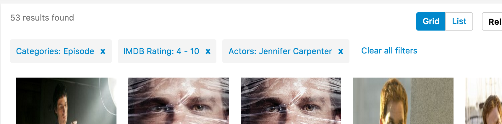 ## Example
```jsx
import {
SelectedFilters,
SearchkitComponent
} from "searchkit";
class App extends SearchkitComponent {
render(){
## Example
```jsx
import {
SelectedFilters,
SearchkitComponent
} from "searchkit";
class App extends SearchkitComponent {
render(){