# Checkbox Filter
A checkbox filter component which can be used with either simple or more complicated filters to decide on/off behaviour.
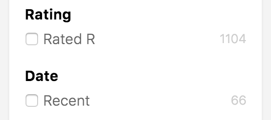 ## Example
```jsx
import {
CheckboxFilter,
TermQuery,
BoolMust,
RangeQuery
} from "searchkit"
```
## Filter property
Notice how we are able to use any arbitrary ES Query, Searchkit offers out the box Query Builders as seen above, but can be any elastic filter query. See [QueryDSL](../../core/QueryDSL.md) for other query builders.
## Props
- `id` *(string)*: Required. id of component. Must be unique. Used as key for url serialisation
- `title` *(string)*: Required. Title used for component and for selected filters component
- `label` *(String)*: Required. The label used to describe the boolean, used for the selected filters component
- `filter` *(ES Filter object)*. Required. The filter used decided the on/off functionality of the checkbox.
- `mod` *(string)*: Optional. A custom BEM container class.
- `showCount` *(boolean)*: Optional, whether the component should render the facet count, defaults to `true`
- `containerComponent` *(React component)*: Optional override for the container component, defaults to `Panel`
- `listComponent` *(React component)*: Optional override for the list component which renders the checkbox, defaults to `CheckboxItemList`
## Example
```jsx
import {
CheckboxFilter,
TermQuery,
BoolMust,
RangeQuery
} from "searchkit"
```
## Filter property
Notice how we are able to use any arbitrary ES Query, Searchkit offers out the box Query Builders as seen above, but can be any elastic filter query. See [QueryDSL](../../core/QueryDSL.md) for other query builders.
## Props
- `id` *(string)*: Required. id of component. Must be unique. Used as key for url serialisation
- `title` *(string)*: Required. Title used for component and for selected filters component
- `label` *(String)*: Required. The label used to describe the boolean, used for the selected filters component
- `filter` *(ES Filter object)*. Required. The filter used decided the on/off functionality of the checkbox.
- `mod` *(string)*: Optional. A custom BEM container class.
- `showCount` *(boolean)*: Optional, whether the component should render the facet count, defaults to `true`
- `containerComponent` *(React component)*: Optional override for the container component, defaults to `Panel`
- `listComponent` *(React component)*: Optional override for the list component which renders the checkbox, defaults to `CheckboxItemList`