# Hits Component
Hits component displays results from ElasticSearch. To customize each result, you need to implement a React component and pass into `itemComponent` prop.
The component will receive a single `hit` object from the search results, which will include `result._source` which contains the untouched stored fields which were indexed.

## Example Usage
```jsx
import * as _ from "lodash";
import {
Hits,
SearchkitComponent,
HitItemProps
} from "searchkit";
const HitItem = (props) => (

)
class App extends SearchkitComponent {
render(){
}
}
```
## Props
- `hitsPerPage` *(Number)*: Number of results displayed per page
- `highlightFields` *(Array)*: Array of highlighted fields. Any highlight matches will be returned in the result.highlight[fieldName]. See above for example.
- `mod` *(string)*: Optional. A custom BEM container class.
- Searchkit ships with defaults for `sk-hits-grid` and `sk-hits-list`
- `itemComponent` *(ReactComponent)*: React component used for each hit render.
- `listComponent` *(ReactComponent)*: React component used if you want to control the full list of results (e.g. make a table component)
- `sourceFilter` *(string|boolean|Array)*: A source filter parameter which is sent to elasticsearch to reduce the hit `_source` data within the results. see the [elastic documentation](https://www.elastic.co/guide/en/elasticsearch/reference/current/search-request-source-filtering.html) for further details.
- `scrollTo` *(string|boolean)*: When results have changed, we scroll to the top of the element using the jQuery style selector passed in the `scrollTo` prop. If true, it will use the body as the selector. Default value is true. If false, it will not scroll when new results are rendered. We determine a change by comparing hits `_id` field with the new results.
## Searchkit Theming styles
Searchkit ships out the box with 2 styles of search results which are controlled via the `mod` property
- `sk-hits-grid` grid styling
- `sk-hits-list` List styling
## Table List example using listComponent
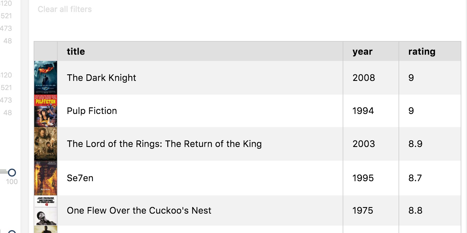
```jsx
class MovieHitsTable extends React.Component {
render(){
const { hits } = this.props
return (
|
Title |
Year |
Rating |
{map(hits, hit => (

|
{hit._source.title} |
{hit._source.year} |
{hit._source.imdbRating} |
))}
)
}
}
class App extends SearchkitComponent {
render(){
}
}
```
## Demo
[](codepen://searchkit/vLgLOw?height=800&theme=0)