# Storybook Addon Knobs
[](https://circleci.com/gh/storybooks/storybook)
[](https://www.codefactor.io/repository/github/storybooks/storybook)
[](https://snyk.io/test/github/storybooks/storybook/8f36abfd6697e58cd76df3526b52e4b9dc894847)
[](https://bettercodehub.com/results/storybooks/storybook) [](https://codecov.io/gh/storybooks/storybook)
[](https://now-examples-slackin-rrirkqohko.now.sh/)
[](#backers) [](#sponsors)
This addon works with Storybook for:
[React](https://github.com/storybooks/storybook/tree/master/app/react).
[React Native](https://github.com/storybooks/storybook/tree/master/app/react-native).
* * *
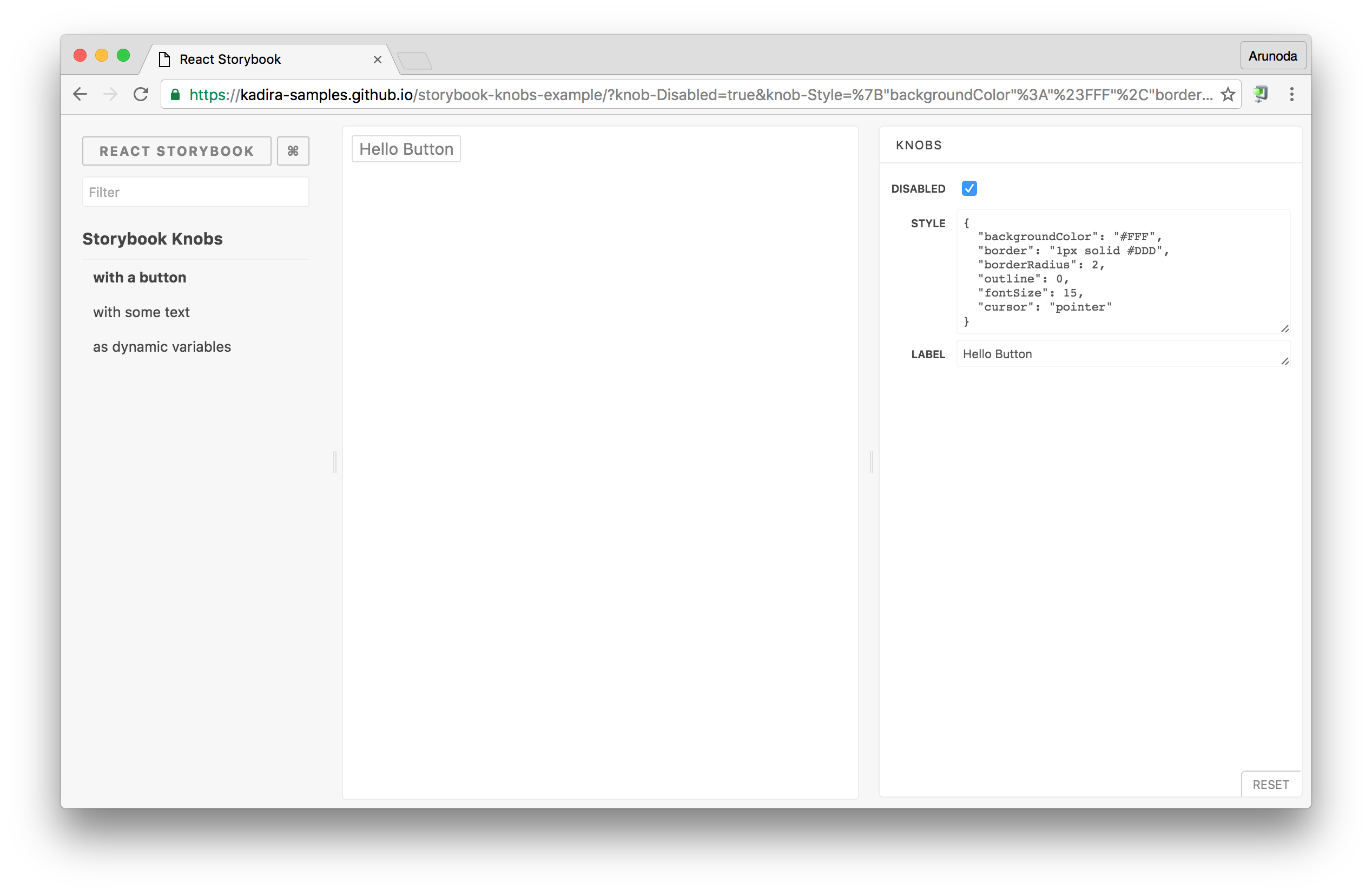
Storybook Addon Knobs allow you to edit React props dynamically using the Storybook UI.
You can also use Knobs as a dynamic variable inside stories in [Storybook](https://storybook.js.org).
This addon works with Storybook for:
- [React](https://github.com/storybooks/storybook/tree/master/app/react)
- [React Native](https://github.com/storybooks/storybook/tree/master/app/react-native)
This is how Knobs look like:
[](https://git.io/vXdhZ)
> Checkout the above [Live Storybook](https://git.io/vXdhZ) or [watch this video](https://www.youtube.com/watch?v=kopW6vzs9dg&feature=youtu.be).
## Getting Started
First of all, you need to install knobs into your project as a dev dependency.
```sh
npm install @nlabs/storybook-addon-knobs --save-dev
```
Then, configure it as an addon by adding it to your `addons.js` file (located in the Storybook config directory).
```js
import '@nlabs/storybook-addon-knobs/register'
```
Now, write your stories with knobs.
```js
import { storiesOf } from '@nlabs/storybook-react';
import { withKnobs, text, boolean, number } from '@nlabs/storybook-addon-knobs/react';
const stories = storiesOf('Storybook Knobs', module);
// Add the `withKnobs` decorator to add knobs support to your stories.
// You can also configure `withKnobs` as a global decorator.
stories.addDecorator(withKnobs);
// Knobs for React props
stories.add('with a button', () => (
));
// Knobs as dynamic variables.
stories.add('as dynamic variables', () => {
const name = text('Name', 'Arunoda Susiripala');
const age = number('Age', 89);
const content = `I am ${name} and I'm ${age} years old.`;
return (
{content}
);
});
```
> In the case of React-Native, use these imports:
>
> ```js
> import { storiesOf } from '@nlabs/storybook-react-native';
> import { withKnobs, text, boolean, number } from '@nlabs/storybook-addon-knobs/react';
> ```
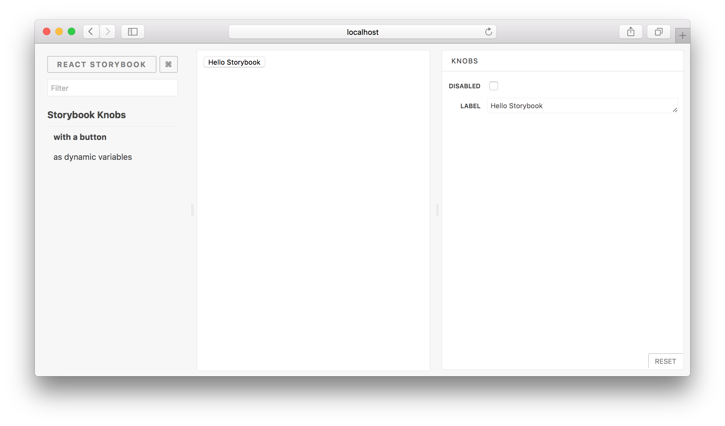
You can see your Knobs in a Storybook panel as shown below.
### Additional Links
- Introduction blog post.
- Watch this video on how to use knobs
- [Live Storybook with Knobs](https://goo.gl/uX9WLf)
- Have a look at this [sample Storybook repo](https://github.com/kadira-samples/storybook-knobs-example).
## Available Knobs
These are the knobs available for you to use. You can import these Knobs from the `@nlabs/storybook-addon-knobs` module.
Here's how to import the **text** Knob.
```js
import { text } from '@nlabs/storybook-addon-knobs';
```
Just like that, you can import any other following Knobs:
### text
Allows you to get some text from the user.
```js
import { text } from '@nlabs/storybook-addon-knobs/react';
const label = 'Your Name';
const defaultValue = 'Arunoda Susiripala';
const value = text(label, defaultValue);
```
### boolean
Allows you to get a boolean value from the user.
```js
import { boolean } from '@nlabs/storybook-addon-knobs/react';
const label = 'Agree?';
const defaultValue = false;
const value = boolean(label, defaultValue);
```
### number
Allows you to get a number from the user.
```js
import { number } from '@nlabs/storybook-addon-knobs/react';
const label = 'Age';
const defaultValue = 78;
const value = number(label, defaultValue);
```
### number bound by range
Allows you to get a number from the user using a range slider.
```js
import { number } from '@nlabs/storybook-addon-knobs/react';
const label = 'Temperature';
const defaultValue = 73;
const options = {
range: true,
min: 60,
max: 90,
step: 1,
};
const value = number(label, defaultValue, options);
```
### color
Allows you to get a colour from the user.
```js
import { color } from '@nlabs/storybook-addon-knobs/react';
const label = 'Color';
const defaultValue = '#ff00ff';
const value = color(label, defaultValue);
```
### object
Allows you to get a JSON object or array from the user.
```js
import { object } from '@nlabs/storybook-addon-knobs/react';
const label = 'Styles';
const defaultValue = {
backgroundColor: 'red'
};
const value = object(label, defaultValue);
```
> Make sure to enter valid JSON syntax while editing values inside the knob.
### array
Allows you to get an array of strings from the user.
```js
import { array } from '@nlabs/storybook-addon-knobs/react';
const label = 'Styles';
const defaultValue = ['Red']
const value = array(label, defaultValue);
```
> While editing values inside the knob, you will need to use a separator.
> By default it's a comma, but this can be override by passing a separator variable.
>
> ```js
> import { array } from '@nlabs/storybook-addon-knobs/react';
>
> const label = 'Styles';
> const defaultValue = ['Red'];
> const separator = ':';
> const value = array(label, defaultValue, separator);
> ```
### select
Allows you to get a value from a select box from the user.
```js
import { select } from '@nlabs/storybook-addon-knobs/react';
const label = 'Colors';
const options = {
red: 'Red',
blue: 'Blue',
yellow: 'Yellow',
};
const defaultValue = 'red';
const value = select(label, options, defaultValue);
```
> You can also provide options as an array like this: `['red', 'blue', 'yellow']`
### date
Allow you to get date (and time) from the user.
```js
import { date } from '@nlabs/storybook-addon-knobs/react';
const label = 'Event Date';
const defaultValue = new Date('Jan 20 2017');
const value = date(label, defaultValue);
```
> Note: the default value must not change - e.g., do not do `date('Label', new Date())` or `date('Label')`
The `date` knob returns the selected date as stringified Unix timestamp (e.g. `"1510913096516"`).
If your component needs the date in a different form you can wrap the `date` function:
```
function myDateKnob(name, defaultValue) {
const stringTimestamp = date(name, defaultValue)
return new Date(stringTimestamp)
}
```
### button
Allows you to include a button and associated handler.
```js
import { button } from '@nlabs/storybook-addon-knobs';
const label = 'Do Something';
const handler = () => doSomething('foobar');
button(label, handler);
```
### withKnobs vs withKnobsOptions
If you feel like this addon is not performing well enough there is an option to use `withKnobsOptions` instead of `withKnobs`.
Usage:
```js
import { storiesOf } from '@nlabs/storybook-react';
const stories = storiesOf('Storybook Knobs', module);
stories.addDecorator(withKnobsOptions({
debounce: { wait: number, leading: boolean}, // Same as lodash debounce.
timestamps: true // Doesn't emit events while user is typing.
}));
```
## Typescript
If you are using typescript, make sure you have the type definitions installed for the following libs:
- node
- react
You can install them using `npm install -save @types/node @types/react`, assuming you are using Typescript >2.0.