# @nannier/canvas
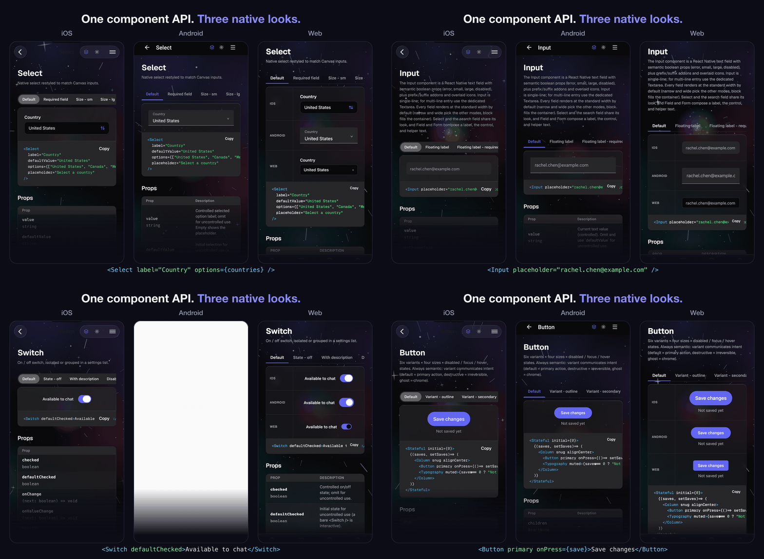
**One universal React Native UI kit that renders natively on iOS and Android, and on the web through React Native Web, from a single component API.**
[](https://www.npmjs.com/package/@nannier/canvas) [](https://github.com/bnannier/canvas/actions/workflows/ci.yml) [Documentation](https://canvas.nannier.com/)
**Try it live:** the [component catalog](https://canvas.nannier.com/components) renders all 81 components (atoms, molecules, organisms, and a full chart family) in the browser, with dark mode, the glass surface, and density switchable site-wide.
Write your screen once and it runs everywhere. Canvas is built entirely from React Native primitives (`react-native`, `react-native-svg`, and its own re-exported `View` / `Text` / `Pressable` / `Image` / `TextInput` / `ScrollView`), with no web-only escape hatches, so the same tree renders identically on device and in the browser. Components are styled with semantic boolean props, are accessible by default (roles and state exposed to assistive tech on all three platforms), and are authored desktop-first so they scale down cleanly to phone. On iOS 26 the functional layer (overlays and bars) renders in real Liquid Glass; on Chromium browsers it renders as a real lens (an SVG displacement filter that refracts the backdrop at the rim); elsewhere it falls back to a genuine frost or a solid surface.
## Install
```bash
npm install @nannier/canvas
```
Canvas ships compiled (no build step in your app) and declares three **required** peer dependencies you install alongside it:
```bash
npm install react react-native react-native-svg
```
### Optional peers
These are only needed if you use the feature they back. Install them lazily; skip them and Canvas still works, degrading gracefully:
| Package | Install only if | Without it |
| --- | --- | --- |
| `react-native-qrcode-svg` | you render the `QRCode` component | `QRCode` is unavailable |
| `expo-glass-effect` | you want real iOS 26 Liquid Glass | glass falls back to a translucent fill |
| `expo-blur` | you want a real frosted blur for glass mode on non-Chromium web, Android, and iOS < 26 (Chromium web renders the SVG lens with no module) | glass falls back to a translucent fill (the Chromium lens keeps working) |
```bash
# add any subset you actually use
npm install react-native-qrcode-svg expo-glass-effect expo-blur
```
## Quick start
Wrap your app once in `ThemeProvider`, then compose components imported from `@nannier/canvas`. The provider supplies the active color scheme, surface, and token map to every component below it.
```jsx
import { ThemeProvider, Card, CardHeader, CardTitle, CardContent, Button } from "@nannier/canvas";
export default function App() {
return (
Welcome to Canvas
);
}
```
That exact tree renders natively on iOS and Android and, through React Native Web, in the browser. There is no separate web component set to learn.
### Styling with semantic boolean props
Every visual variation is a flat boolean prop named for its meaning; passing the prop turns it on, so the call site reads like natural language.
```jsx
Active
...
```
Props are grouped into orthogonal axes (intent, size, density, plus stacking state and layout flags). Props on different axes combine freely; within one axis they are mutually exclusive, so you pass at most one and the component resolves any conflict by a fixed precedence.
```jsx
// Four props from four axes, all applied together.
```
String-valued enum props such as `variant="primary"`, `size="lg"`, or `tone="destructive"` are not part of the API and are not accepted. The boolean form is the only styling surface, and there is no `style`-override escape hatch.
## Platforms
Canvas targets all three platforms from one install. The only thing that changes is which peers your app already provides.
- **Expo** works out of the box. Expo ships `react-native` and `react-native-svg` compatible versions, and the optional `expo-blur` / `expo-glass-effect` peers are Expo modules, so glass renders at full fidelity with no extra native setup.
- **Bare React Native** works the same way once the required peers are installed and linked (`react-native-svg` needs the usual autolinking / pod install). Add the optional peers if you want QRCode or full-fidelity glass.
- **Web via React Native Web** needs one bundler step: install `react-native-web` and alias `react-native` to `react-native-web`, exactly as any RNW project does. Canvas resolves its `react-native` entry point through your alias; nothing else is web-specific. On the web you can also flip glass at runtime with the exported `setSurface("glass")` / `setSurface("solid")` DOM helper.
## Theming
`ThemeProvider` reads the OS color scheme by default and exposes the resolved tokens to every Canvas component through the `useTheme` hook. Optional props control it:
- `dark` / `light` (booleans): the scheme axis, spelled like every other Canvas axis (`dark` wins if both are passed). Omit both to follow the OS appearance. The legacy `scheme` value prop (`"light" | "dark"`) stays supported for code that already holds a scheme value.
- `glass` / `solid` (booleans): the surface axis, spelled like every other Canvas axis. Omit both for the platform default (Liquid Glass on iOS 26+, solid everywhere else); pass `glass` to force the translucent functional-layer material, `solid` to force flat. `glass` wins if both are passed. The legacy `surface` value prop (`"solid" | "glass"`) stays supported for config-driven code holding a `Surface` value.
- `tokens`: brand token overrides merged over the active scheme, so you can rebrand without forking the token files. Pass a flat `Partial` to apply to both schemes, or `{ light, dark }` to override each separately. Use a stable reference (a module constant or memoized object).
```jsx
const brand = { primary: "#7c3aed" };
```
## Documentation and components
Full docs, live examples, and the complete prop reference live at ****.
The kit exports 60+ components across atoms, molecules, and organisms, all from `@nannier/canvas`:
- **Forms and inputs**: Button, Button Group, Input, Textarea, Checkbox, Radio, Switch, Slider, Stepper, Input OTP, Select, Autocomplete, Listbox.
- **Overlays**: Dialog, Alert Dialog, Drawer, Popover, Tooltip, Dropdown, Action Sheet, Toast, Command palette.
- **Navigation**: Tabs, Tab Bar, Navbars, Sidebar, Breadcrumb, Pagination, Steps.
- **Data and content**: Data Table, Stacked / Grid Lists, Stats, Calendar, Charts, Card, Avatar, Badge, Description Lists, Media Objects, QR Code.
- **Disclosure and feedback**: Accordion, Collapsible, Carousel, Progress, Skeleton, Spinner, Alert, Empty State.
Alongside the components, the package exports the style foundation: the theme runtime (`ThemeProvider`, `useTheme`), the design tokens (`token`, `hsl`), the responsive and motion helpers (`useResponsive`, `useReducedMotion`), the glass helpers (`liquidGlassAvailable`, `setSurface`), and the raw React Native primitives (`View`, `Text`, `Pressable`, `Image`, `TextInput`, `ScrollView`).
## Contributing
Contributions are welcome. [CONTRIBUTING.md](./CONTRIBUTING.md) covers the Bun-based
setup, the docs app you develop against, the check battery, and the design principles
(semantic boolean props, no styling escape hatches, React Native everywhere) that
pull requests are reviewed against.
## Security
Please report vulnerabilities privately; see [SECURITY.md](./SECURITY.md). Do not open
public issues for security problems.
## License
None. Canvas is purpose-built for my own projects and carries no license, so all rights
are reserved. It is not offered for outside use, modification, or redistribution.
© 2026 Bobby Nannier.